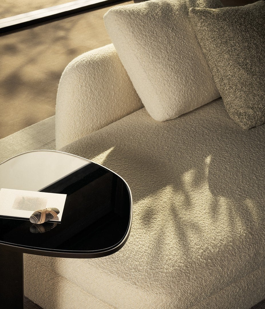
A material sample is small enough to hold, but the decision it represents may occupy an entire room. Its colour is only the beginning. Texture, direction, junctions, light and the relationship to neighbouring finishes determine how it will be experienced once it becomes part of an interior. A useful sample review connects that small piece to the complete project.
Read more than the colour
Begin by identifying the material and the proposed finish precisely. A commercial name can refer to a family rather than one exact specification. Record the supplier, reference and finish, and establish what application is being considered. The same broad material description may cover several appearances or constructions that should not be treated as equivalent.
Then describe what the sample is doing visually. Is the surface smooth or strongly textured? Does it have a directional grain or pattern? Are there abrupt changes in colour, or a gradual movement across the field? These observations are more useful than a loose label such as ‘warm’, because they explain how the material contributes to the composition.
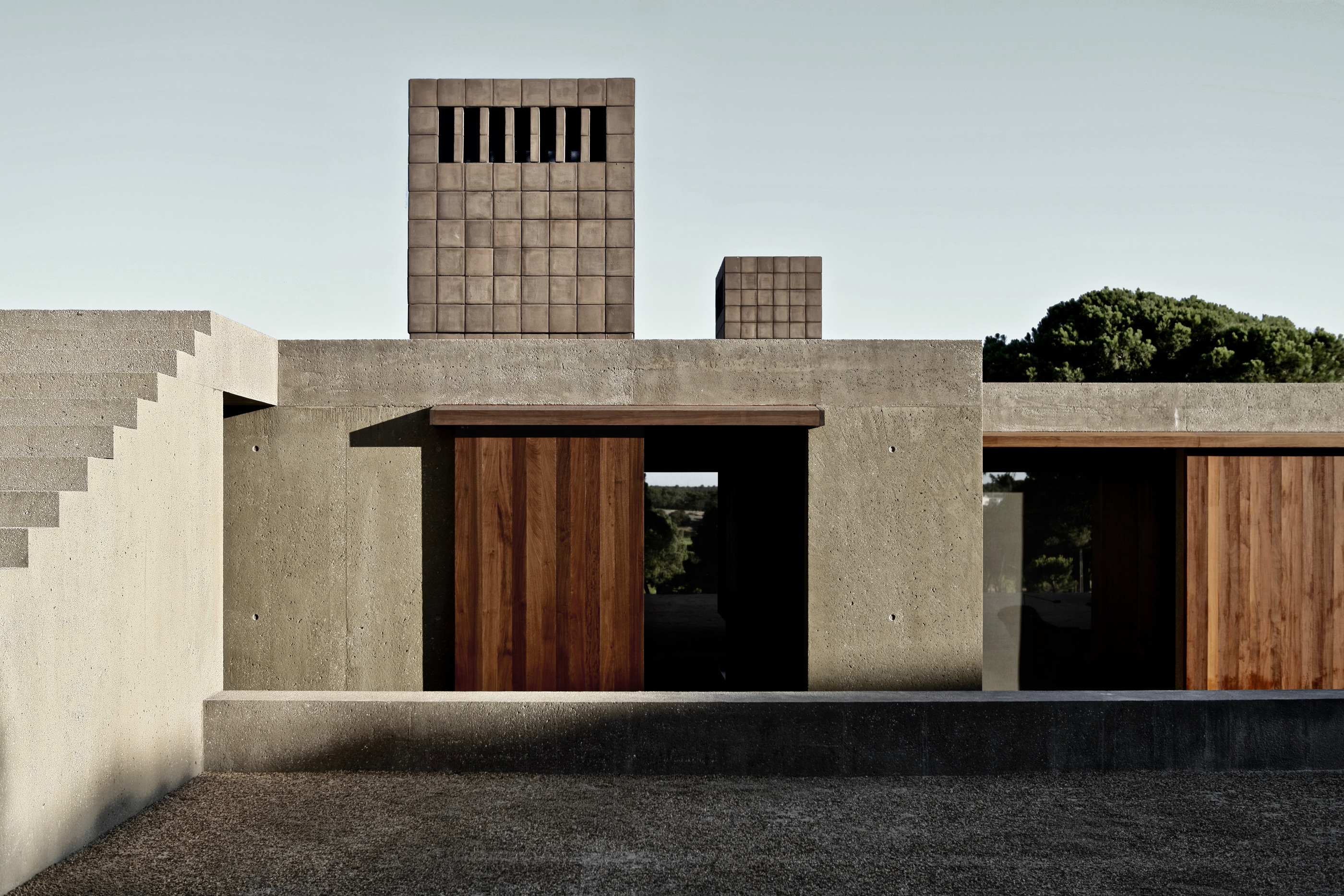
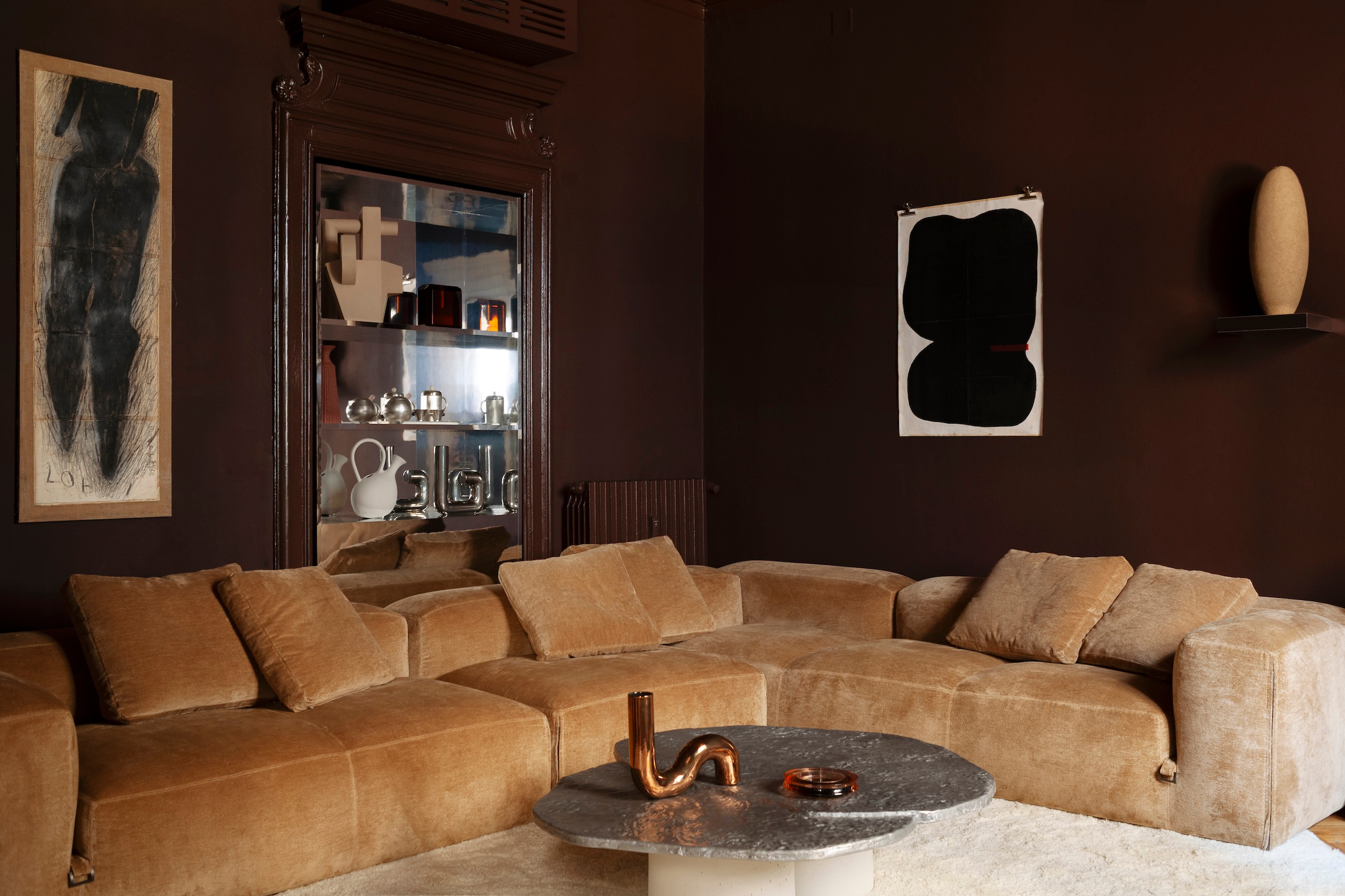
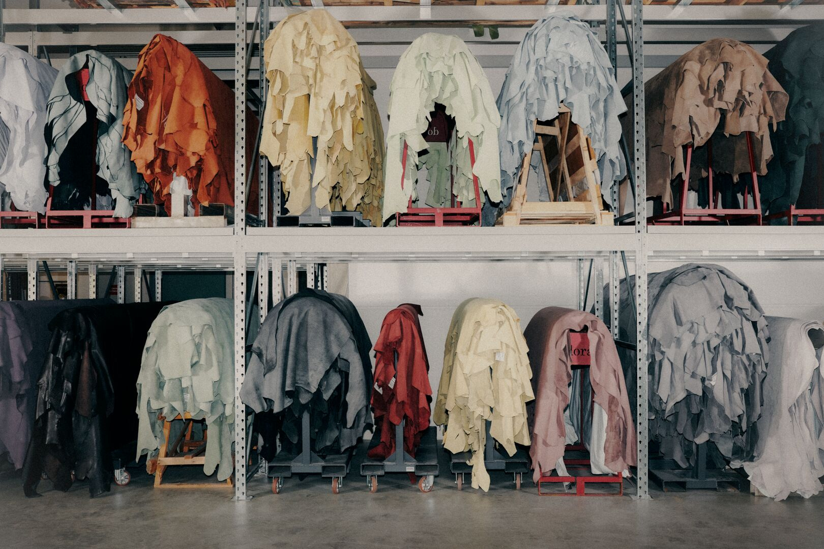
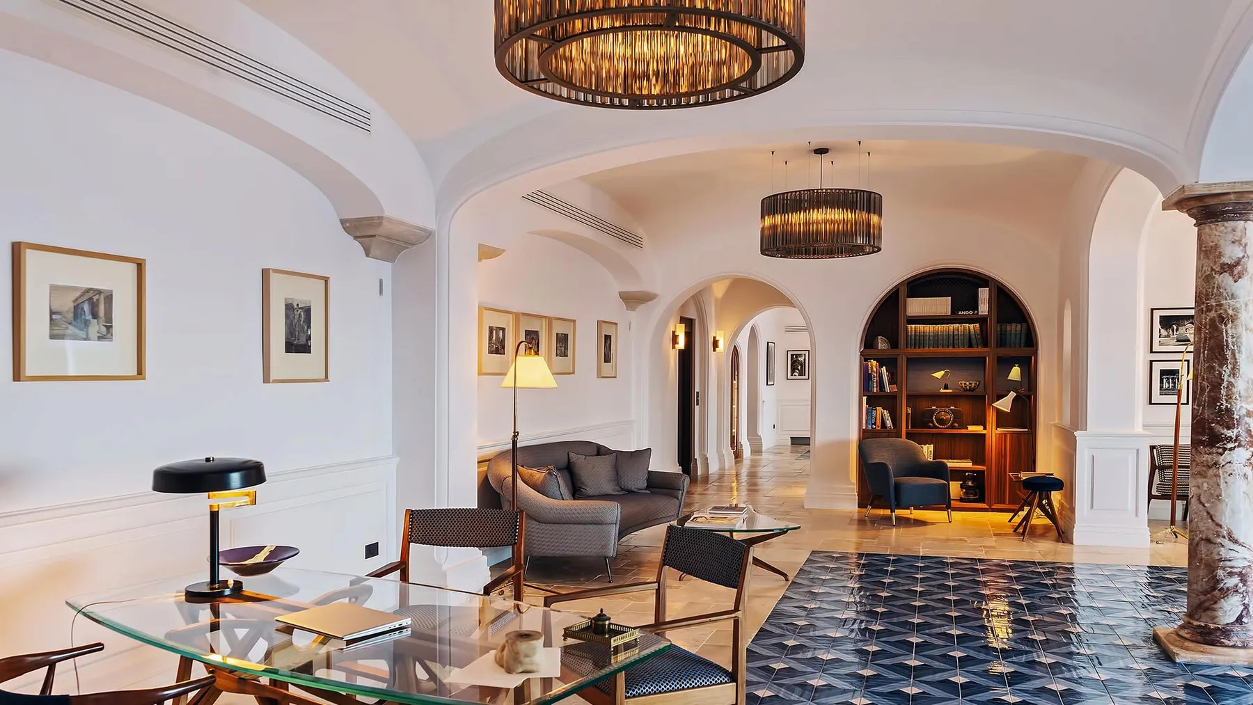
The examples illustrating this guide come from named published LuxeDigital furniture and lighting studies. They show materials in the context of complete objects and rooms. They are references for a way of looking, not claims that the samples, finishes or product configurations are universally interchangeable. Every actual selection needs its own current supplier information.
Put the sample in its intended position
A surface laid flat on a table will not necessarily read as it does vertically on a wall. Its angle to the light changes. So does the distance from which it is seen. A sample review should therefore include the orientation in which the material is intended to be installed, rather than treating the desktop arrangement as a complete preview.
If the finish is directional, mark that direction in the project record. Timber grain, a repeated groove or a woven texture can reinforce the proportions of an elevation or cut across them. Neither is automatically correct; the choice should be deliberate and consistent with the design. A small rotation can change the relationship to adjacent lines more than a slight colour adjustment.
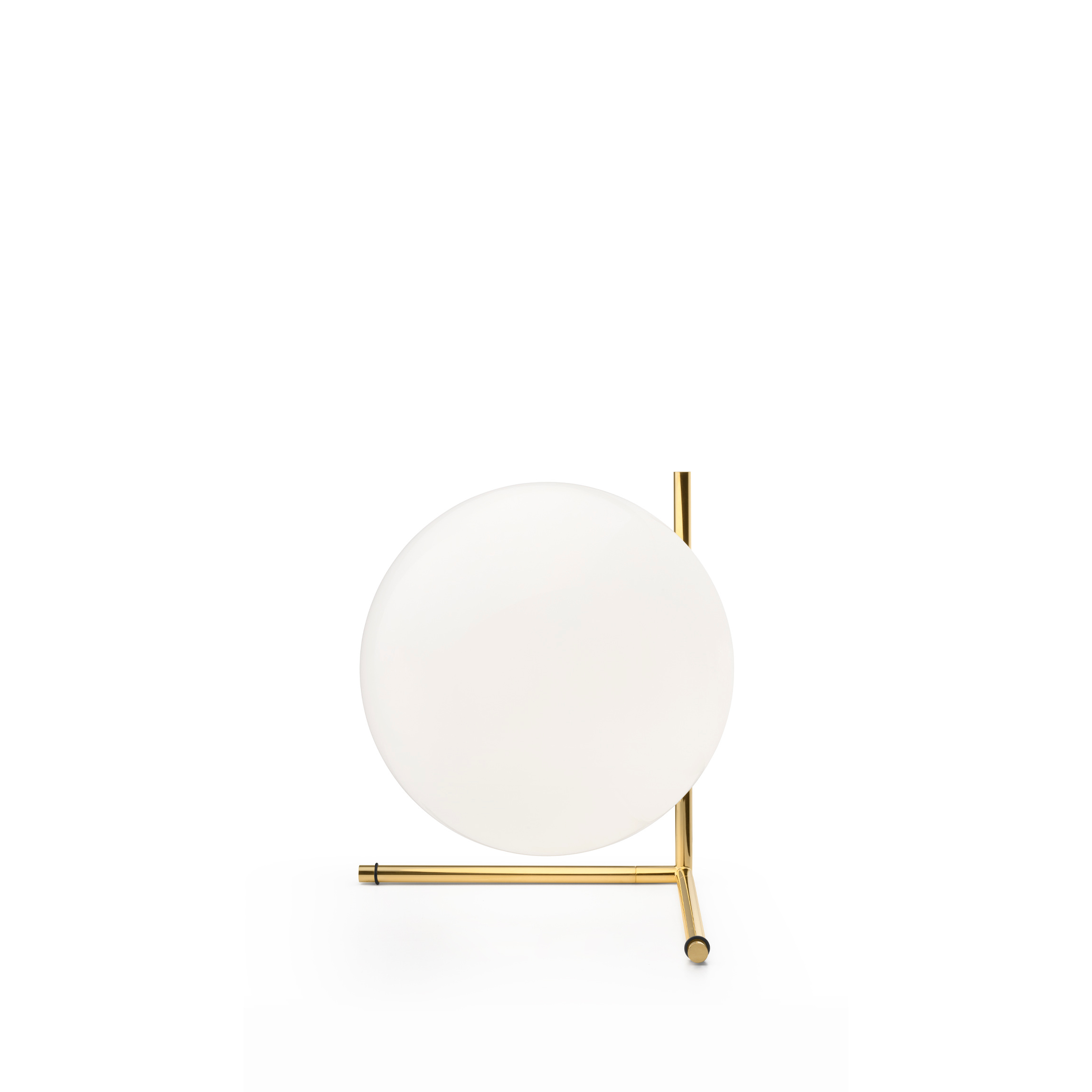
Consider the principal viewpoints as well. A wall seen obliquely from the entrance may reveal a texture that is less obvious from the sofa opposite it. A tabletop receives close scrutiny from a seated position. The sample should be assessed at the distances and angles that matter to the people using the space.
Let light reveal the differences
Look at the proposed combination in daylight and under the intended artificial lighting where possible. This is a comparison exercise, not an attempt to certify performance by eye. The aim is to understand whether the materials remain coherent as the room’s conditions change through the day.
A strongly textured surface may gain depth under light from the side. A reflective finish may pick up colour from neighbouring objects. Pale upholstery can appear different beside timber than against a white background. These relationships are difficult to judge if the samples are inspected separately or under a single showroom light source.
Ask the design team to explain how the lighting plan affects the principal surfaces. A material chosen for its texture deserves a discussion about how that texture will be seen. Conversely, a visually busy finish may need quieter surrounding light and materials to preserve the room’s hierarchy. The surface and the lighting belong in the same design conversation.
Judge the junction, not just the field
The centre of a sample is often its most flattering part. In a finished interior, attention frequently settles on the edges: where timber meets stone, where a metal profile turns a corner or where upholstery finishes against a frame. These junctions give the material its architectural meaning.
Request a drawing or physical detail for the important meeting points. The appropriate level of detail depends on the project, but the underlying question is simple: what will the transition actually look like? A beautiful palette can become less convincing if its edges are resolved as unrelated technical necessities after the design has been approved.
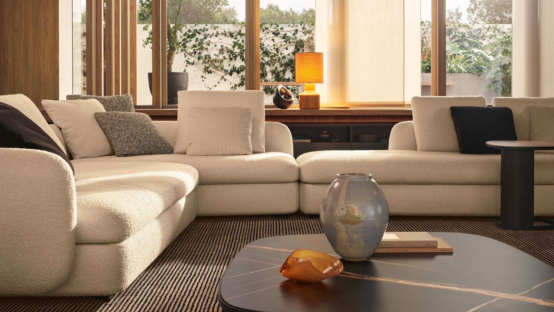
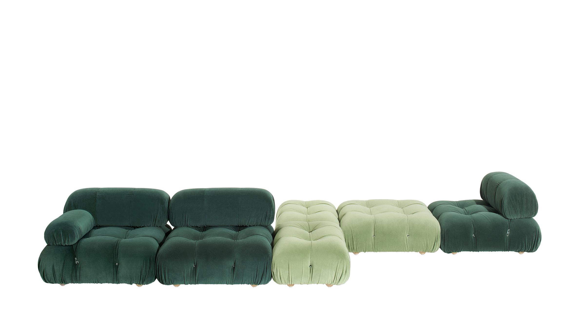
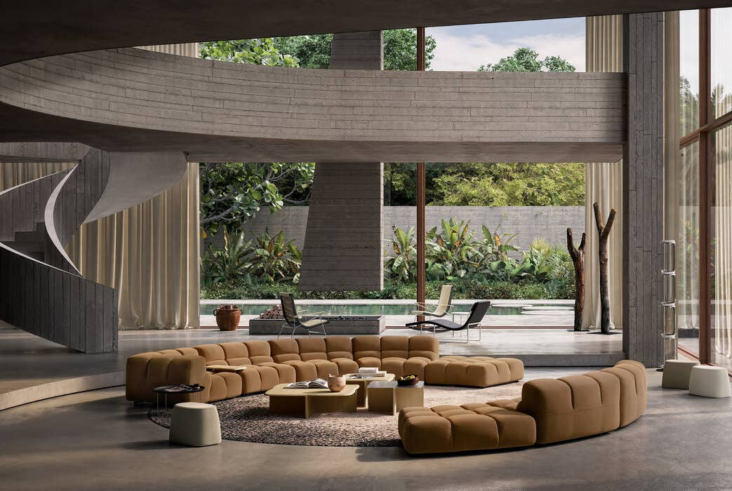
The same applies within a product. The published Camaleonda, Tufty-Time 20 and Saint-Germain studies show upholstery as part of a complete form. A textile does not remain a flat square once it turns a curve, meets a seam or covers a large cushion. The selected finish should be considered in relation to the product’s geometry and current available options.
Understand what can vary
Some materials and processes produce variation that is part of their character. The useful question is which aspects may differ and how the supplier describes the expected range. Do not assume that one sample is an exact image of every future piece, or that all variation is automatically acceptable simply because the material is described as natural or handcrafted.
For a larger application, ask what information can establish the likely overall appearance. Depending on the material and commission, this may involve a larger sample, a set showing range or a review of the actual selected material. The appropriate route should be agreed with the supplier and design team rather than invented from a generic rule.
Record the decision in a way that can be understood later. The reference, approved sample, intended direction and agreed characteristics should remain connected. This is particularly helpful when several parties are involved in ordering, fabrication and installation. A photograph of a loose sample may communicate the idea while failing to identify the actual selection.
Ask about life after installation
Appearance is one part of the specification. Request current information about the intended use, cleaning and care, and discuss it in relation to the household. A beautiful finish that requires a level of maintenance the owner cannot provide is an unresolved design decision, however convincing the initial presentation may be.
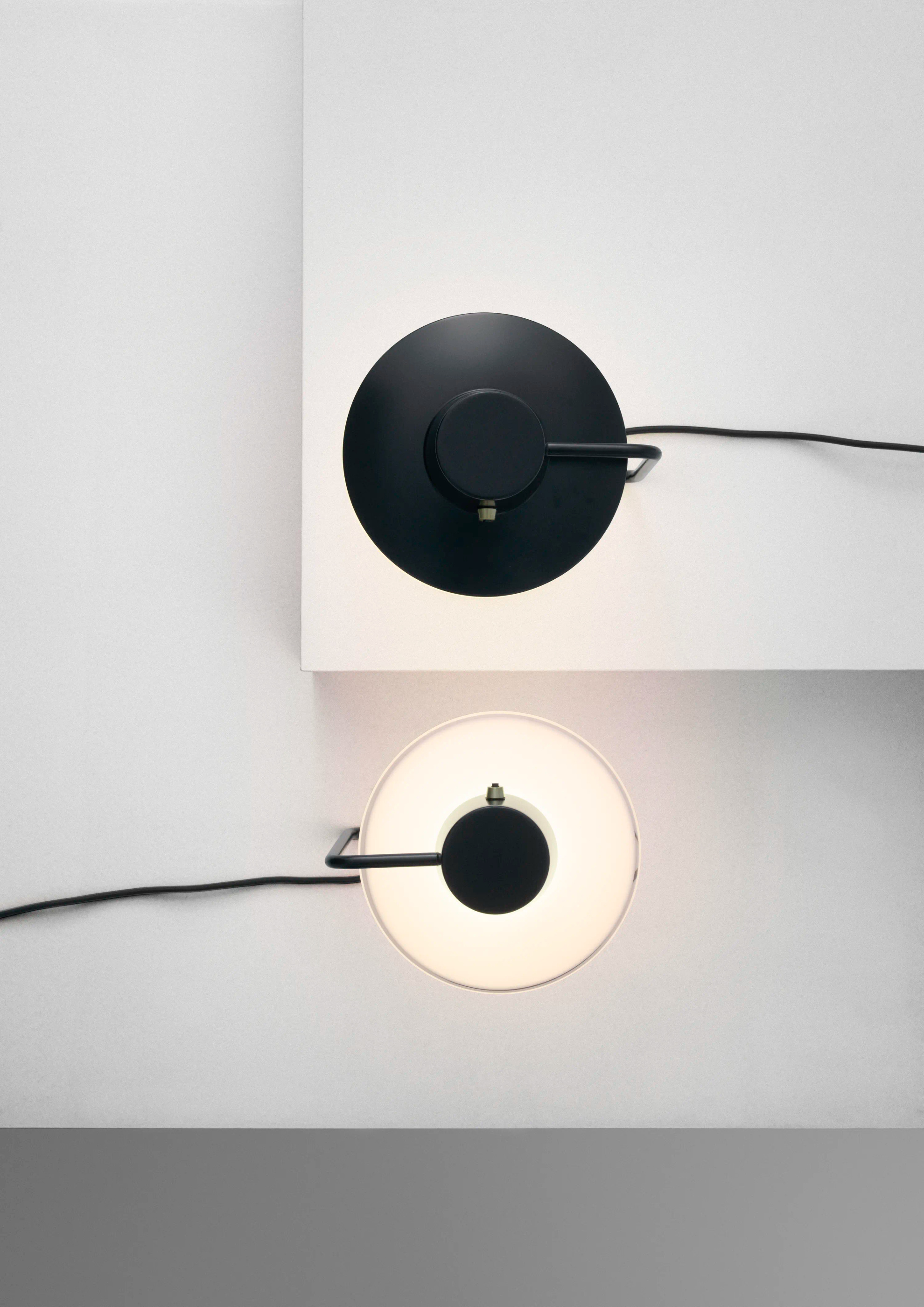
Keep product-specific advice distinct from general assumptions. An outdoor timber collection, a metal light and an upholstered sofa do not share one universal care regime. The named studies accompanying this guide are useful precisely because they show different roles for materials. Their care information must come from the current documentation for the selected product and finish.
Also establish how replacement or future matching would be approached where relevant. A project may be installed in phases, or a component may eventually need attention. The answer can depend on the material and production process. Raising the question early helps make the commission understandable without pretending that every future outcome can be guaranteed.
Make the approval useful to the whole team
The final palette should be more than an attractive tray of samples. Connect each selection to its location and detail in the project. Where two surfaces meet, make sure their relationship is visible in the approval record. This gives the team a shared reference when the work moves from presentation to delivery.
| Review step | What to examine | What to record |
|---|---|---|
| Identity | Material, product and finish reference | Exact supplier and selection |
| Orientation | Grain, pattern and installed direction | The intended position on the drawing |
| Light | Daylight and proposed artificial light | Conditions used for the comparison |
| Junction | Edges, seams and adjacent surfaces | Approved detail or mock-up where needed |
| Variation | Expected range across the finished work | What the sample represents |
| Care | Current product-specific instructions | Information supplied to the owner |
This record should support the design rather than overwhelm it. A clear, proportionate set of decisions is more useful than a large folder of unconnected photographs. The aim is to preserve the reasoning that made the palette coherent, so that later choices do not gradually undo it.
The Luxe Digital view
A material earns its place through its relationship to light, use and the forms around it. The sample is a means of testing that relationship at a manageable scale. It becomes valuable when it helps the owner and project team make a decision they can identify, explain and carry through to the finished work.
That is also a useful standard for a maker’s presentation. Show the field, the edge and the complete application; explain what varies and what the reference establishes. The result gives a reader more than a seductive texture. It makes the quality of the design decision visible, which is where a material story begins to become useful knowledge.
A material earns its place through its relationship to light, use and the forms around it.
Sources & credits
Sources and methodology
Independent design and reference analysis of the named official records and imagery, checked on 15 October 2026. Launch specifications and later product records retain their own dates and references. Images show the identified configurations. Original visual and commissioning analysis of the exact official product/project records and identified images. No visit, interview, comfort test or performance measurement claimed. Existing projects retain their dates; product versions, showroom photographs, sample images and official visualisations are identified separately.
- Poliform — existing-9233.
- B&B Italia — existing-9117.
- B&B Italia — existing-9225.
- Louis Poulsen — existing-9337.
- Flos — existing-9203.
Illustrations also accompany these published LuxeDigital studies: