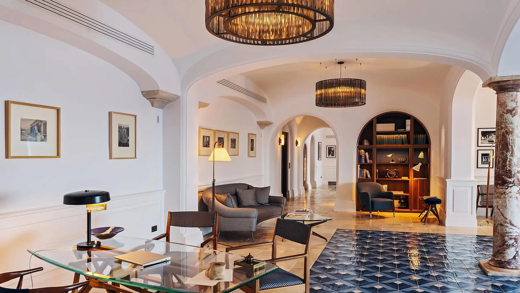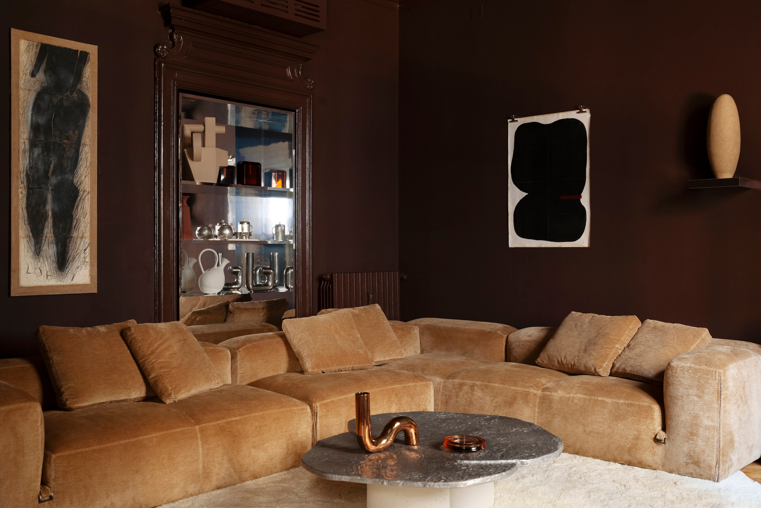
In Studiopepe’s photographed interior for Tacchini’s Milan showroom, a room seems to have acquired its objects over time. A low table, a deep sofa, ceramics and framed works share the view without becoming a matching set. The effect gives the visitor a useful starting point for understanding the studio: character is built through relationships between things.
A room with an imagined occupant
Arianna Lelli Mami and Chiara Di Pinto founded Studiopepe in Milan in 2006. The studio’s work spans interiors, products and creative direction. Here the focus is its documented approach, read through the Tacchini showroom project dated 2025 and photographed by Andrea Ferrari. The figure inhabiting these rooms is an imagined collector in the project narrative, not a private client whose life we have observed.
The commission begins with a point of view
Studiopepe’s account describes the showroom as an apartment for a cultured, eclectic figure. That premise gives the design a direction before any individual object is discussed. A showroom can offer many products; an imagined home needs reasons for those products to share a room. The premise makes selection and arrangement part of the project’s argument.
The distinction is useful for a residential commission. A description of how someone wants to inhabit a place provides more direction than a list of visual preferences alone. It can explain whether rooms should invite gathering, concentrated work, quiet reading or the display of things accumulated through a life. The result need not imitate a showroom. Its value is the discipline of giving decisions a shared purpose.
A reader evaluating a studio can therefore ask how an initial concept survives into the resolved interior. Look for connections between a room’s intended use and its objects, rather than judging only the quantity of references in a presentation. An idea becomes more convincing when it helps the design team choose and omit with equal clarity.
Colour works across the doorway
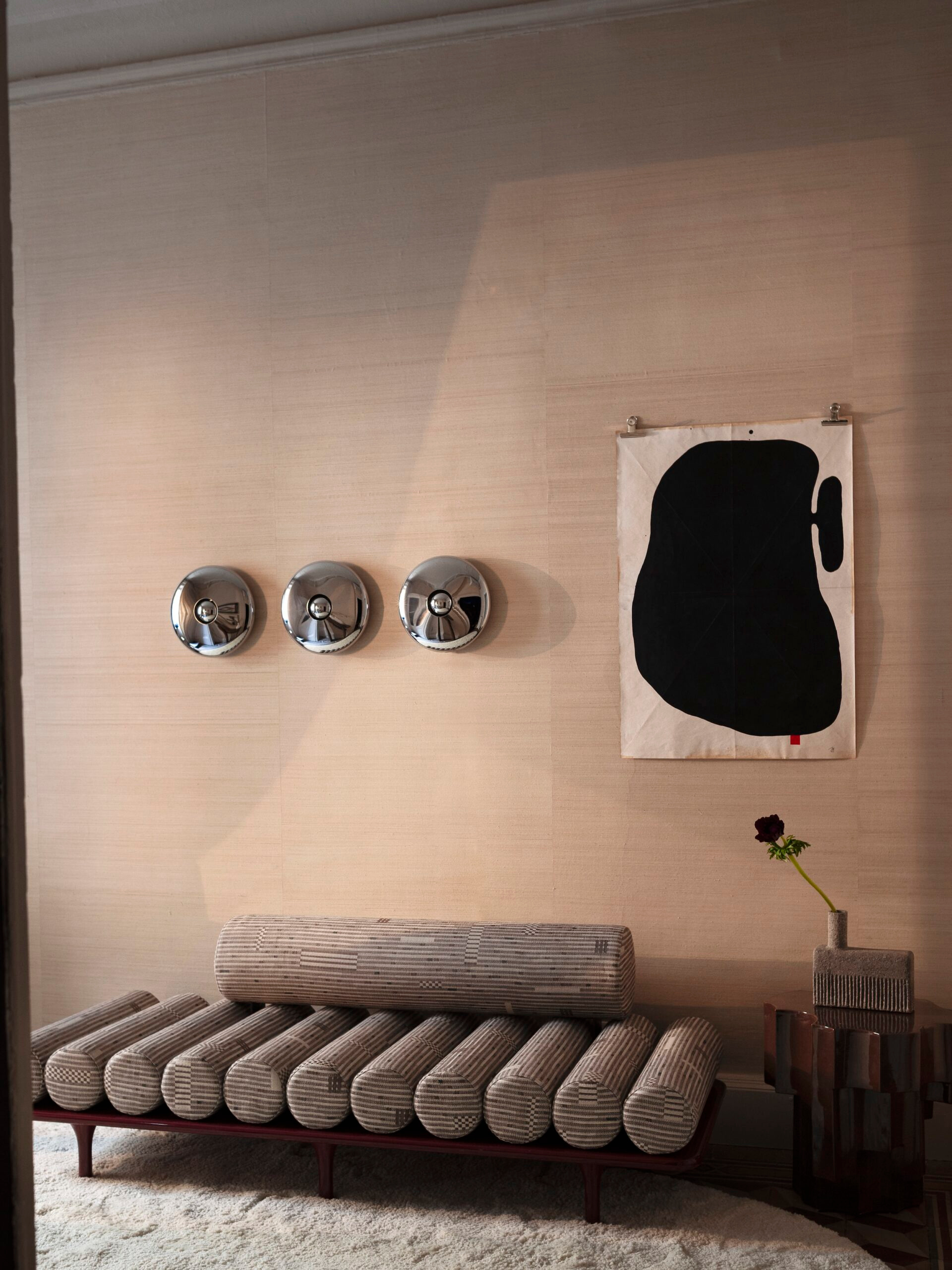
The published sequence reveals several rooms through their connecting openings. A foreground wall, a door surround and the room beyond enter the same composition. This makes colour a spatial decision. A tone chosen for one room also becomes part of the neighbouring room’s view.
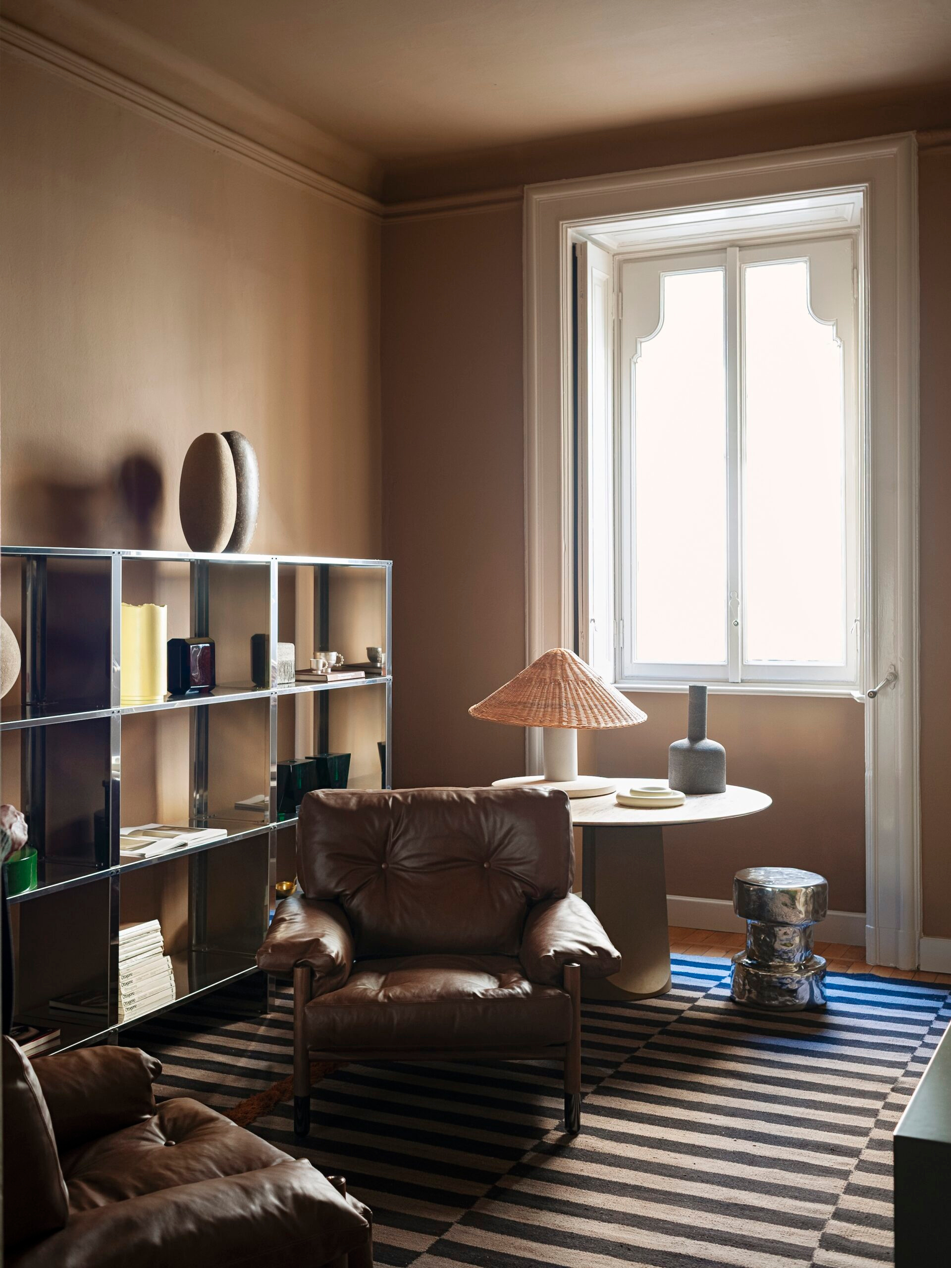
In the darker sitting area, timber and upholstered volumes create a close visual field. Other frames bring lighter surfaces and a brighter window into the account. The difference gives the sequence variation while repeated materials and objects keep it connected. These are observations of the photographs; they do not establish the rooms’ appearance under every lighting condition.
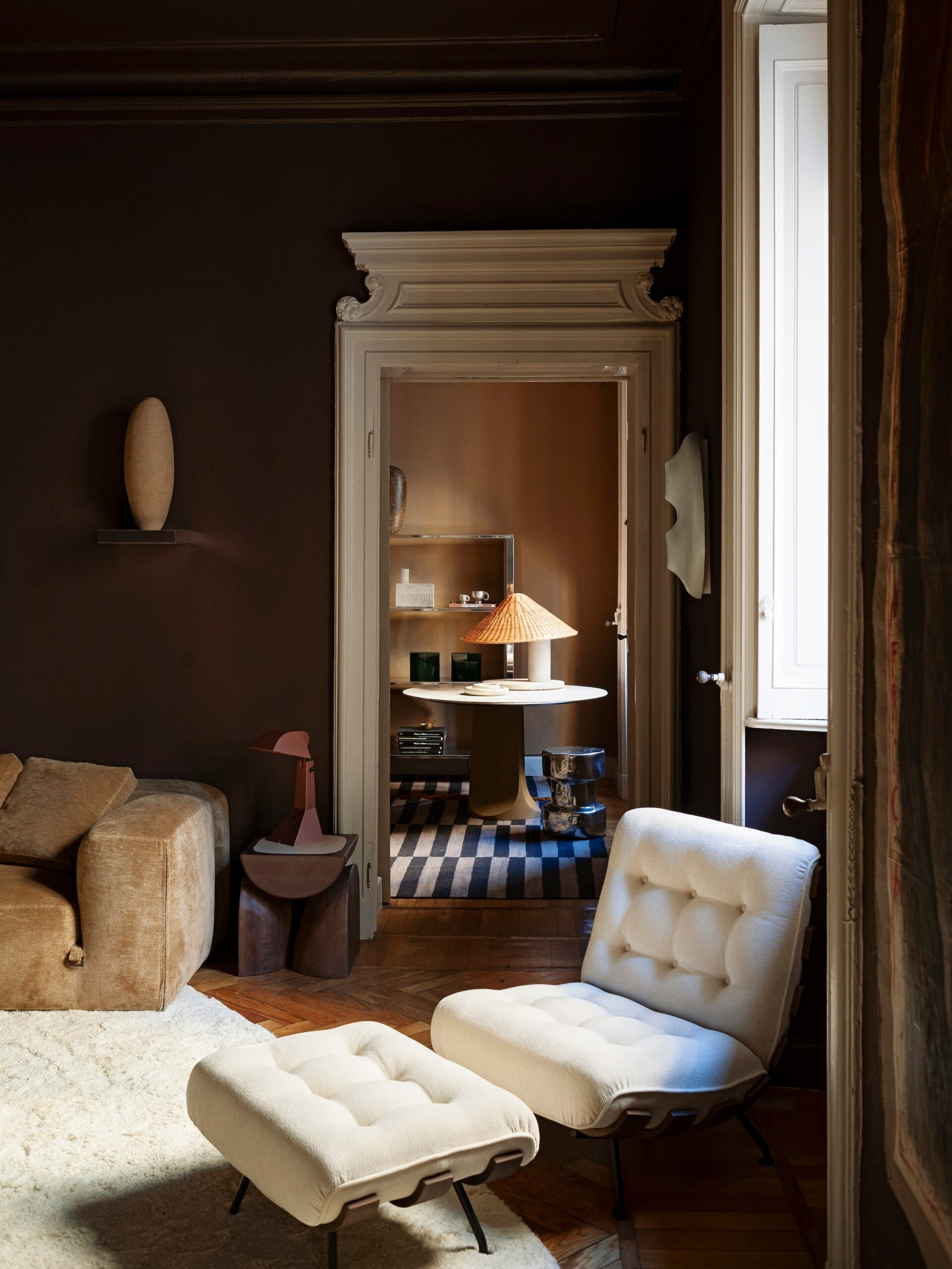
For an actual home, the practical lesson is to review a palette across thresholds. Ask for the view from the hall into the sitting room and from the dining area back towards it. A collection of individually attractive samples may produce an unintended sequence when brought together. The doorway offers a simple way to test that relationship before decisions become fixed.
An object needs a little company
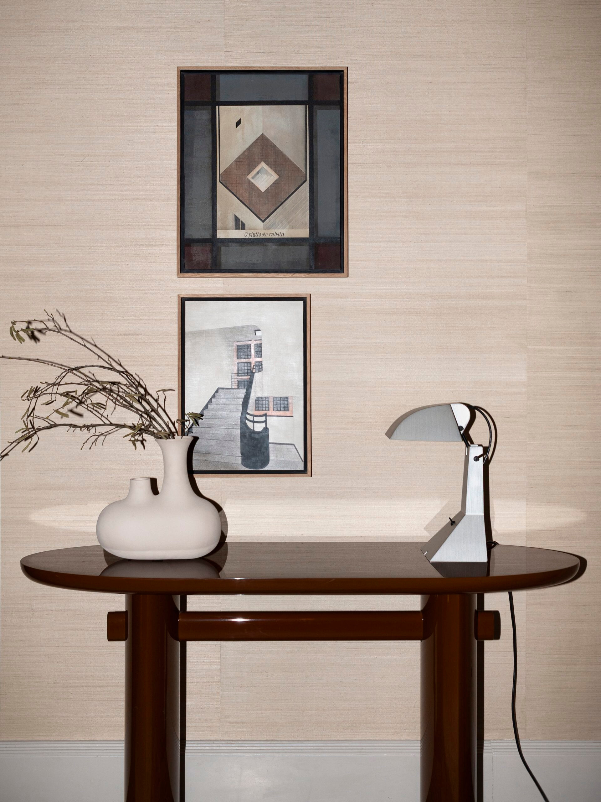
The console photograph gives a compact account of the studio’s method. A table, a vase, lighting and framed works occupy different heights and establish several points of attention. No single object has to provide the room’s entire identity. The arrangement makes the spaces between them active participants in the composition.
This is also why an interiors article should resist turning each photograph into a shopping list. A recognisable piece can be important, but the room’s effect also depends on placement, neighbouring surfaces and the viewpoint from which the grouping is seen. Moving the same objects into another room may produce a different result. The design work includes that negotiation.
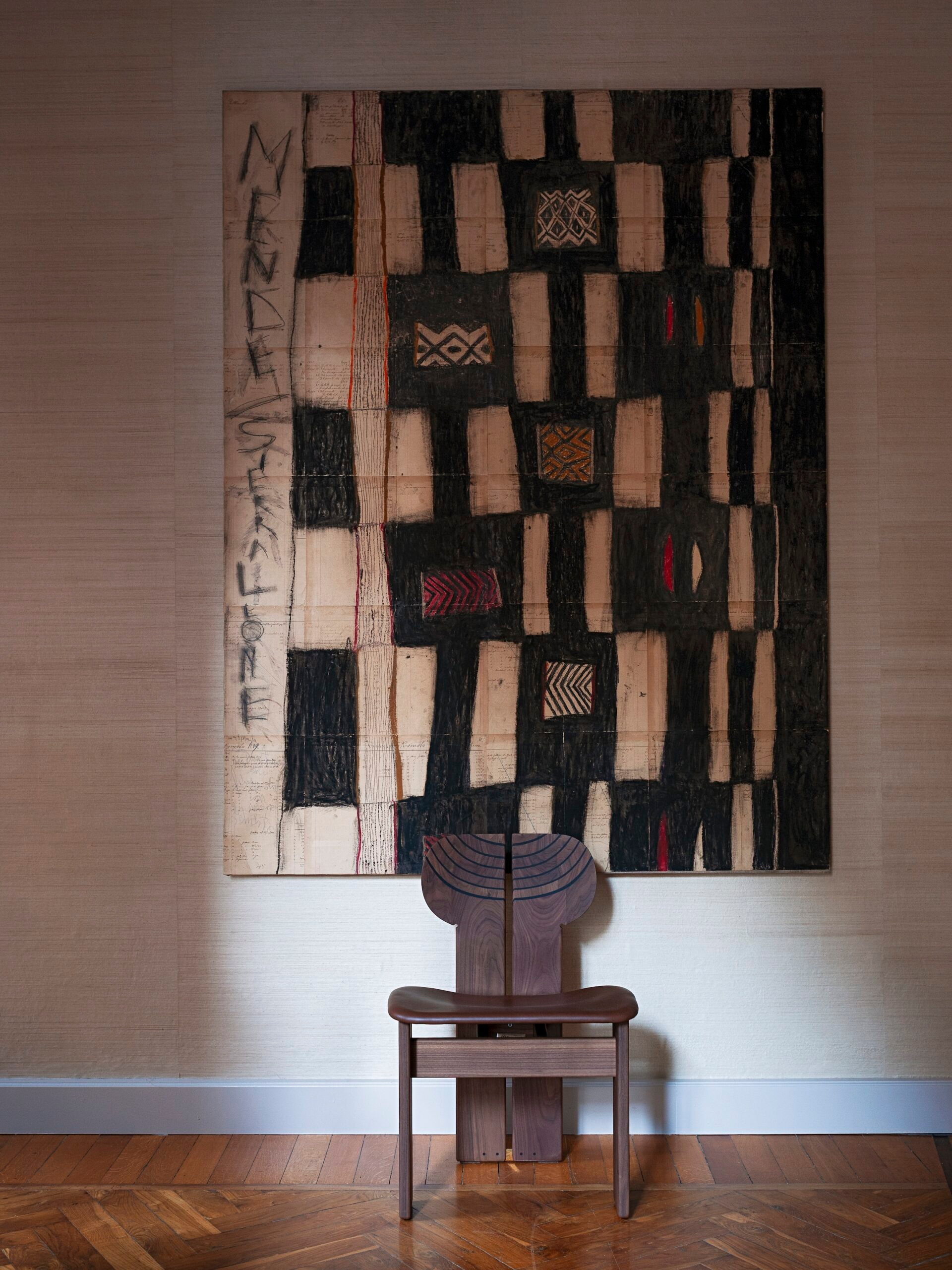
The studio and manufacturer records establish the collaboration. They do not identify every visible artwork or supply a complete room specification. We have therefore kept unconfirmed objects unnamed. Precision about what is known leaves more room for a useful reading of what the photographs actually show, without attaching unsupported provenance or designer names to every shape in the frame.
Daylight and the constructed evening
The project account describes rooms with different characters and qualities of light. Ferrari’s photographs make that range visible: a window helps organise one composition, while pendants and local pools of light establish emphasis elsewhere. The light source and the object it illuminates can be read as a pair.
For a commissioning reader, this suggests a way to evaluate a proposed interior. Request a daylight account and an evening account of the same room. A presentation that works beautifully with the window behind the camera may need further consideration when the occupants depend on the installed lighting. The exercise concerns the experience of the room as a whole, rather than a count of decorative fixtures.
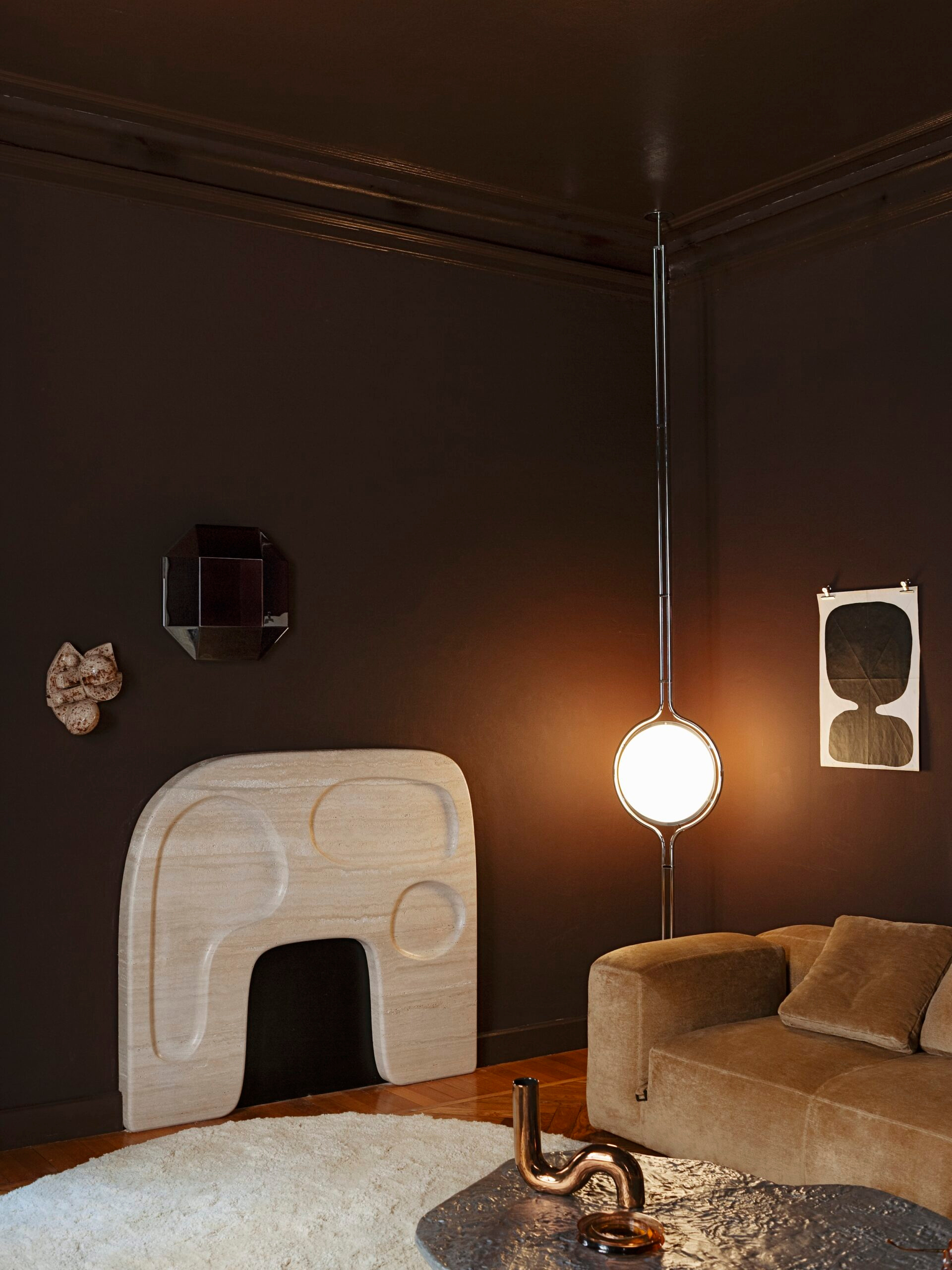
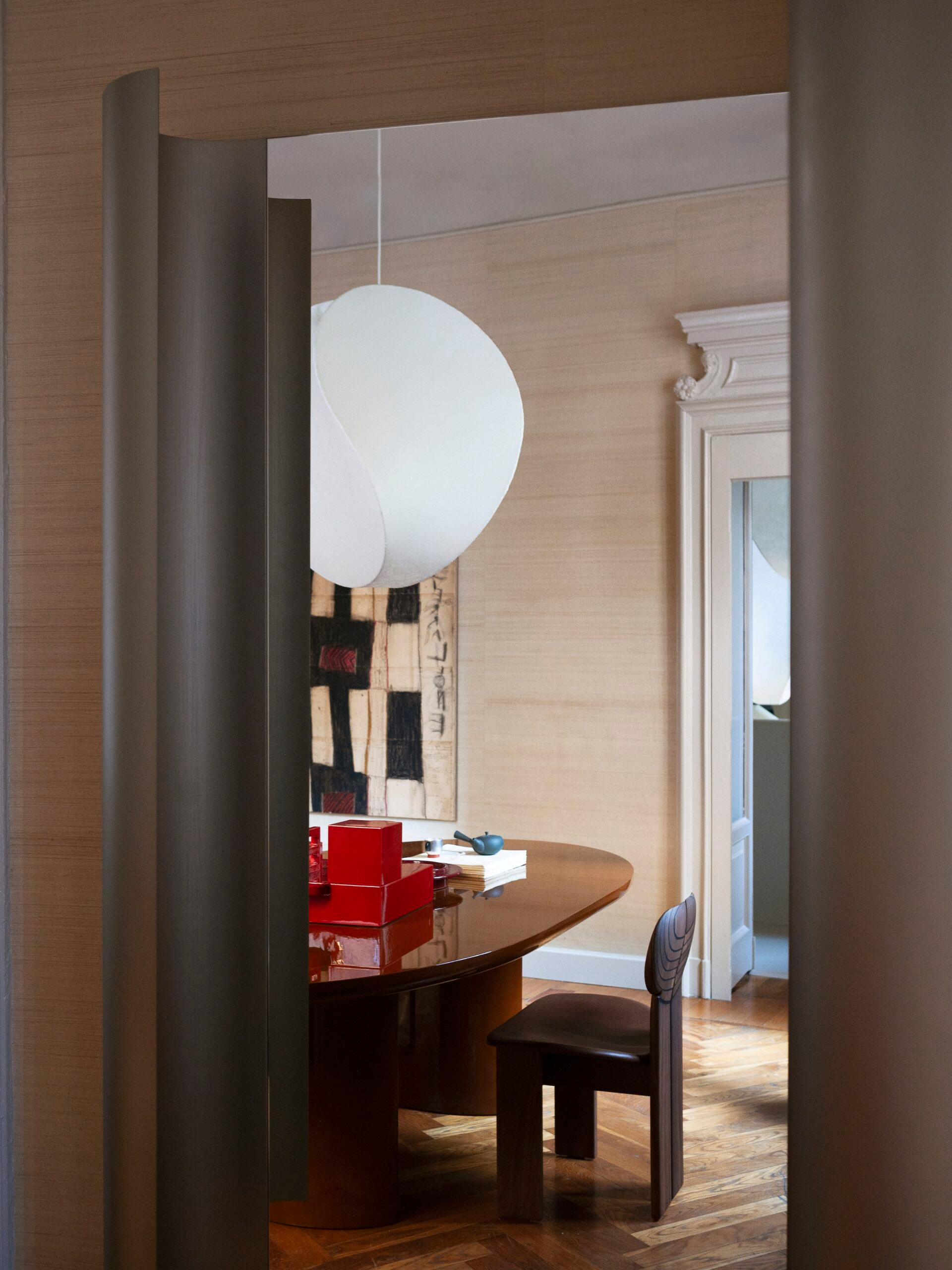
Published project photography provides a record of particular conditions. It does not supply measured lighting data, nor does this article assess the showroom’s comfort in use. The images are valuable because they show where a discussion with the design team should become more specific: what is intended to attract attention, which surfaces carry the light and how the room changes when its main source changes.
How to read a studio presentation
| What to examine | A useful sign in the presentation | Question for a commission |
|---|---|---|
| Concept | A clear inhabitant or use gives selections a reason | Which decisions does the concept actually govern? |
| Sequence | Connected rooms are shown together | What will be seen through each principal doorway? |
| Objects | Several scales contribute without filling every interval | What needs to remain open or visually quiet? |
| Light | Daylight and local light create distinct readings | How will the same room work in the evening? |
These questions make a portfolio discussion more concrete. They invite the studio to explain its process without asking it to repeat a previous interior. They also help the client distinguish a compelling visual language from a scheme that has been resolved for their own rooms, belongings and patterns of use.
The Luxe Digital view
Studiopepe’s Tacchini interior offers an accessible reading of a practice that works across objects and environments. The rooms gain their character through the choice of neighbours: a curved seat beside a stricter table, a framed image above a substantial surface, an object catching light against a darker field. The result rewards looking across a room rather than isolating one statement piece.
For Luxe Digital, the interest lies in showing that design work as a sequence of intelligible decisions. A strong studio presentation can make authorship visible while leaving space for the client’s own history. The practical ambition is a home with a considered point of view and the capacity to keep changing. That is a more demanding brief than reproducing a photograph, and a better reason to engage with the people who designed the room.
Studiopepe’s Tacchini interior offers an accessible reading of a practice that works across objects and environments.
Sources & credits
Sources and methodology
Independent design and reference analysis of the named official records and imagery, checked on 15 October 2026. Launch specifications and later product records retain their own dates and references. Images show the identified configurations. Original visual and commissioning analysis of the exact official product/project records and identified images. No visit, interview, comfort test or performance measurement claimed. Existing projects retain their dates; product versions, showroom photographs, sample images and official visualisations are identified separately.