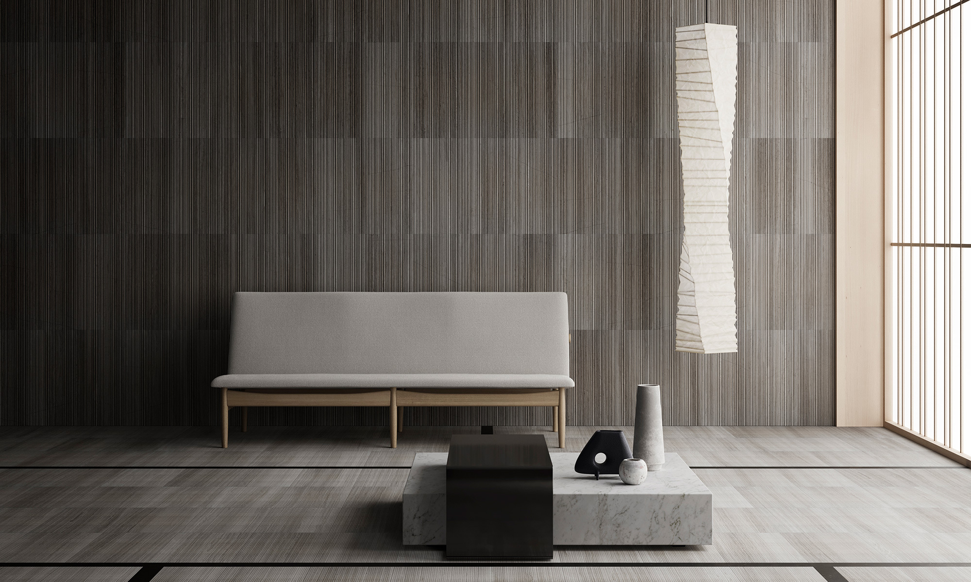
Stone can make a room feel heavy, but it can also make light more articulate. In Salvatori’s published Tokyo apartment, textured walls turn a restrained palette into a sequence of different surfaces. The interest lies in the way a line, a groove and a broad unbroken area change the room without asking for more colour.
A project to read through its surfaces
Salvatori presents Living Tokyo as an apartment in Omotesando. Its account identifies a collection of contributions: John Pawson’s Span table, Piero Lissoni’s Stone Tatami and other textures, and pieces by Elisa Ossino and Franz Siccardi. The project should not be attributed wholesale to Pawson merely because his table occupies an important position in the dining room.
That distinction makes the apartment more interesting. The room brings several authors into a shared material conversation. The visual coherence comes from the relationships between their work, rather than a claim that one hand designed every element. Stone, timber, light and the spacing between objects provide a framework within which those individual contributions can remain legible.
The published project is a reference study, not a newly announced residence or a property visit. Its enduring value is the clarity with which the project images show surface, scale and shadow working together. A reader can use that evidence to ask better questions about a current project without treating the apartment as a template to copy in full.
Texture gives the wall another scale
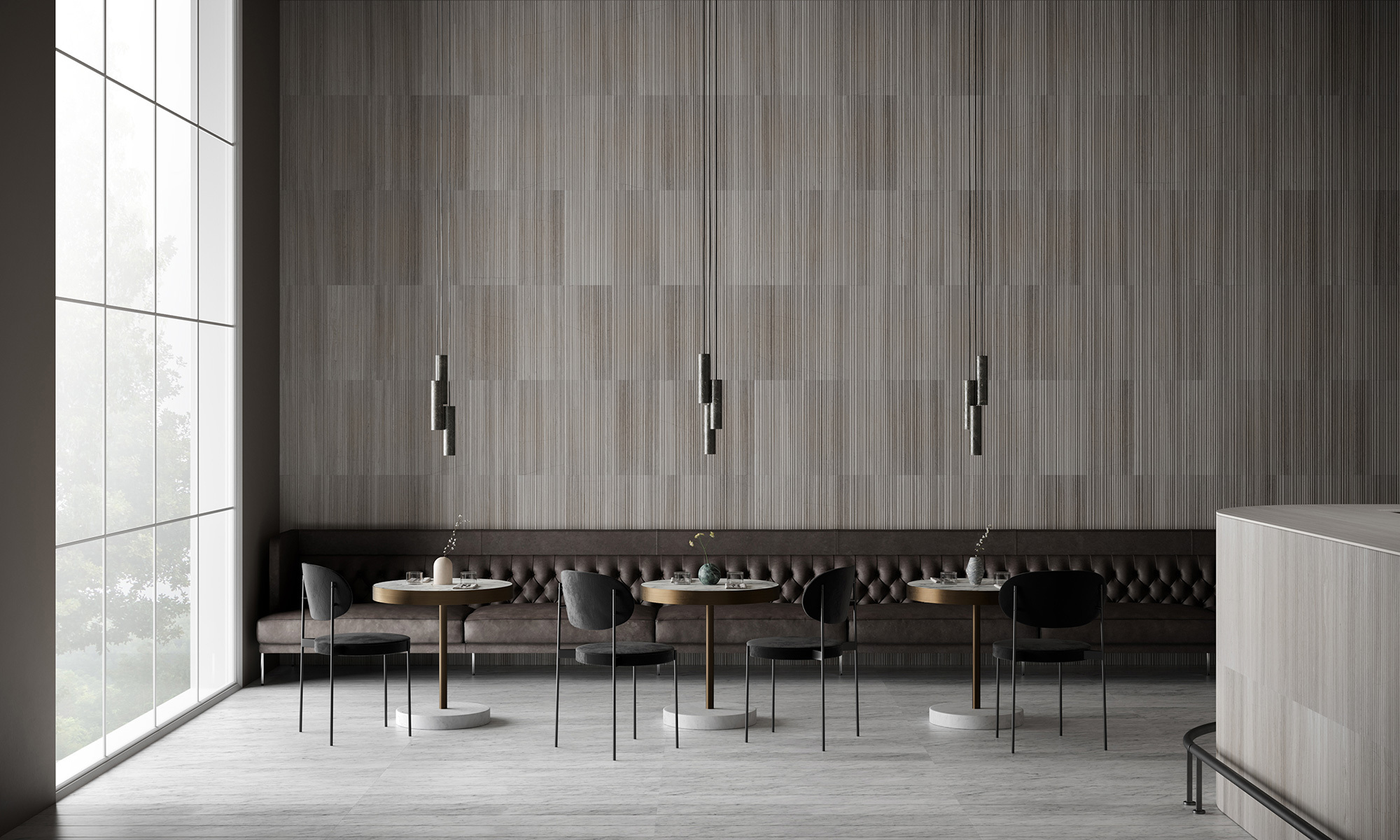
In the principal room, the wall has a rhythm that becomes more apparent as light crosses it. From a distance the surface reads as a broad field; closer views reveal a more intricate pattern. This allows one material to hold attention at more than one scale without requiring the room to be filled with separate decorative elements.
The official account names Bamboo in the living area, Stone Tatami on walls and floors elsewhere, and Rain in the bathroom. Those are distinct textures, not interchangeable labels for any grooved stone in a photograph. The captions and text retain that distinction where the manufacturer’s record identifies the setting.
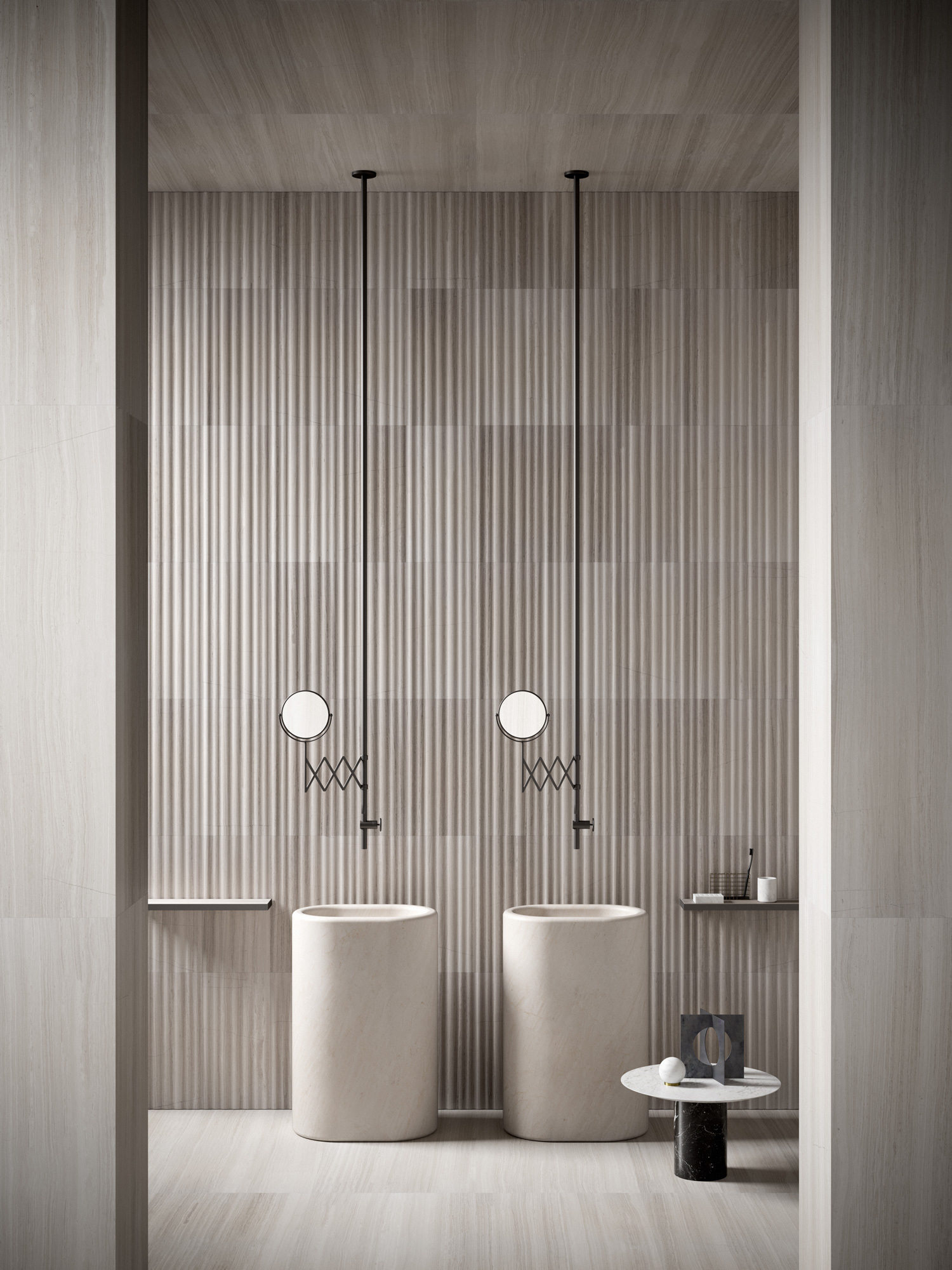
For a real interior, the practical lesson is to choose texture in relation to the expected light. A material that looks almost flat under a frontal lamp can acquire considerable depth beside a window. A sample review should therefore include the proposed orientation and light direction. The surface is not fully described by its colour alone.
The dining table sets a quieter centre
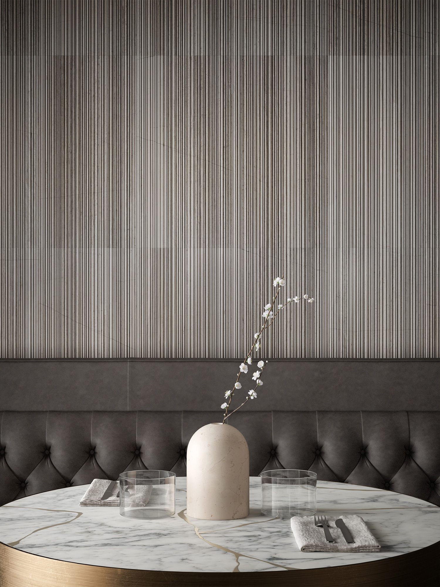
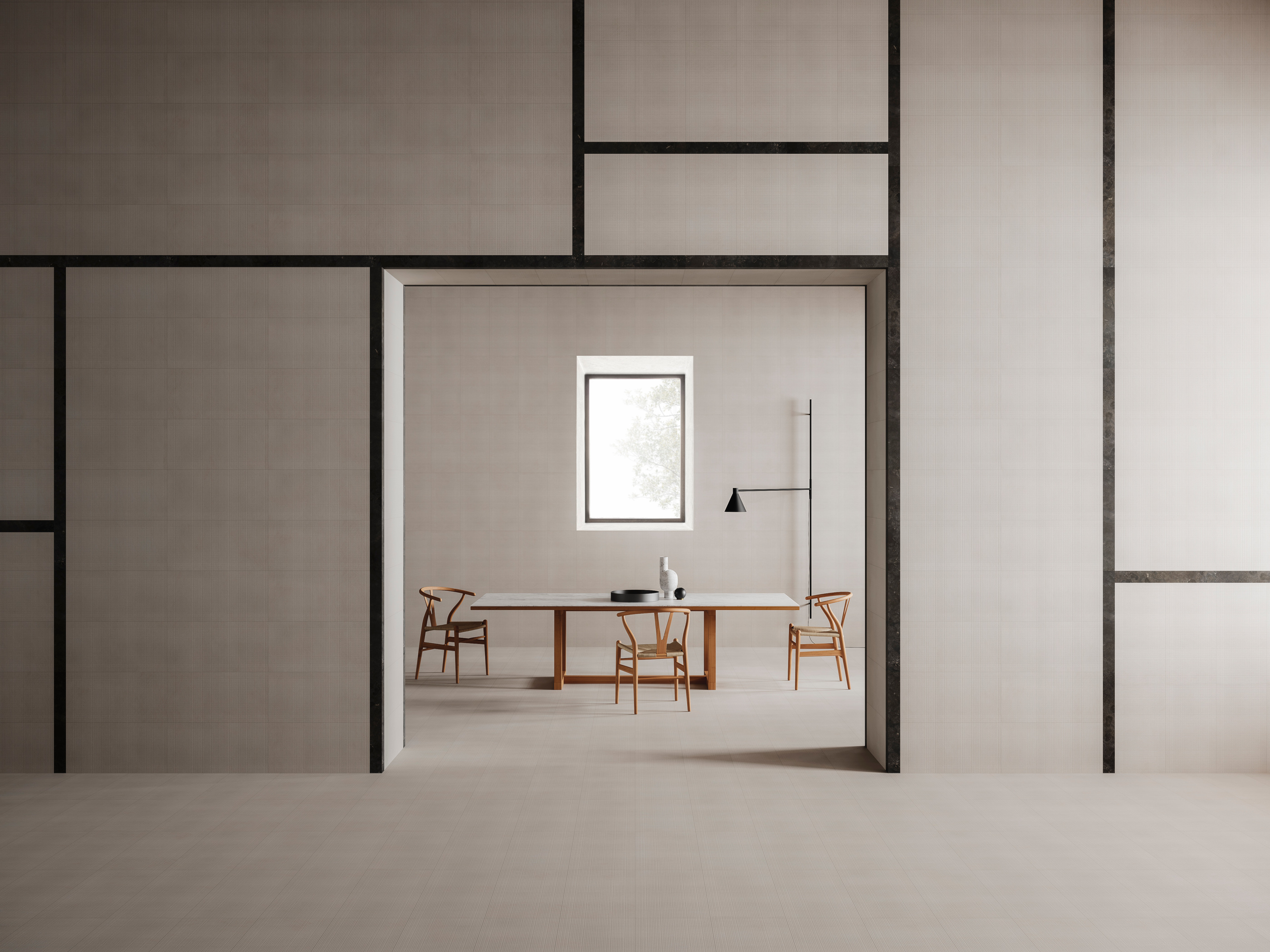
Salvatori identifies Pawson’s Span table as the dining room’s centrepiece and describes Bianco Carrara with cherry wood in the setting. The contrast introduces a softer register beside the surrounding stone. Its importance is compositional: a table establishes an occupied horizontal plane within an interior whose walls carry a strong vertical rhythm.
The room also demonstrates the value of leaving intervals between objects. The table can be read as a complete form because the view around it is not saturated. This is not an argument for an empty home. It is an observation about hierarchy: when one piece is intended to anchor a setting, nearby elements should make that role clearer rather than competing with it.
For a dining room brief, draw the occupied scene as well as the central object. Chairs, movement and the view towards adjacent rooms determine whether the intended calm survives use. A photograph establishes the visual proposition; the dimensions of the household’s actual arrangement must still be worked through at plan scale.
Furniture lets the material change pace
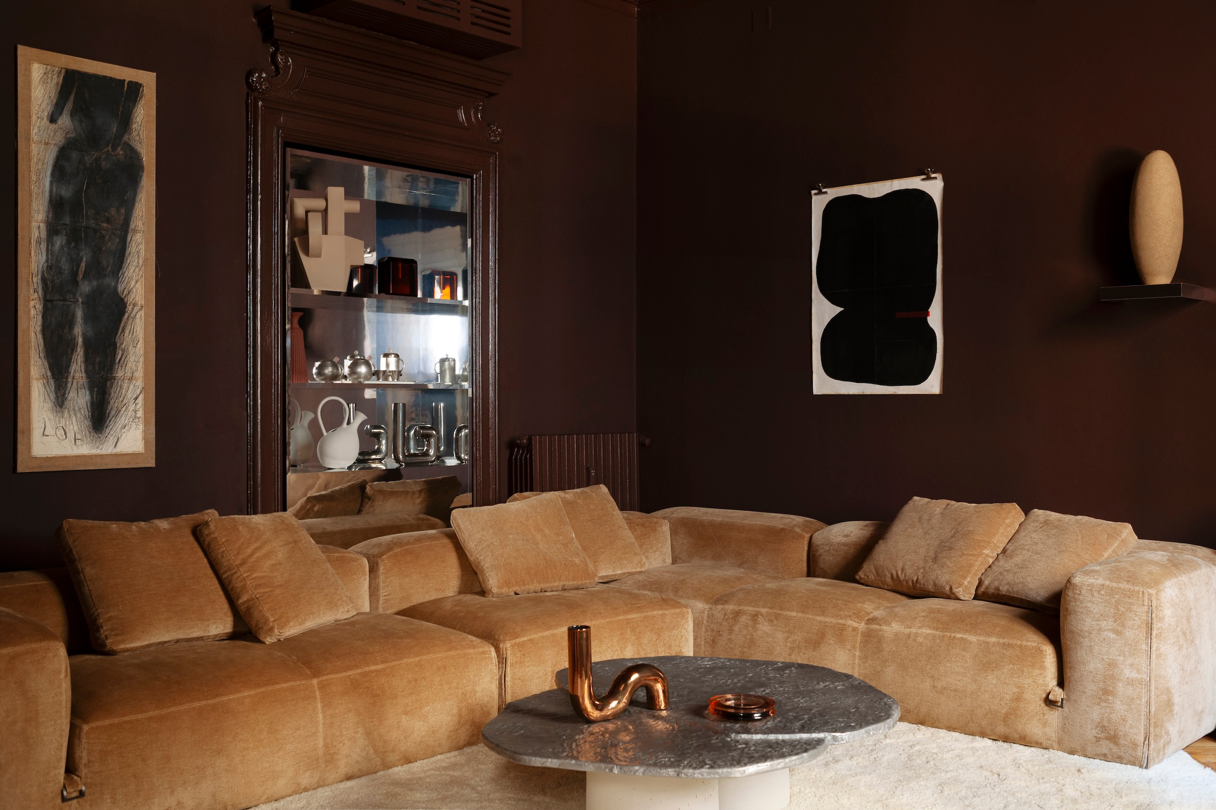
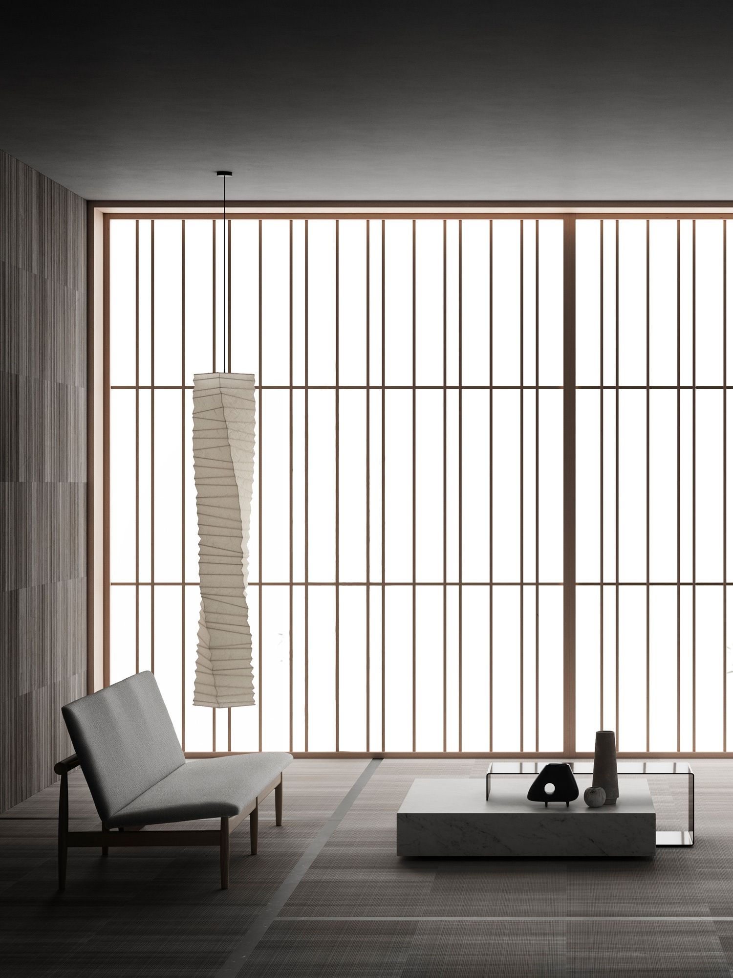
The living room project images bring the stone into contact with upholstery and low horizontal objects. These different scales prevent the textured wall from carrying the entire composition. The room has a background, a middle ground and a set of objects close enough to use, which gives it a more inhabitable reading.
The official project account identifies Franz Siccardi’s Ta_Volo coffee table and Elisa Ossino’s Urano lamp within the living setting. Their role is not simply to add recognisable names. Each introduces a different type of volume against the more continuous planes around it. The composition becomes a dialogue between surfaces and objects.
This suggests a useful discipline for a material-rich project: do not select every item for maximum visual impact. A textured wall, a sculptural light and a highly figured table can each be attractive independently, yet their combination may need editing. Decide which element carries the principal idea in each view, then let the others support it.
The bathroom continues the argument
The project account describes Stone Parquet on the bathroom floor, Rain on the walls and Alfeo basins from the Fontane Bianche collection. The change of room does not abandon the material language; it alters its arrangement around a different routine. Vertical and horizontal textures acquire a new relationship to the body and to the fittings.
That continuity is particularly useful for an owner seeking a coherent home. Coherence need not mean repeating one finish everywhere. It can come from related materials used with different proportions, directions and degrees of emphasis. The bathroom can belong to the same interior while still having a more enclosed and private character.
The images do not establish the technical suitability of a proposed stone or finish for another bathroom. Obtain current advice on the selected reference, application, installation and care. The purpose of this study is to read the composition, while leaving project-specific decisions to the appropriate documentation and team.
| Element | What the project makes visible | A useful design question |
|---|---|---|
| Textured wall | Light creates depth across a repeated pattern | How will the surface read beside the actual windows? |
| Dining setting | A table establishes a horizontal centre | Is the occupied arrangement clear in plan? |
| Material palette | Timber changes the register of the stone | Which material provides relief? |
| Objects | Distinct volumes sit against continuous planes | What should lead each principal view? |
| Bathroom | Related textures support a different routine | How can continuity allow a change of atmosphere? |
The Luxe Digital view
The apartment’s most useful lesson is that a restrained palette can contain considerable variation. Texture, direction, scale and light do the work that another interior might ask of additional colour or decoration. The result is worth reading as a set of relationships rather than a catalogue of stone finishes.
For LuxeDigital, it is also a coherent way to connect Italian material expertise with an international setting. The story travels through the work itself: named designers, identified surfaces and a room in which their relationships are visible. That is a stronger basis for judging a design project than either a geographical label or an unsupported claim of timelessness.
The apartment’s most useful lesson is that a restrained palette can contain considerable variation.
Sources & credits
Sources and methodology
Independent design and reference analysis of the named official records and imagery, checked on 15 October 2026. Launch specifications and later product records retain their own dates and references. Images show the identified configurations. Original visual and commissioning analysis of the exact official product/project records and identified images. No visit, interview, comfort test or performance measurement claimed. Existing projects retain their dates; product versions, showroom photographs, sample images and official visualisations are identified separately.