A journey can change the meaning of a familiar hour. The Reverso Tribute Geographic gives that thought a physical form: a blue dial for the time immediately in front of the wearer, and a world-time display revealed by turning the case. In the steel reference Q714845J, the contrast is between two ways of organising information, rather than two unrelated decorative faces.
Two readings within one outline
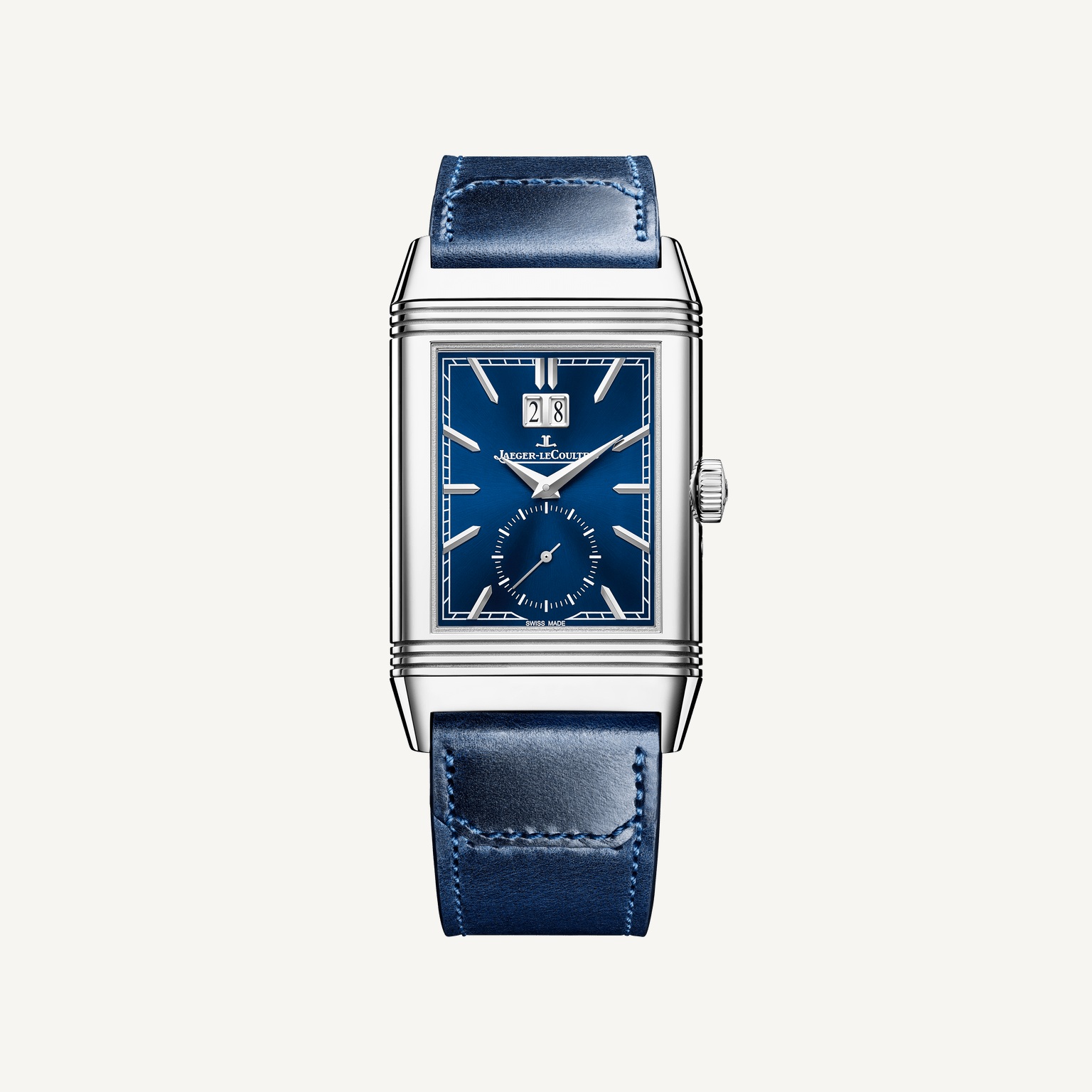
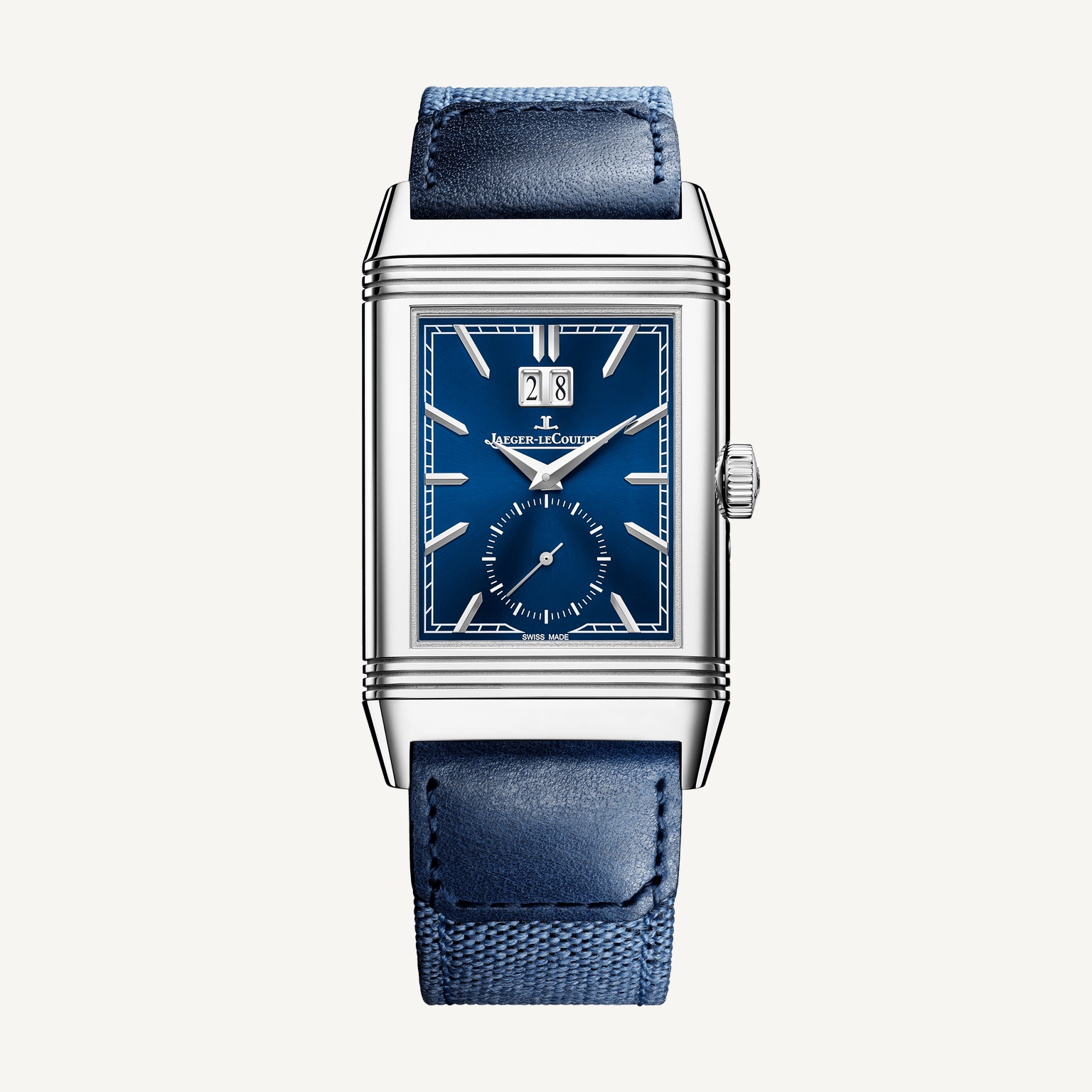
The front is recognisably a Reverso. A rectangular dial, sharply defined markers and horizontal bands at the ends of the case establish a firm geometry. The large date near the top and the small seconds below create a vertical sequence. The eye has several things to read, but they occupy distinct positions rather than sharing the same crowded area.
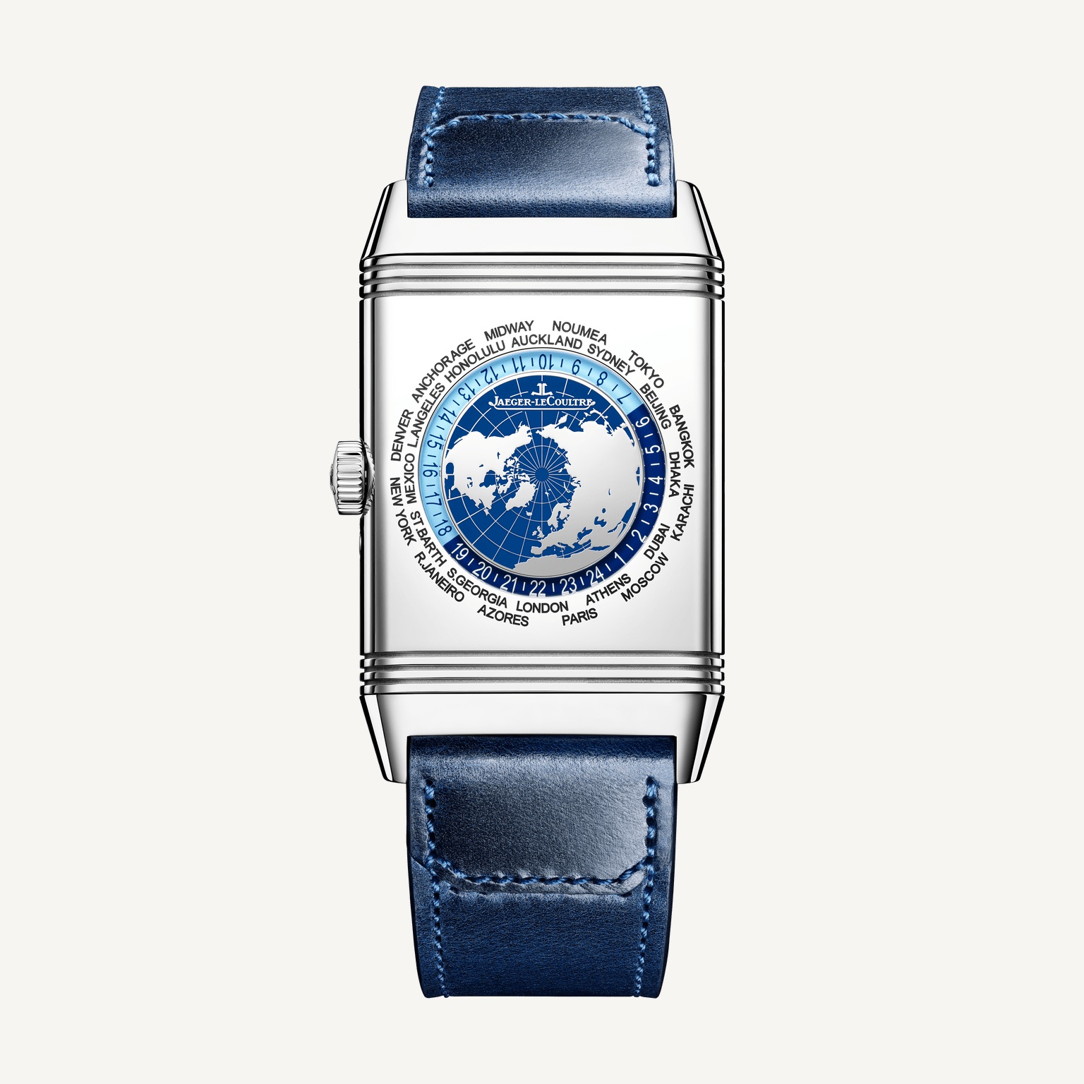
The reverse asks for a different movement of attention. A circular world map sits inside the rectangular case, surrounded by the time indication and the names of cities. The change is immediately visible in the official front-and-back views: one face organises the day along a vertical axis; the other asks the eye to travel around a ring. The case is the constant that makes their difference interesting.
That is a useful way to approach a complicated watch without beginning with a list of functions. First understand where the information lives. Then consider the gesture that reveals it. A Reverso makes the transition between displays a physical action, so the design of the case and the design of the indications cannot be considered entirely separately.
The rectangle holds its ground
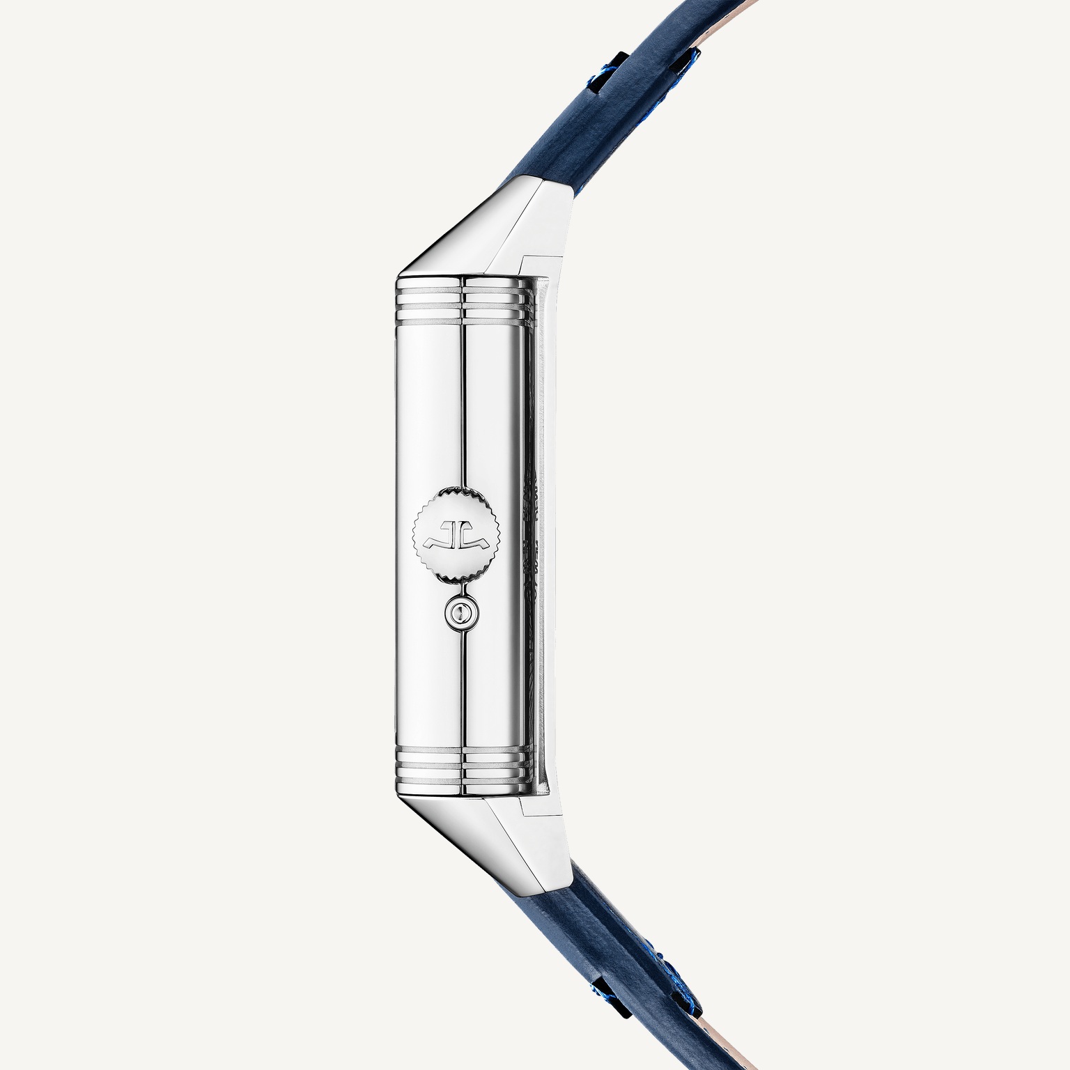
Jaeger-LeCoultre publishes dimensions of 49.4 by 29.9mm, with a thickness of 11.14mm. The length is explicitly a lug-to-lug measurement. That distinction matters because a rectangular watch cannot be meaningfully reduced to a single round-case comparison. Its long axis, the distance between the strap attachments and the way the case sits in its cradle all contribute to its visual presence.
The side view is particularly helpful. It shows an object with depth, articulated edges and a crown that belongs to a real working case. On the wrist, that profile meets clothing as well as skin. A shirt cuff will frame it differently from an open sleeve, and the practical experience of turning the case deserves to be tried with the watch fastened as it would normally be worn.
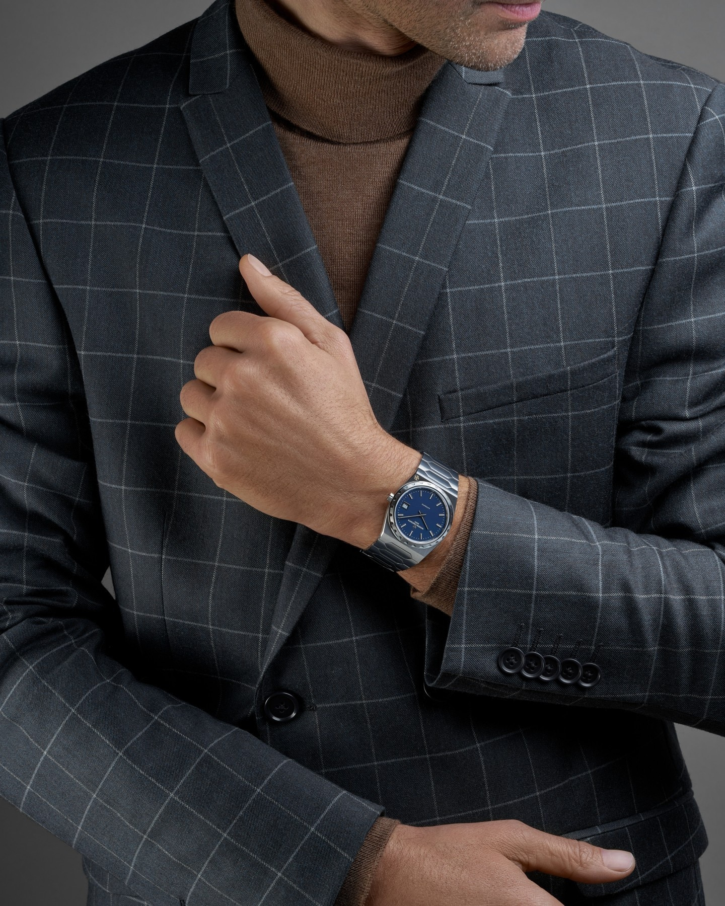
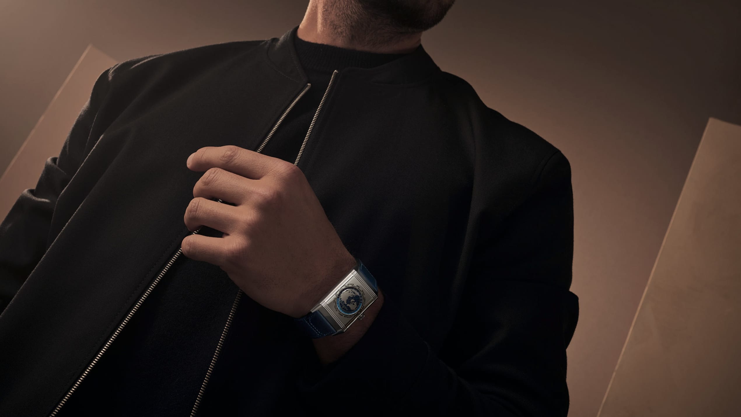
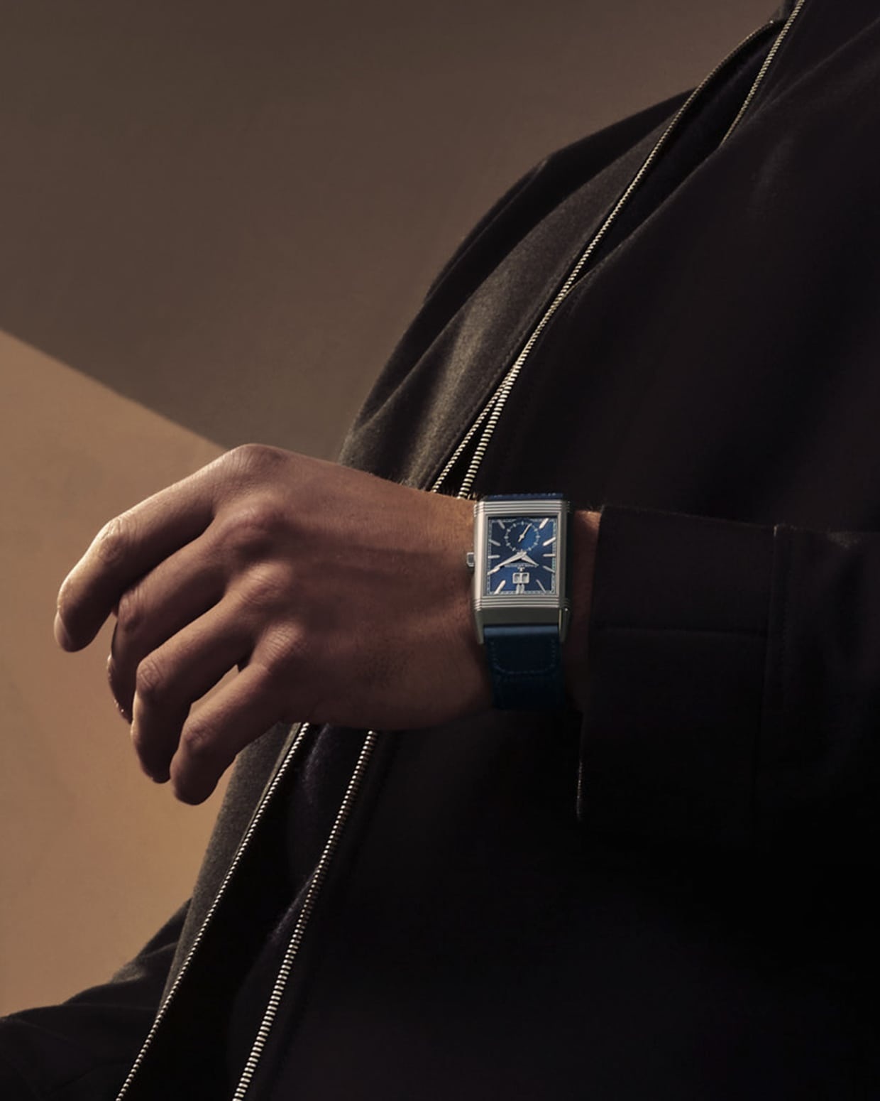
The official campaign photographs show a relatively quiet styling approach: the blue watch becomes a distinct note against dark clothing. They also restore scale after the enlarged product views. A case that fills a photograph is still an object meant to be read at an ordinary distance. The stronger design question is whether its different indications retain a clear hierarchy when they are no longer enlarged to occupy a screen.
A map that is also a material surface
On the reverse, the map is not simply a printed picture used to suggest travel. The manufacture describes a steel disc in which the ocean areas are hollowed out by laser and filled by hand with blue lacquer. Polished land masses and the coloured ocean areas therefore meet as different surfaces. In the official close view, the map has a physical role within the display as well as a geographical one.
The city names are fixed on the steel surround; the 24-hour ring rotates. That arrangement gives the reader a stable set of names and a moving indication to compare with them. It is an important distinction from assuming that every world timer is operated or read in exactly the same way. The display needs to be understood through its own setting instructions, particularly when using it for a real itinerary rather than admiring the map as a decorative motif.
The appeal of that map does not depend on a claim that travel becomes effortless. Its more interesting contribution is to make distance visible in the same object that supplies the local time. A conversation arranged across continents, a familiar city recalled during a journey, or the time at home while away all give the reverse a different emotional register from the front. The mechanism supplies the listed indications; the wearer supplies the places that make them matter.
The date belongs to the architecture
The Grande Date is a second exercise in fitting information into a shaped case. Jaeger-LeCoultre explains that its two date discs sit side by side, rather than being stacked at different levels. The result is intended to keep the two digits on the same plane. On the face, the surrounding frame also gives the date a clear relationship with the watch’s rectangular outline.
It is a small detail with consequences for the whole composition. Above, the date provides a compact horizontal element; below, the round small-seconds display introduces a softer counterpoint. Neither simply fills an available corner. The front is arranged as a sequence of different forms that can be read together, even though each has its own job.
This is where the close photographs and the wrist photograph serve different purposes. The former make the geometry and finishing available for inspection. The latter lets the reader judge which elements remain prominent at normal scale. A well-edited sequence needs both, because a complication designed entirely for enlargement would miss the conditions in which a watch is actually used.
Changing the frame with a strap
The steel model is presented with two interchangeable Casa Fagliano-designed straps: blue calf leather and a blue leather-and-canvas combination. Keeping the colour related to the dial does not make the two textures equivalent. Smooth leather gives the case a more continuous, dressed frame; the canvas introduces a different surface rhythm beside the polished steel.
The complete-watch view is useful here precisely because it preserves the strap. A close-up of the dial cannot answer how the watch is carried visually on the wrist. Compare the junction at the lugs, the scale of the stitching or weave, and the way the blue changes between material and dial. These are small relationships, but they help determine whether the whole object feels convincingly assembled.
One watch, two priorities
| Face | Main indications | The visual priority |
|---|---|---|
| Front | Hours, minutes, small seconds and Grande Date | A clear vertical arrangement within the blue rectangle |
| Reverse | World time, world map and 24-hour display | A circular reading within the same steel outline |
Both are driven by the manually wound Calibre 834, for which Jaeger-LeCoultre quotes a 42-hour power reserve. That shared mechanism is an important part of the story, but the reader need not begin by memorising its component count. The more immediate discovery is how a single case can hold two different information hierarchies without abandoning its identity.
The Geographic is therefore an especially rewarding Reverso to examine through a sequence of distances: the whole case, one display, its reverse, the side profile and the watch worn. Each view answers something the others leave open. Together they make a travel watch feel less like a symbolic accessory and more like a carefully organised object for thinking about time in more than one place.
Sources & credits
Methodology and sources
Independent design and travel-context analysis of the steel Reverso Tribute Geographic Q714845J, introduced in 2025. The official product specifications and launch release were independently checked on 4 November 2026. Images are restricted to the documented steel model; the pink-gold limited edition is not pictured or treated as the same specification. Display details and quoted reserve are manufacturer statements, not results of an independent wearing or timing test. Local prices and availability are excluded.