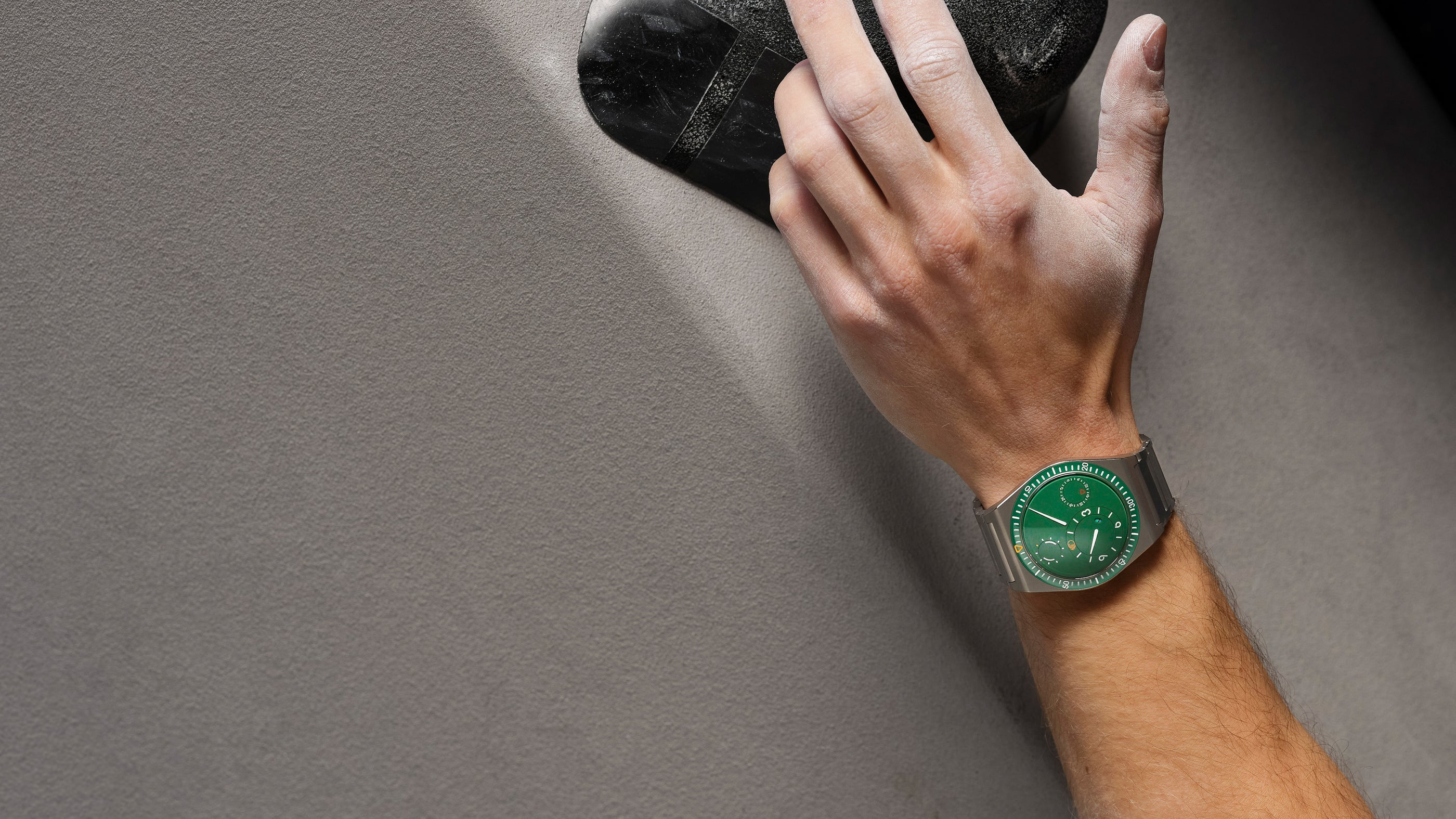
The Ressence TYPE 7 makes time appear to occupy the surface of the watch. Its oil-filled display brings the indications close to the eye, while separate circular fields give the face an organisation quite different from a conventional set of hands over a flat dial. The addition of a second time zone turns that visual language towards another everyday question: how to keep two places in mind at once.
A display that asks for a different first glance
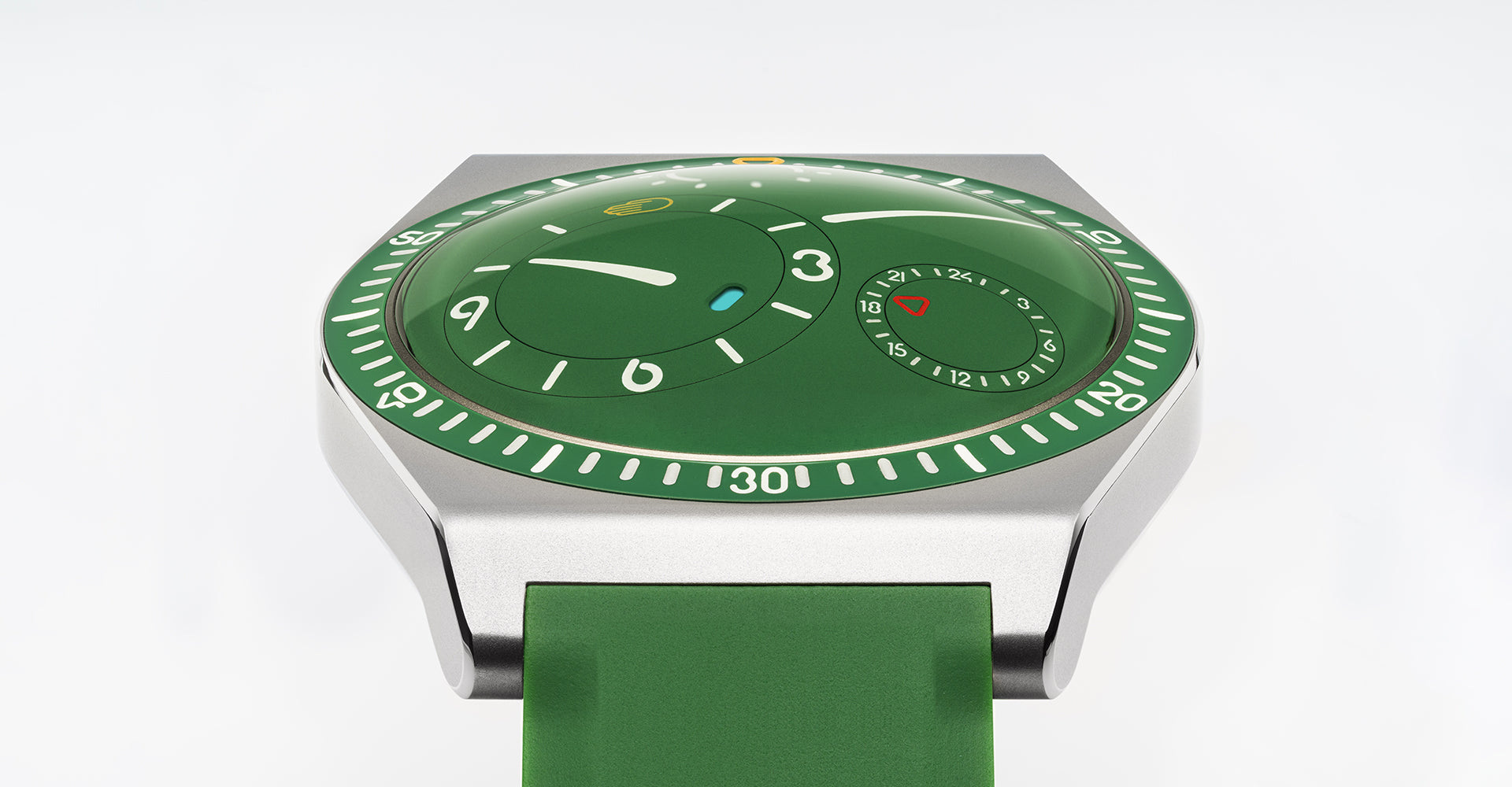
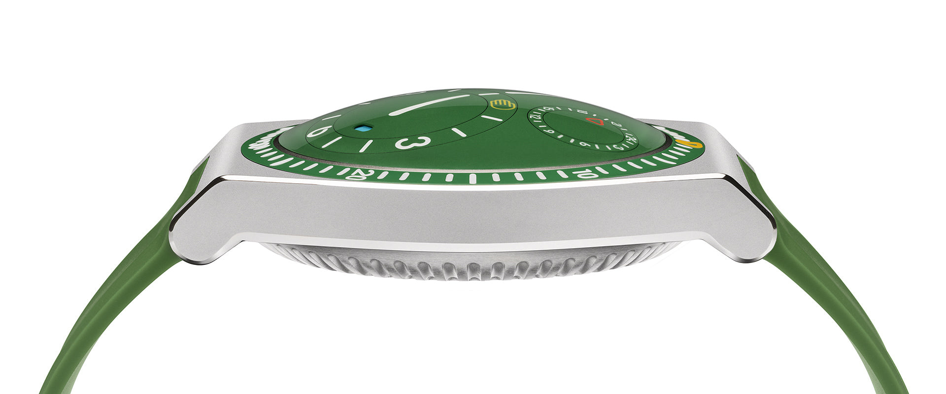
The Cactus green TYPE 7 in the current official imagery gives the display a particularly clear identity. Pale indications sit within a broad field of colour, with smaller circular areas creating their own centres inside the larger face.
Ressence describes the watch as oil-filled. The maker presents that construction as a way to reduce the visual boundary between indications and viewing surface. In the oblique product image, the face appears unusually close to the glass, giving the graphic arrangement a strong sense of immediacy.
That effect is part of the design, but the more useful question is how the information is organised. A distinctive display needs a reading habit of its own. The owner’s task includes learning the relationship between its moving fields, rather than assuming that an unfamiliar arrangement will become entirely self-explanatory from a single product photograph.
Two time zones within one visual language
The current TYPE 7 account identifies a GMT function for tracking a second time zone. Its interest is in the way that extra information is introduced into Ressence’s existing approach, rather than being expressed through a conventional additional central hand.
The official page includes a time-reading simulator and directs the owner towards instructions for reading, setting and winding. Those are valuable parts of the product’s presentation. They recognise that the display has a learning dimension and give the user a way to connect its appearance with its operation.
The simulator also separates the indications into named fields, including oil temperature. It is worth exploring that hierarchy before returning to the complete face. A field that seems visually minor may have a specific role, and a moving circular display becomes easier to understand once its different jobs have been identified individually.
For a prospective wearer, the relevant test is practical: can the two required times be identified at an ordinary glance, and does the setting routine make sense? The photographs establish the organisation of the face. The simulator, instructions and direct handling help determine whether that organisation suits the individual.
Titanium carries the display around the wrist
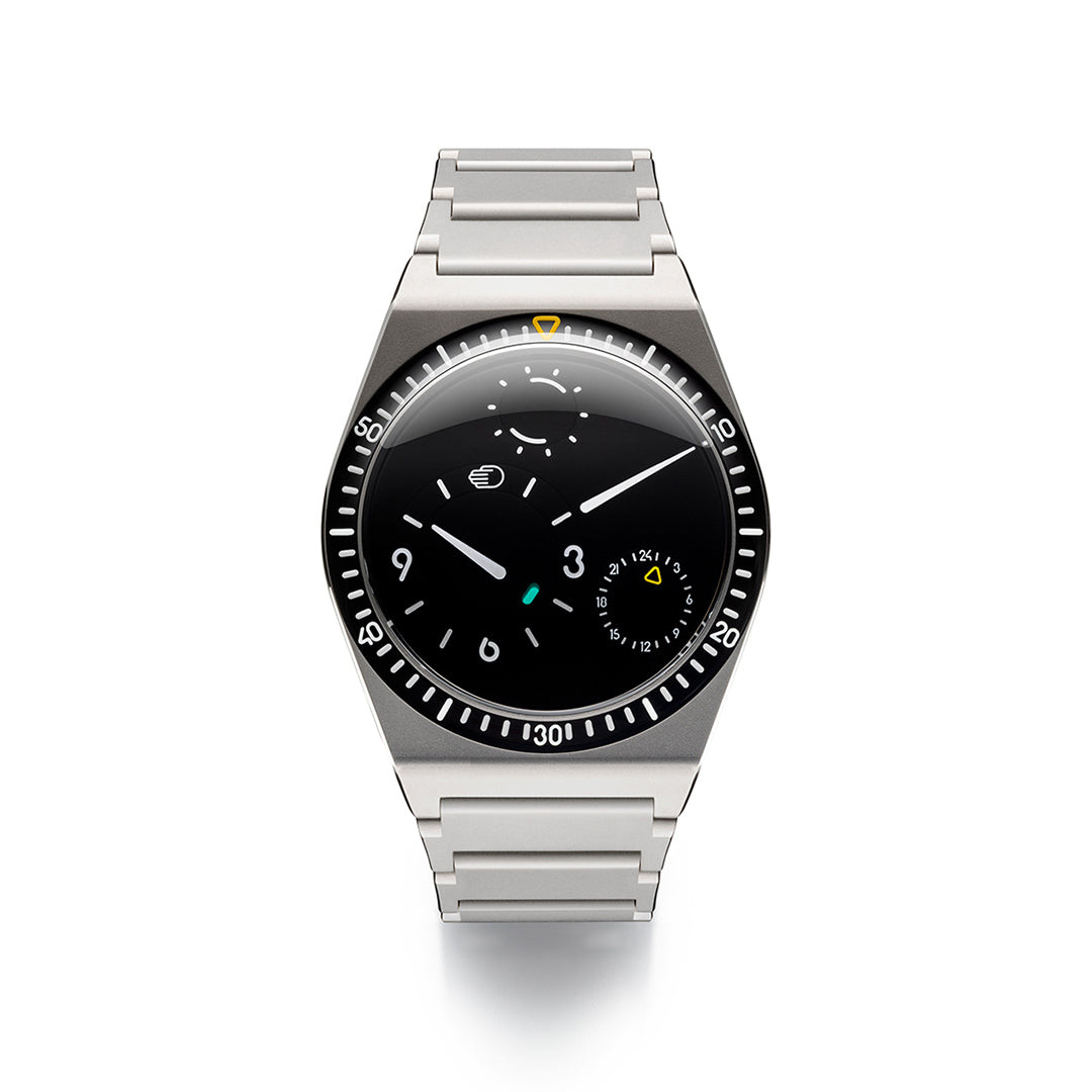
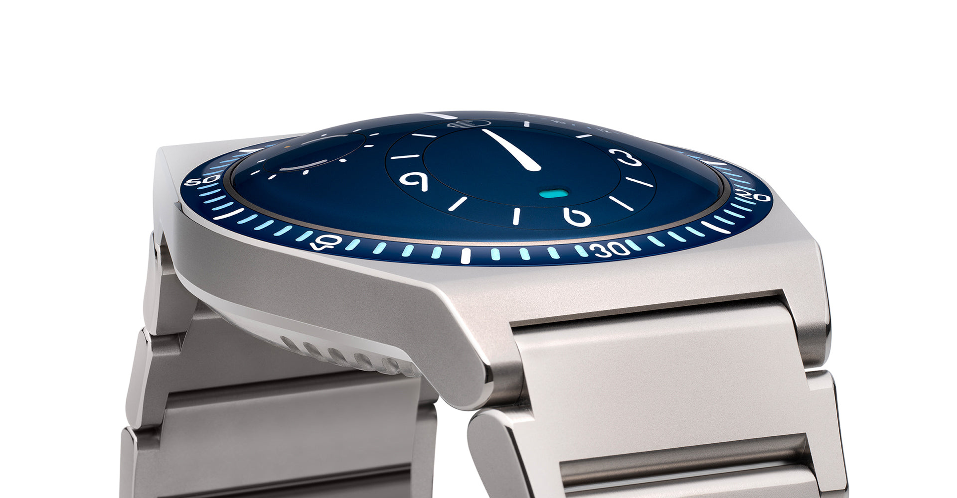
Ressence specifies Grade 5 titanium and gives TYPE 7 its first titanium bracelet. The integrated arrangement makes the outer case part of a longer surface, with the bracelet continuing the metallic character beyond the circular display.
The black model’s complete product view makes that continuity easy to follow. The face remains the principal centre, while the bracelet provides a comparatively restrained frame. Its repeated links introduce a different rhythm from the circular information above.
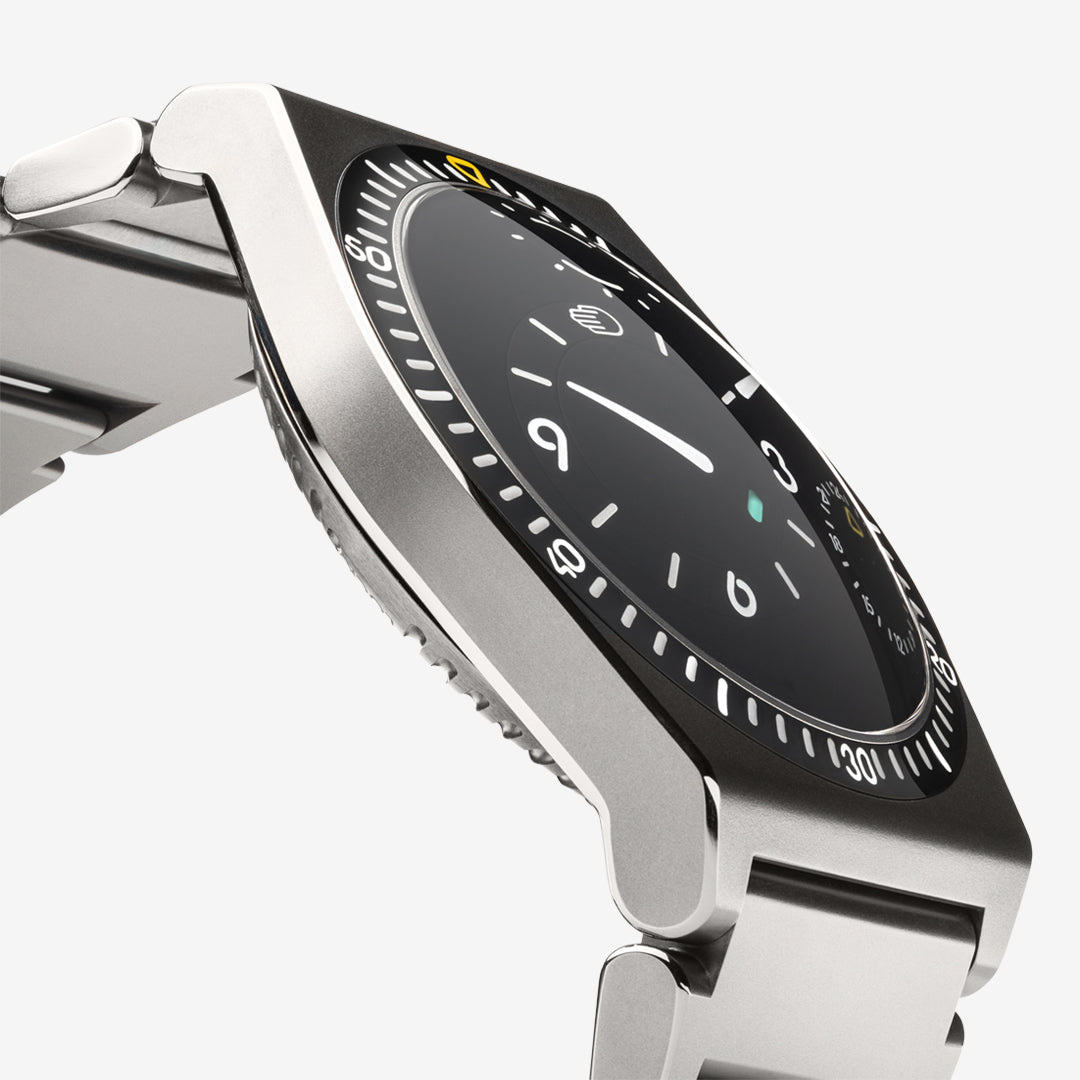
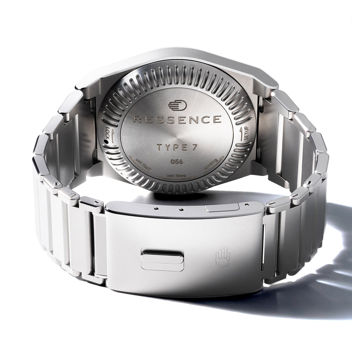
The current account describes an eighteen-link bracelet and a clasp with five adjustment positions. Those details belong to the physical experience of the watch. They connect the visual idea of integration with the need for a fastening that can be set appropriately for the wrist, including changes in fit over time.
A rubber strap gives the colour another route
The Cactus green configuration on rubber develops a different relationship between case and wrist. Colour continues beyond the face, while the titanium case becomes a brighter boundary between two green areas.
In the side view, the strap also makes the case profile easier to isolate. The viewer can see the point where one material leaves the other, along with the height of the viewing surface above the wrist. That provides information which a straight-on portrait tends to compress.
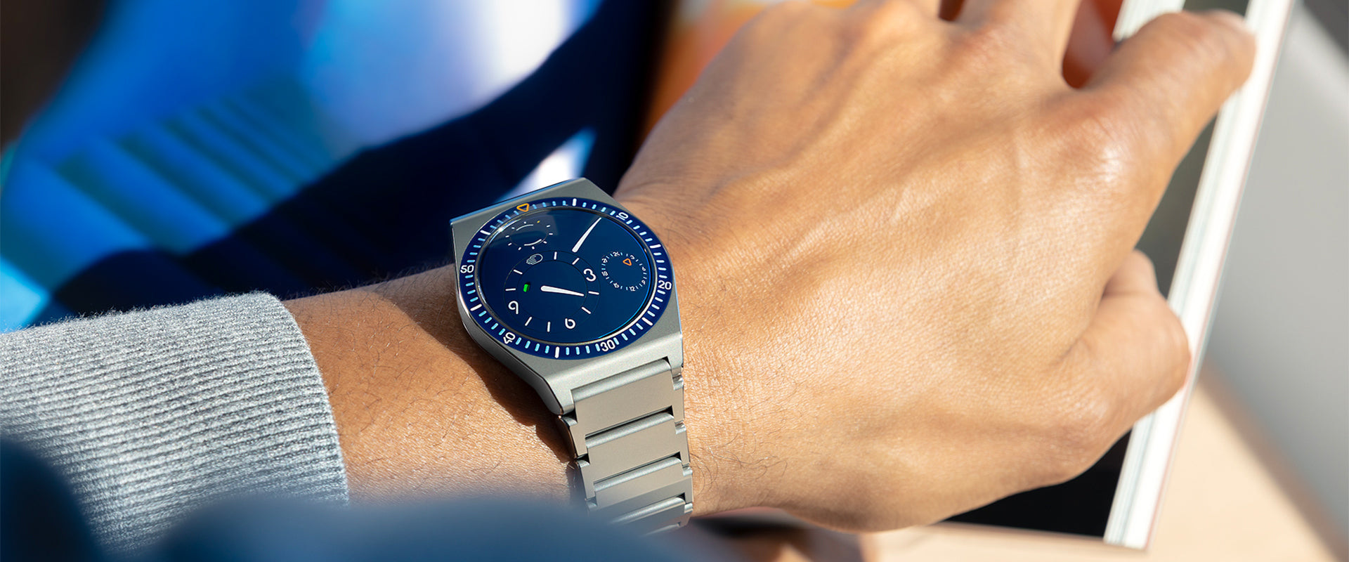
The bracelet and rubber configurations therefore deserve distinct images and captions. They express different characters within the same TYPE 7 family, and they create different practical questions about fit, adjustment and preferred use. A colour preference can begin the enquiry, but the complete fastening arrangement should finish it.
Read the functions alongside the instructions
The maker’s current account gives the watch a 5 ATM water-resistance rating. As with any rating, it should be considered with the current instructions and the condition of the actual watch, rather than converted into a general promise about every activity.
| Element | Current official account | Useful ownership enquiry |
|---|---|---|
| Display | Oil-filled mechanical watch | Learn the intended reading and setting sequence |
| Second time zone | GMT function | Check how both required times are identified |
| Case material | Grade 5 titanium | Consider the complete object on the wrist |
| Bracelet | Titanium with five clasp adjustment positions | Establish fit and the available adjustment routine |
| Alternative | Colour-matched rubber configurations | Compare the strap’s feel and fastening directly |
| Water resistance | 5 ATM | Follow the current use and care instructions |
The same discipline applies to the different colours in the official sequence. Cactus green, black and blue illustrate a family, not one watch changing appearance without a change of configuration. The distinction preserves both the visual range of the product and the precision of the technical discussion.
The Luxe Digital view
TYPE 7 is most interesting where its unusual display becomes useful information rather than spectacle alone. The oil-filled face supplies the first impression, while the second time zone asks the graphic system to carry a more complex everyday task.
Its bracelet gives that face a substantial physical counterpart. Titanium continues the watch around the wrist, while a colour-matched rubber option offers another reading of the same case. The differences are clear enough to reward separate consideration rather than a single generic product image.
The strongest decision for an owner is to engage with both layers: learn the display, then compare the complete configurations on the wrist. The resulting appeal is specific. This is a watch that offers another way of seeing time and provides an equally particular object through which that way of seeing can become a habit.
TYPE 7 is most interesting where its unusual display becomes useful information rather than spectacle alone.
Sources & credits
Sources and methodology
Independent design and reference analysis of the named official records and imagery, checked on 15 October 2026. Launch specifications and later product records retain their own dates and references. Images show the identified configurations. No independent handling or timing test is implied.