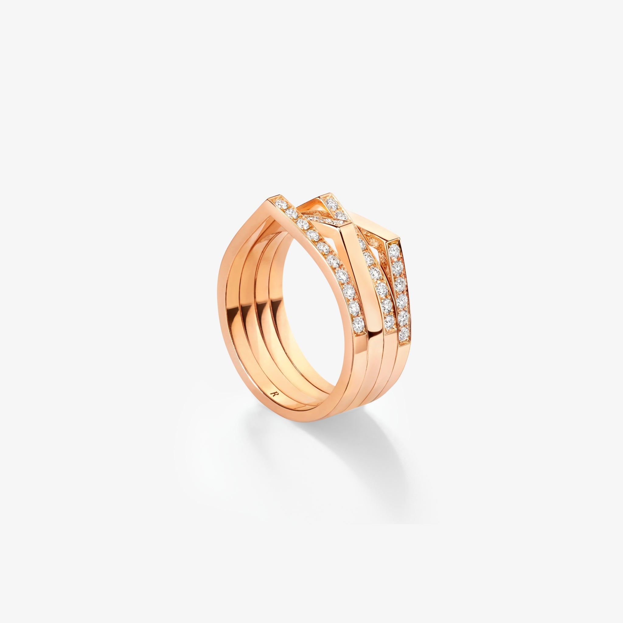
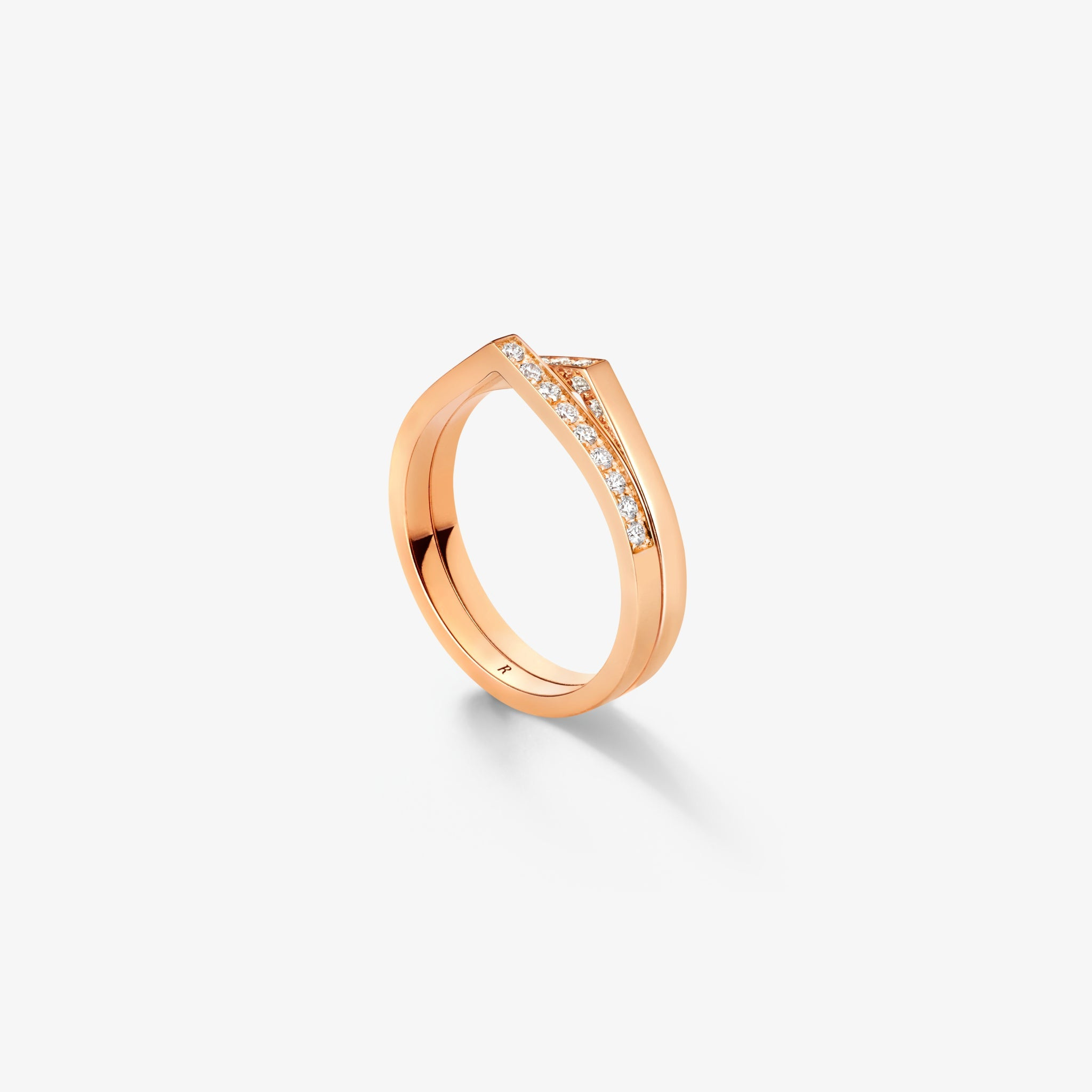
Antifer begins with a shape that seems almost complete: a circle rising into a peak. Repossi’s current presentation turns that interruption into a design language for rings and ear cuffs. The point is not an added emblem sitting on top of the band. It appears to belong to the route of the band itself, changing a familiar circumference into a line with a deliberate rise.
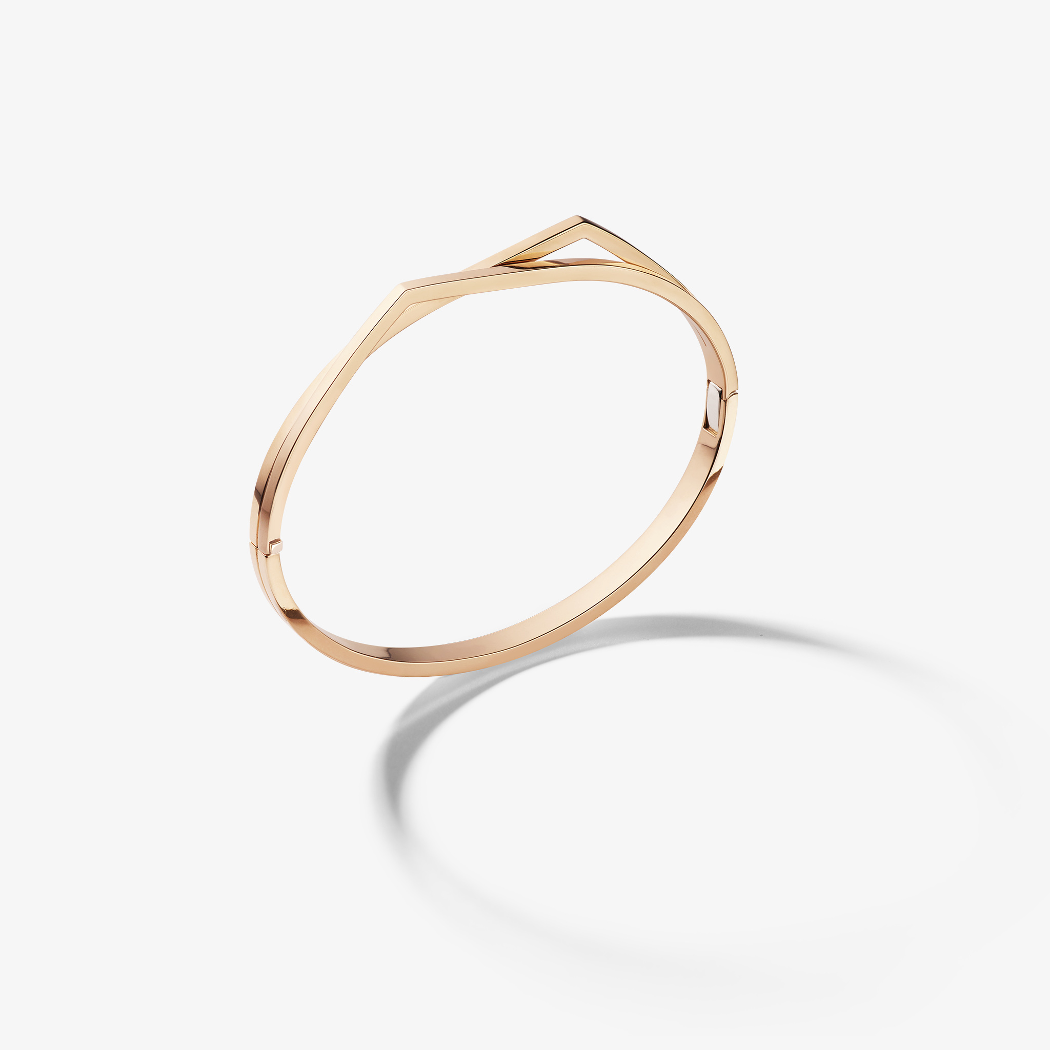
A circle interrupted by a peak
The complete studio objects are the strongest introduction. A single pointed ring makes the idea clear; two and several rows then show how it develops through repetition. The more complex forms are easier to read after the simpler one, because the viewer already knows which part of the outline to follow. The collection can be understood as a study in repeated geometry rather than as a series of increasingly elaborate ornaments.
Repossi describes the juxtaposition of a circle and a peak in its collection account. The observations here concern the current official objects and their visible outlines. No claim is made about a new 2026 launch, a particular wearer’s comfort or the tactile experience of the pointed forms. The photographs establish geometry; the exact product records and a fitting would establish the dimensions and physical relationship to the body.
The single band establishes the grammar
The plain pointed ring is useful because little distracts from the outline. Its curved route rises, forms a peak and continues, leaving the rest of the circumference comparatively quiet. The viewer can recognise the intervention without needing a gemstone description. That is an important foundation for a collection: the identifying gesture survives in a relatively simple object.
An angled view would reveal a different aspect from a front-facing one. A ring has thickness and projection as well as a plan seen from above. The studio images selected here keep the full object visible so that the peak can be read in relation to the inner opening and the supporting band. A tight crop of the pointed centre would exaggerate one feature and remove the circumference that makes it meaningful.
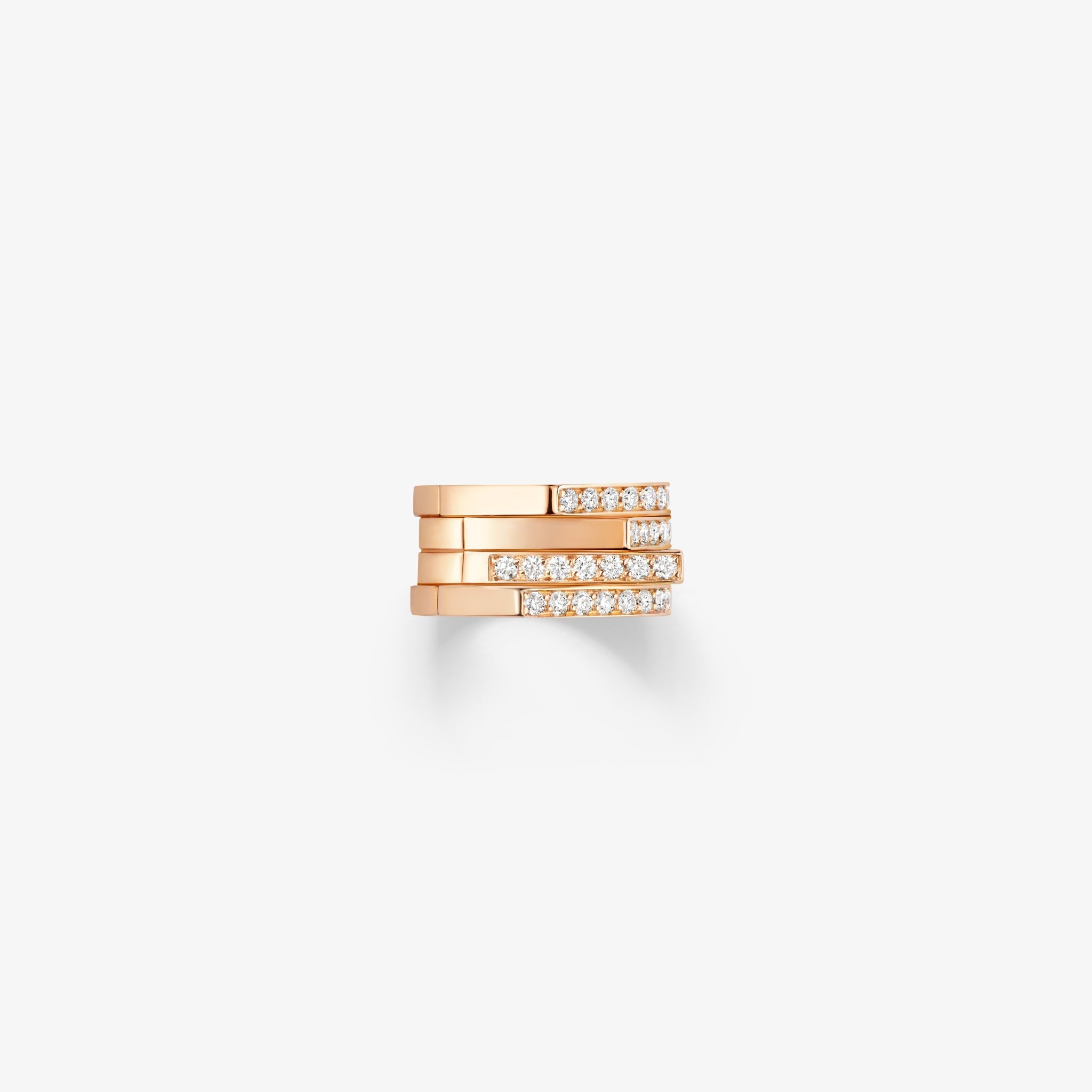
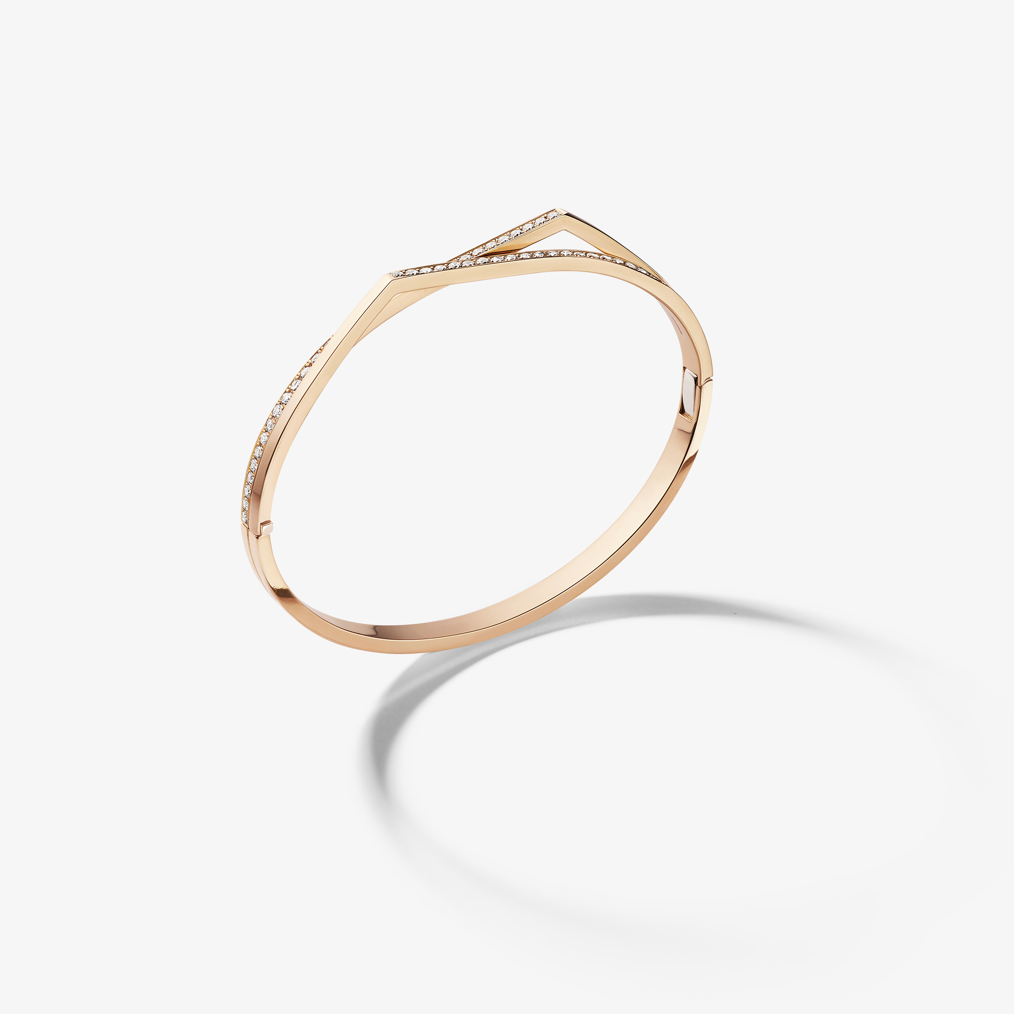
The diamond-set pointed ring changes the surface while retaining the geometric route. Brightness can draw attention towards the rise, but the peak still does the work of identifying the shape. The comparison should not be used to combine the specifications of the two references. Plain-metal and diamond-set interpretations may share an outline while differing in materials, dimensions and construction. Their connection is a design decision, not an assumption that one record can stand in for the other.
Repetition creates a small architecture
The two-row ring makes the idea less solitary. Two rising lines sit together, turning one peak into a relationship between neighbouring peaks and the spaces around them. The gap is part of the composition. It prevents the object from becoming one undifferentiated broad band and allows the eye to distinguish separate routes within a compact area.
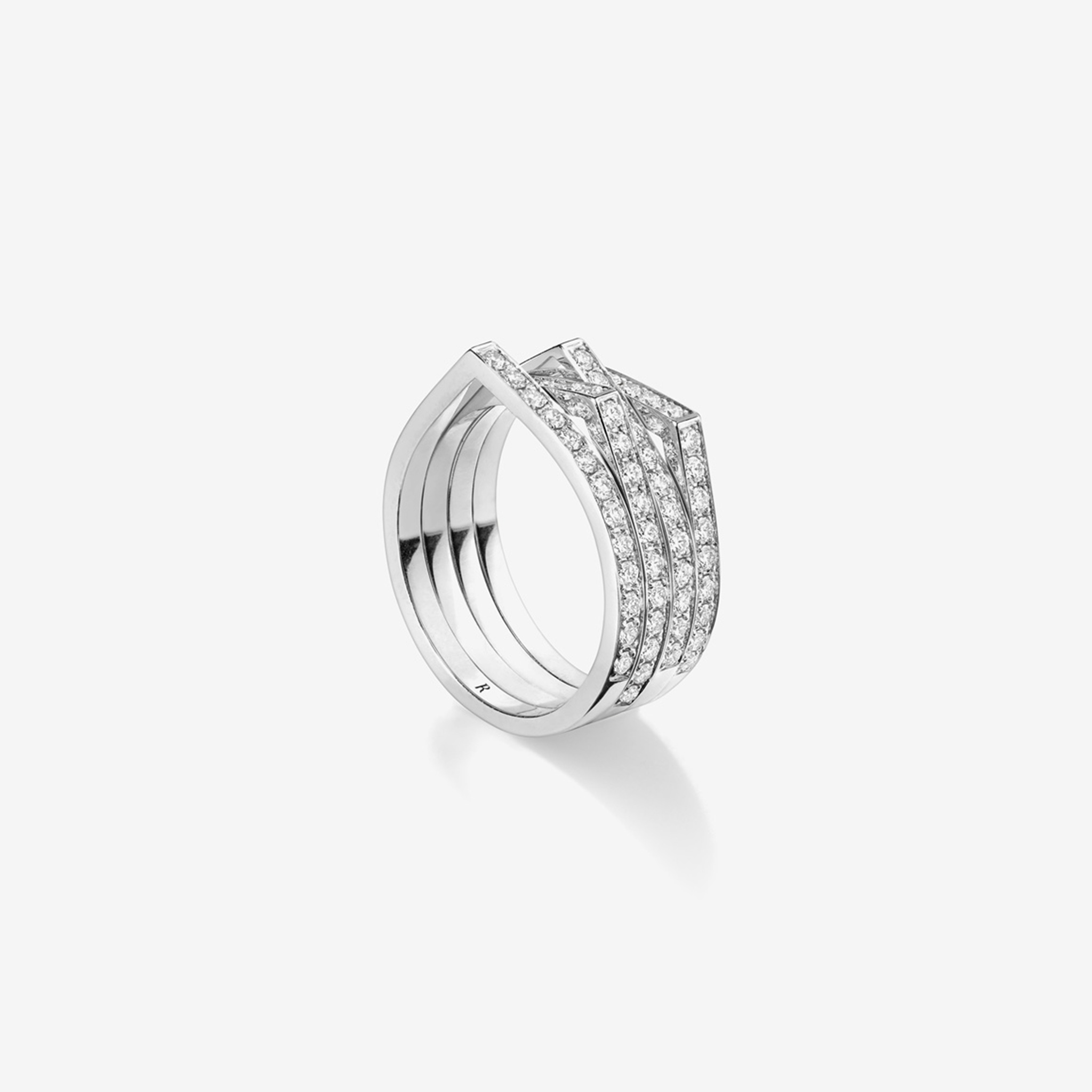
The multi-row ring extends that principle. Its presence is broader, but the geometry remains readable because the individual lines retain their own rises and intervals. Seen complete, it resembles a small arrangement of related curves rather than a solid block with decoration on its surface. The white-metal view changes the colour and brightness of that arrangement without removing the repeated pattern.
This is where an architectural comparison is helpful, provided it remains an analogy. The object organises levels, neighbouring lines and openings at a small scale. It is not a building, and a photograph does not establish structural performance. The analogy directs attention to composition: how many routes can occupy the same field while remaining legible, and how a repeated interruption creates a larger rhythm. Antifer’s visual interest lies in that organisation rather than in complexity for its own sake.
The ear cuff gives the peak another route
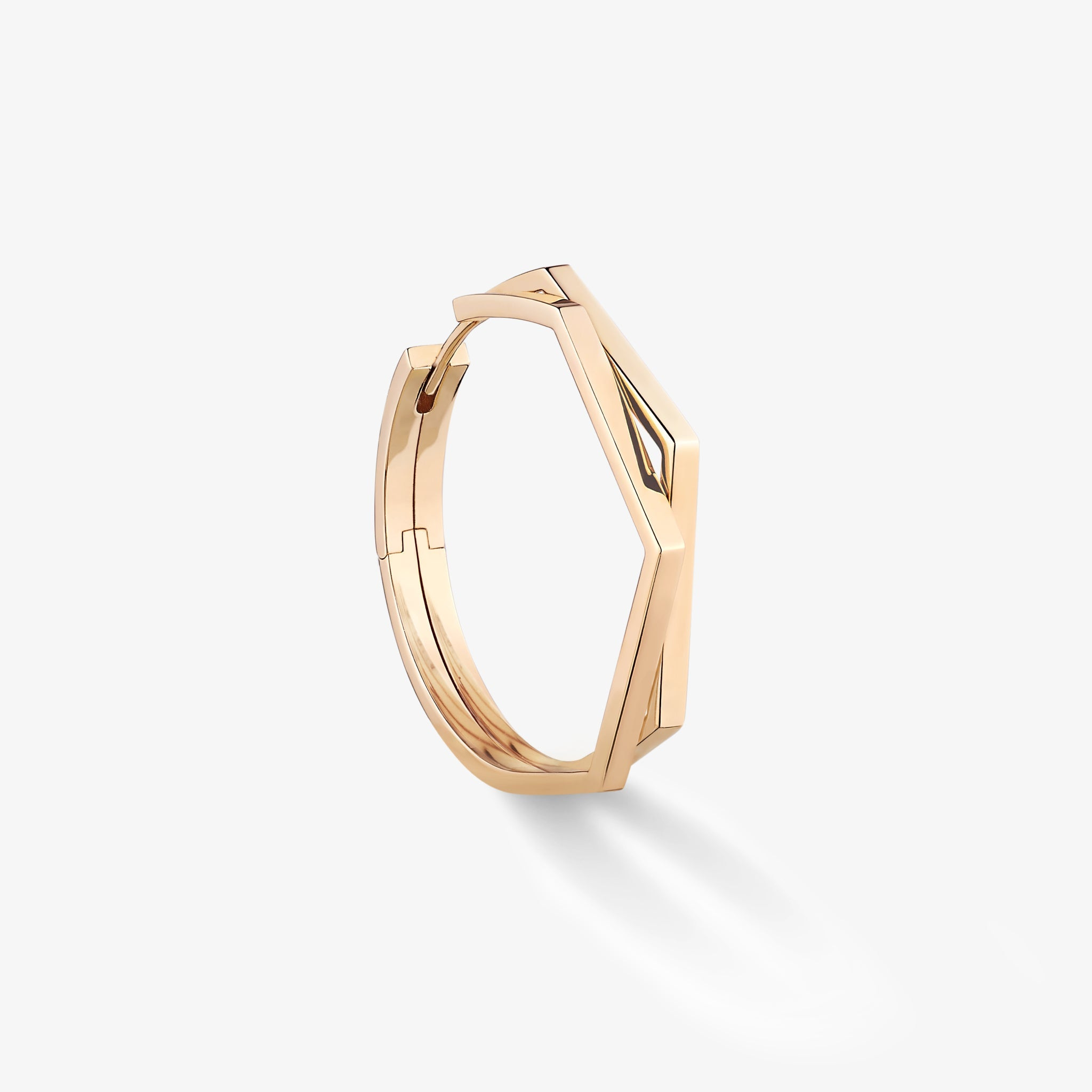
An ear cuff changes the destination of the curve. Instead of completing a ring around a finger, the form is intended for a different area of the body, with its own scale and fitting requirements. In the complete official photograph, several rising rows create a concentrated geometric outline. The angled view then makes the depth of that outline more apparent, showing why a single front-facing image would be insufficient to understand the object.
The broader earring interpretation offers another comparison. The peak and curved route remain part of the family language, but they meet a different supporting form. The collection does not need to reproduce the exact ring unchanged at the ear. It can retain the recognisable interruption while adapting the larger contour to another object category. This is how a small geometric gesture becomes a coherent vocabulary rather than a repeated decorative badge.
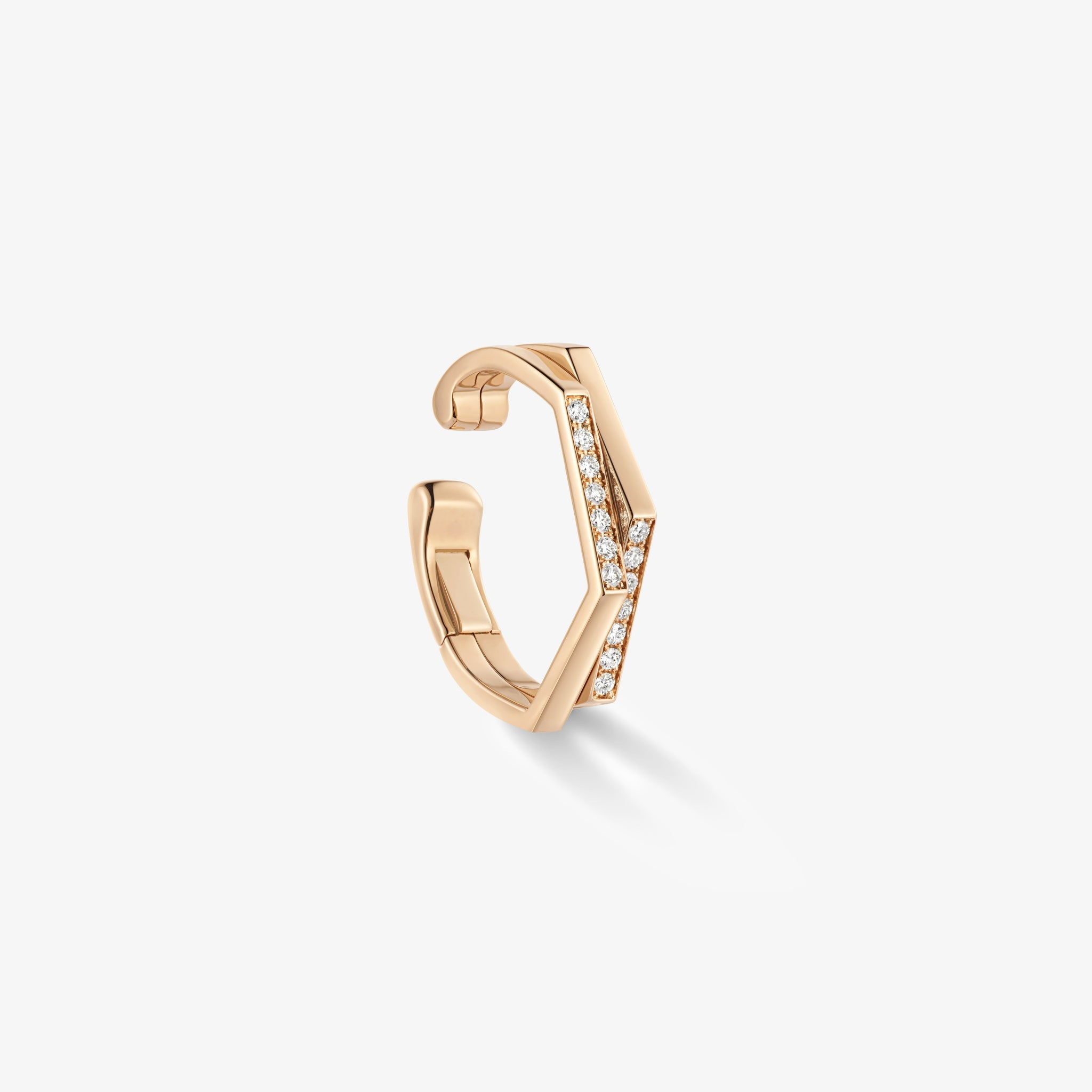
Fitting matters particularly for an ear cuff. Its intended location, size and the maker’s handling instructions should be established for the actual reference; the photograph should not be read as evidence that any cuff can be placed anywhere or freely reshaped. Likewise, a dark surface seen elsewhere in the collection should not be assigned a coating or metal from appearance alone. The visual language can be discussed confidently while those material and practical details remain precise.
The same rise at different scales
| Object | Geometric reading | Information to obtain for the reference |
|---|---|---|
| Single ring | One peak interrupts the circle | Size, band width and projection |
| Two-row ring | Neighbouring routes retain a visible interval | Complete width and relationship between rows |
| Multi-row ring | Repetition becomes the larger composition | Exact material and diamond description |
| Ear cuff | The rise follows a different body location | Intended position, fitting and handling guidance |
Antifer Heart, separately named in the official collection, is a distinct interpretation and is not used as a substitute for the pointed objects featured here. This article compares the current photographs’ geometry, rather than merging specifications across differently named designs or reporting an independent wear test.
The Luxe Digital view
Antifer’s identity comes from making the peak part of the circle’s route. Repossi can then repeat that gesture, vary its surface and take it to another part of the body without losing the original idea. The collection is most clearly understood when the complete outline and the intervals between its rows remain in view.
Antifer’s identity comes from making the peak part of the circle’s route.
Sources & credits
Sources and methodology
Independent visual analysis of current official imagery and named product records, checked on 14 October 2026. Historical introductions, manufacturer specifications and visual observations are kept distinct. No visit, interview, independent handling or appraisal is implied.
- Repossi — source 1: Current official collection, named designs, dated context and selected image provenance.
- Repossi — source 2: Current official collection, named designs, dated context and selected image provenance.