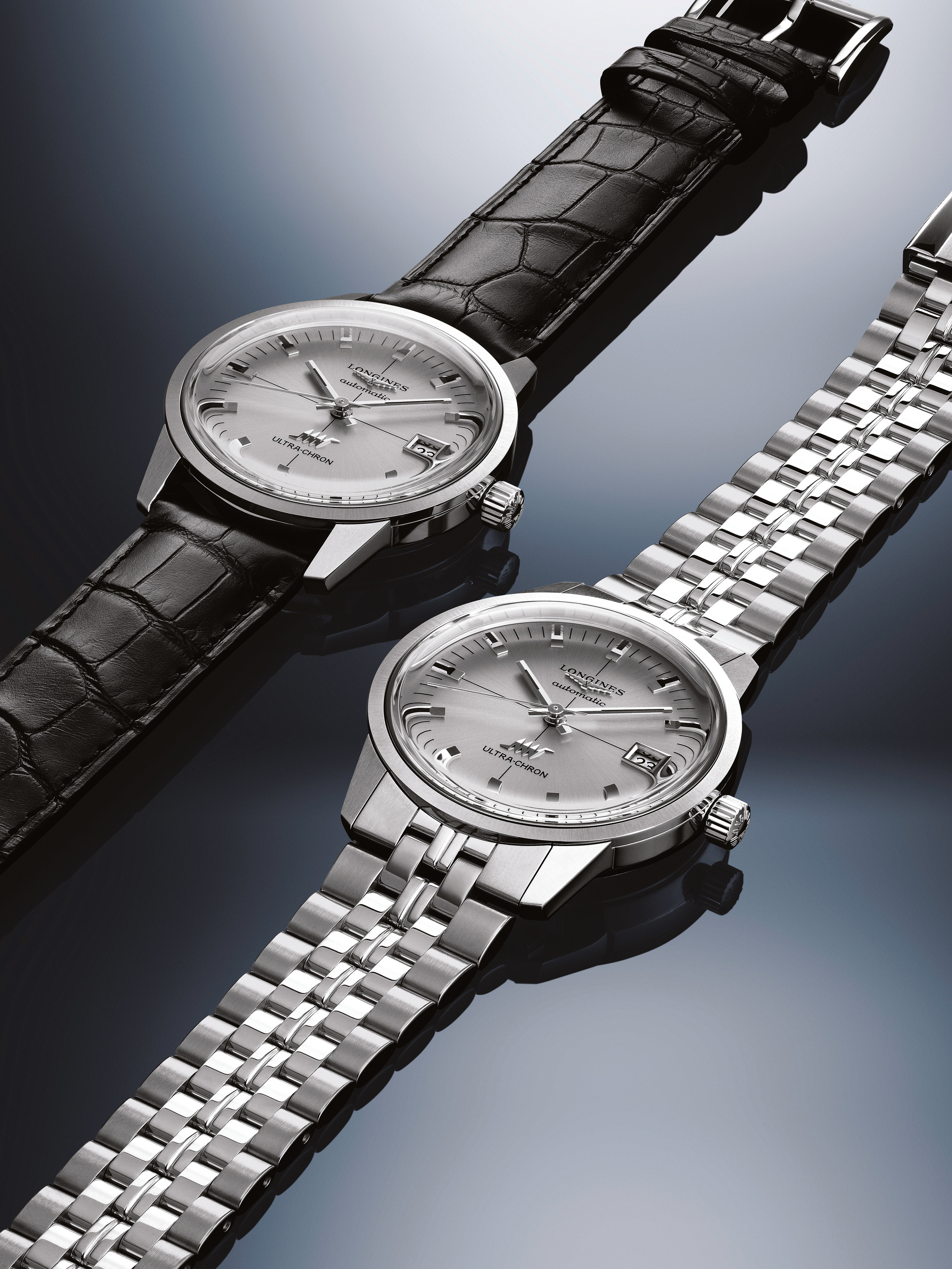
The Longines Ultra-Chron Classic places a high-frequency movement behind a deliberately quiet face. A silver dial, applied markers and a compact date window give little immediate indication of the rate at which the mechanism works. Its appeal lies in that difference of scale: a restrained object on the wrist, with a more specific technical rhythm within.
A dial that leaves room for light
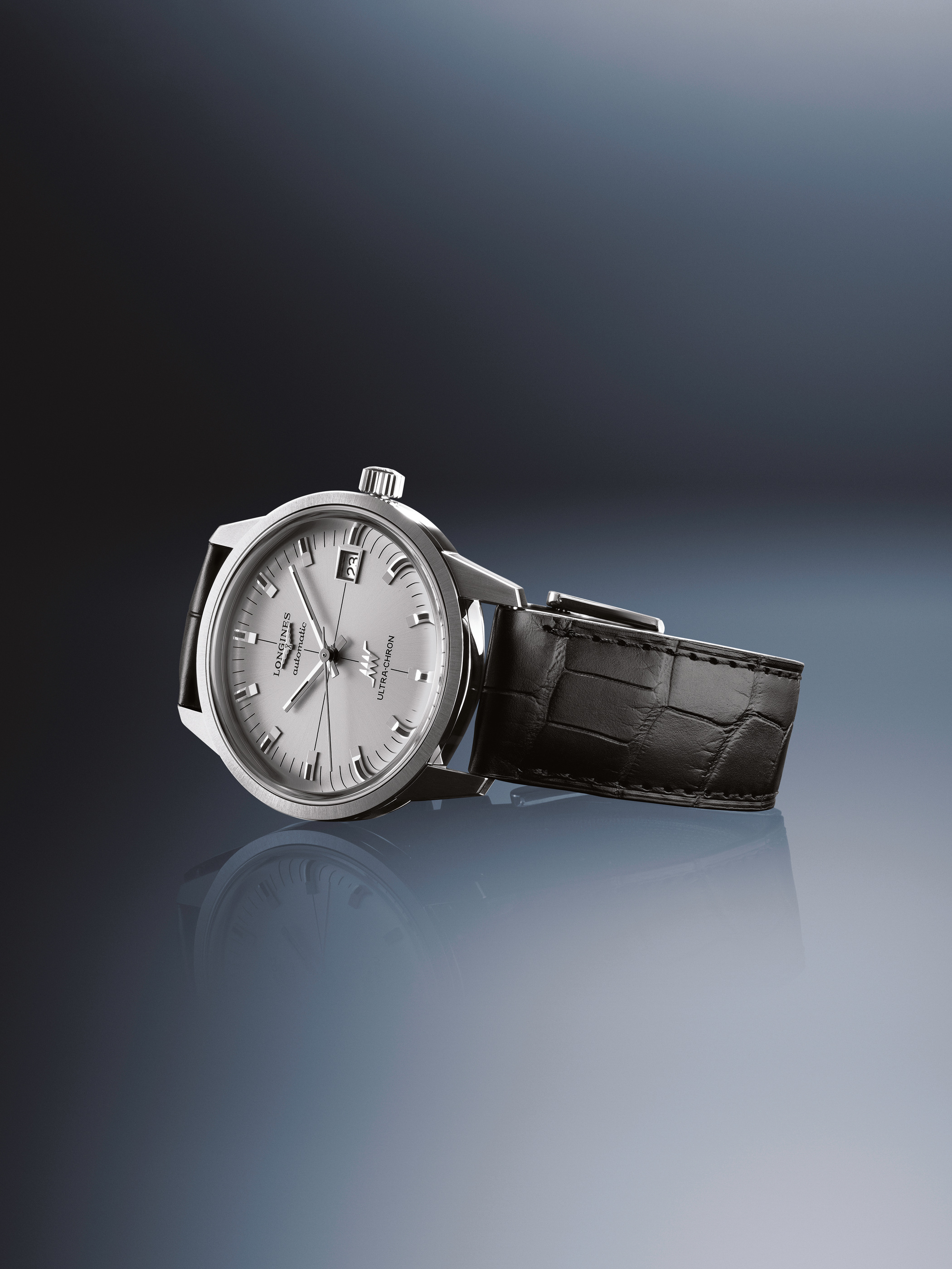
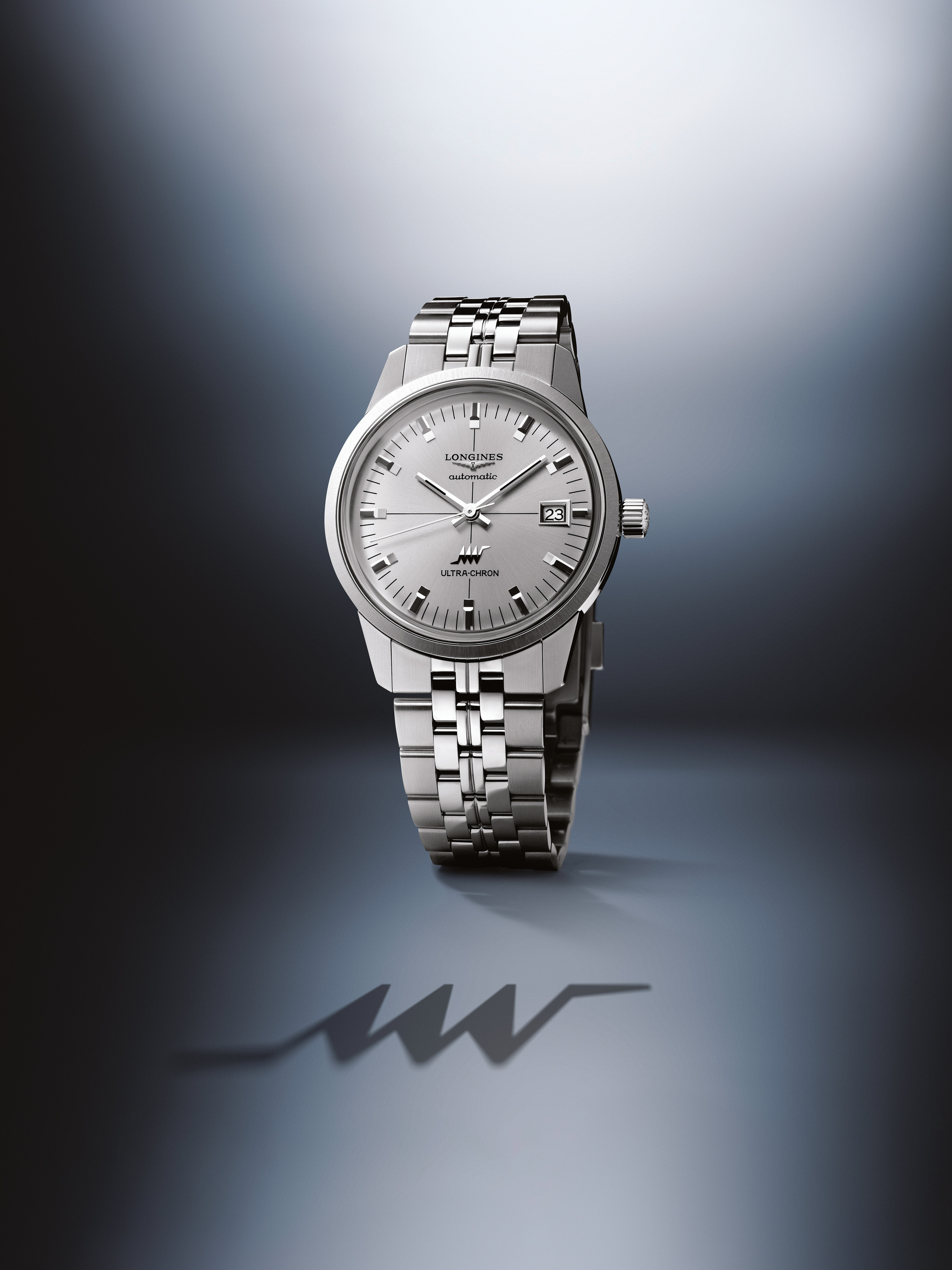
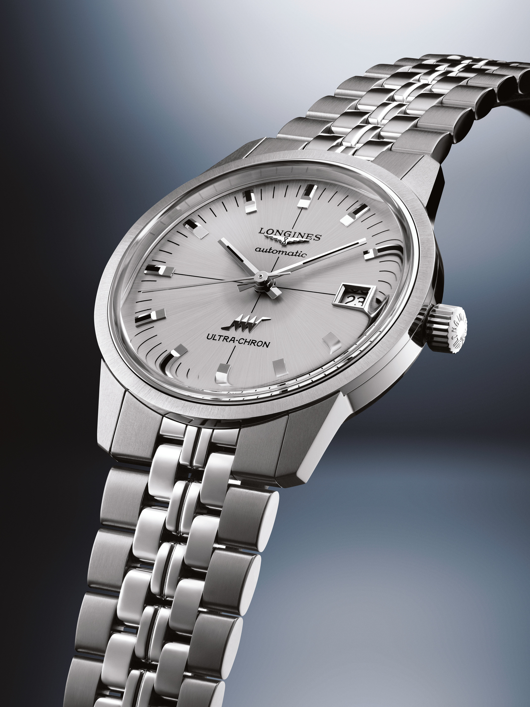
The official front and angled views show a silver dial whose appearance changes with the direction of the light. Applied markers stand above that surface, while the date window introduces a small rectangular interruption on the right-hand side.
The arrangement is economical. The hands have a clear central role, the hour markers establish the perimeter and the text occupies a relatively limited part of the face. The eye can follow the dial before being asked to consider the movement’s frequency or the collection’s historical account.
That order is one of the watch’s more interesting decisions. A technical identity does not have to become a visibly complicated interface. Here, the movement’s operating rate is part of the knowledge carried by the object, while the face remains concerned with the ordinary act of reading the time.
What 36,000 vibrations per hour means
The current 40 mm reference L2.937.4.72.2 specifies a mechanical movement operating at 36,000 vibrations per hour. In frequency terms, that is five complete oscillations per second, conventionally expressed as 5 Hz.
The number describes the movement’s operating rate. It is not, by itself, a complete statement of daily accuracy, performance in every position or the result a particular watch will produce over a week. Those questions involve the finished watch, its regulation and the conditions under which it is used or tested.
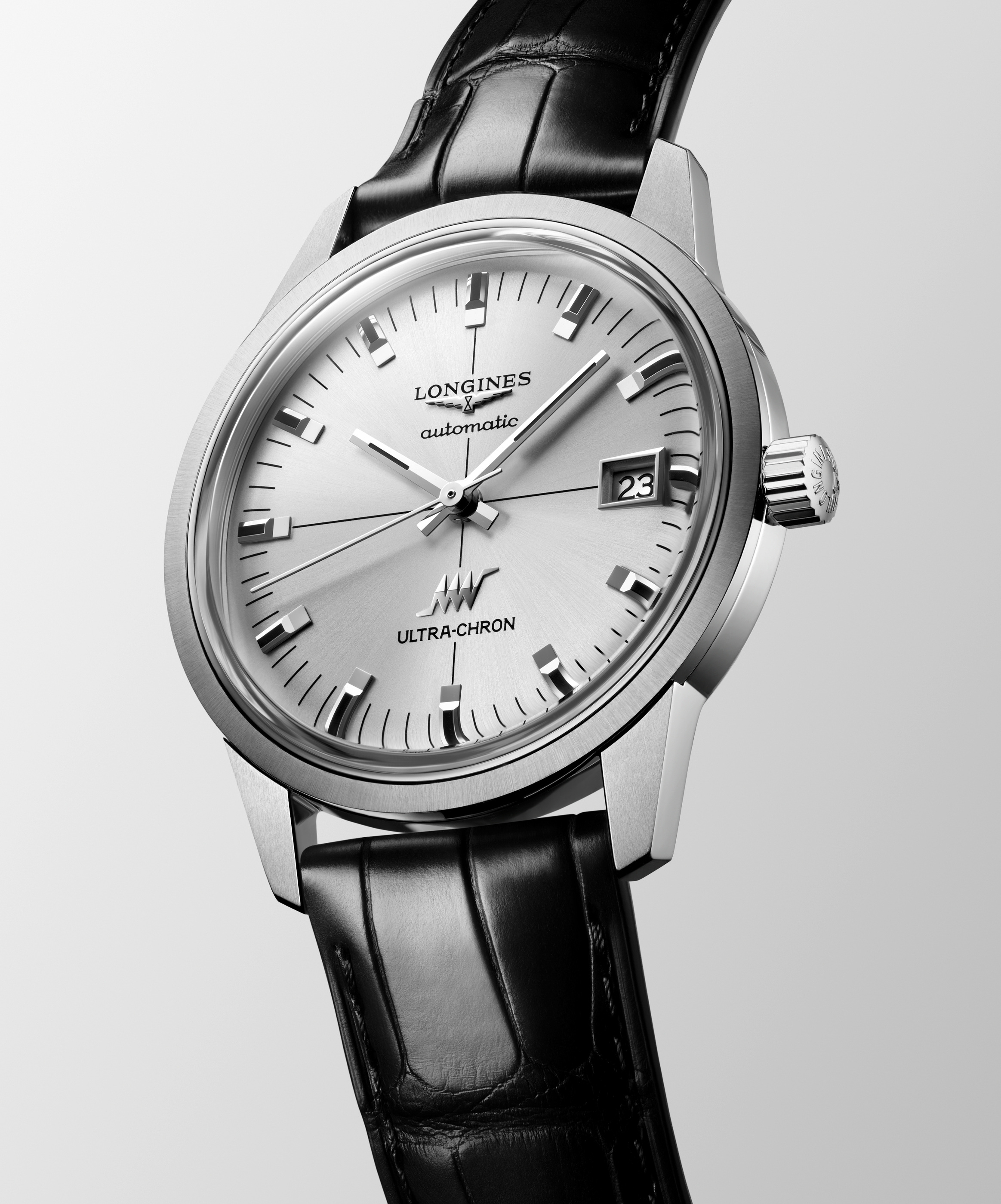
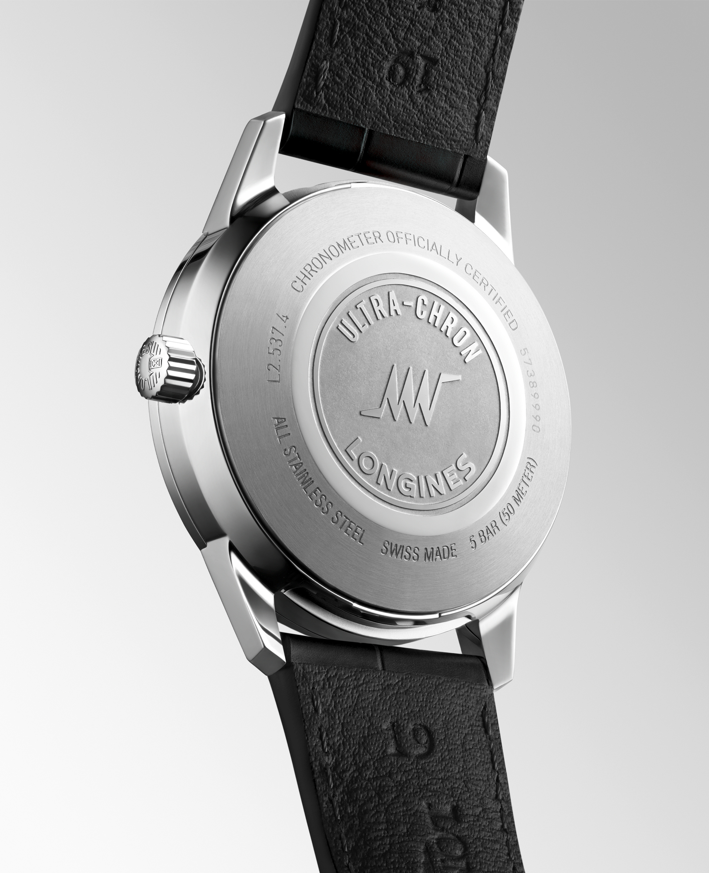
The design interest is the coexistence of that specific technical identity with a quiet exterior. The case does not need an extra opening or a highly exposed mechanism to communicate it. A closed back and a conventional display can carry a substantial mechanical story without turning the dial into an illustration of the movement.
The official back detail has its own graphic organisation. The collection name and emblem occupy the centre, while lettering follows the surrounding circle. It is a second, less frequently encountered face of the watch, with a different purpose from the silver dial. The engraving identifies the object; the current reference documentation remains the place to establish the specification attached to that identity.
Two sizes require two identities
Longines’ current product page offers 37 mm and 40 mm sizes. The official media gallery also distinguishes the L2.537 and L2.937 reference families in its image captions. That makes it possible to keep the smaller product views and the larger launch photographs accurately identified.
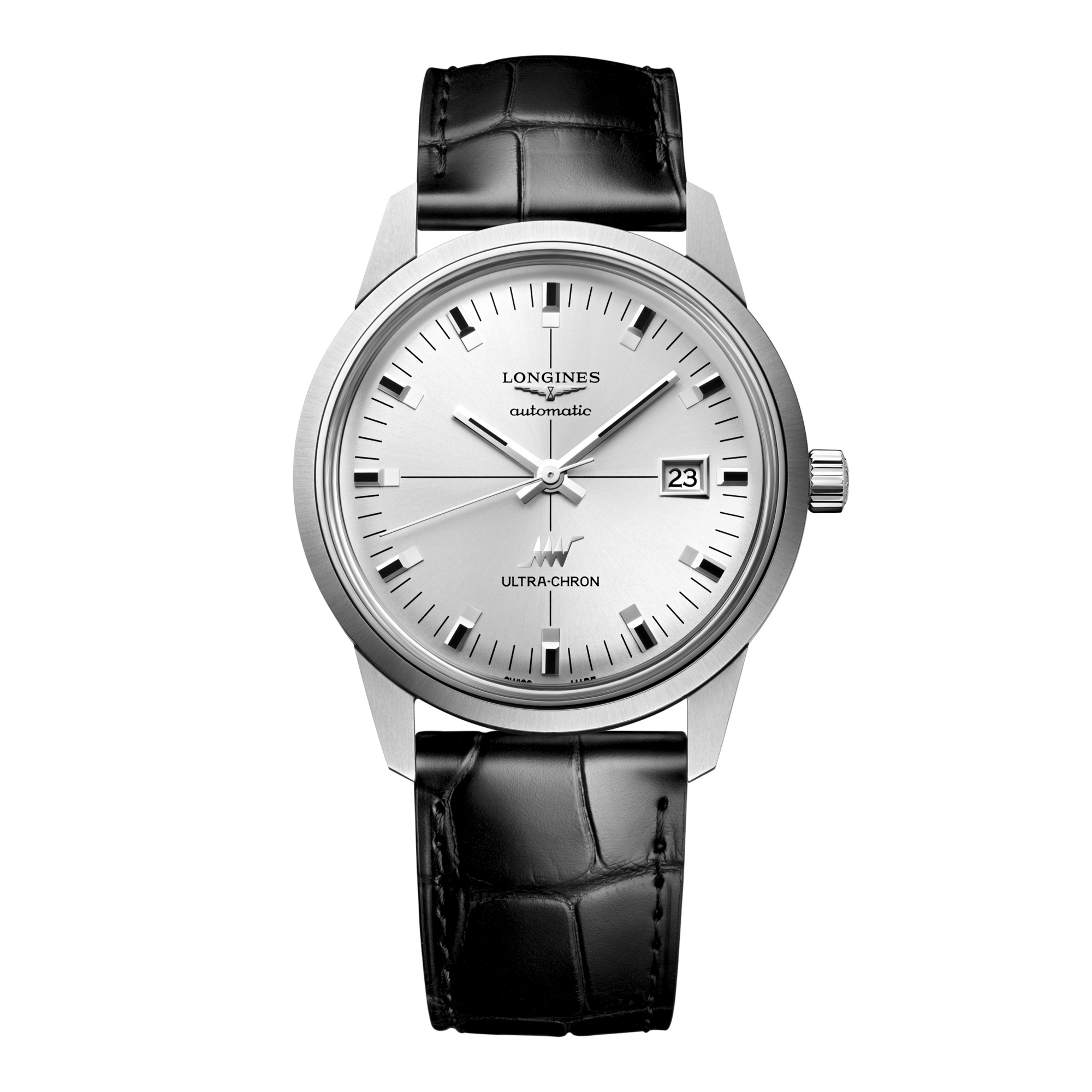
The distinction matters because proportions change through more than a number. A dial, case and strap can maintain the same visual language while occupying a different amount of the wrist. Comparing the two should therefore begin with their exact references, followed by a view of each in its own complete configuration.
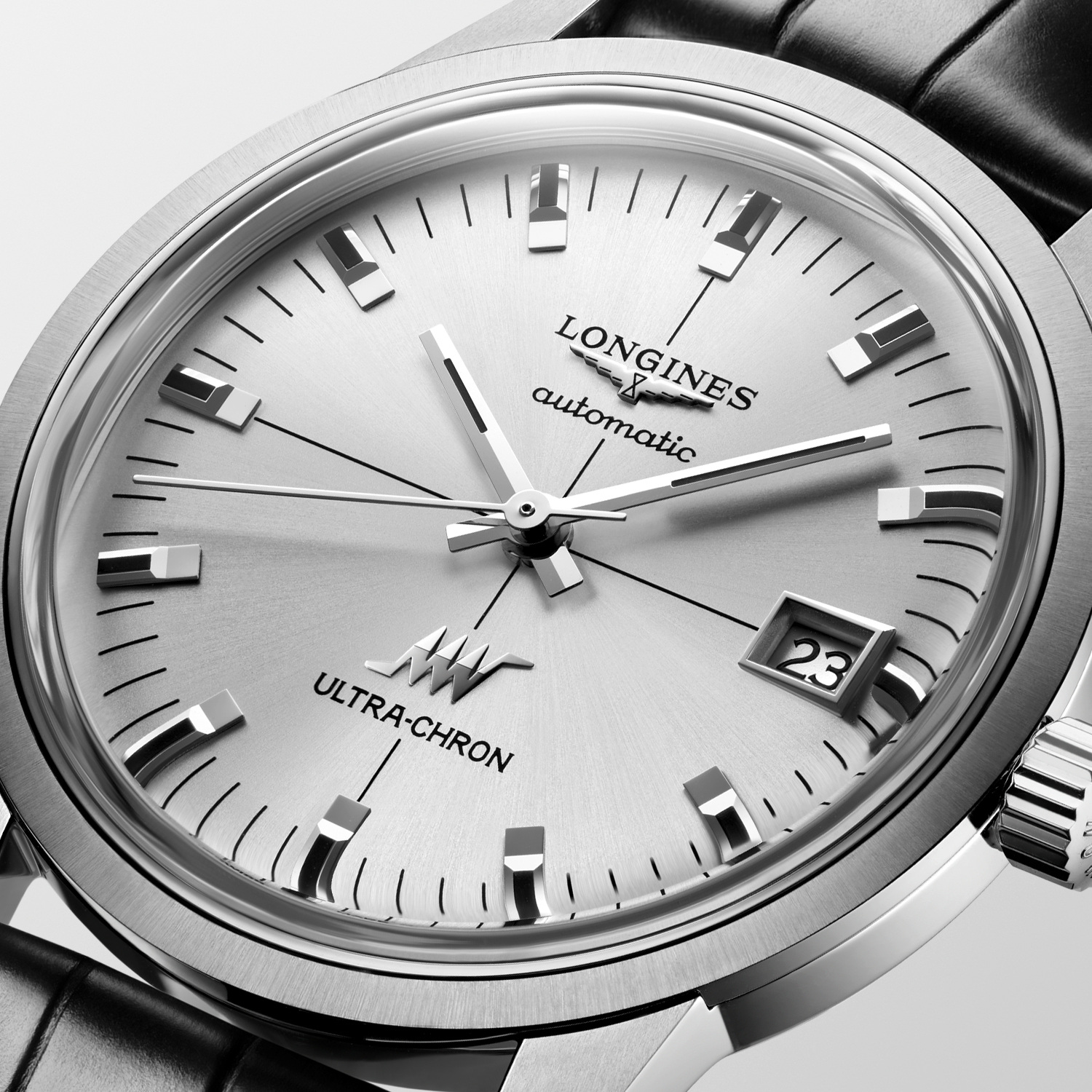
The 40 mm leather reference is the basis for the current specification discussed here. Where the image sequence shows a 37 mm example, the caption retains that identity. This allows the family to be considered as a design without pretending that every photograph depicts one interchangeable watch.
Bracelet and strap change the outer frame
The leather and bracelet versions offer two different continuations of the case. Leather makes a clear material break at the lugs, while the bracelet carries metal further around the wrist and introduces a repeated pattern of smaller elements.
In the official paired image, that change is easier to read than it would be from separate frontal portraits. The dial remains recognisable in both, but its surrounding frame changes. One configuration gives greater emphasis to the circular head; the other makes the watch part of a longer metallic surface.
For an owner, the choice should include handling as well as appearance. Clasp arrangement, adjustment and the way the ends meet the wrist are practical parts of the design. A studio image can establish the visual difference, while a fitting determines which configuration works best for the individual.
A specification read in the right order
The launch media introduction is dated October 2025. The current product record supplies the following details for the 40 mm reference discussed here. Keeping launch chronology and reference-specific specifications separate avoids turning a family history into an ambiguous catalogue entry.
| Field | Current L2.937.4.72.2 record | Why it belongs in the comparison |
|---|---|---|
| Case diameter | 40 mm | Identifies the larger of the two offered sizes |
| Movement rate | 36,000 vibrations per hour | Describes the high-frequency operating rhythm |
| Reserve | Up to 52 hours | States the maker’s running-reserve figure |
| Water resistance | 5 bar | A rating to read with current use and care instructions |
| Dial | Sunray silver | Identifies the surface treatment shown in the product record |
The table is a starting point for direct questions. Confirm the exact reference, compare the two case sizes if both are being considered and examine the preferred strap or bracelet. The most useful technical information is the information connected to the actual object being chosen.
The Luxe Digital view
The Ultra-Chron Classic is most interesting because it keeps its technical rhythm and visual rhythm distinct. The movement works at a specified high frequency, while the face offers a comparatively calm arrangement of markers, hands and a date window.
The two case sizes and alternative outer frames give that idea a broader range of expression. Leather makes the head a more separate object; a bracelet extends its metallic character. Neither decision changes the need to identify the exact reference and understand how it occupies the wrist.
Its strongest presentation therefore connects a quiet complete watch with a precise technical account. The silver dial gives the eye a clear place to begin. The movement rate, reserve and reference details then deepen the understanding without asking the exterior to become a diagram of everything inside it.
The Ultra-Chron Classic is most interesting because it keeps its technical rhythm and visual rhythm distinct.
Sources & credits
Sources and methodology
Independent design and reference analysis of the named official records and imagery, checked on 15 October 2026. Launch specifications and later product records retain their own dates and references. Images show the identified configurations. No independent handling or timing test is implied.