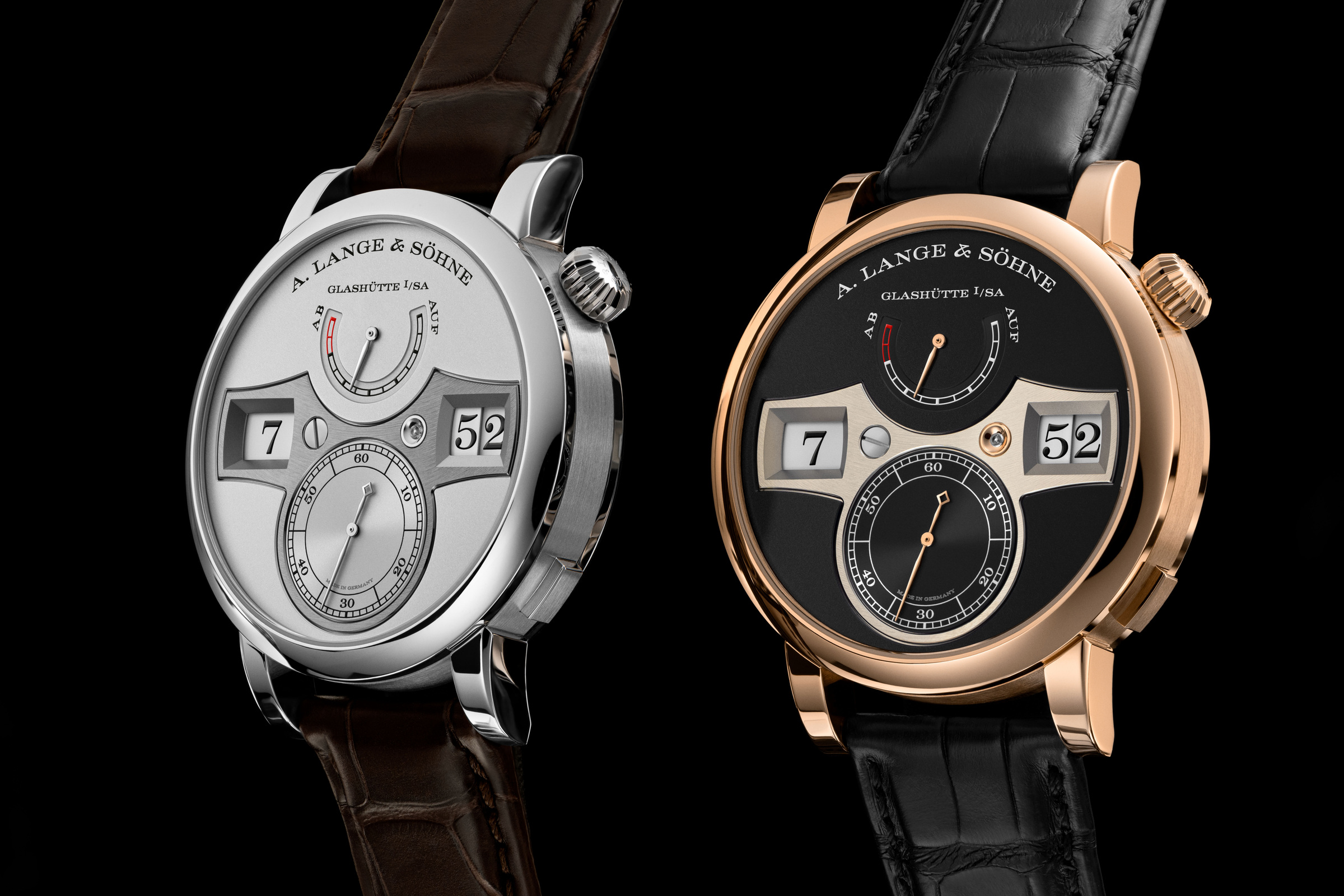
The Zeitwerk makes a small event out of an ordinary action. Instead of asking the eye to interpret the angle between hands, it places the hour and minute side by side. Then, at the next minute, the display changes. The experience is digital in the literal sense of reading digits, but the mechanism behind it is entirely mechanical.
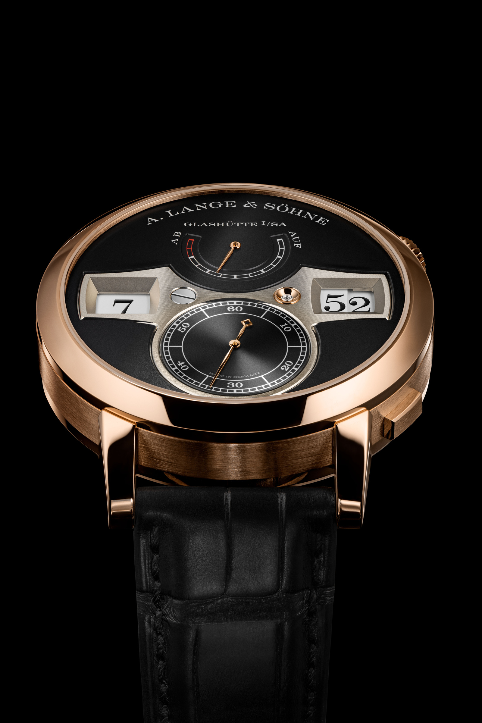
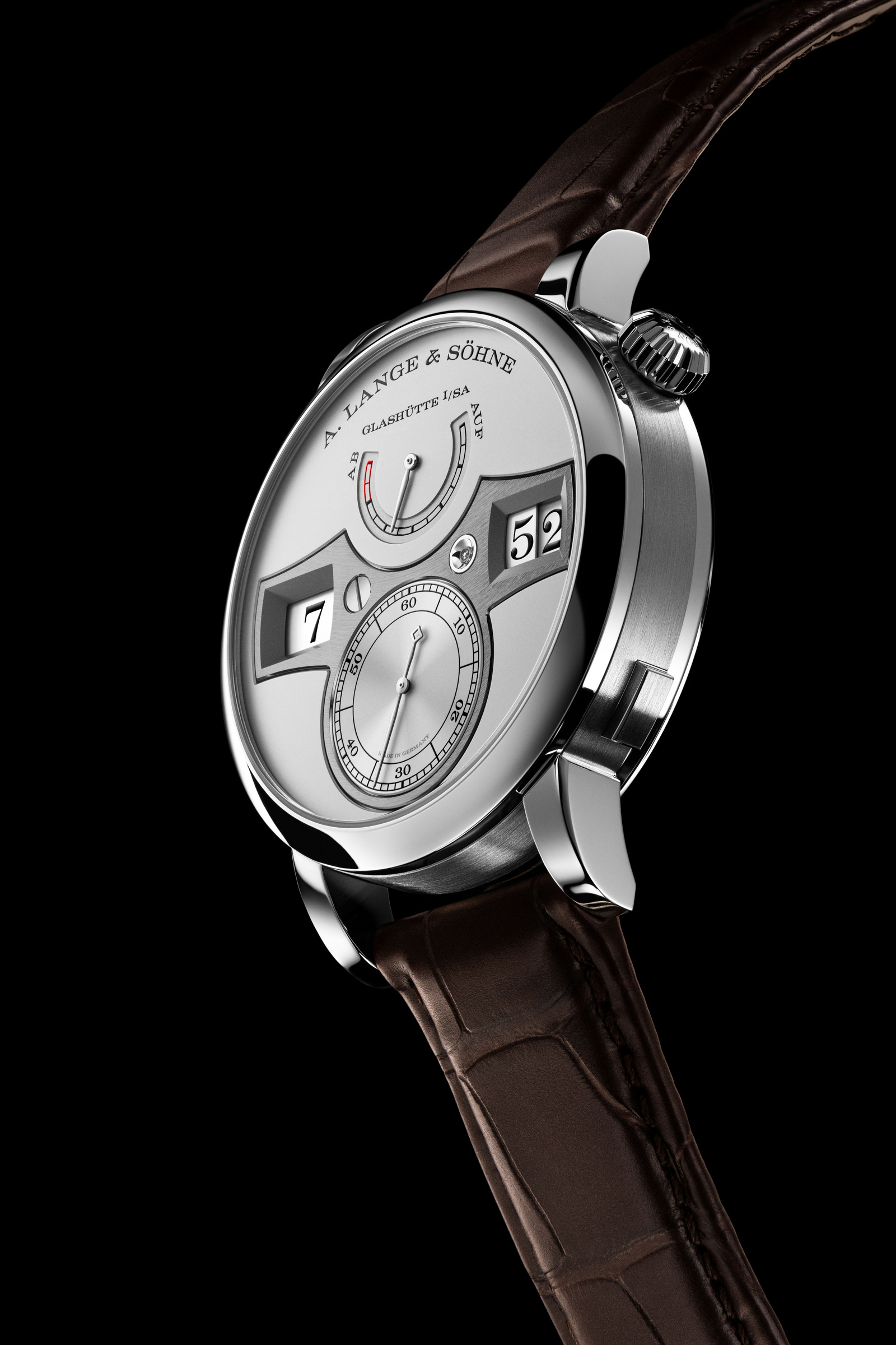
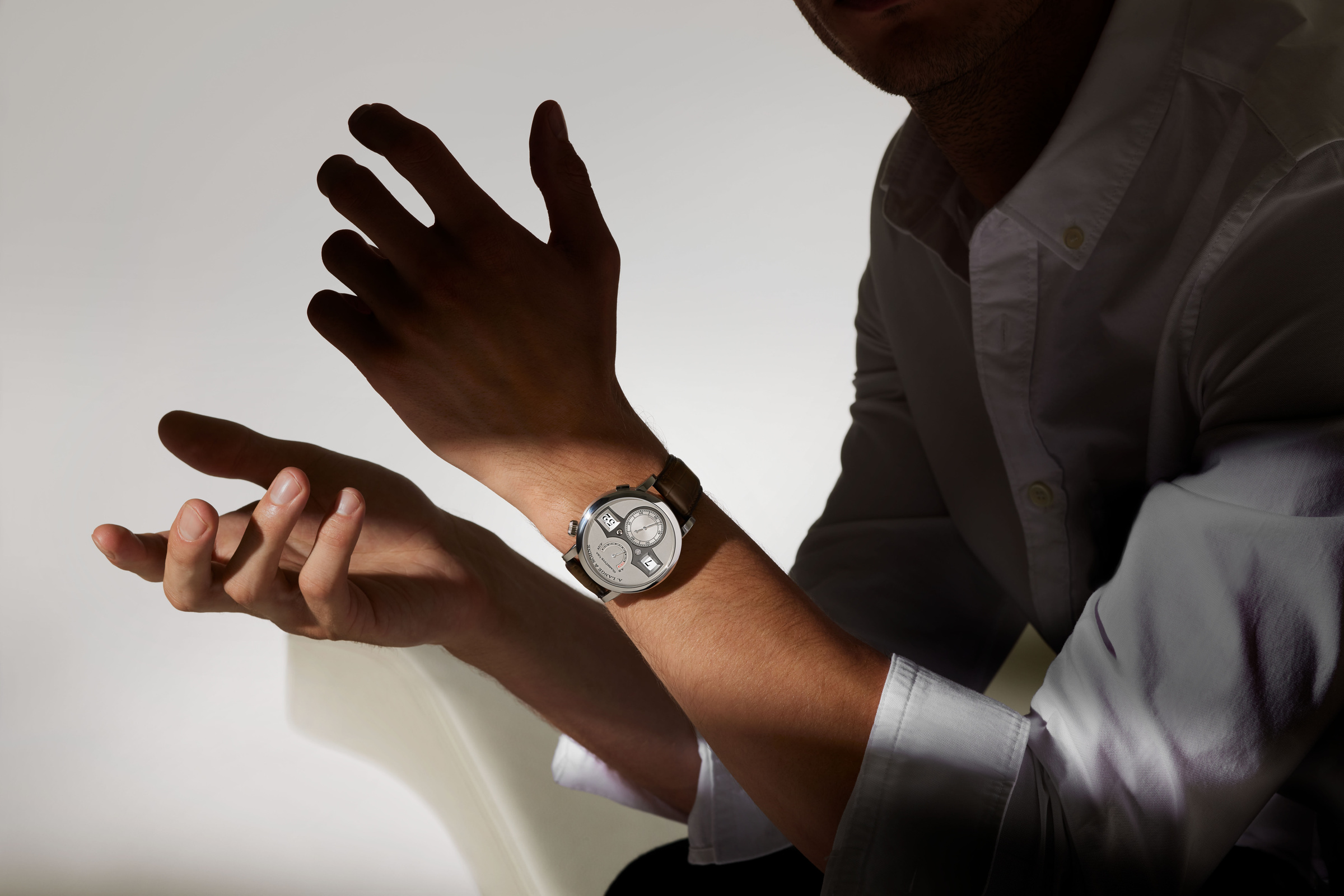
This feature examines the second-generation Zeitwerk presented by A. Lange & Söhne in 2022, specifically the platinum and pink-gold versions documented in the official launch material. It is a study of the watch as an interface and a designed object, rather than a report of a new 2026 launch or a claim to have worn either reference.
A horizontal reading of time
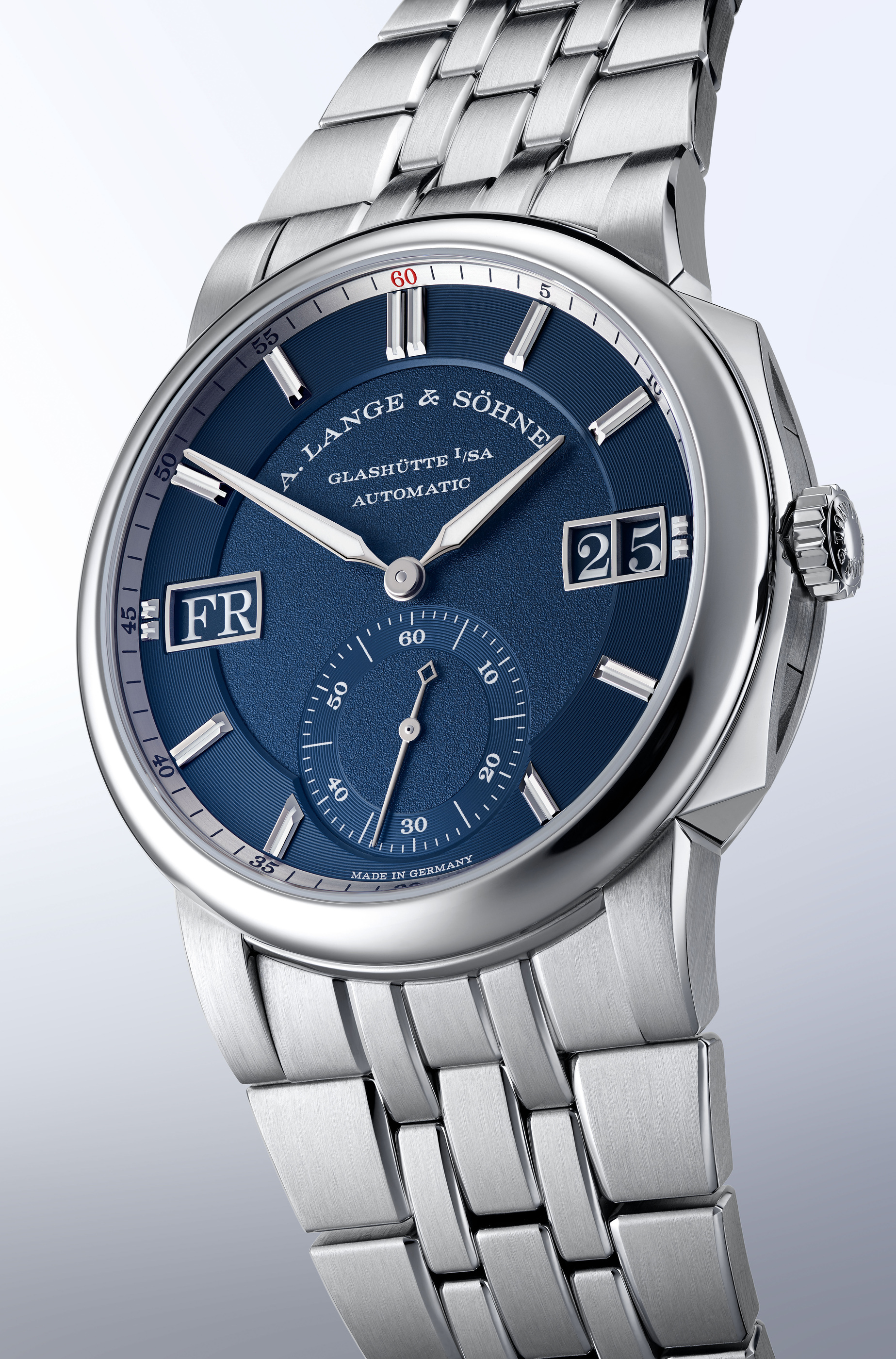
Start with the face, not the movement. The large numerals create a line across the dial, bounded by the distinctive time bridge. Hours and minutes can be read in a familiar order, while the seconds occupy a smaller dial below. The power-reserve indication sits above. These elements give the display a strong orientation and a clear hierarchy.
The manufacturer describes three jumping discs behind the numerals: one for hours and two for minutes. That arrangement explains why the watch’s visual simplicity is not the same as mechanical simplicity. A still photograph shows the display in one state; the minute change is what reveals the underlying choreography. At the top of an hour, all three discs need to advance together.
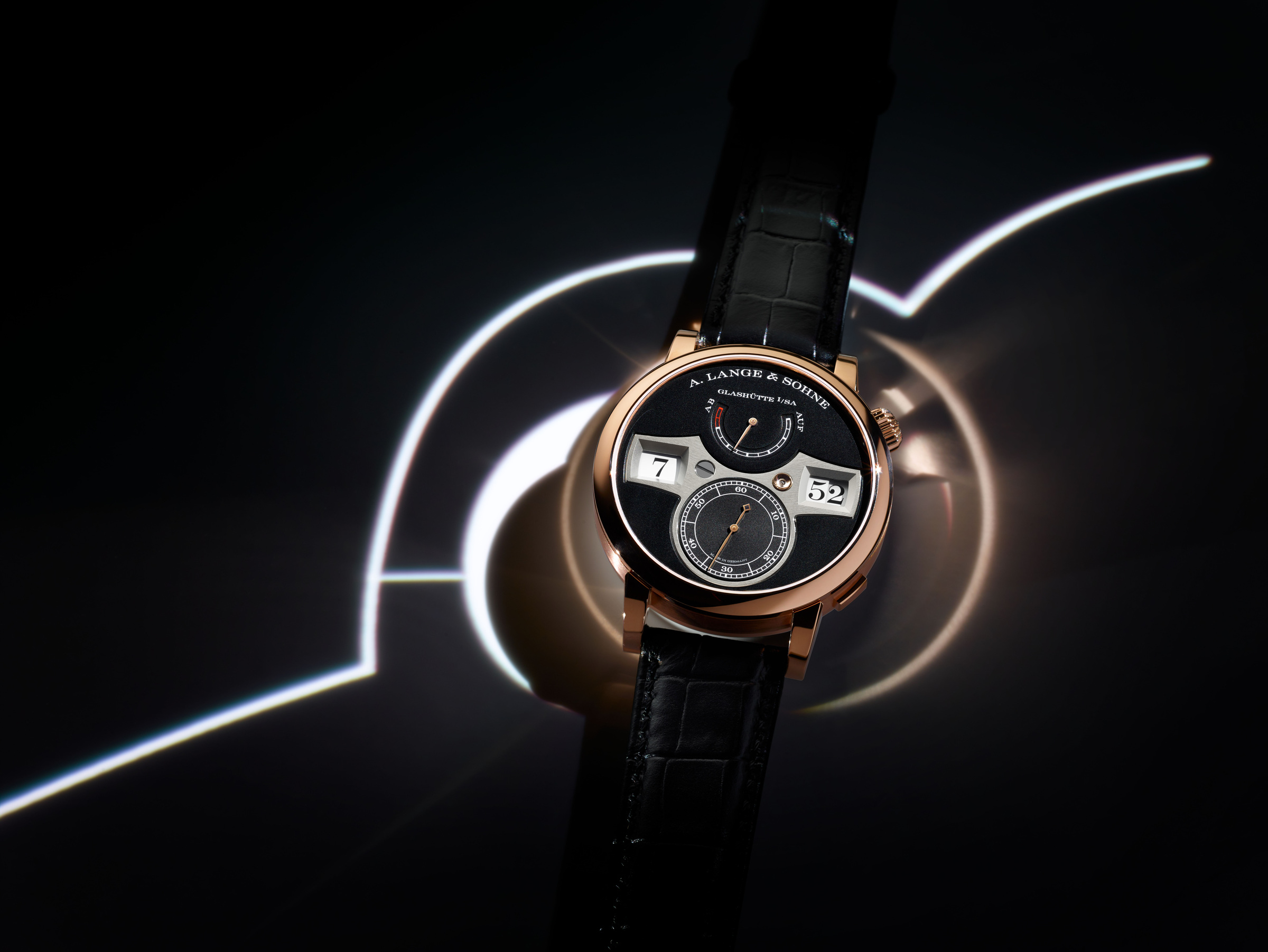
The layout also resists the assumption that a mechanical watch must borrow its appearance from a familiar arrangement of hands. It is recognisably a watch, but its principal reading action is different. The time bridge gives that difference a physical frame. It turns an abstract display concept into a shaped component with edges, depth and a relationship to the surrounding dial.
The bridge is part of the argument
Lange specifies German silver for the time bridge, a material also associated with its movement components. The visible structure is therefore more than decoration around three windows. In the design’s own terms, it connects the front of the watch to the mechanical architecture behind it. The choice gives the face a kind of internal honesty: the interface belongs to the mechanism.
The close photographs make this clearer than an overall product image can. Around the subsidiary seconds and the minute aperture, the observer can follow the bridge’s shape and the transitions between surfaces. The dial is composed from several distinct planes. Those small changes in depth help the numerals remain the centre of attention while giving the surrounding metal a reason to be examined.
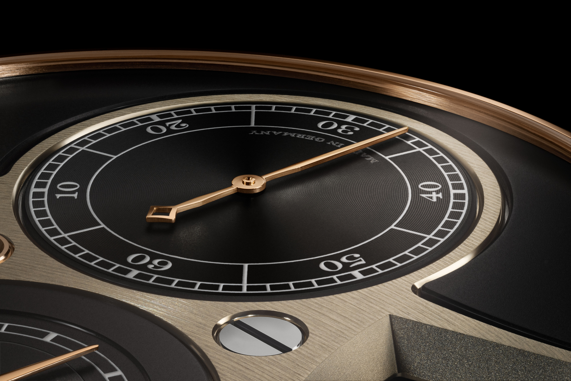
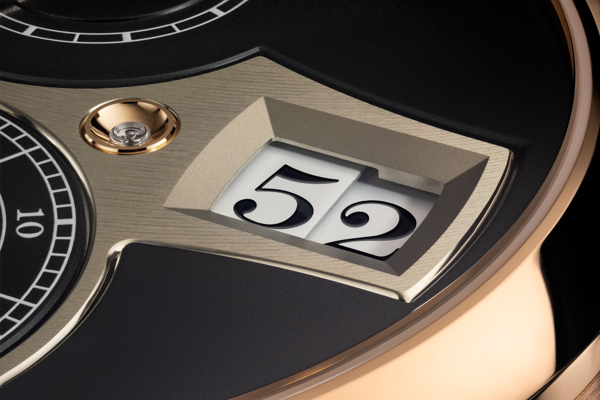
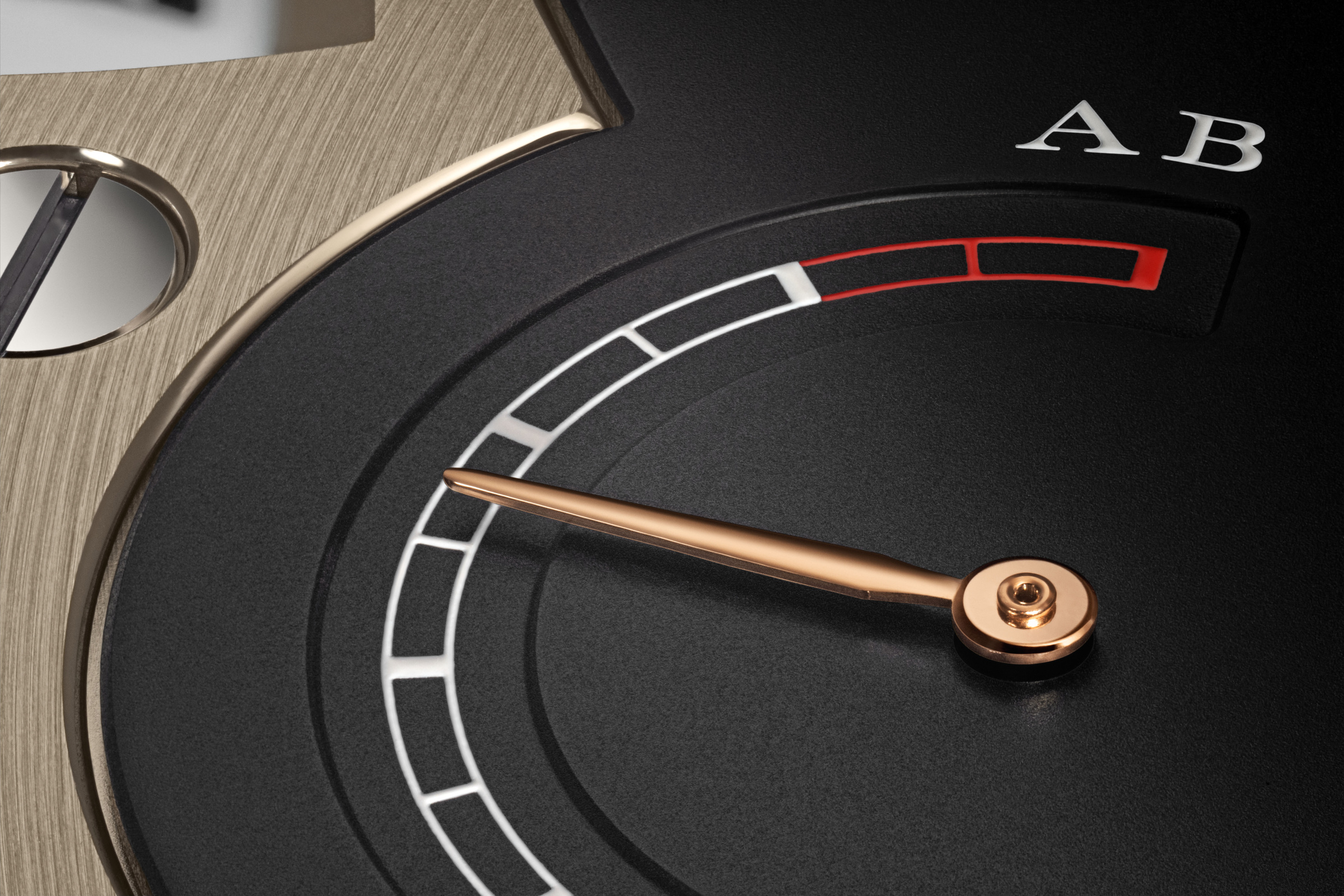
This is also where the two case versions begin to feel different. Pink gold, a black dial and an untreated German-silver bridge create one relationship of warmth and contrast. The platinum version uses a rhodié dial and a black-rhodiumed bridge. Neither treatment is a neutral substitution of metal. Each changes which edge and surface first catches the eye.
A mechanism that supports the interface
The second-generation calibre is L043.6. Lange’s official release gives it a 72-hour power reserve, twice that of the earlier generation, and identifies a constant-force mechanism as essential to controlling the jumping display. Those are manufacturer specifications. We have not measured reserve duration or rate performance on an individual watch.
For this article, the important point is the connection between mechanism and reading experience. Moving a display in distinct jumps creates a different energy demand from moving a pair of hands continuously. The watch has to support that change repeatedly, while keeping the rest of its timekeeping work coherent. The apparent ease of reading is the result of machinery that the face only partly reveals.
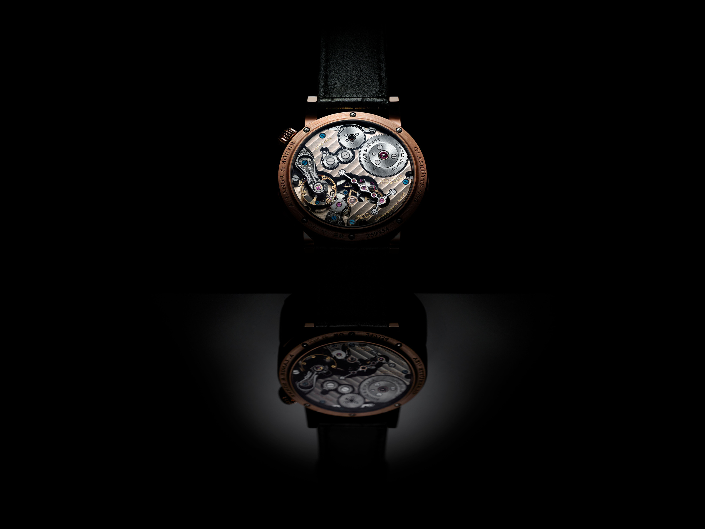
Turn the watch over and the tone changes. The documented movement has 451 components and 59 jewels. Lange identifies hand-engraved balance and escape-wheel cocks, solarised winding wheels and a straight-grained remontoir bridge among the details visible through the sapphire back. The eye moves from the face’s compact information architecture to a landscape of working parts. It is a second view of the same object, with a different purpose. The dial is designed to communicate time quickly; the back invites slower observation of how that communication is made possible.
The everyday detail at four o’clock
The second generation adds a pusher that advances the hour indication independently. Lange explains that the change occurs when the pusher is released. The distinction is small enough to be missed in a general specification list, yet it is relevant to the way a person interacts with the watch, particularly when changing time zones.
It also illustrates a broader principle of thoughtful product evolution. An unusual display does not need to remain difficult to set in order to remain distinctive. The interface can be made more convenient while its visual identity stays intact. That is a more useful account of the update than simply calling the newer mechanism improved in every possible respect.
The wrist photographs add another necessary scale. They show how the broad display and the case sit against a cuff and a hand. They are official styling images, not our own wearing trial. For someone considering the watch, a personal fitting still matters: case diameter alone does not establish how a particular wrist will accommodate its shape and thickness.
Two references, one concept
The following reference keeps the versions within the documented 2022 release. It does not fold in other Zeitwerk complications, later editions or market pricing. Those would change the comparison and require their own evidence.
| Detail | Platinum, reference 142.025 | Pink gold, reference 142.031 |
|---|---|---|
| Dial treatment | Rhodié dial | Black dial |
| Time bridge | Black-rhodiumed German silver | Untreated German silver |
| Movement | Calibre L043.6 | Calibre L043.6 |
| Stated power reserve | 72 hours | 72 hours |
| Case dimensions | 41.9 mm diameter; 12.2 mm height | 41.9 mm diameter; 12.2 mm height |
Choosing between them is partly a decision about contrast. The warmer case and dark dial create one reading of the architecture; the cooler case and lighter dial create another. Official photographs can make that difference intelligible. They cannot settle a personal preference, establish availability or replace a current quotation from an authorised point of sale.
Craft should be shown at the scale where it happens
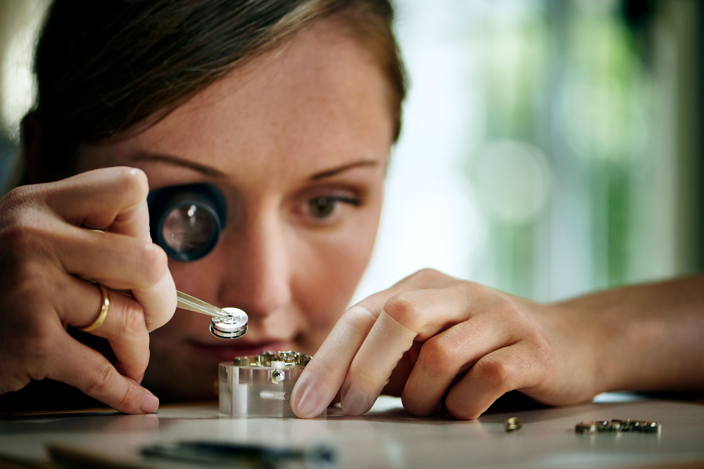
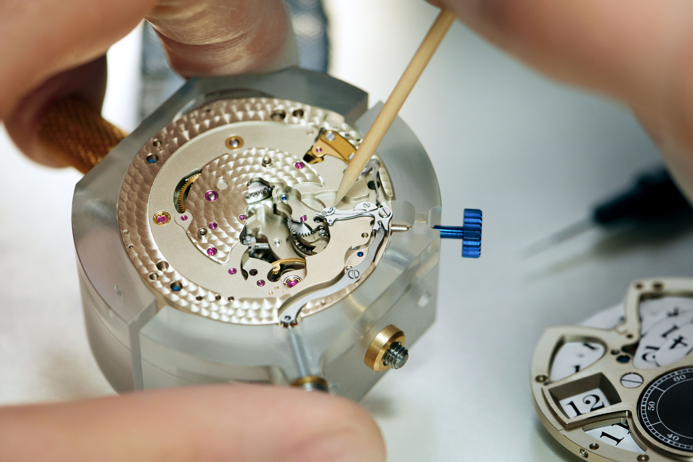
At the bench, the watch returns to the scale of individual components. A tool meets an assembly that looks almost architectural when enlarged, but belongs inside a case less than 42 millimetres across. This change of scale is part of the Zeitwerk’s appeal: what appears effortless on the wrist is the result of concentrated work on very small relationships.
The Zeitwerk turns reading the time into watching time change. That is the central design idea, and it is strongest when the visual sequence moves from the complete face to its bridge, then to the movement and the people assembling it. The reader can understand the object quickly, and then choose to look more closely. The watch makes room for both speeds of attention: a glance to know the time, and a longer look to understand how that minute arrived.
The Zeitwerk turns reading the time into watching time change.
Sources & credits
Methodology and sources
This independent design feature uses official 2022 launch and making-of material, alongside the current Zeitwerk family reference. It does not imply direct handling, a timing test or an interview. Specifications are attributed to A. Lange & Söhne. The scope is the two documented second-generation references, not the full contemporary Zeitwerk collection or a specialist service assessment.