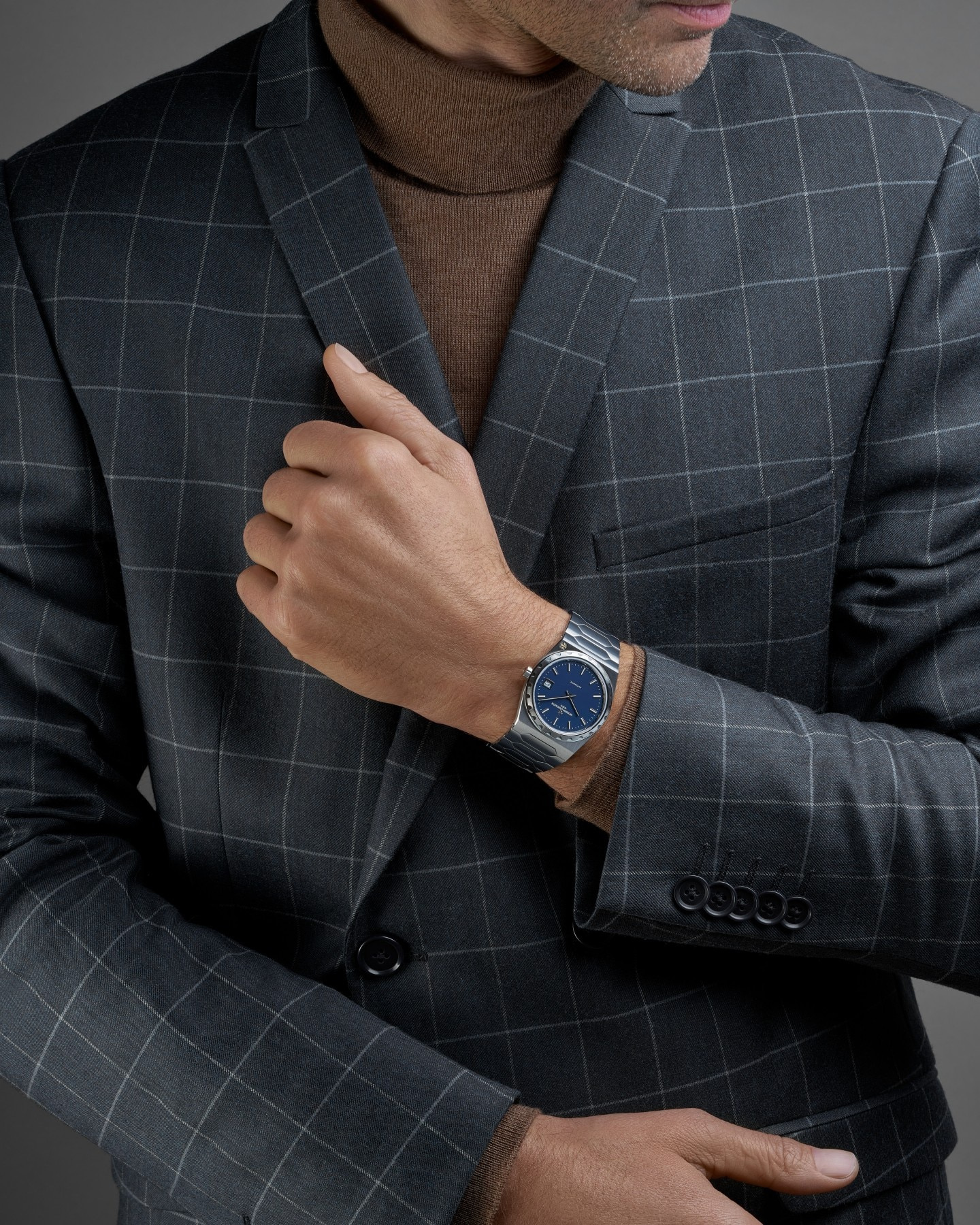
The steel Historiques 222 is best read as a continuous outline. Its case, notched bezel and articulated bracelet belong to the same composition, while a matte blue dial gives the centre a quieter register. Reference 4200H/222A-B934 does not need to be enlarged into a story about queues or resale prices to be interesting. The more durable question is how a compact watch gives so much of its identity to the metal surrounding the dial.
The silhouette before the dial
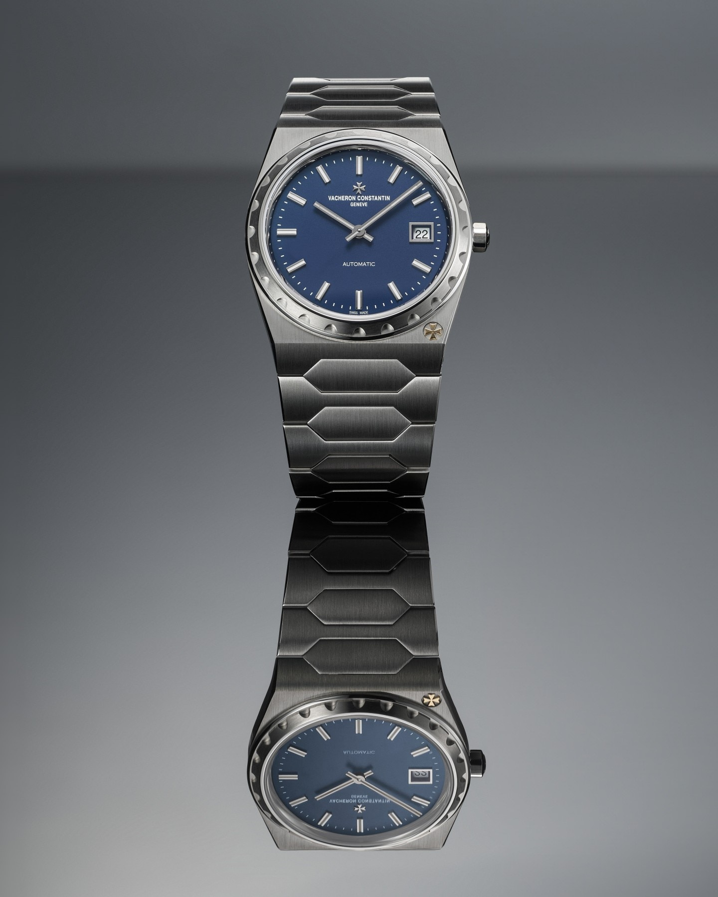
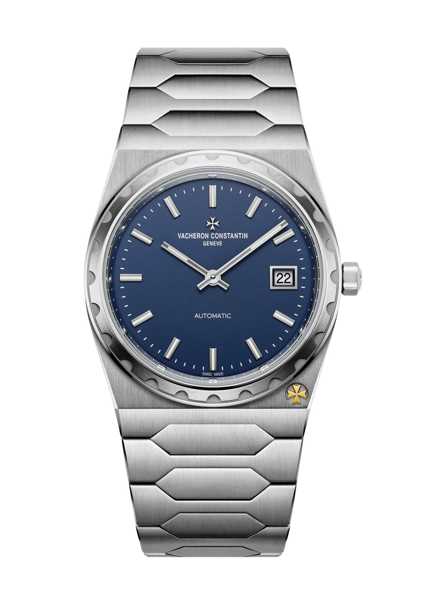
Vacheron Constantin specifies a 37-millimetre case, 7.95 millimetres thick, for this steel reference. The measurements establish diameter and thickness, not a complete account of how the watch will occupy a wrist. An integrated bracelet extends the visible object beyond the round portion containing the dial. The outer outline therefore deserves to be considered separately from the nominal case size.
The manufacturer’s description calls attention to a tonneau-shaped case and fluted bezel. In the official photographs, the bezel supplies a repeated edge around the relatively calm dial. The case then broadens into the first bracelet links rather than ending in a pair of visually detached lugs. A small Maltese cross near five adds an asymmetrical detail within that otherwise coherent frame.
This hierarchy is useful. From across a room, the complete metal silhouette can register before the face is readable. Closer up, the bezel and bracelet become separate textures. At reading distance, the dial takes priority. A successful design gives each distance something appropriate to see, instead of asking every detail to perform equally loudly at once.
The bracelet is part of the case
The current specification identifies a stainless-steel bracelet with polished and satin-finished surfaces and a triple-folding clasp. The finish distinction matters visually: a bracelet assembled from repeated links need not reflect light as one uninterrupted strip. Small changes of angle make some surfaces bright while neighbouring ones remain quieter.
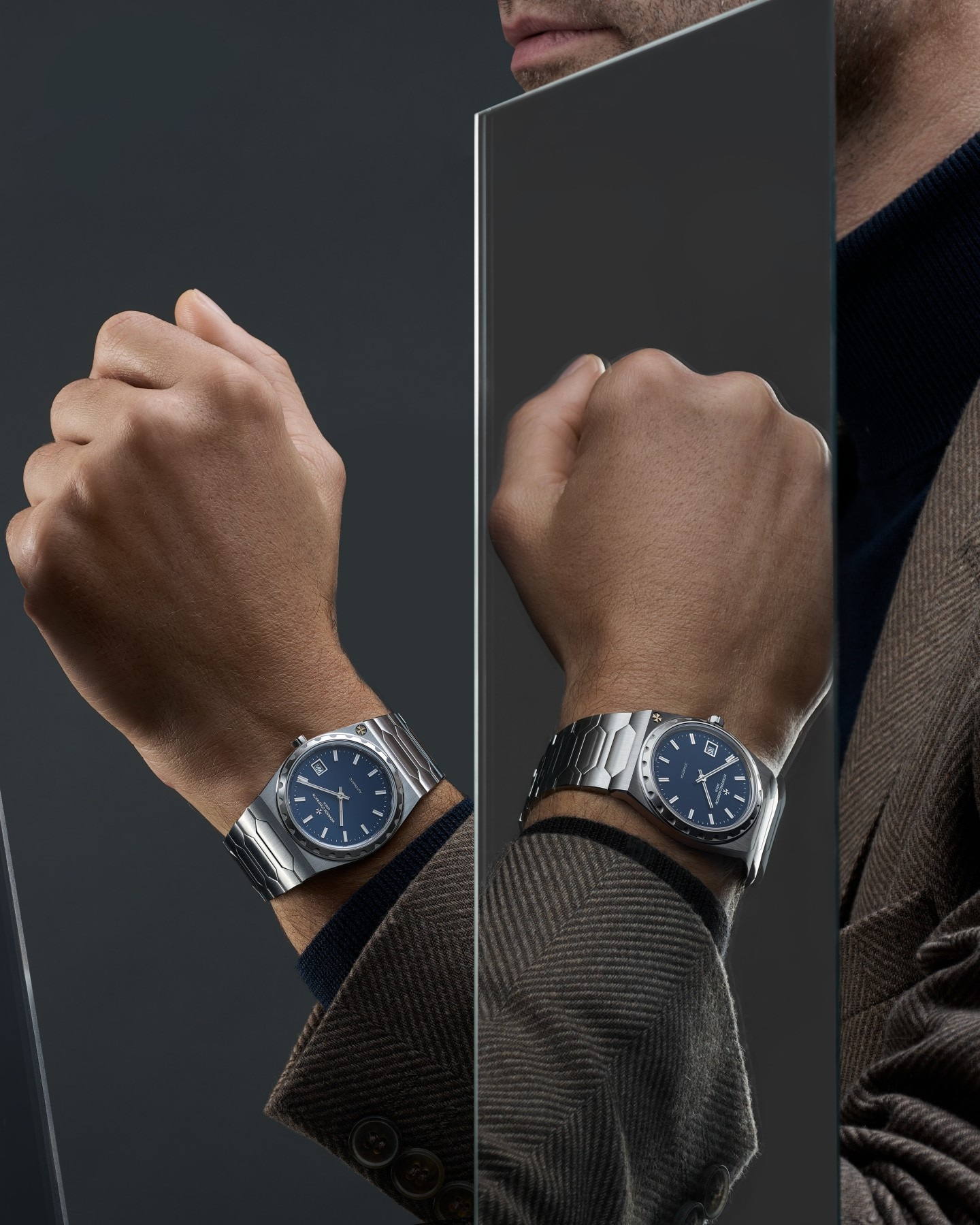
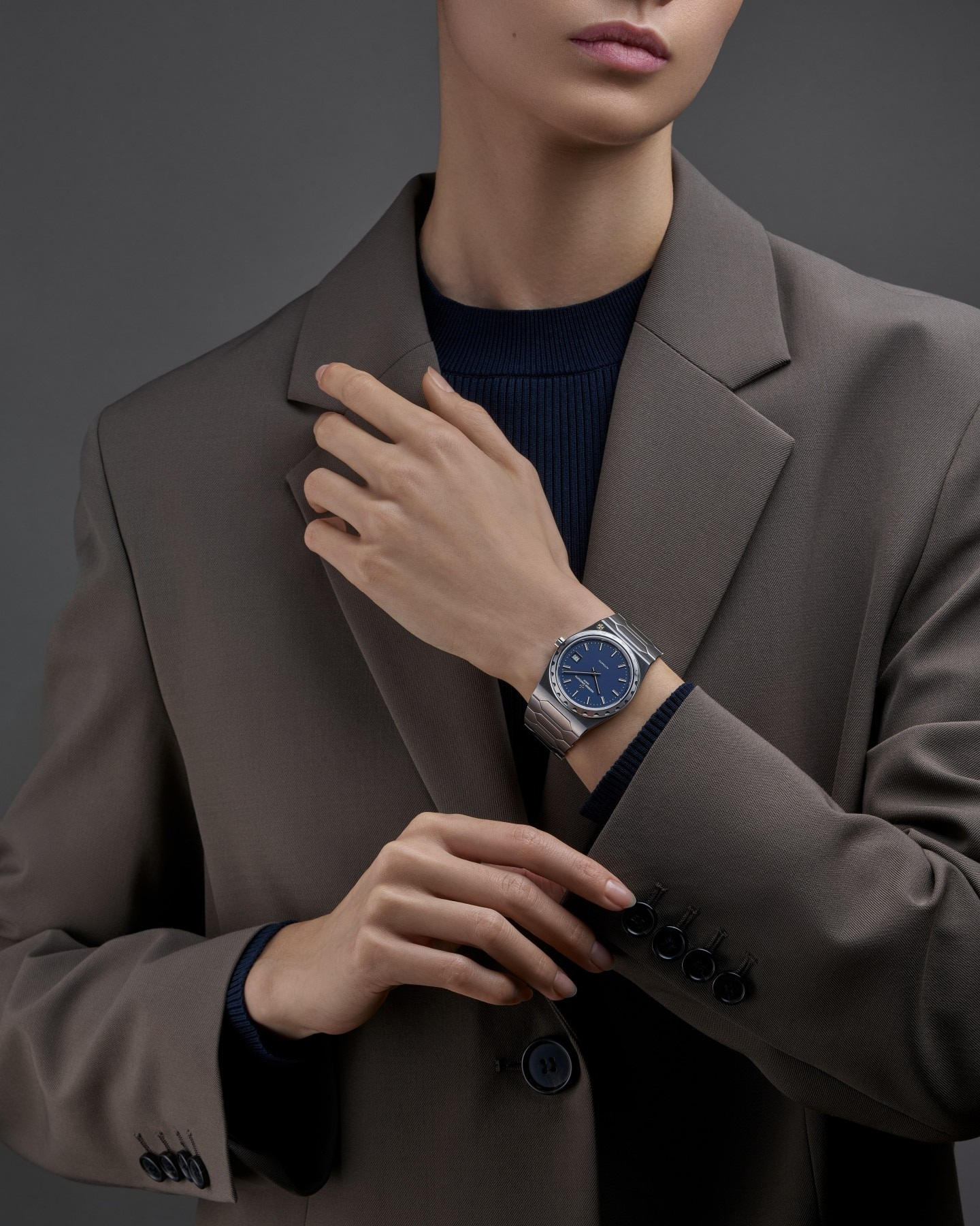
The published wearing images demonstrate different relationships with sleeves and hands. They are campaign compositions, not a LuxeDigital wearing test or proof that the watch will fit every wrist in the same way. Their value is in showing the complete watch as part of an arm, rather than exclusively as an isolated dial. They make a useful starting point for a fitting, provided they do not replace one.
Ask how the actual bracelet is sized, which adjustments are available and how the clasp sits beneath the wrist. Look at the case-to-bracelet transition when the arm is relaxed, rather than only when the watch is held square to a mirror. A diameter can be numerically modest while the first links create a broader visual presence. The right answer depends on the individual wrist and preferred fit.
A blue field with a clear hierarchy
Vacheron describes the dial as blue with a matte finish, straight hour markers, baton-type hands and a date at three. The relative quiet of that field allows the surrounding case to remain prominent. It also means that the hands and markers carry much of the work of reading the watch. Their contrast should be assessed under normal light, rather than inferred from a perfectly controlled product photograph.
The date creates another small interruption in the geometry. Its position at three is familiar, but within this design it joins the Maltese cross near five and the wordmark above the centre as a set of unevenly weighted details. The face avoids becoming a perfectly empty disc while remaining far less busy than the bezel’s repeated edge.
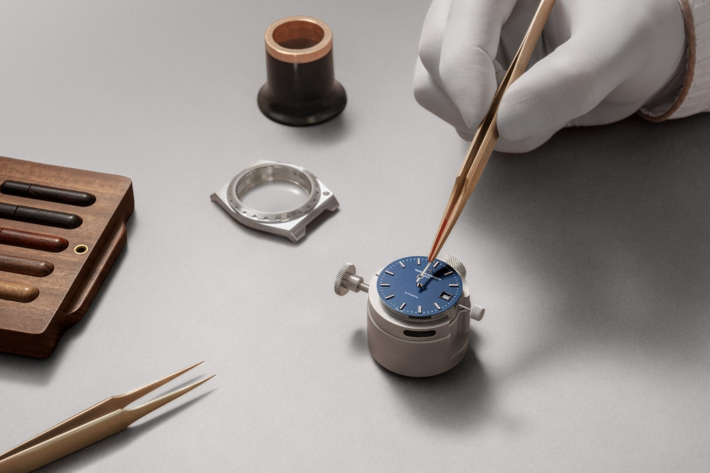
The official assembly image offers another perspective: a blue dial seen at the scale of hands and tools before the complete case encloses it. That photograph documents the manufacturer’s presentation of a making stage. It does not independently certify a particular delivered watch’s finishing, accuracy or inspection history. Used accurately, it helps the reader reconnect a polished final object to the smaller elements that organise its face.
The view underneath
The steel reference has a transparent sapphire caseback and the self-winding Calibre 2455/2. The current specification gives a 40-hour power reserve and a balance-stop function. These are model specifications supplied by the manufacture. They should remain distinct from the measured performance, service condition and adjustment of any individual example offered for sale.
The official rear view shows how the movement and oscillating weight occupy the back of the watch. It introduces a different set of circles and surfaces from those visible on the wrist. The front is about a blue centre within a metal outline; the reverse makes winding architecture and finishing visible within a smaller, bounded space.
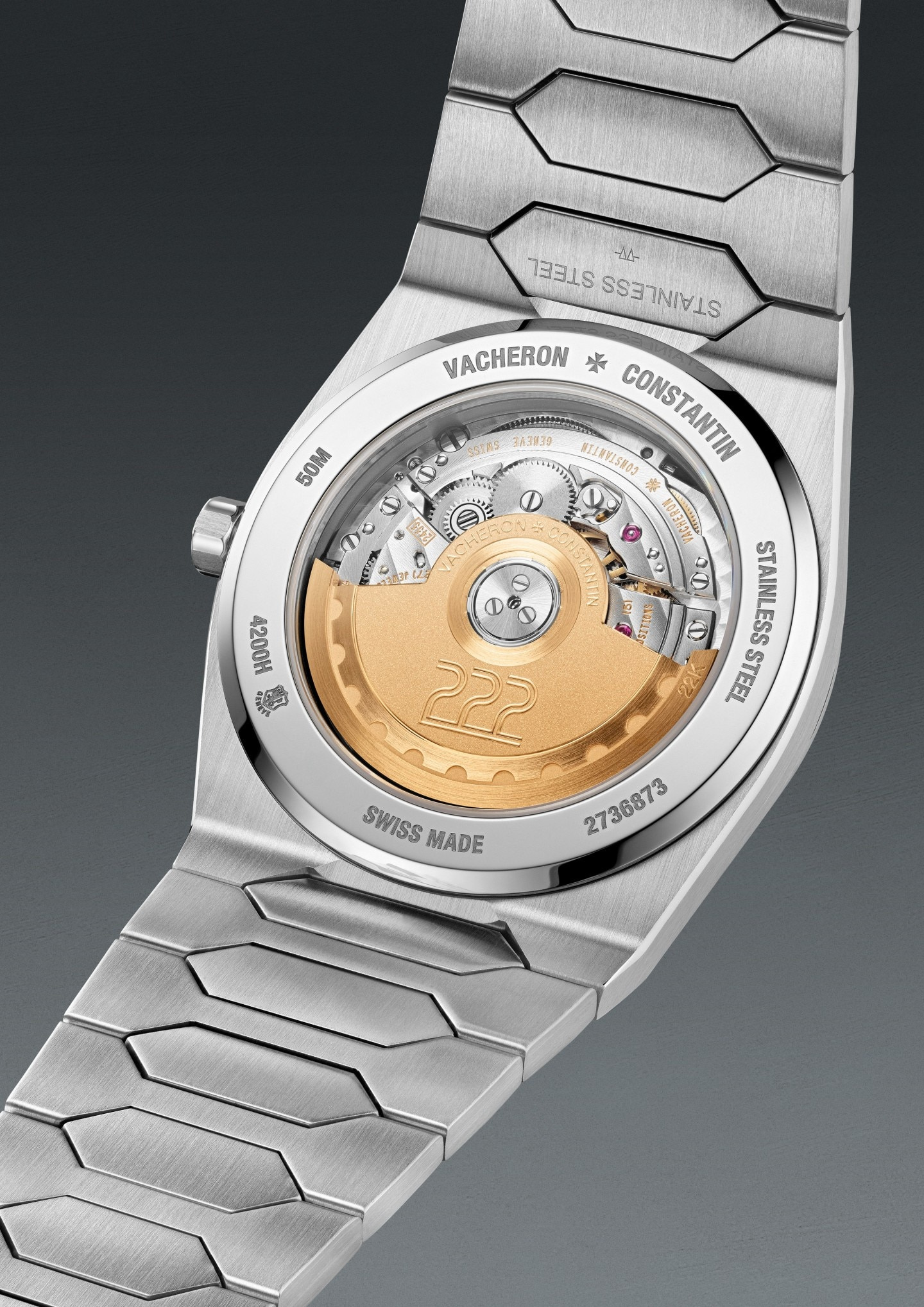
That is a reason to look beneath the watch, without turning the movement into an automatic claim of value. A buyer should also establish the actual documentation, service and warranty arrangements through the relevant authorised channel. A contemporary specification page describes a reference. It is not a condition report for a watch, a promise of immediate supply or a forecast of future demand.
The acquisition notebook
Keep the steel reference separate from the yellow-gold Historiques 222. The manufacturer’s broader collection includes both; similar dimensions and family resemblance do not make photographs or material descriptions interchangeable. The imagery selected here identifies the steel, blue-dial configuration.
| Element | Official steel-reference specification | A useful next question |
|---|---|---|
| Identity | 4200H/222A-B934 | Does the offered watch and its documentation match? |
| Case | 37 mm diameter; 7.95 mm thick | How do case and first links occupy the wrist together? |
| Dial | Matte blue with date at three | Are hands and date comfortable to read in ordinary light? |
| Bracelet | Steel, polished/satin-finished; triple-folding clasp | What sizing and adjustment are available? |
| Movement | Self-winding 2455/2; stated 40-hour reserve | Which operating and service instructions accompany it? |
| Reverse | Transparent sapphire caseback | What is visible in the actual watch being considered? |
Treat a fitting as an opportunity to understand the whole shape. The watch should be seen from the side and beneath the wrist, then with the sleeve normally worn. Those observations will not produce a universal verdict about comfort, but they will produce a decision grounded in the person’s own use rather than the scale of a campaign image.
The Luxe Digital view
The steel 222’s appeal comes from continuity with carefully placed interruptions. The bracelet carries the case’s direction along the arm, the bezel supplies rhythm and the blue dial gives the composition somewhere to rest. The small details work because the broader outline is already resolved.
Choose it by looking at that outline in real use. The fitting, reference identity and actual supply conditions deserve clear answers; none needs an invented market narrative. A watch whose design remains recognisable from several distances has a stronger editorial story than the question of who might be waiting to acquire it.
The steel 222’s appeal comes from continuity with carefully placed interruptions.
Sources & credits
Sources and methodology
Independent watch design and reference analysis of the named official records and imagery, checked on 15 October 2026. Original introduction dates and reference-specific specifications are retained. Images show the identified configurations. Independent visual and reference analysis of official material. No hands-on wearing, accuracy or water-use test, workshop visit, interview or specimen inspection claimed. Launch, current regional records, studio visuals, campaign compositions and assembly photographs are identified separately. Availability, individual condition, fitting and care require exact-reference confirmation.