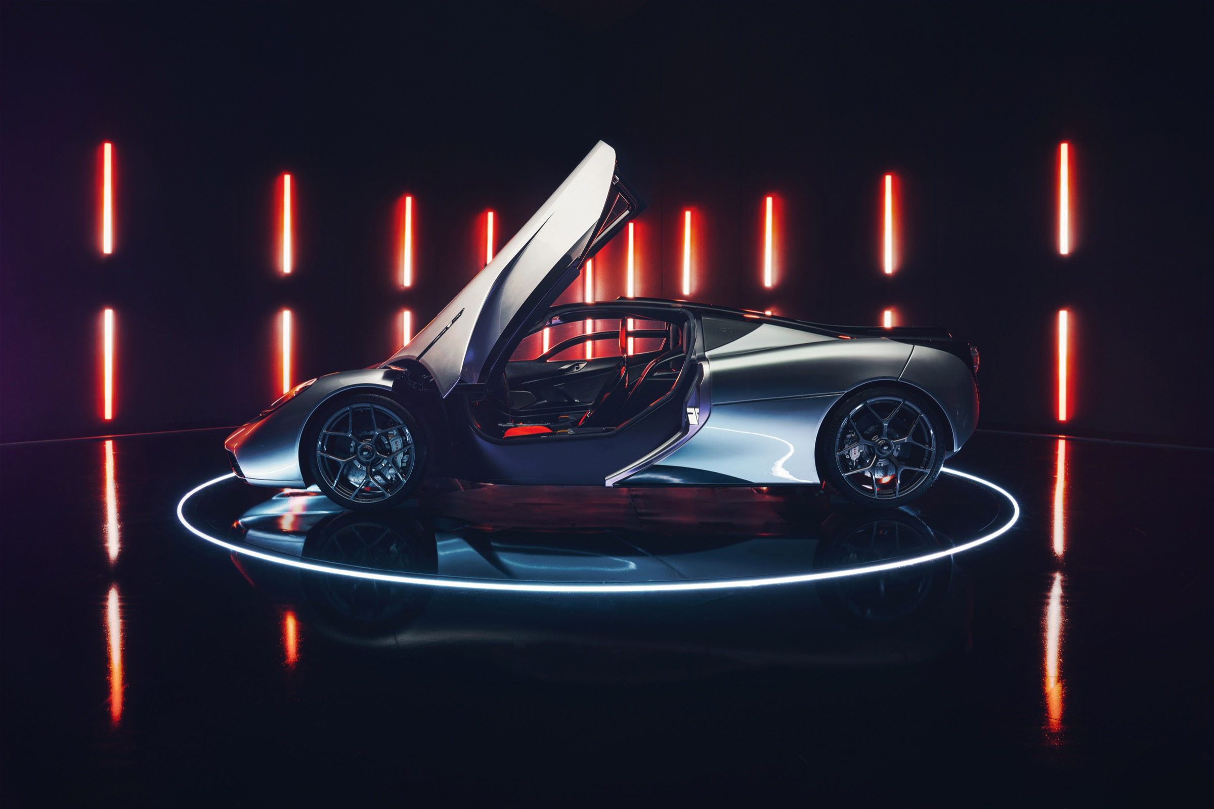
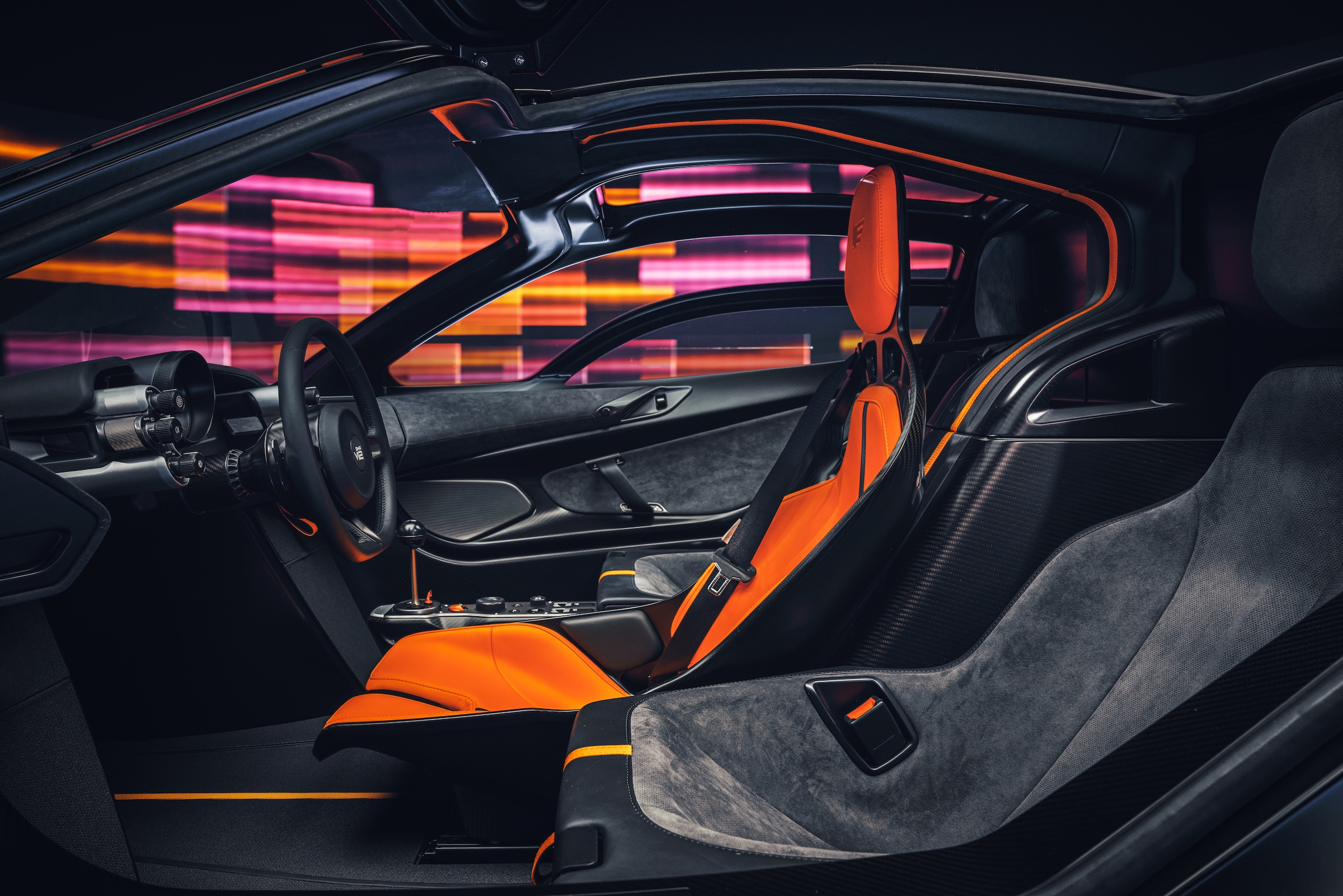
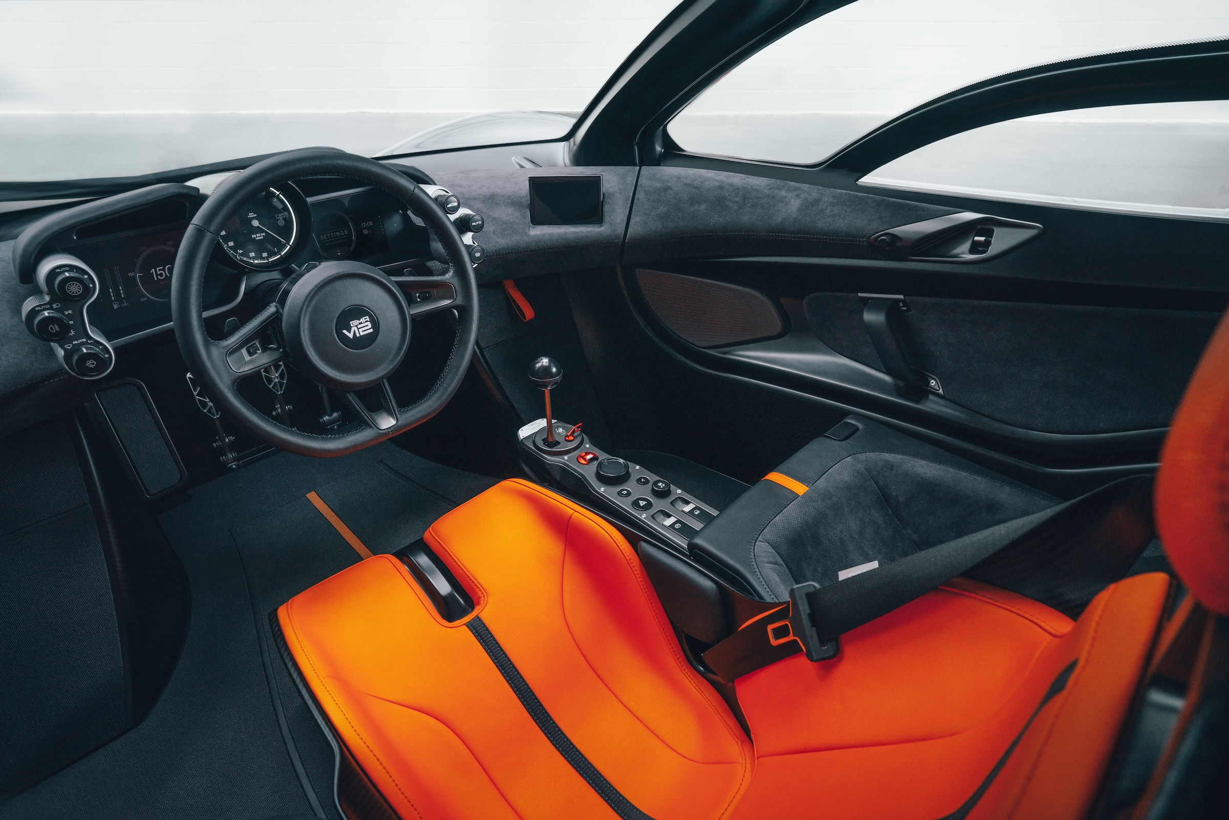
The most revealing view of the Gordon Murray Automotive T.50 is through an open door. An orange seat sits on the centreline, with two darker passenger places set back beside it. The cabin makes an unusually clear promise: this car has been arranged around one person’s relationship with the machine. Its proportions, controls and rear-mounted fan turn that proposition into something visible.
A centreline rather than a console
A conventional supercar interior usually gives two occupants parallel territories, divided by a console. The T.50 reverses that hierarchy. In the official photographs, the central seat establishes the main axis and the other two seats become a supporting arrangement. The result looks closer to an instrument organised around its operator than a small lounge furnished symmetrically.
That distinction matters before any discussion of speed. The eye can follow a straight route from seat to steering wheel to the large analogue rev counter. Around it, smaller controls occupy discrete positions. The architecture has a legible centre without needing a bank of screens to announce where the important information lives. This is a reading of the published design, rather than a claim about visibility on the road.
It also changes how the exterior is understood. Seen with the door raised, the relatively compact cabin becomes the centre of the composition. The body does not appear to be draped over a broad ceremonial interior. Instead, the small glazed volume and the surrounding surfaces seem to gather around that single orange place. The colour is doing useful explanatory work: it marks the driving position immediately.
The mechanism becomes the decoration
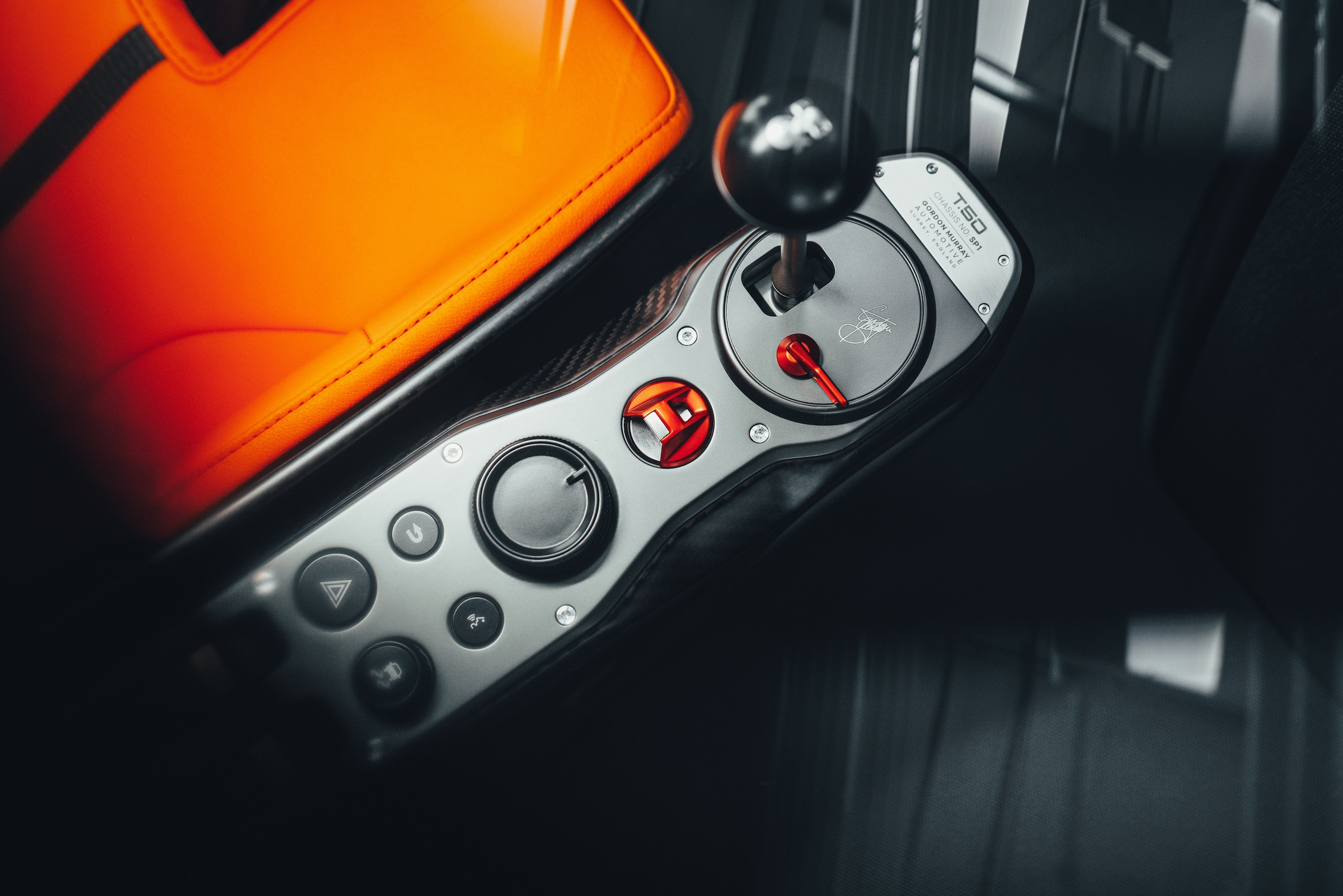
Look down to the driver’s right and the gear lever has an unusual amount of visual independence. Its supporting arm is open beneath, leaving the mechanism legible rather than burying everything in a deep console. Gordon Murray Automotive identifies titanium in the gearstick and exposed gearchange mechanism. In the photograph, the material catches a different light from the dark surrounding trim, making a small functional object feel carefully placed.
The nearby red-covered start button introduces another deliberate interruption. Much of the control panel is restrained in colour, so the red element supplies a precise point of emphasis. The effect depends on scarcity. If every switch had the same visual volume, the distinction between ordinary adjustment and the start of a drive would disappear. Here the composition establishes a small sequence without requiring an explanatory animation.
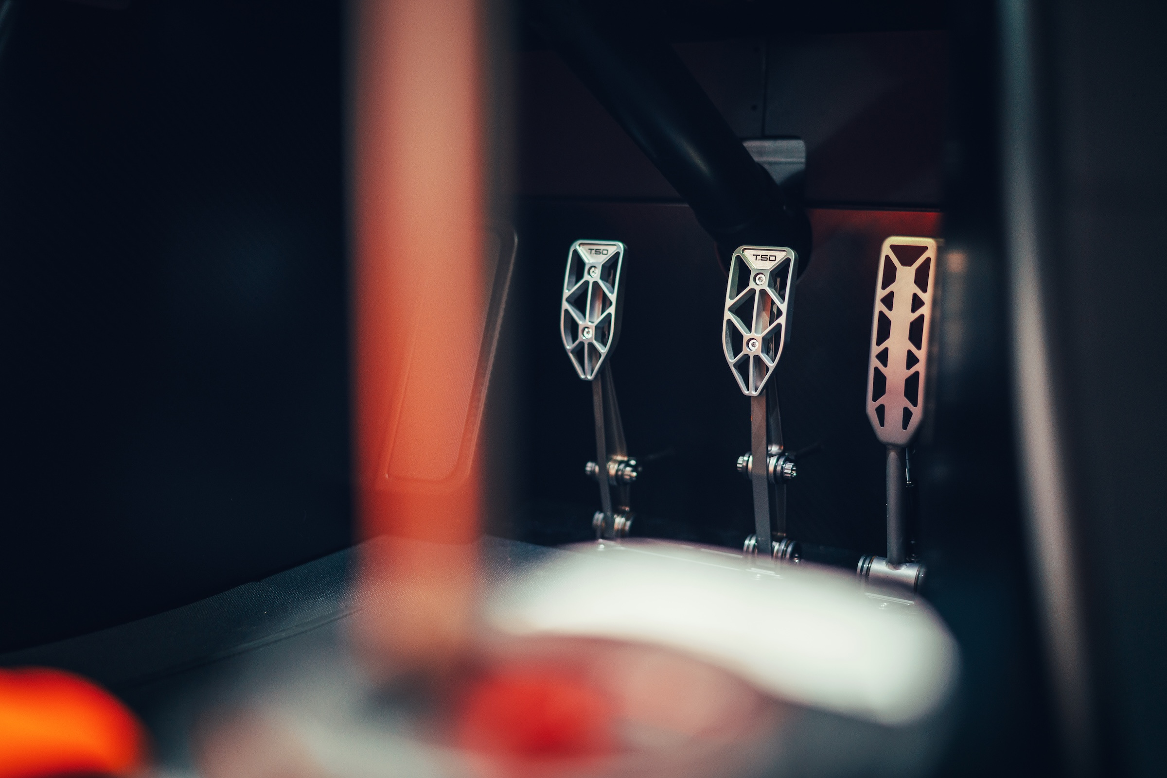
The pedal photograph develops the same idea at another scale. Open, skeletal forms replace the visual mass of a solid slab. The manufacturer describes aluminium brake and clutch pedals and a titanium accelerator; the images let the reader inspect the different shapes without pretending to communicate their resistance underfoot. Material, machining and the spaces between the parts become the interior’s ornament.
Reading the rear before reading a number
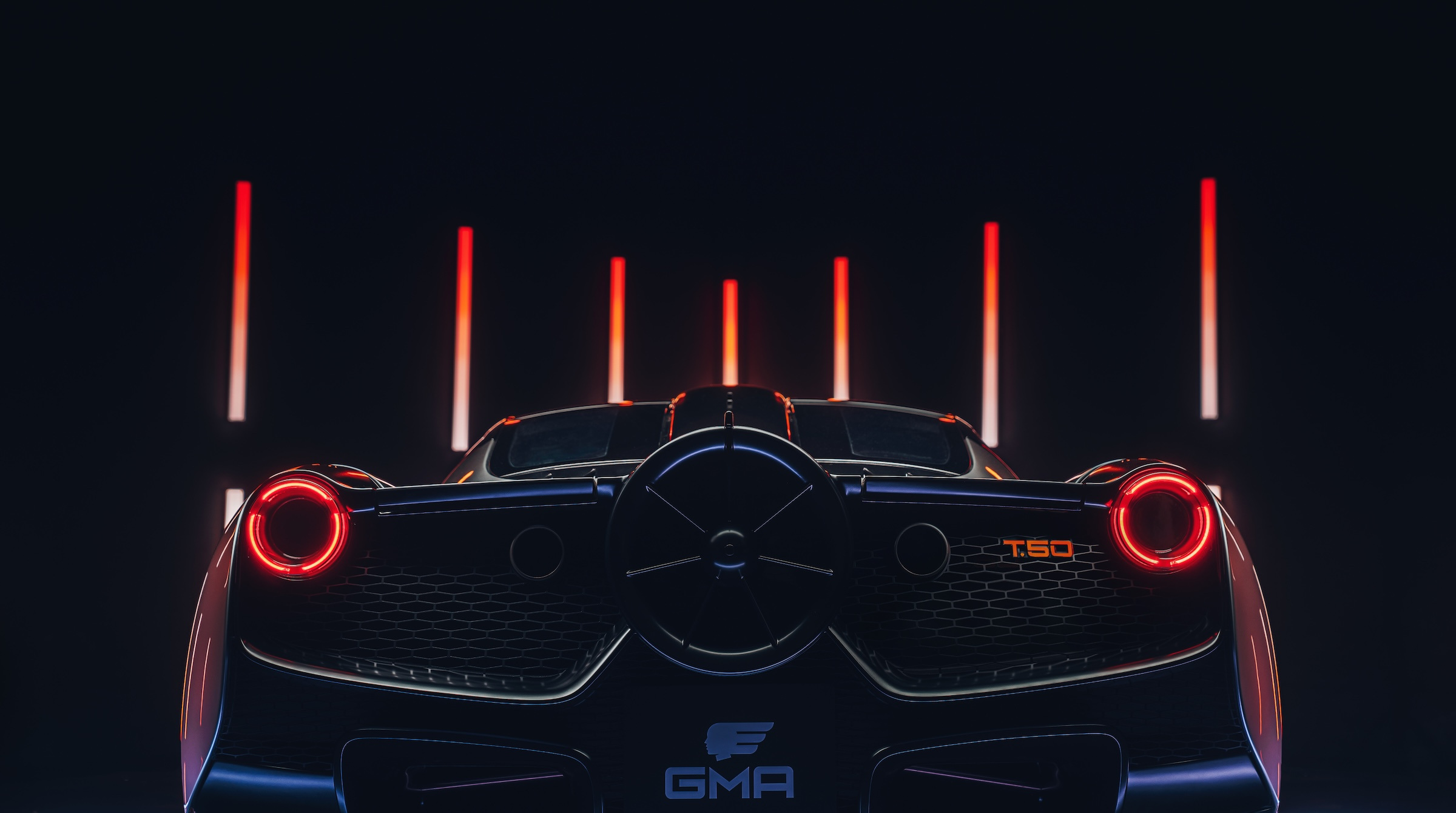
At the back, the fan occupies the position that might otherwise become a large central exhaust statement. The circular opening gives the rear a recognisable focal point, balanced by two round lamps at its edges. The fan is a functional aerodynamic device in GMA’s account, with a stated diameter of 400 mm. It is also the clearest visual explanation that this car follows its own engineering programme.
The dark studio sequence makes that arrangement particularly easy to read. Red lighting draws a horizontal line across the body while the central opening remains a deep circle. There is little need for a complicated graphic signature: three circles and a broad, low structure carry the composition. A closer rear photograph then reveals how much surface and mesh sits between those apparent essentials.
An image cannot demonstrate downforce, throttle response or braking distance. It can, however, explain why the rear looks the way it does. That is a more useful starting point than repeating a manufacturer’s performance superlatives. The fan should be read as a documented design decision, with its operating results requiring the test conditions and technical evidence appropriate to each claim.
The specification deserves careful reading
The current official model page and the original reveal are not interchangeable specification sheets. Even the current page contains different power and torque figures in its introductory copy and technical table. Rather than select a convenient headline figure, this study concentrates on the features that can be identified consistently. An exact car’s documentation remains the proper place for a purchase or service decision.
| Element | What the official material establishes | Why it matters to this design reading |
|---|---|---|
| Seating | A central driver with two passenger places | The cabin has one clear organising axis |
| Transmission | A six-speed manual | The exposed lever belongs to an operating system, not a styling theme |
| Rear aerodynamics | A 400 mm fan | A working component becomes the rear’s defining form |
| Engine layout | A naturally aspirated Cosworth V12 | The rear compartment is part of the architectural story |
| Published output | Different figures appear across official sections | Do not treat an undated headline as a reconciled technical certificate |
This distinction does not diminish the car’s design interest. It makes the account more useful. A specification table should identify what it describes, rather than turn every available number into an apparently settled fact. The seat layout and manual transmission are sufficient to explain the editorial argument here; an unresolved output figure would add drama without adding understanding.
A complete object, not a collection of details
The raised-door side view brings the separate observations back together. The opening exposes the orange seat, the sill defines a strong lower boundary and the rear body extends behind a compact cabin. That single photograph connects an exterior silhouette to an interior arrangement. It earns its place because it answers a question that the front three-quarter image cannot.
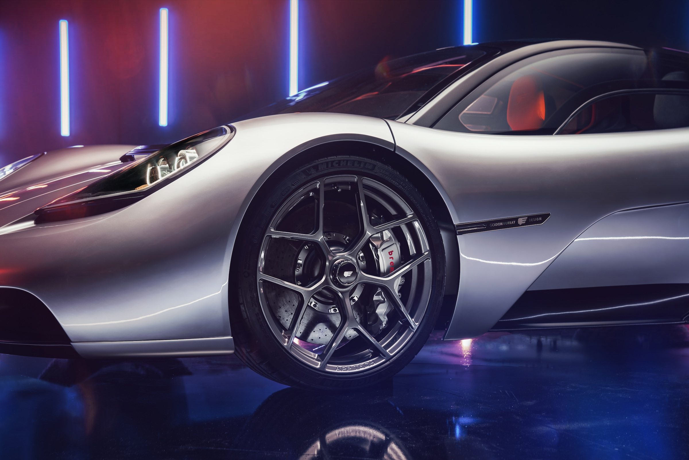
The studio lighting also needs to be understood as presentation. Blue and red reflections intensify edges and make metallic surfaces change character across the sequence. They are not evidence of a particular paint finish in daylight. Alternating the complete car, cockpit and close details allows the design to remain readable even while the photography supplies its own theatrical atmosphere.
For a collector looking beyond a headline, this is the productive territory: how the object establishes priorities, how controls are made visible and how an unusual engineering component shapes the whole. Those questions survive changes in fashionable display technology. They also give a more precise vocabulary for discussing personal specification than simply asking whether the car looks dramatic.
The Luxe Digital view
The T.50 makes its strongest design statement by giving the driver a clear place and the mechanisms room to be seen. Its central seat, exposed controls and unmistakable rear arrangement form a coherent argument. The interest lies in how those decisions reinforce one another, rather than in treating each component as another exceptional statistic.
The T.50 makes its strongest design statement by giving the driver a clear place and the mechanisms room to be seen.
Sources & credits
Sources and methodology
Independent automotive design and material analysis of the named official records and imagery, checked on 16 October 2026. Original presentation and model dates are retained. Images show the named commission or identified model configuration. Independent automotive design analysis of official model or individual-commission records and imagery. No drive, visit or interview is claimed. Original dates, alternative specifications, source compositions and drawings remain identified. Current availability, price and measured performance are not inferred.