A compass rose gives direction to a map. In Dior’s Rose des Vents, it gives direction to a small surface: a star-like centre held within a rounded, beaded edge. The contrast is immediately readable. Pointed rays meet a circular boundary, while a coloured or pale face supplies a quiet field around the centre. The result can be understood at a glance without losing its interest when the eye moves closer.
A compass rose at the scale of a jewel
Dior’s official anniversary account dates the collection’s creation to 2015 and connects it with Victoire de Castellane. That account celebrated its tenth anniversary, a 2025 milestone. The current catalogue provides the objects and photographs considered here in October 2026. Keeping the origin, anniversary and present viewing date distinct allows the line to be discussed as an established jewellery language, rather than presented as a newly launched collection.
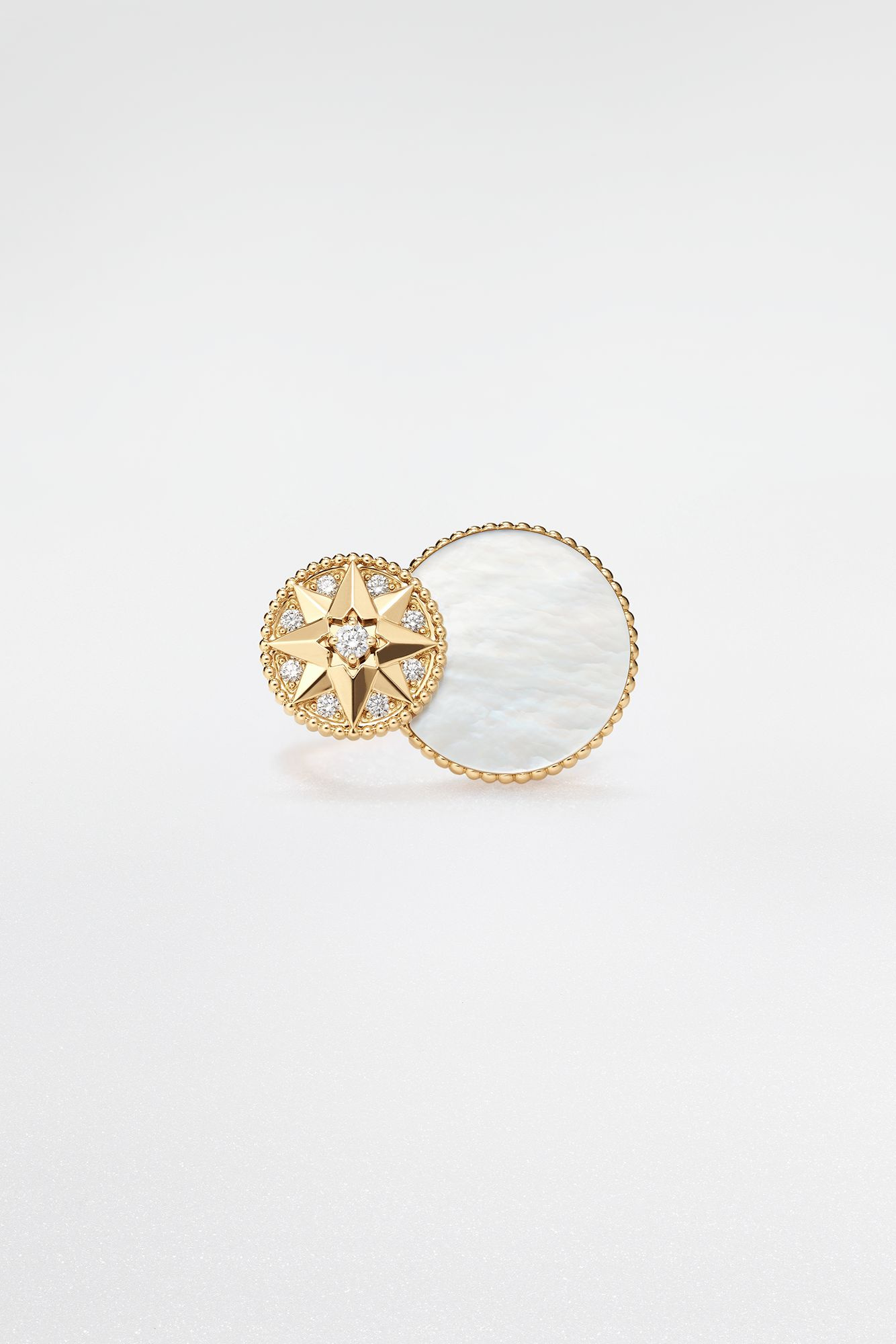
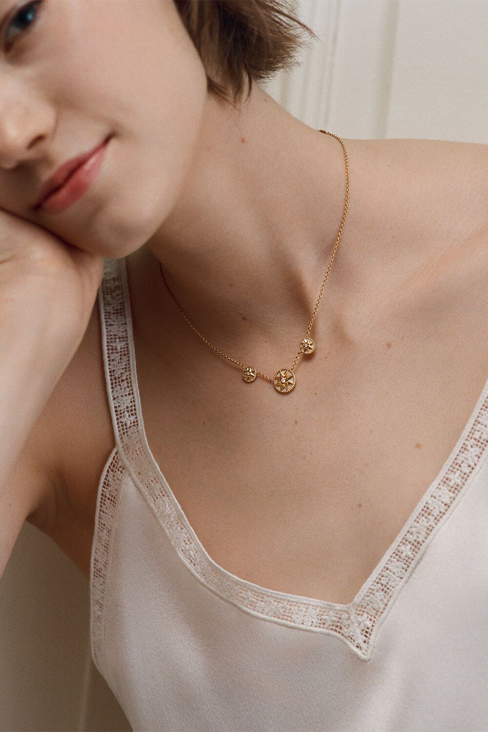
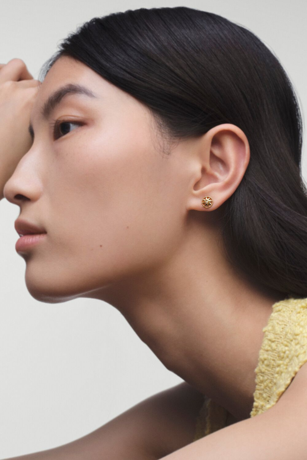
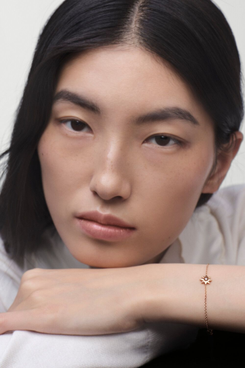
The official imagery alternates between complete objects and portraits. The ring is shown at studio scale, with its face and surrounding structure visible. The necklaces, bracelets and earrings are then encountered on the body, where the same small emblem has to coexist with clothing, skin and movement. Those changes of setting explain more than a sequence of close crops could: they make the collection’s recurring form legible at several distances.
The garden supplies the origin, not the specification
The maison’s account traces the inspiration to Les Rhumbs, Christian Dior’s childhood house in Granville, and a mosaic compass rose in its garden. That is a specific place and visual point of departure. It connects the collection with the founder’s surroundings without turning every contemporary object into a literal model of the garden. A mosaic belongs to a fixed surface; jewellery has to carry its image into a different scale and a different relationship with the viewer.
Seen in that context, the circular face becomes a small field of orientation. The star directs attention outwards, while the beaded border brings it back towards the centre. This is an editorial reading of the visible form, not a claim about the wearer’s personal symbolism. The origin gives the motif historical context; the object still needs to work through proportion, colour and its own physical outline. Its meaning does not have to be prescribed for its design to remain clear.
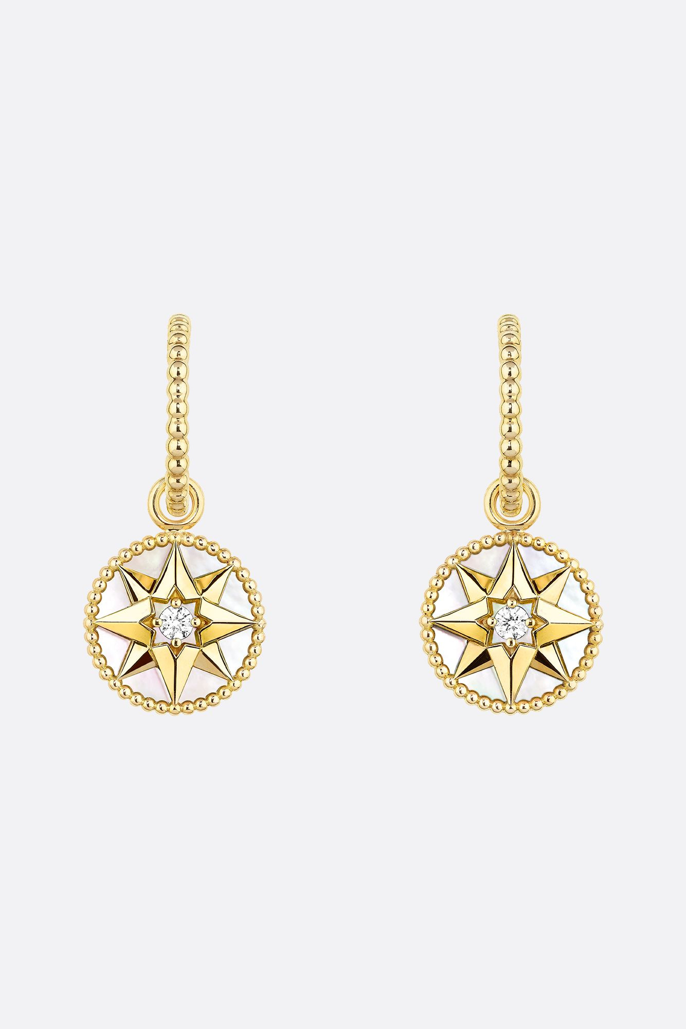
Nor should the story substitute for a product description. A ring, a bracelet and an earring may all carry the compass-rose idea, but their metals, stones and dimensions remain reference-specific. The pale surface visible in a photograph is not by itself a gemmological identification. Where the official product record names mother-of-pearl or another material, that wording belongs to the named reference. A collection-wide narrative should not silently extend it to every medallion in a styled image.
The border gives colour a contained field
The ring’s complete studio photograph makes the relationship between star and edge especially clear. The central figure is crisp, but it does not fill the whole face. A surrounding field remains visible, and the beaded perimeter gives that field a defined boundary. It is a small compositional balance: the sign must be strong enough to read, while the surface around it must have enough room to contribute colour and contrast.
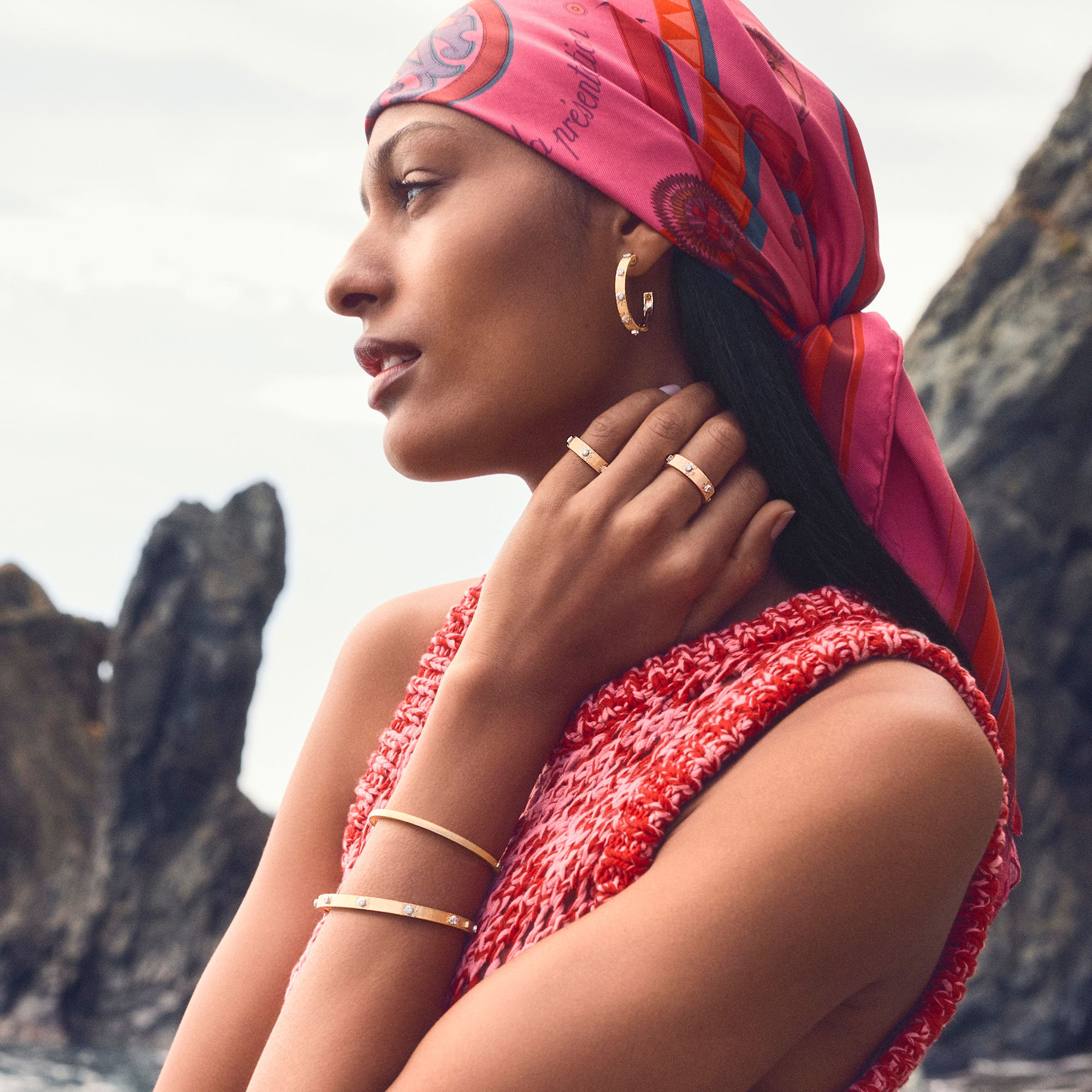
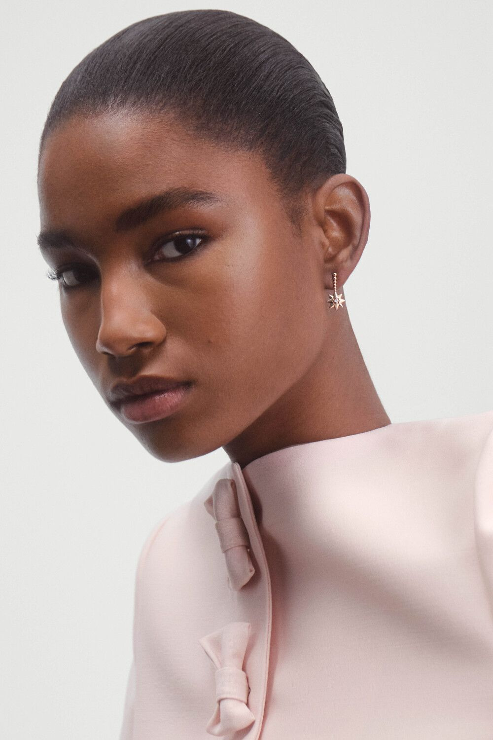
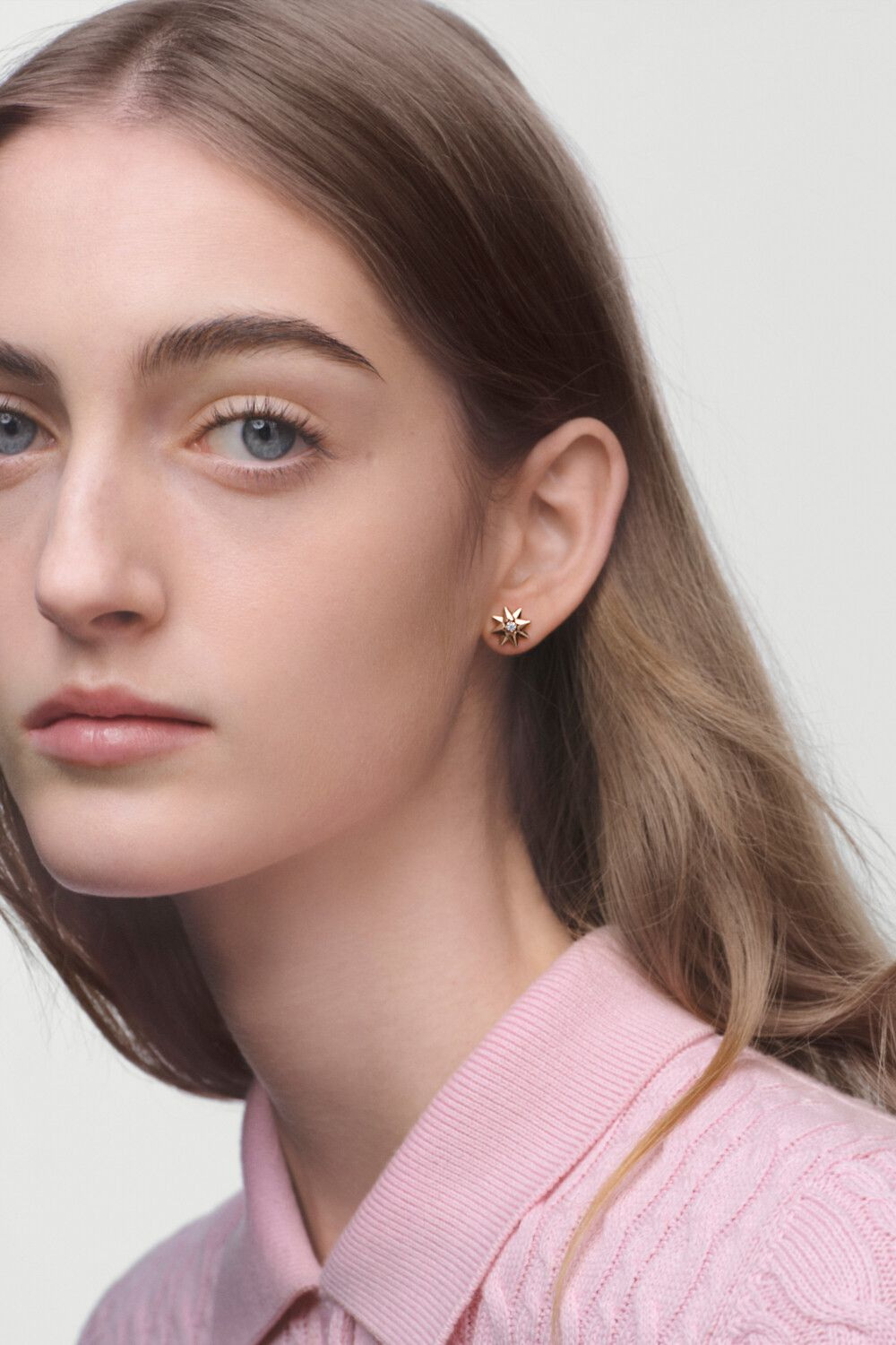
The earrings repeat that balance on either side of the face. In profile, the medallion meets a very different background from the white studio field. Skin, hair and a collar can either emphasise the pale centre or soften its contrast. The photograph makes that relationship visible without needing to place every object against an identical backdrop. Rose des Vents retains its identity because the star and border continue to work together as the surroundings change.
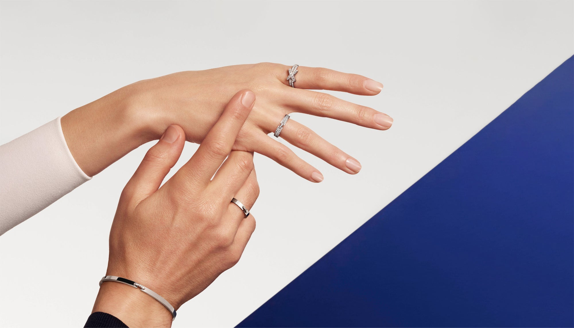
The wrist photographs add the interval between objects. A bracelet’s centre is part of a longer route around the arm, and the eye notices the transition from chain to medallion. When more than one piece is worn, the spaces between them become part of the composition too. The collection can therefore be read through repetition without assuming that a fuller stack is always more effective. One visible star and a quiet margin of skin can have a different, equally deliberate presence.
Dress gives the medallion its measure
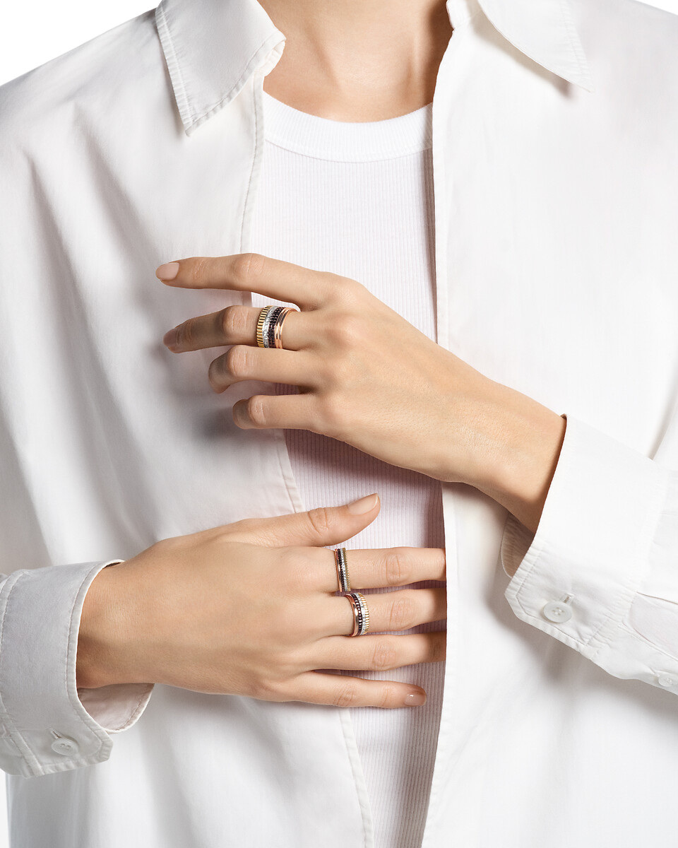
In the necklace portrait, a light shirt supplies both scale and contrast. The jewel sits in relation to the opening of the garment, so its position is understood as part of a neckline rather than as a suspended object in empty space. A change in clothing could alter that relationship substantially. The photograph is valuable because it shows one complete arrangement, not because it promises the same effect for every chain length or outfit.
The more concentrated portraits give the earrings and bracelets another kind of attention. Their small surfaces remain visible, but the body prevents them from becoming enlarged abstractions. This is why both studio and worn views belong in a considered presentation. The studio frame explains the design; the portrait explains the proportion. A reader can move between the two and see which details remain legible when the jewel returns to the dimensions of a person.
If considering a particular piece, begin with that change of distance. Look at the complete object, then at a photograph showing the whole relevant area of the body. Confirm the exact length, size and closure with the maker. A reversible or moving feature, where specified for an individual reference, also needs its own instructions; it should not be inferred for every object because the collection uses a medallion. The design story is shared, but the practical decision remains precise.
Three dates, one continuing line
| Context | What Dior documents | How to read it now |
|---|---|---|
| Origin | Rose des Vents created in 2015 | The beginning of an established line |
| Anniversary | The official account marks ten years | A 2025 milestone, not a 2026 launch claim |
| Current catalogue | Present collection and official imagery | The basis for this October 2026 visual study |
The chronology concerns the line’s published history. It does not date the manufacture of a particular jewel or establish current availability in every market. The images are official styled photographs, and the observations concern visible design rather than an independent wearing session.
The Luxe Digital view
Rose des Vents is most persuasive when its compass rose is given enough surrounding space to remain a small, precise composition. Dior’s star, coloured field and beaded boundary provide three distinct things to look at. The Granville origin adds context; the lasting visual interest lies in how those elements continue to organise a jewel against the body.
Rose des Vents is most persuasive when its compass rose is given enough surrounding space to remain a small, precise composition.
Sources & credits
Sources and methodology
Independent visual analysis of current official imagery and named product records, checked on 14 October 2026. Historical introductions, manufacturer specifications and visual observations are kept distinct. No visit, interview, independent handling or appraisal is implied.
- Dior — source 1: Current official collection, named designs, dated context and selected image provenance.
- Dior — source 2: Official anniversary account, 2015 origin, Victoire de Castellane and Granville compass-rose inspiration.