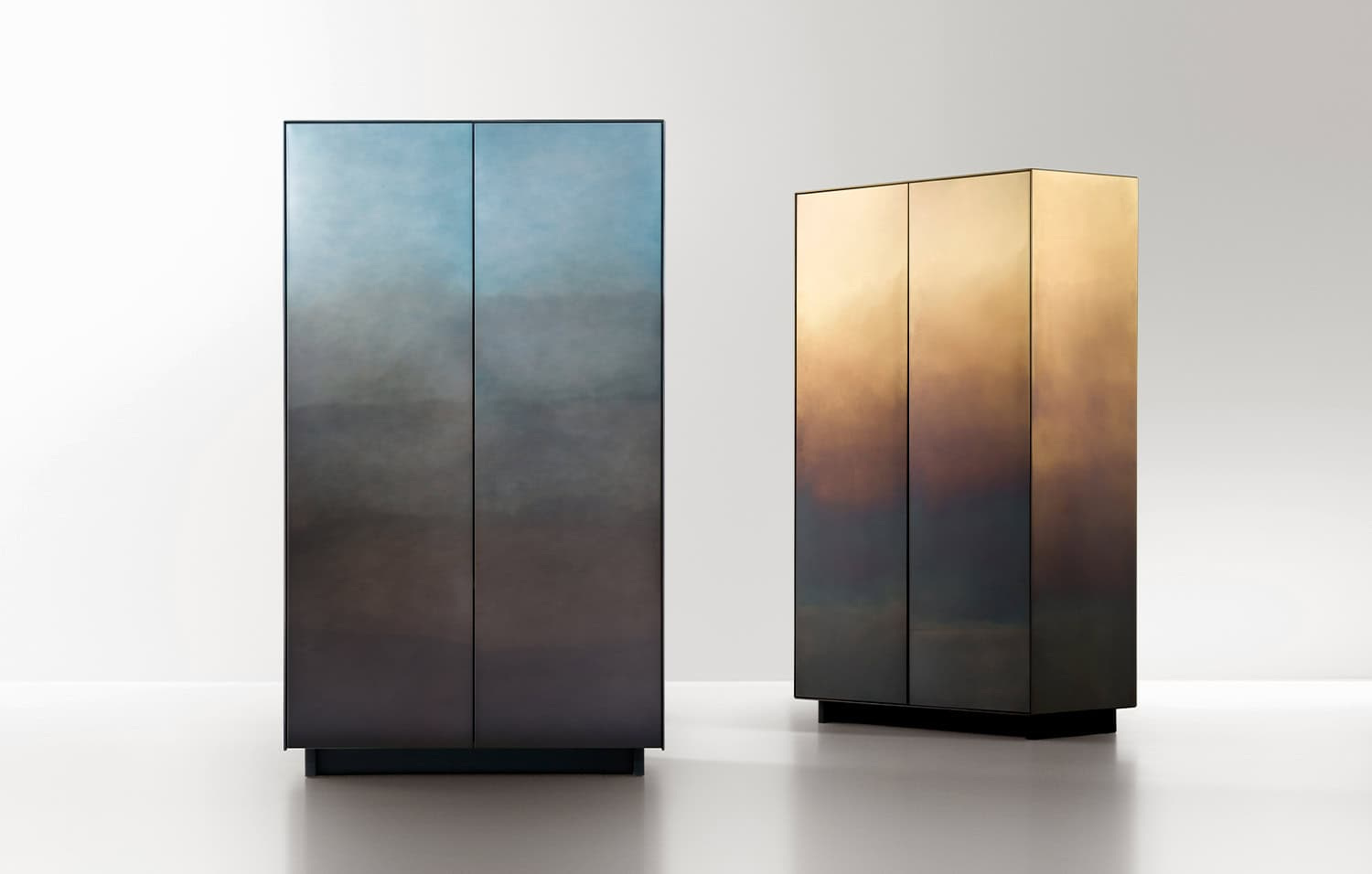
Some surfaces reward a long look because they resist a single description. De Castelli’s DeMarea moves between metal, colour and the suggestion of a tide line. A close view reveals variation; a complete object reveals how that variation has been composed across an edge, a door and a larger volume.
A finish with a direction
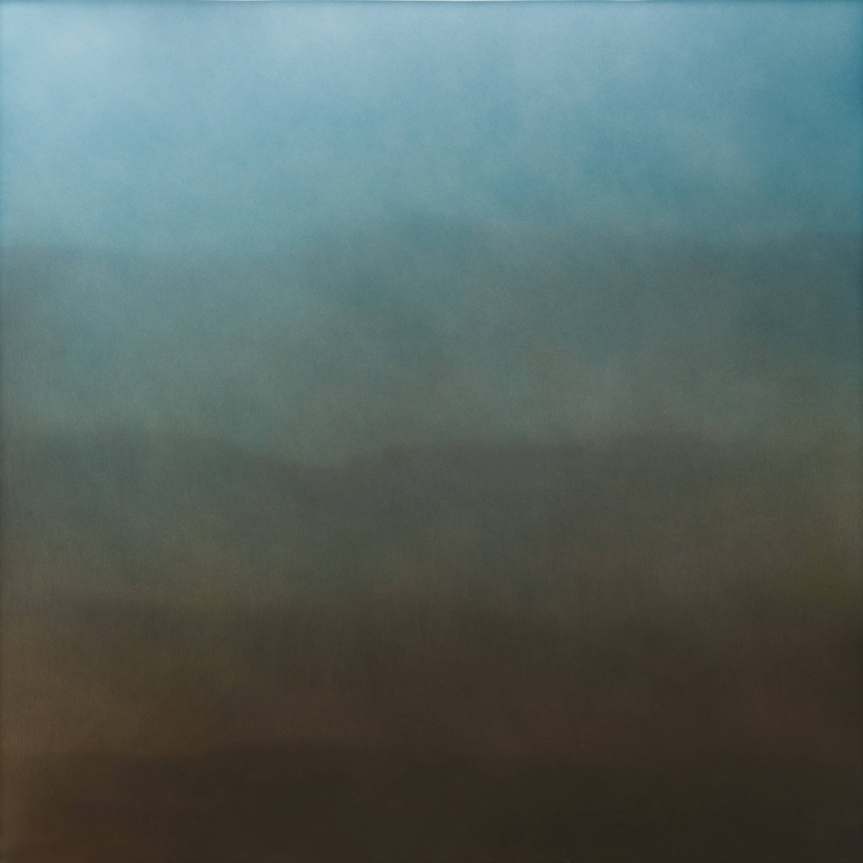
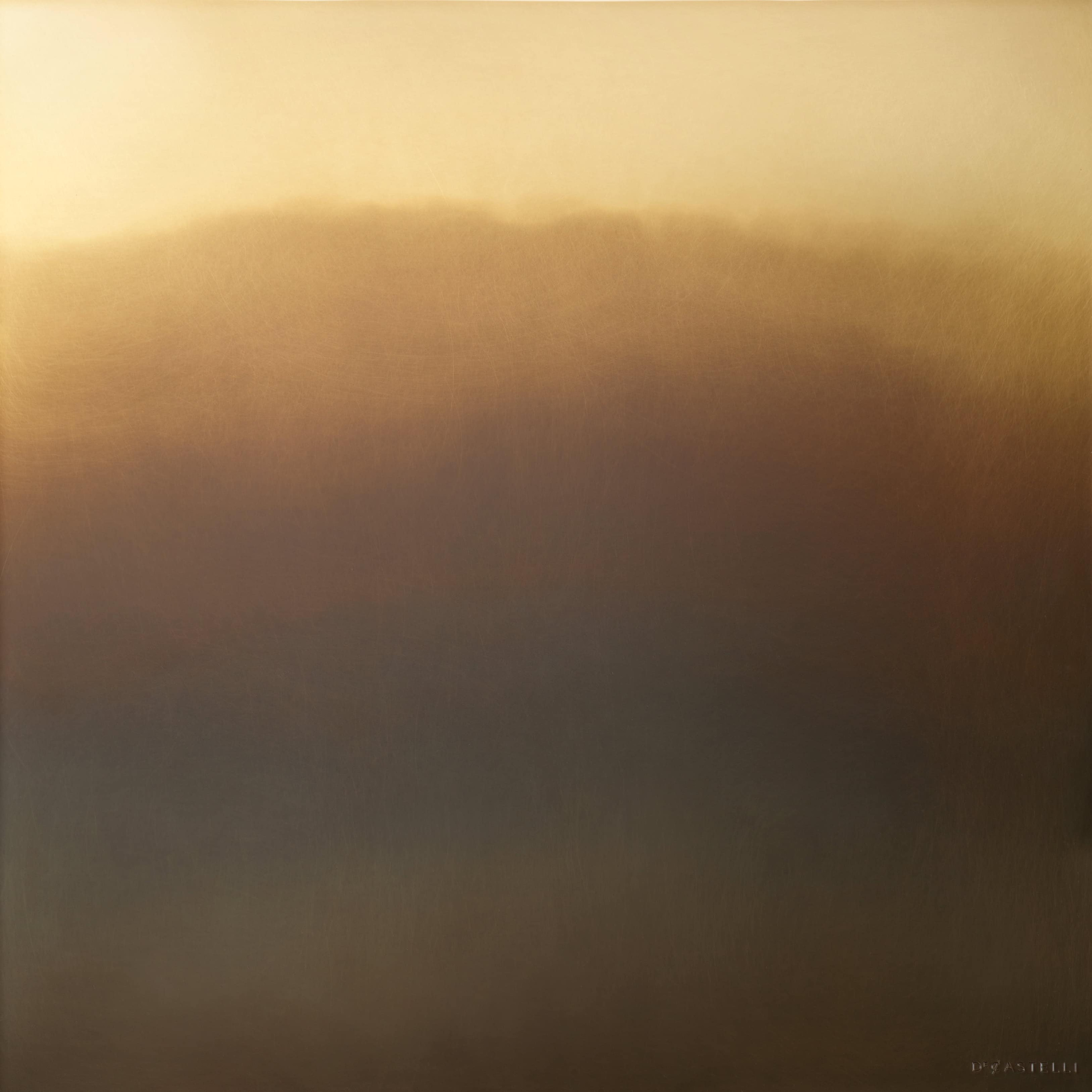
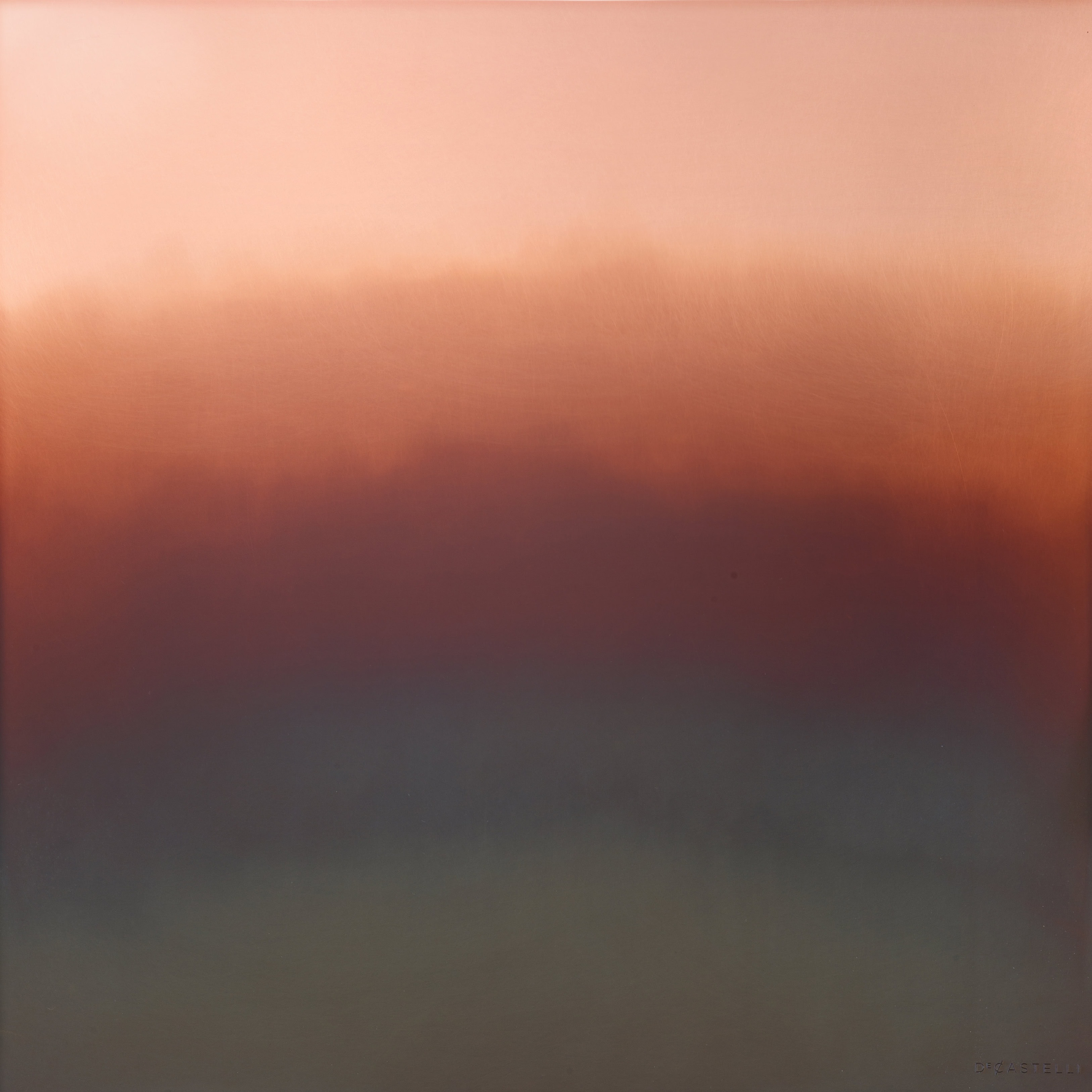
De Castelli identifies DeMarea as a handcrafted finish designed by Zanellato/Bortotto. The maker describes overlapping manual oxidation followed by a transparent protective varnish. Its current material record distinguishes stainless steel M4, brass M6 and copper M5, each with a different colour character in the published samples.
That distinction should survive the moodboard. A blue-grey steel sample, a warmer brass surface and a copper field are not merely three filters applied to the same image. They are named material and finish combinations. The project needs to specify which combination is intended, together with the object or surface on which it will be realised.
The most immediate visual quality is the movement across the field. Colour does not stop at a crisp geometric division. It builds, recedes and leaves irregular boundaries that suggest something accumulated through a process. This gives the metal a different presence from a uniform painted plane, even when viewed at the scale of a relatively small sample.
The sample is the beginning of the conversation
An artisanal surface raises a useful question: what should remain consistent, and what variation is part of the work? De Castelli’s official notes state that tone and homogeneity may vary and that identical reproduction is not guaranteed. That is important context for anyone comparing a sample with a future commissioned piece.
The conversation should therefore be more precise than choosing a colour name. Discuss the desired tonal range, the direction of the pattern and the relationship between adjacent surfaces. A small sample can communicate character; it cannot necessarily predict the complete appearance of a large three-dimensional object. The maker’s own notes distinguish the effects of geometry on the finish.
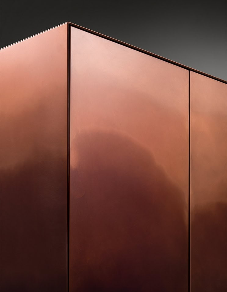
For the owner, this is not a reason to avoid variation. It is a reason to understand it before commissioning. A deliberate acceptance of material character is very different from discovering an unexpected difference at delivery. The project record should describe what has been approved and which aspects are expected to vary through the process.
From a surface to a volume
The official imagery includes Marea cabinets with a continuous field of colour crossing the front faces. The cabinet makes a useful change of scale after the samples. A finish is no longer an abstract square; it has to turn a corner, meet a door line and support the reading of a complete piece.
In that setting, the tonal movement supplies much of the visual activity. The outline can remain comparatively restrained because the surface already has depth. The eye moves across the colour before returning to the object’s proportions. This is one reason a richly worked material can be more effective when the surrounding composition gives it some quiet space.
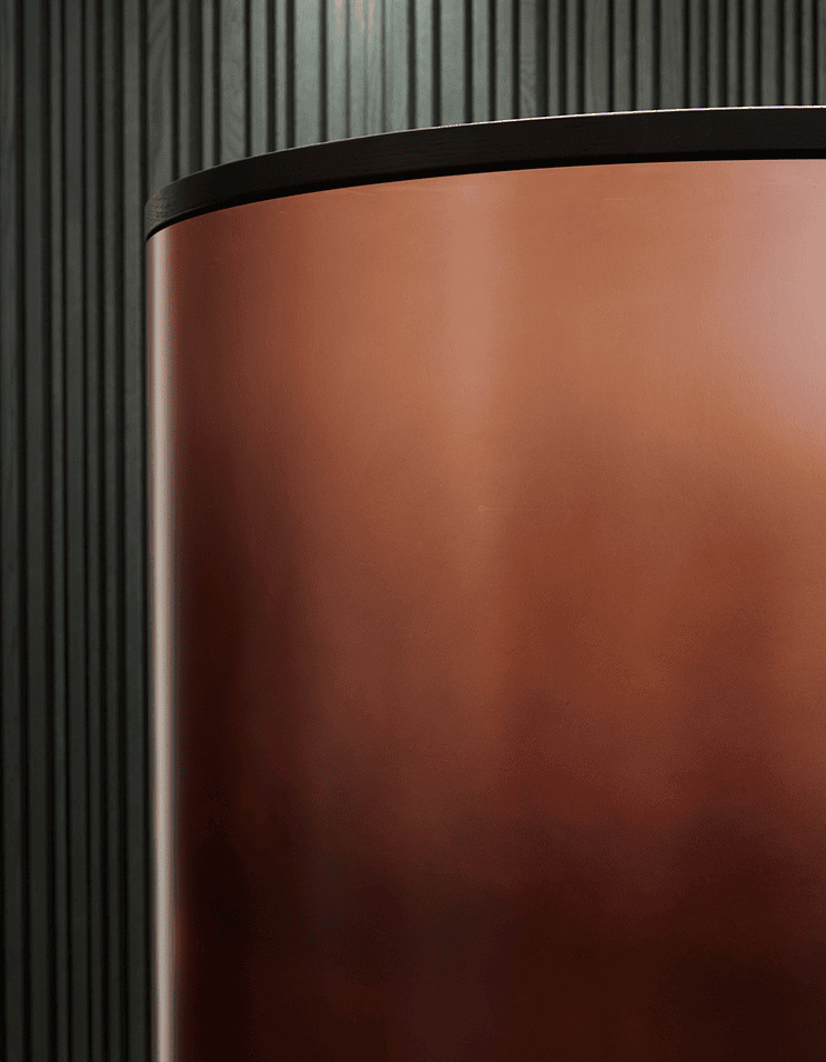
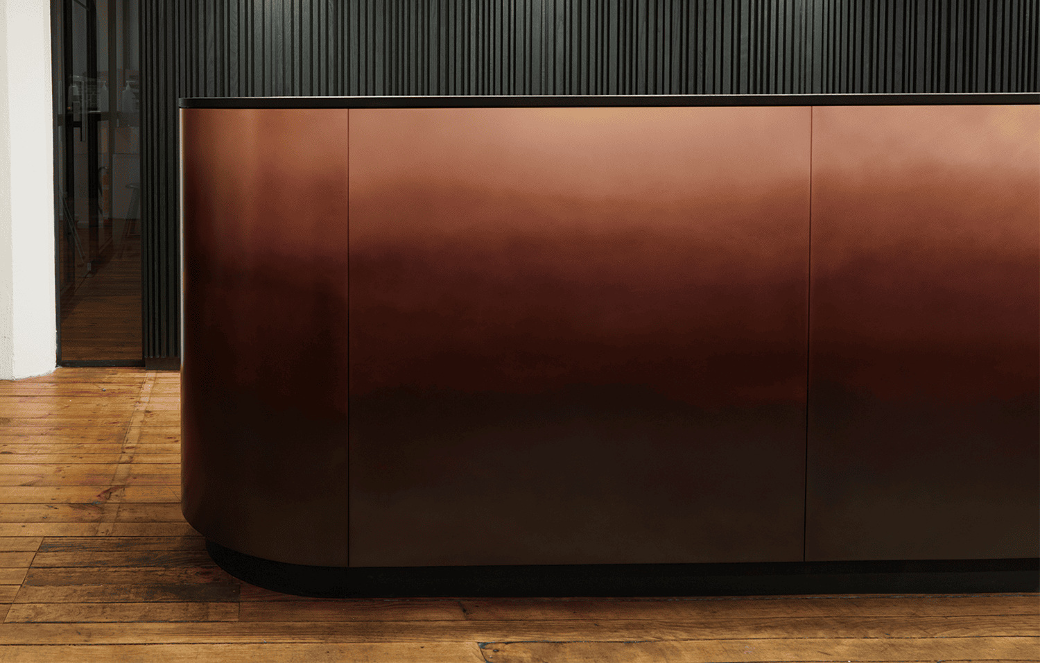
The photographs do not establish that every DeMarea combination is offered on every cabinet or in every dimension. The correct quotation should identify the chosen product or custom application and its feasibility. The broader material palette is a starting point for that discussion, not a universal promise of availability.
A material can organise a room
De Castelli’s record also places DeMarea in built projects. In the Speicherstadt reception example, the official project account identifies MARKETSTUDIOS and a copper application. The setting shows how a worked metal can become part of the room’s architectural identity, rather than an isolated decorative object.
At this larger scale, adjacency becomes especially important. A reflective or tonally varied surface will be read in relation to nearby timber, stone, paint and light. The most useful sample review brings those materials together. Looking at each in isolation can conceal an awkward competition between textures that becomes obvious only after installation.
Ask how the finish will be seen from the entrance and from the principal occupied positions. Will the tonal movement run with the room’s horizontal lines or cut across them? Does it need a broad uninterrupted area, or will joints and openings become part of its rhythm? These questions allow the material to participate in the design instead of being added after the composition is settled.
Commission the process as well as the appearance
The maker states that it offers complete design and custom production rather than supplying oxidised semi-finished sheets as a general material commodity. This makes the scope of the commission important. The desired image, the object’s geometry and the production route should be discussed as one connected brief.
| Decision | What the record establishes | What the commission must clarify |
|---|---|---|
| Base material | DeMarea variants for steel, brass and copper | Exact material and finish code |
| Variation | Manual processing produces individual results | Agreed range and sample approval |
| Geometry | Flat and three-dimensional surfaces may differ | The complete intended application |
| Composition | Tonal movement affects the reading of a volume | Pattern direction and adjacent materials |
| Care | A protective finish requires appropriate maintenance | Current care instructions for the supplied work |
No surface photograph can replace that record. It can communicate the ambition and help identify the qualities that matter, but a well-run commission translates them into agreed material, geometry and care information. That process is part of the value of the work, even when it remains invisible in the final room.
The Luxe Digital view
DeMarea is compelling because its colour belongs to a process and to a particular material. The finish gains another dimension when it turns across an object or establishes an architectural plane. Its richness is most persuasive when the surrounding design allows it to be read clearly.
For a reader commissioning a home, the lesson is to make variation an informed decision. For a studio or maker, the opportunity is to explain craft through evidence: a sample, a junction, a complete object and a realised setting. That progression says more about the work than a claim of exclusivity. It makes the relationship between appearance and production understandable, which is where a high-end material story should begin.
DeMarea is compelling because its colour belongs to a process and to a particular material.
Sources & credits
Sources and methodology
Independent design and reference analysis of the named official records and imagery, checked on 15 October 2026. Launch specifications and later product records retain their own dates and references. Images show the identified configurations. Original visual and commissioning analysis of the exact official product/project records and identified images. No visit, interview, comfort test or performance measurement claimed. Existing projects retain their dates; product versions, showroom photographs, sample images and official visualisations are identified separately.