A bracelet is seen in motion more often than it is seen in isolation. The wrist turns, a cuff passes over an edge and the light moves across a surface that never quite holds still. Clash de Cartier makes that changing surface the centre of its identity, combining a precise repeat with forms that resist a single, settled reading.

A surface made of contrasts
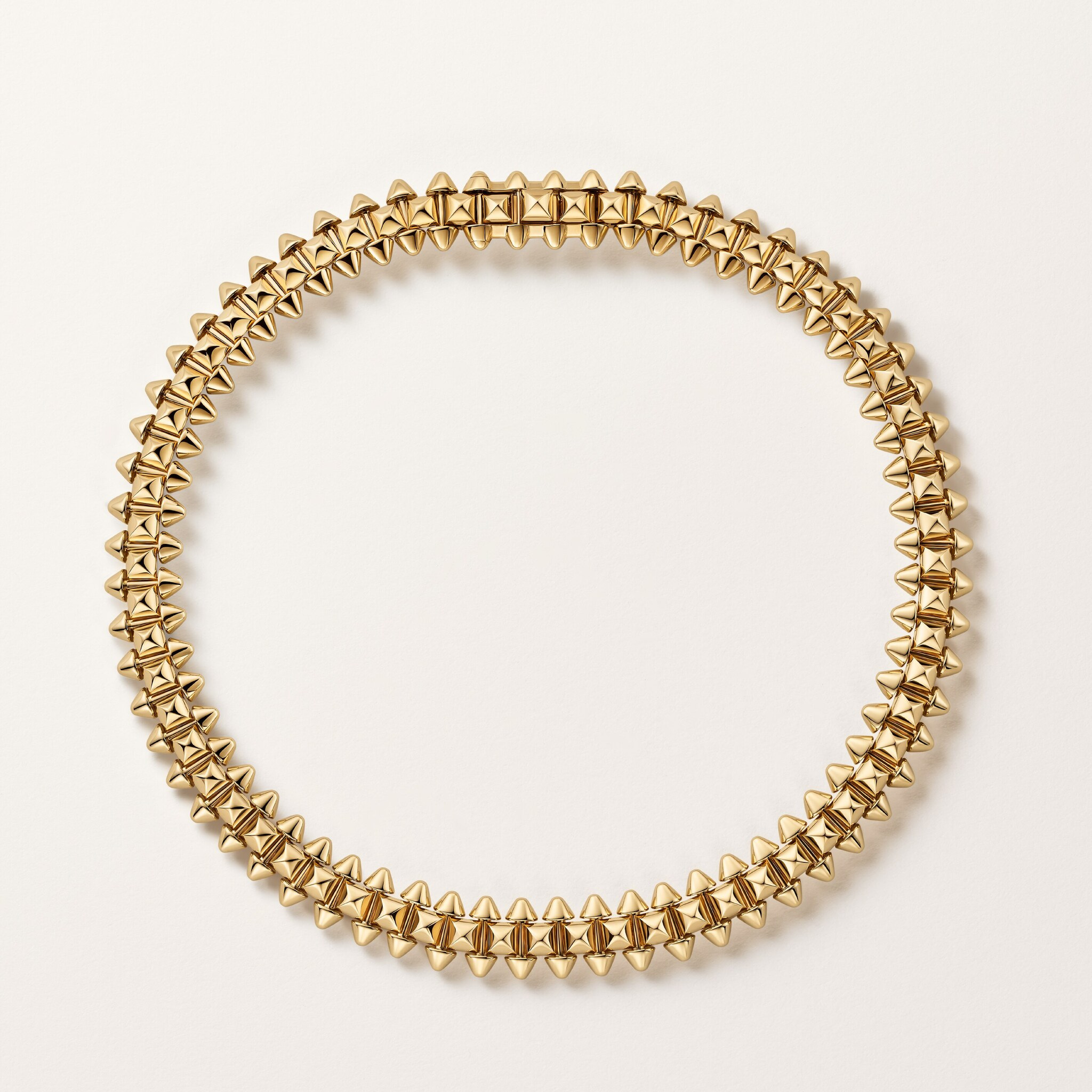
Cartier’s current collection presentation identifies studs, beads and clous de Paris as the visual codes of Clash. This feature concentrates on the flexible bracelet presentation, rather than duplicating a specialist necklace profile. The official studio and worn views provide a way to read the design at both object and body scale.
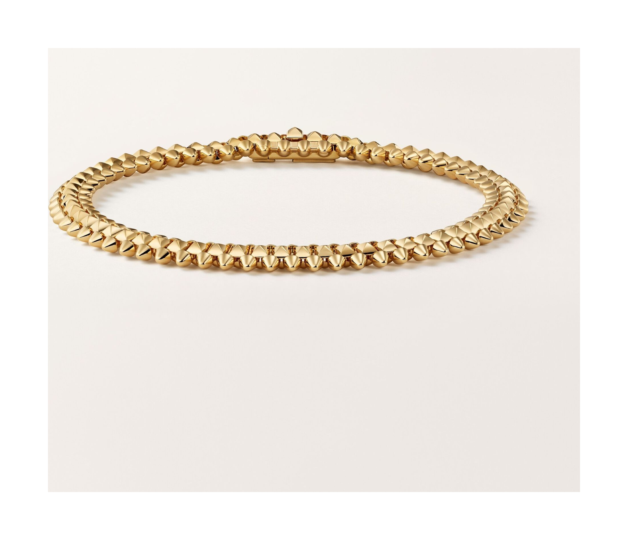
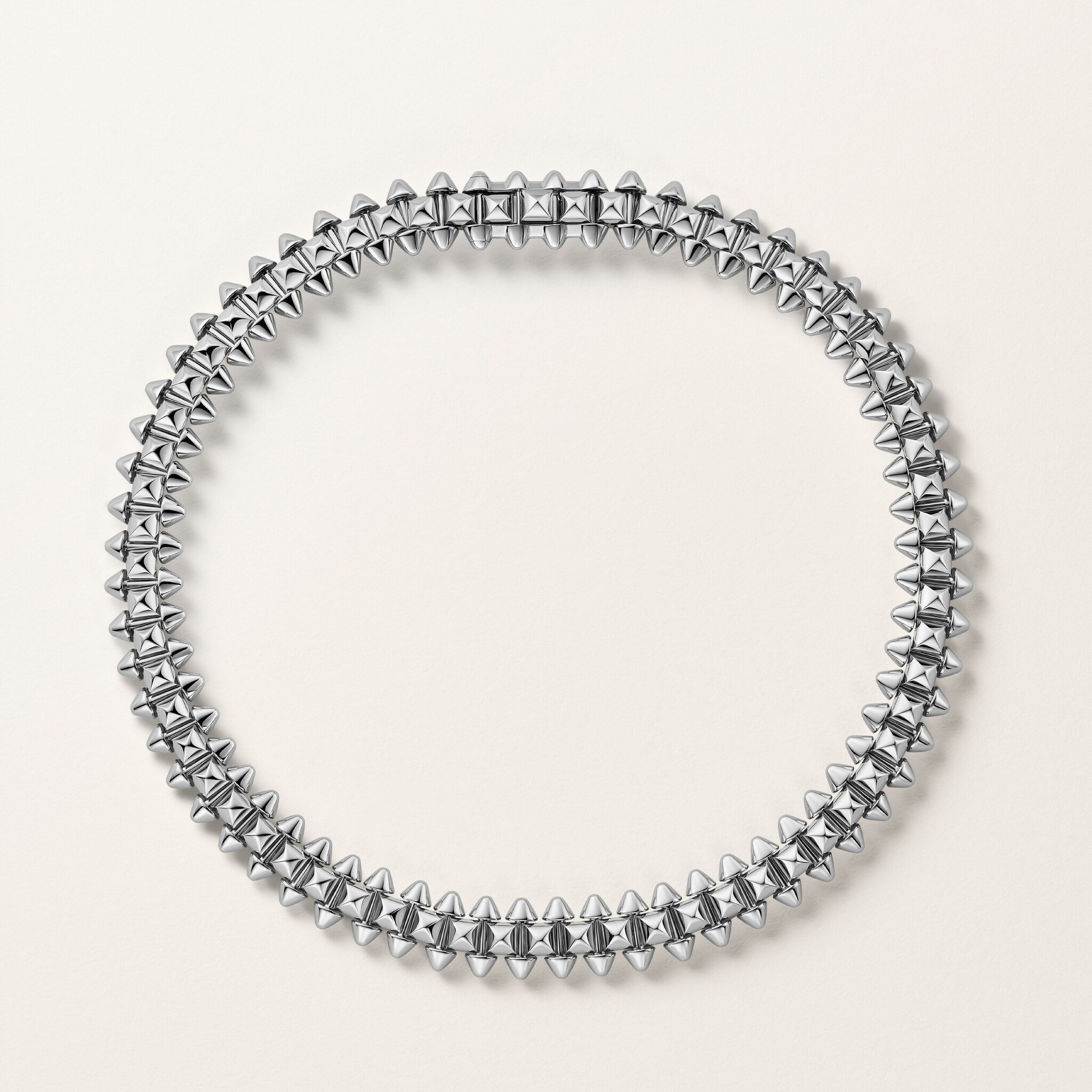
In isolation, the bracelet’s circle looks ordered and continuous. Closer inspection reveals a more varied edge: rounded elements interrupt sharper points, while the light alternates between the upper surfaces and the small spaces between them. The contrast is visible before the viewer knows any of the collection’s terminology.
That is the useful quality of a strong design code. The object does not need a written explanation to make its character legible, but the explanation can reveal why the first impression changes as the bracelet turns. The name becomes less important than the relationship between the parts.
The circle and the wrist
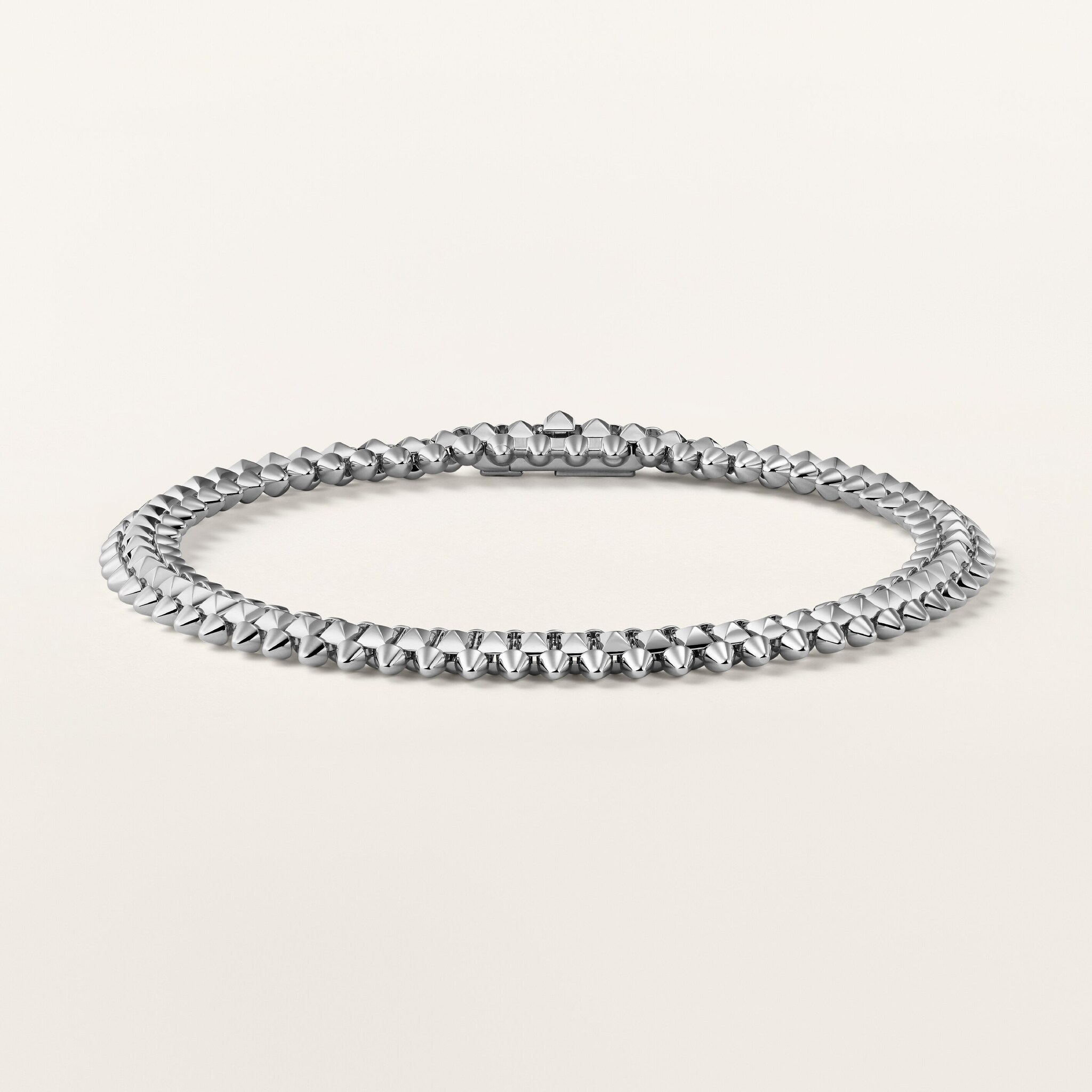
The isolated product views establish the complete circumference. A worn photograph then changes the reading: the jewel follows a particular wrist rather than hovering in an empty field. The eye begins to compare it with a sleeve, a hand and the space between skin and metal.
Cartier describes the pictured bracelet family as flexible, and its editorial collection story discusses that quality. Flexibility is therefore a documented product characteristic, not a conclusion drawn from a still photograph. Its practical consequences remain reference-specific: the appropriate size, fastening and comfort should be checked with the exact bracelet rather than inferred from a campaign image.
The distinction between flexibility and softness is worth keeping. A flexible construction can still have a strongly defined surface. The appeal of the Clash bracelet is that the repeating pattern retains its character while the complete object belongs to the movement of the wearer. The image tells us about the silhouette; personal fit requires a different kind of evidence.
Metal changes the visual weight
The official range shows the bracelet in different gold colours. In the product images, yellow gold gives the repeating surface a warmer, denser presence. The paler presentation makes the difference between highlight and shadow appear more pronounced, while rose gold introduces a different relation to skin in the worn views.
These are observations of the photographs, not a promise that a given finish will look the same under a reader’s daylight. The camera’s exposure and the background contribute to the comparison. An actual choice benefits from seeing the intended metal beside clothing and other pieces that are already worn regularly.
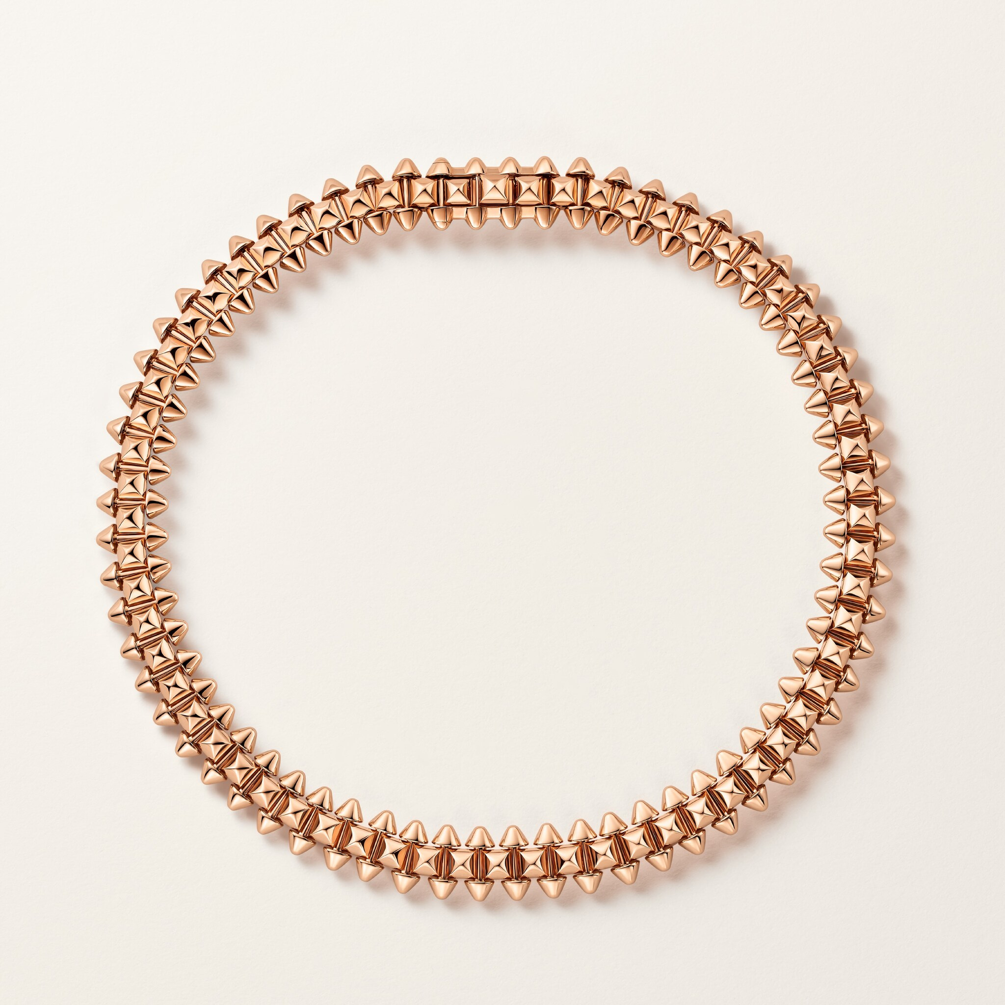
Do not turn colour into a rule about who should wear it. The more useful question is the effect the bracelet should have within a personal composition. It may need to provide a clear foreground, sit quietly beside another piece or bridge a contrast between a light cuff and a darker sleeve. Those intentions can lead to different choices without making one metal intrinsically preferable.
A cuff gives the object context
The campaign views are restrained enough to make the relationship to clothing visible. A simple garment leaves the repeating edge clear; a change in sleeve or hand position gives the same bracelet a different prominence. The most persuasive images restore ordinary scale rather than relying on an enormous isolated object to create drama.
This is also a useful way to approach a fitting. Bring the kind of sleeve the bracelet is likely to meet. Consider the edge of a cuff, the position where the jewel settles and whether the fastening can be handled comfortably. A photograph can suggest these questions, but it cannot answer them for another person’s wrist.
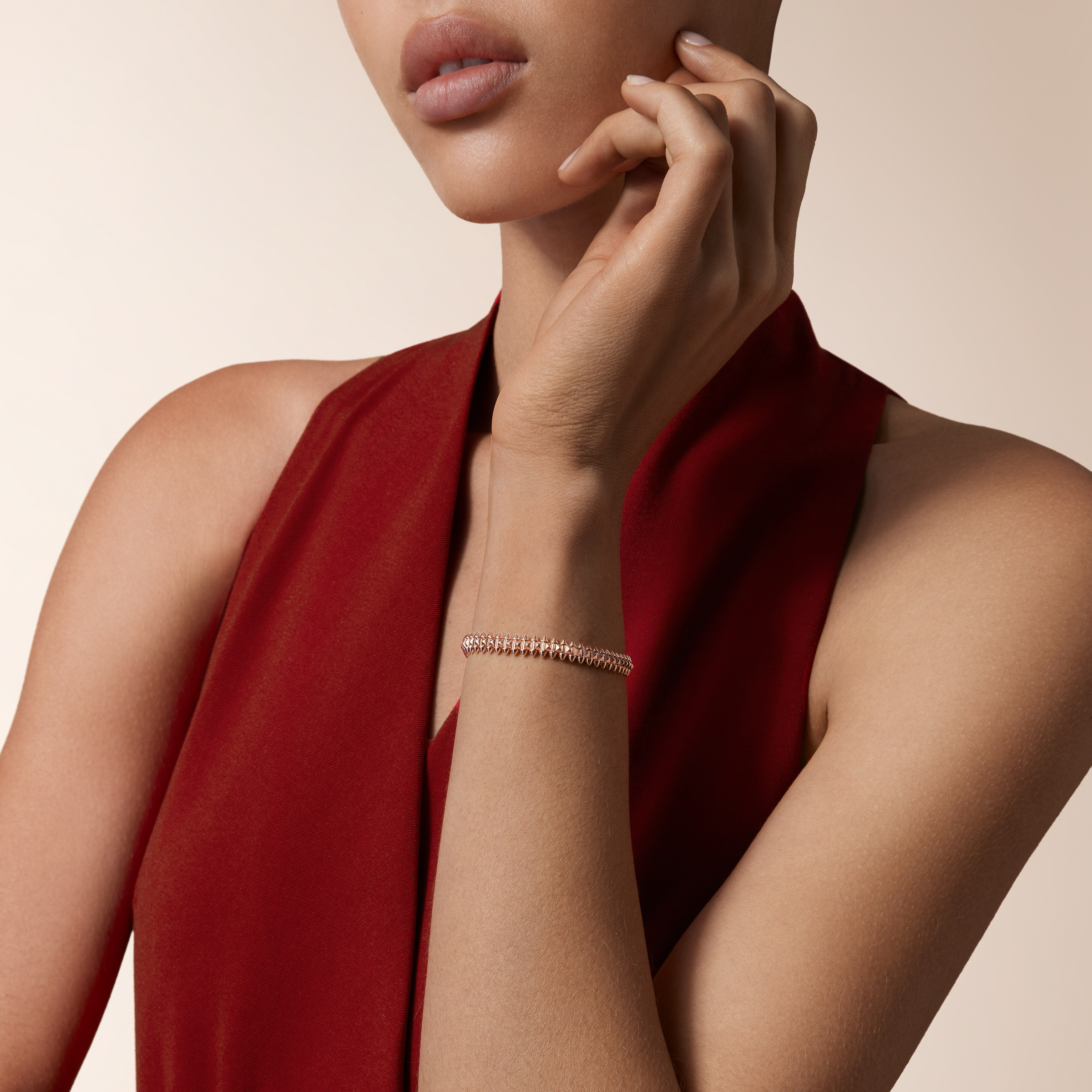
There is no need to assemble a full matching set to make the design coherent. A single repeating surface can carry the idea. Adding another jewel should introduce a considered relationship in scale or texture, rather than simply repeat the collection name. Restraint can make the bracelet’s construction easier to notice.
A fitting brief rather than a rulebook
| Decision | Useful visual reading | Evidence for the exact piece |
|---|---|---|
| Surface | Compare the circle with a close view of its repeat | Current product record and an in-person inspection |
| Size | Observe space between wrist and bracelet | A fitting of the chosen reference |
| Flexibility | Separate articulated behaviour from surface shape | The manufacturer’s description and actual handling |
| Metal | Review the effect beside skin and clothing | The specified material under real lighting |
| Fastening | Look beyond the uninterrupted studio circle | Demonstration of the actual closure |
| Pairing | Keep the bracelet’s edge readable | The pieces and sleeves it will meet |
Ownership starts with identification
Clash de Cartier is a collection, not one uniform technical specification. The jewellery page includes different categories and references. Dimensions, material and care must follow the item being considered, and a description of a flexible bracelet should not automatically be assigned to a ring, earring or another construction.
The official photographs used here are labelled as studio or styling views, with no implication that Luxe Digital has handled these pieces. Their value is in the design reading they enable. Purchase and service records should remain with the owner, preserving the exact identity behind the broader collection language.
The Luxe Digital view
Clash de Cartier gives a bracelet a changing surface within a clear outline. The design holds together because the repeat remains recognisable at different angles and at the scale of a wrist. Its most convincing presentation allows that relationship to unfold between the complete object, the close detail and the person wearing it.
Clash de Cartier gives a bracelet a changing surface within a clear outline.
Sources & credits
Sources and methodology
Independent editorial analysis of the documented product and official source imagery, checked on 14 October 2026. Visual interpretation is distinguished from manufacturer specifications. No handling, driving or acoustic test is implied; exact references and archival dates are retained.
- Cartier — source 1: Current collection codes and named flexible bracelet studio/styling views.
- Cartier — source 2: Official editorial story on contrasts and flexibility in the bracelet presentation.