Liens has more than one way to draw a connection. In Chaumet’s current presentation, crossed lines create one recognisable sign, while a divided circular form creates another. The difference is useful: Jeux de Liens is not simply Liens Harmonie seen from a different angle. They are distinct expressions within a family whose name directs attention towards the idea of a link.
A connection drawn in two directions
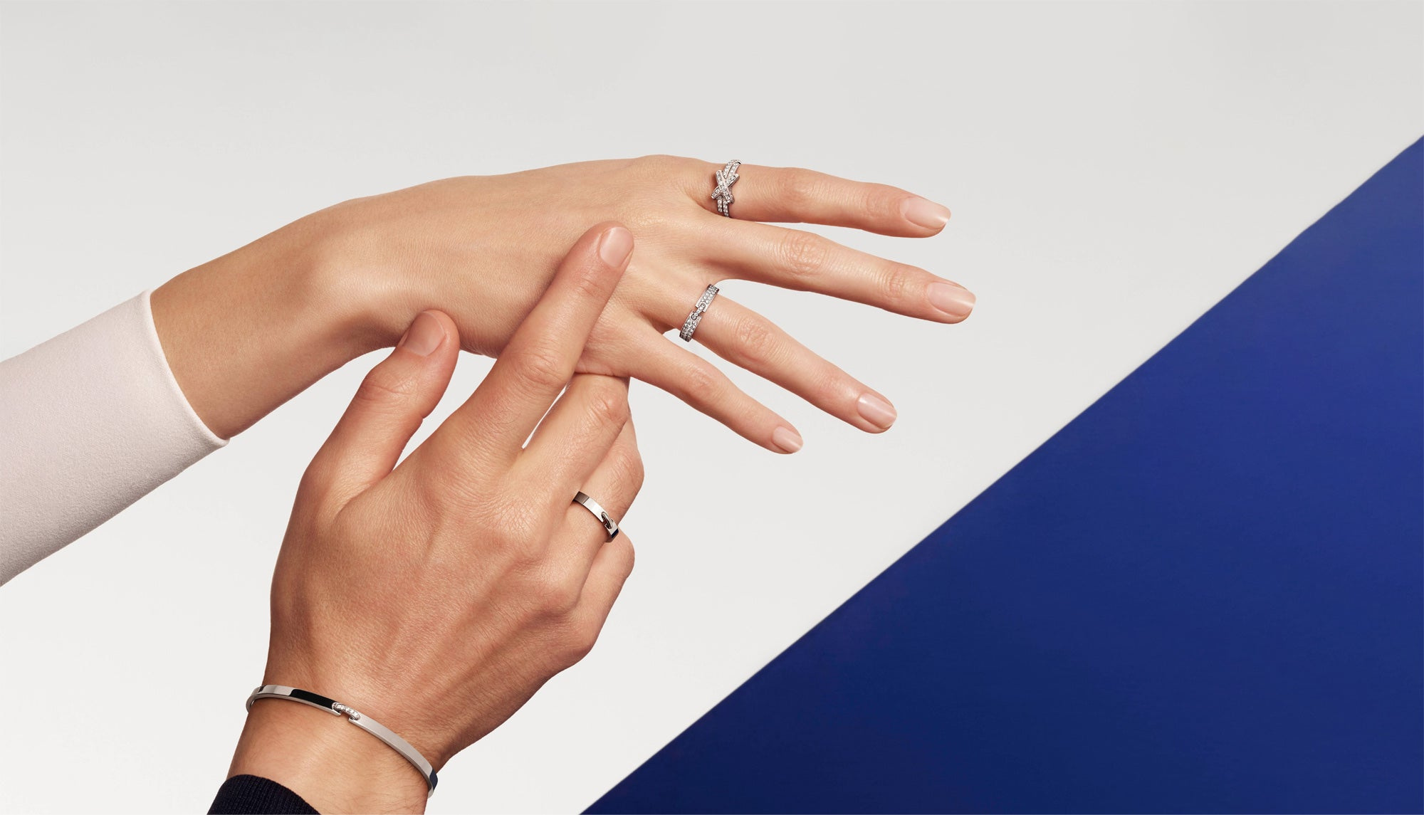
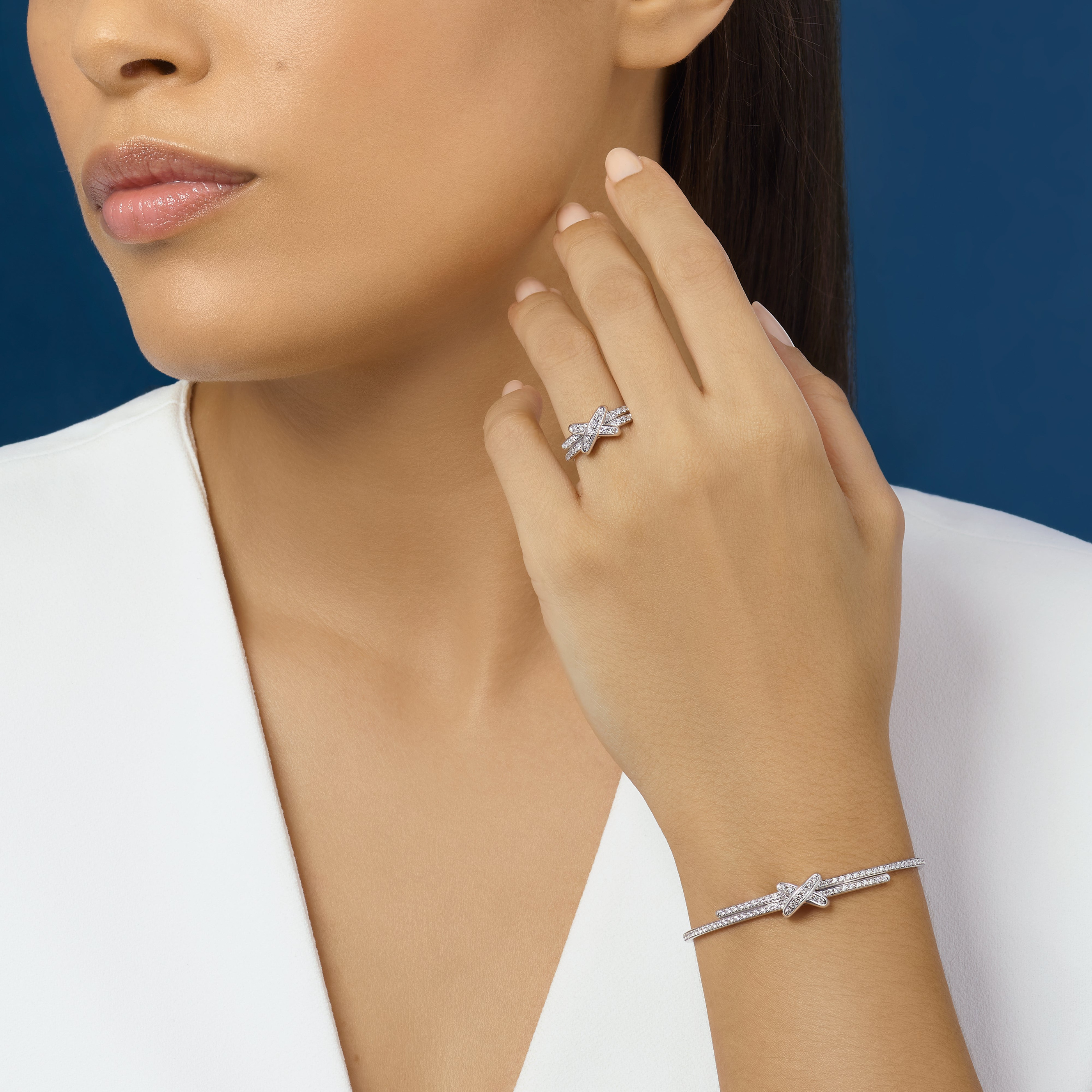
The opening photograph makes the subject tangible. Hands and wrists meet against a geometric blue background, with rings and bracelets providing small points of continuity between the gestures. The jewellery is not enlarged into a world without scale. It remains part of a person, so the viewer can judge how a crossing at the wrist differs from a broader ring on the hand.
The official Liens narrative and a small rose-gold pendant reference, 084220, provide the source context. The latter names mother-of-pearl and diamonds for that particular piece. The collection’s wider design story does not make every crossed or circular object share those materials. This article follows the visible forms across several objects, keeping the crossed Jeux de Liens and the circular Harmonie reading distinct.
Crossed lines make a compact sign
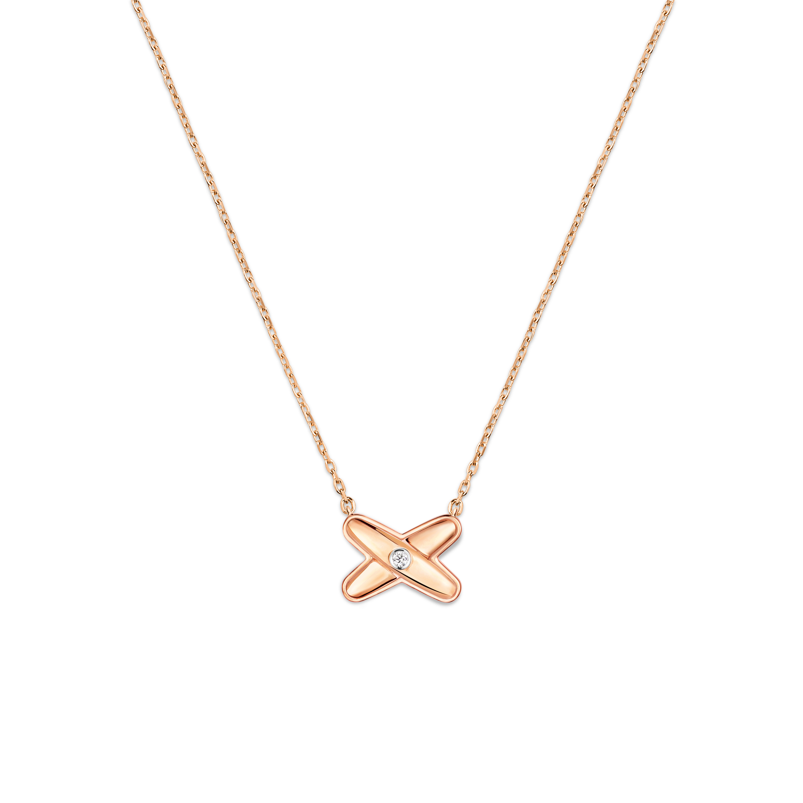
The crossed pendant concentrates its identity within a small area. Two directions meet, creating four outward ends and a more densely organised centre. In the studio view, the surrounding chain gives that sign room to remain legible. The motif can be read quickly because the eye understands the crossing before examining its surface or any smaller bright details.
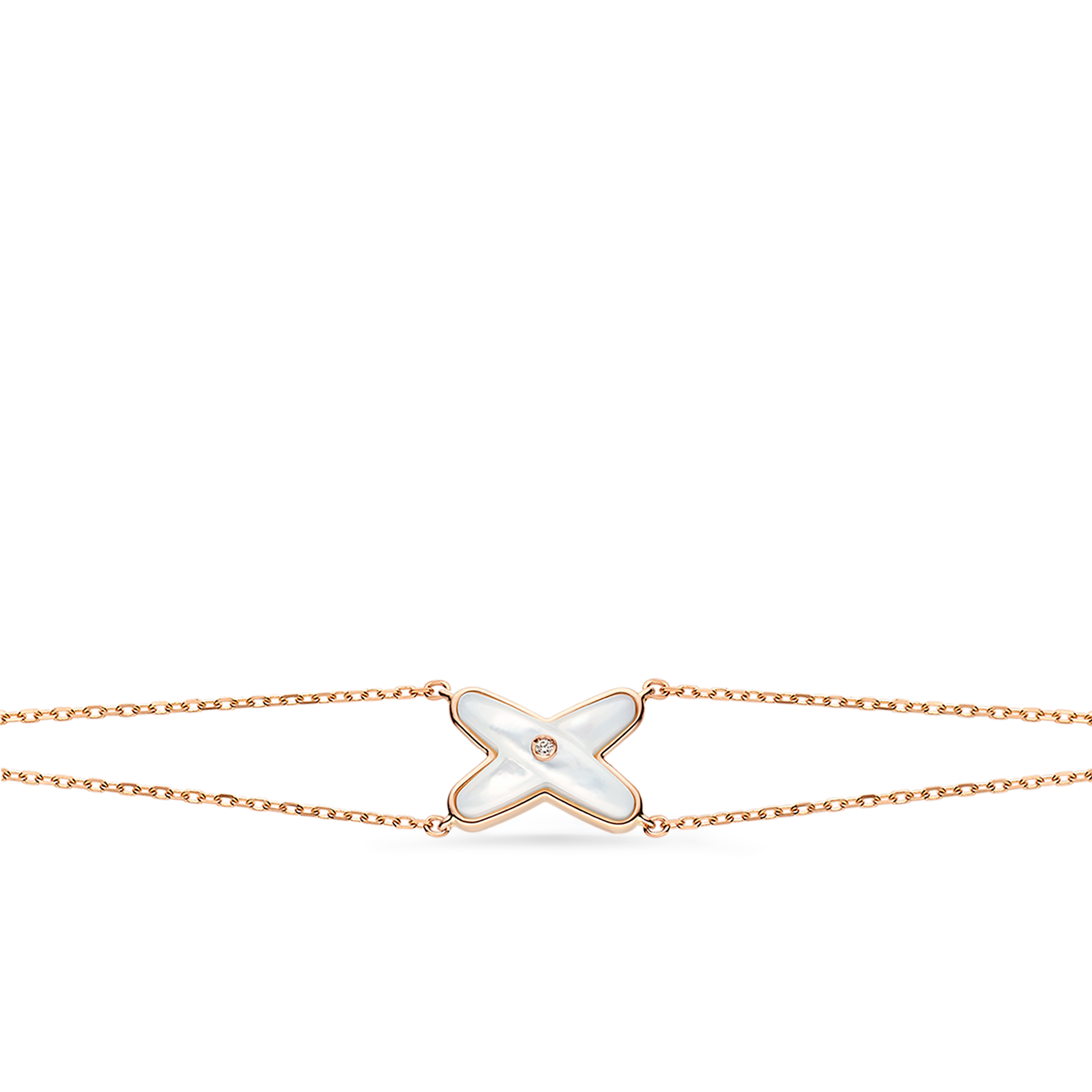
The bracelet places a related centre within a horizontal route around the wrist. A chain extends to either side, so the crossing becomes a junction between the two directions of the bracelet’s line. The object is visually quiet away from the centre, and that contrast helps the motif retain its character. It does not need to be repeated continuously to belong to the whole composition.
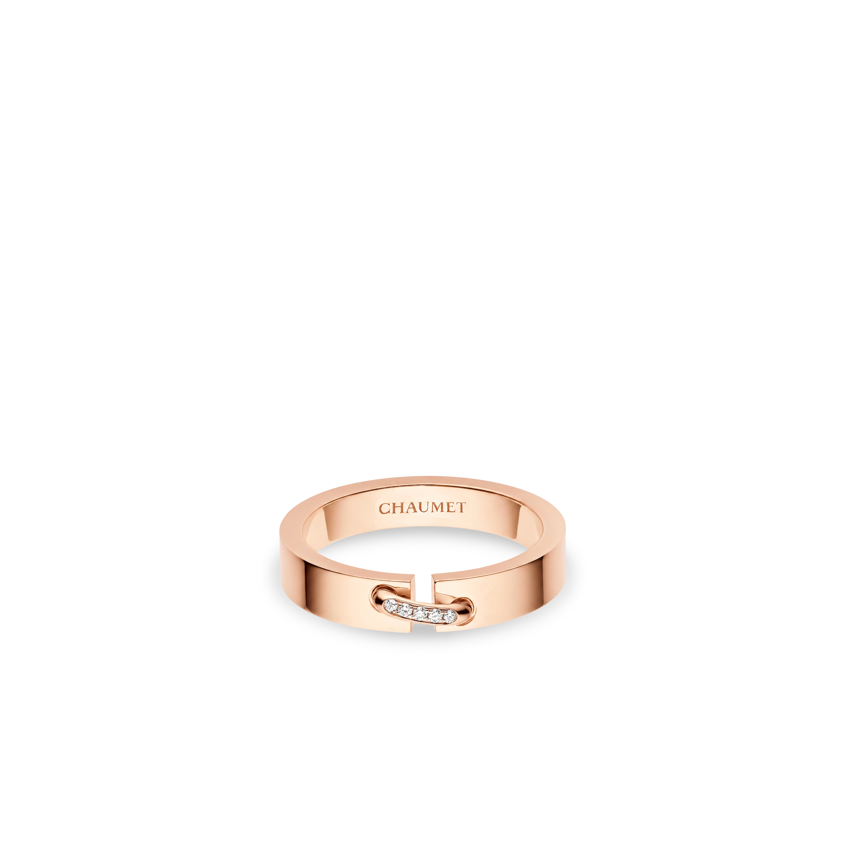
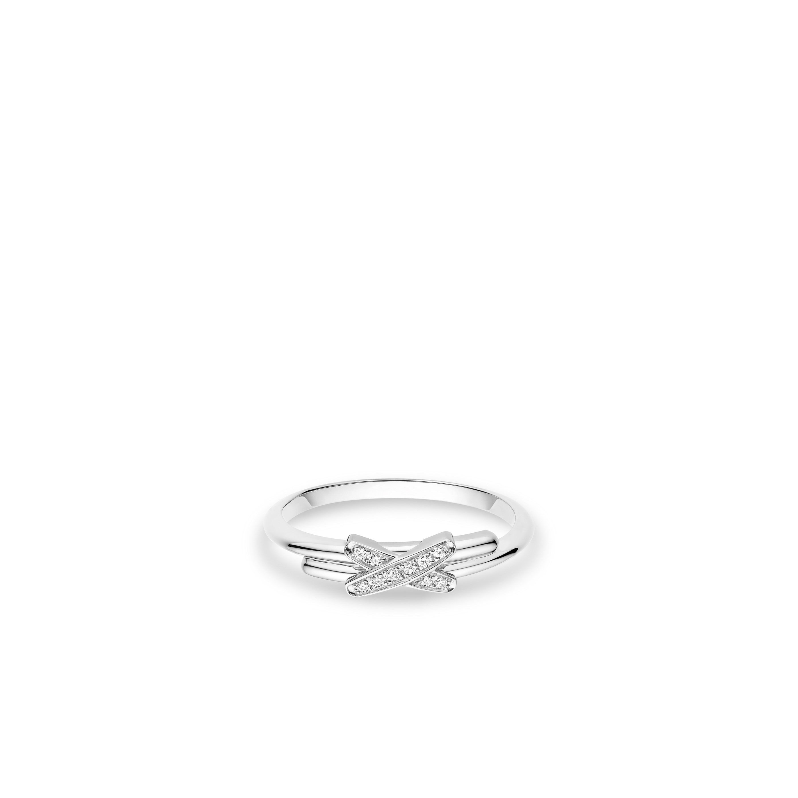
The wider ring changes the scale of the idea. The link sits across a broader band, bringing the crossing closer to the object’s larger structure. Seen beside the more slender ring view, it shows how the collection can alter visual weight without discarding the sign. One interpretation reads as a fine accent; the other becomes a more substantial surface around the finger. The connection between them lies in the route of the lines, rather than in identical proportions.
The circle proposes a different kind of meeting
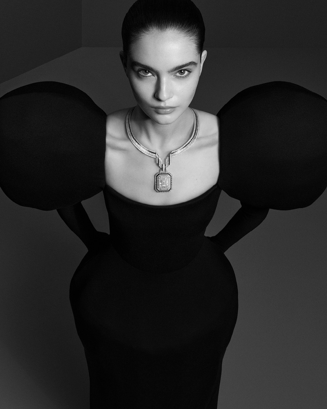
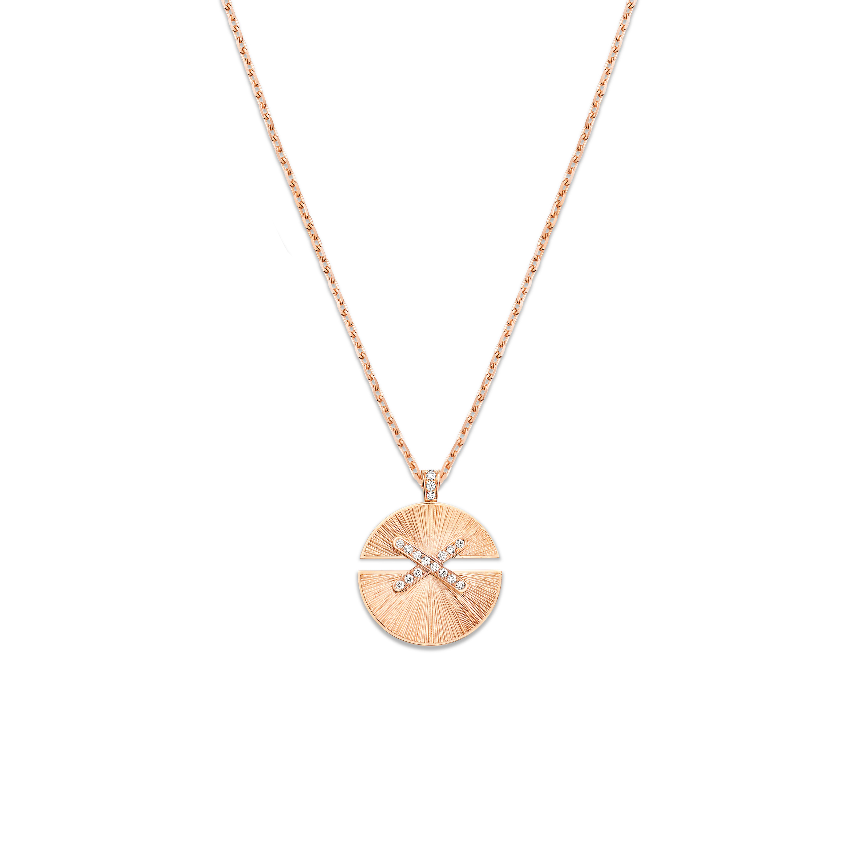
Liens Harmonie introduces a circular face. Instead of following the four outward directions of a cross, the eye follows a rounded boundary and the division within it. The complete pendant view makes that distinction immediately visible. Its calm perimeter contains a more concentrated internal relationship, giving the idea of a link a different pace from Jeux de Liens.
This is why the two forms belong together in an article but should not be labelled interchangeably. A collection can remain coherent while offering different signs for its central idea. The crossing emphasises directions meeting; the divided circle emphasises parts sharing a boundary. Those are editorial readings of the visible geometry, not instructions for how a wearer must interpret the jewellery personally.
Colour and pale surfaces can change the contrast within either sign. The circular pendant’s face has more uninterrupted area than the crossing, so its visible material becomes a stronger part of the composition. In a small crossed motif, the surrounding chain and the gaps around its arms have more visual influence. The design comparison therefore extends beyond shape: it concerns how much surface is available and how that surface meets the empty space around it.
A ring is read with the hand, not only from above
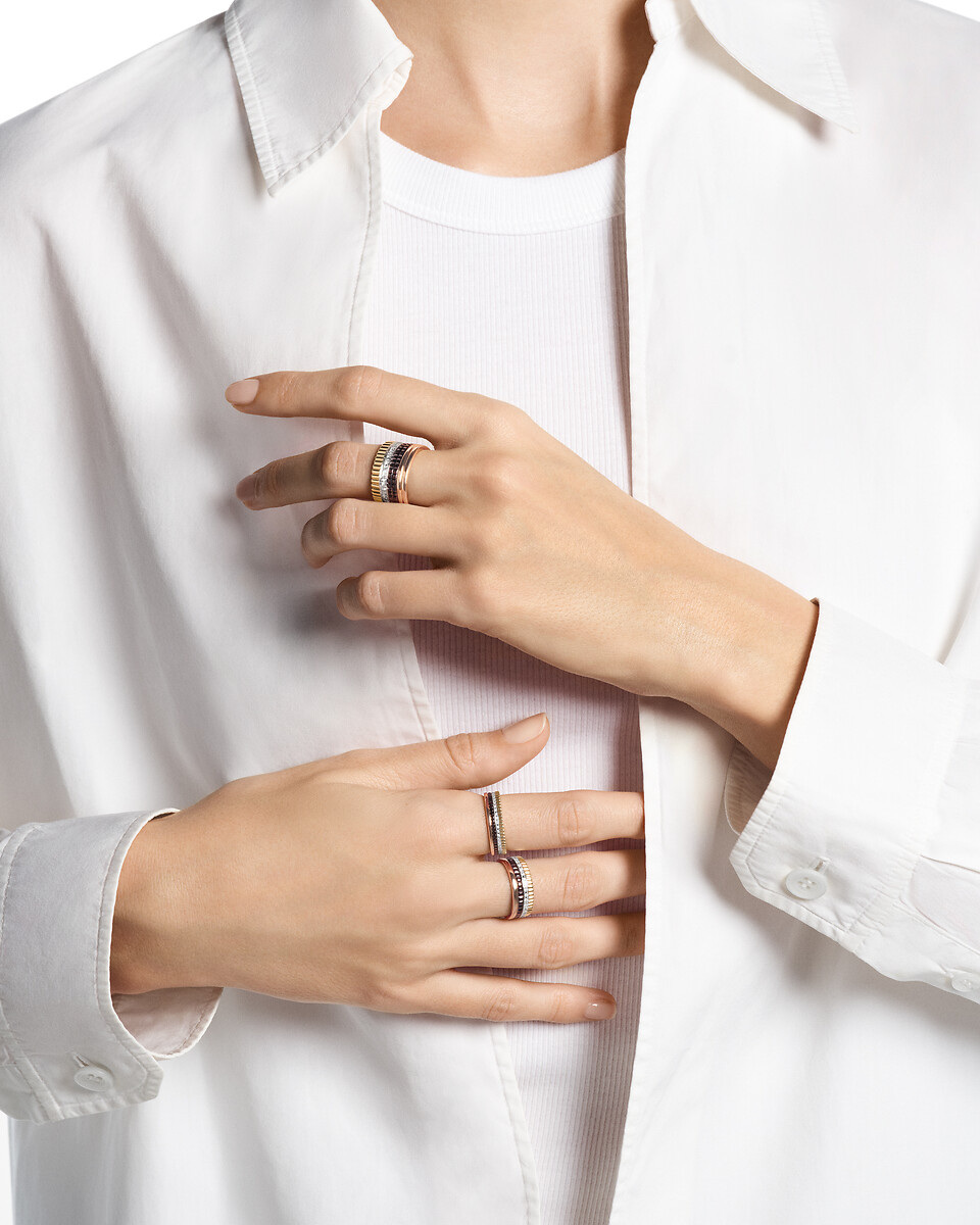
The official worn photographs bring the collection back to the body. A broad Liens ring against dark tailoring has a different presence from a narrow crossed pendant above a light garment. The hand gives the ring a field of movement and scale; the clothing supplies a contrasting background. The link remains recognisable, but its visual emphasis changes with the surrounding composition.
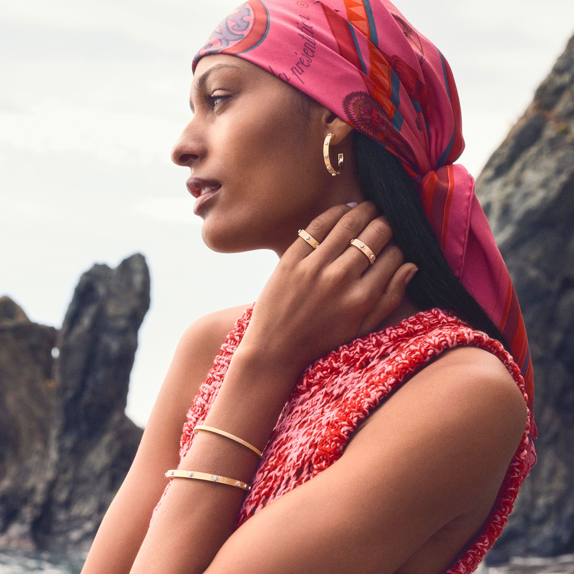
The portrait showing rings and a bracelet together is useful because it preserves the intervals between them. Jewellery worn on neighbouring parts of the body does not automatically become one matching set. Here the eye can move from finger to wrist, noticing a related design language without losing the identity of each object. The empty areas of hand and skin keep the forms distinct.

This suggests a more considered way to assemble jewellery than simply adding further pieces from the same family. Begin with the strongest sign in the intended arrangement, then look at how another object changes the rhythm. A broad ring may already establish the centre; a bracelet can create a quieter continuation. The official photographs show possibilities of composition, while the exact dimensions and fitting still belong to the chosen references.
A link can remain clear as its surface changes
The white-metal ring and the rose-gold-coloured bracelet do not rely on an identical surface colour to communicate their connection. The line remains recognisable through the change. That is a useful sign of a coherent jewellery vocabulary: the shape can be followed even when brightness, colour and scale alter the surrounding visual field.
The small pendant record offers a concrete point of reference within that broader vocabulary. Chaumet describes 084220 as a rose-gold pendant with mother-of-pearl and diamonds. Those materials help explain the particular object, but the collection’s continuity is carried by the motif. A reader can therefore distinguish two questions: what this reference contains, and how its form belongs to Liens.
The photographs selected here answer the second question at several distances. A complete object establishes the outline, a worn view establishes proportion and a closer product view clarifies the centre. The sequence is deliberately varied. It makes the collection feel more substantial than a repetition of isolated pendants while remaining focused on the objects themselves, rather than turning the idea of connection into an abstract slogan detached from the design.
Two signs, several objects
| Expression | Visible organising idea | Where the article follows it |
|---|---|---|
| Jeux de Liens | Two directions crossing | Pendant, bracelet and ring |
| Liens Harmonie | A divided circular face | Complete pendant view |
| Broader ring | The link meets a substantial band | Studio object and worn portrait |
| Small pendant 084220 | A named rose-gold, mother-of-pearl and diamond reference | Product record, kept distinct from the full family |
The table describes the forms rather than combining their specifications. A shared collection name does not establish identical materials, closures or dimensions. All photographs are official imagery; the article is an independent design reading, with no handling session or personal visit implied.
The Luxe Digital view
Liens is most interesting where Chaumet lets the idea of connection take more than one visible form. Crossed lines and a divided circle provide distinct ways to organise a jewel, while the worn photographs show their scale against the body. The family holds together because its objects remain clear, rather than because every link has been made identical.
Liens is most interesting where Chaumet lets the idea of connection take more than one visible form.
Sources & credits
Sources and methodology
Independent visual analysis of current official imagery and named product records, checked on 14 October 2026. Historical introductions, manufacturer specifications and visual observations are kept distinct. No visit, interview, independent handling or appraisal is implied.
- Chaumet — source 1: Current official collection, named designs, dated context and selected image provenance.
- Chaumet — source 2: Current official collection, named designs, dated context and selected image provenance.