The shape of 5 is already a composition: a horizontal beginning, an inward turn and a rounded lower section. CHANEL’s N°5 jewellery takes that familiar sign away from the printed page and gives it depth, brightness and a place against the body. Its recognisability is immediate. The more interesting question is what happens to its proportions when a number becomes a necklace, a ring or an element at the wrist.
A familiar sign, given depth
The official photographs offer several answers. A small numeral can act as punctuation within a longer necklace. A larger interpretation becomes a more emphatic graphic object. In a ring, the shape is encountered from above and at an angle; in an earring, it enters the narrow space beside the face. The collection’s unity lies in that repeated change of context, rather than in making every object look exactly alike.
This is a visual study of the current fine-jewellery collection and CHANEL’s published craftsmanship presentation. The chosen views alternate between complete objects and worn portraits. The studio frames make the outline legible; the portraits test its visual hierarchy against skin, clothing and the dimensions of a person. Neither supplies an independent assessment of weight or comfort, but together they explain why a familiar character can sustain more than one type of jewel.
The necklace makes a line around the sign
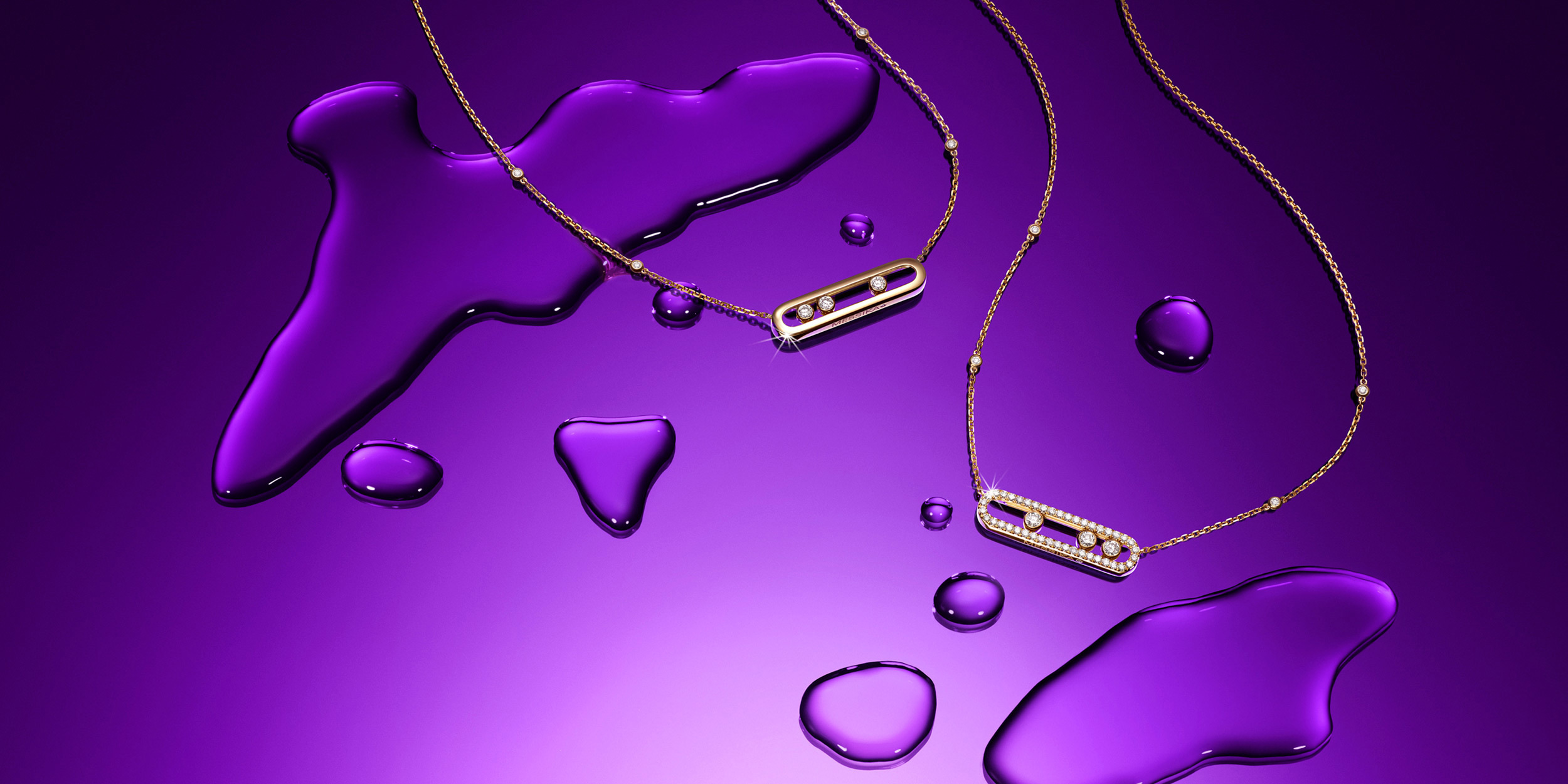
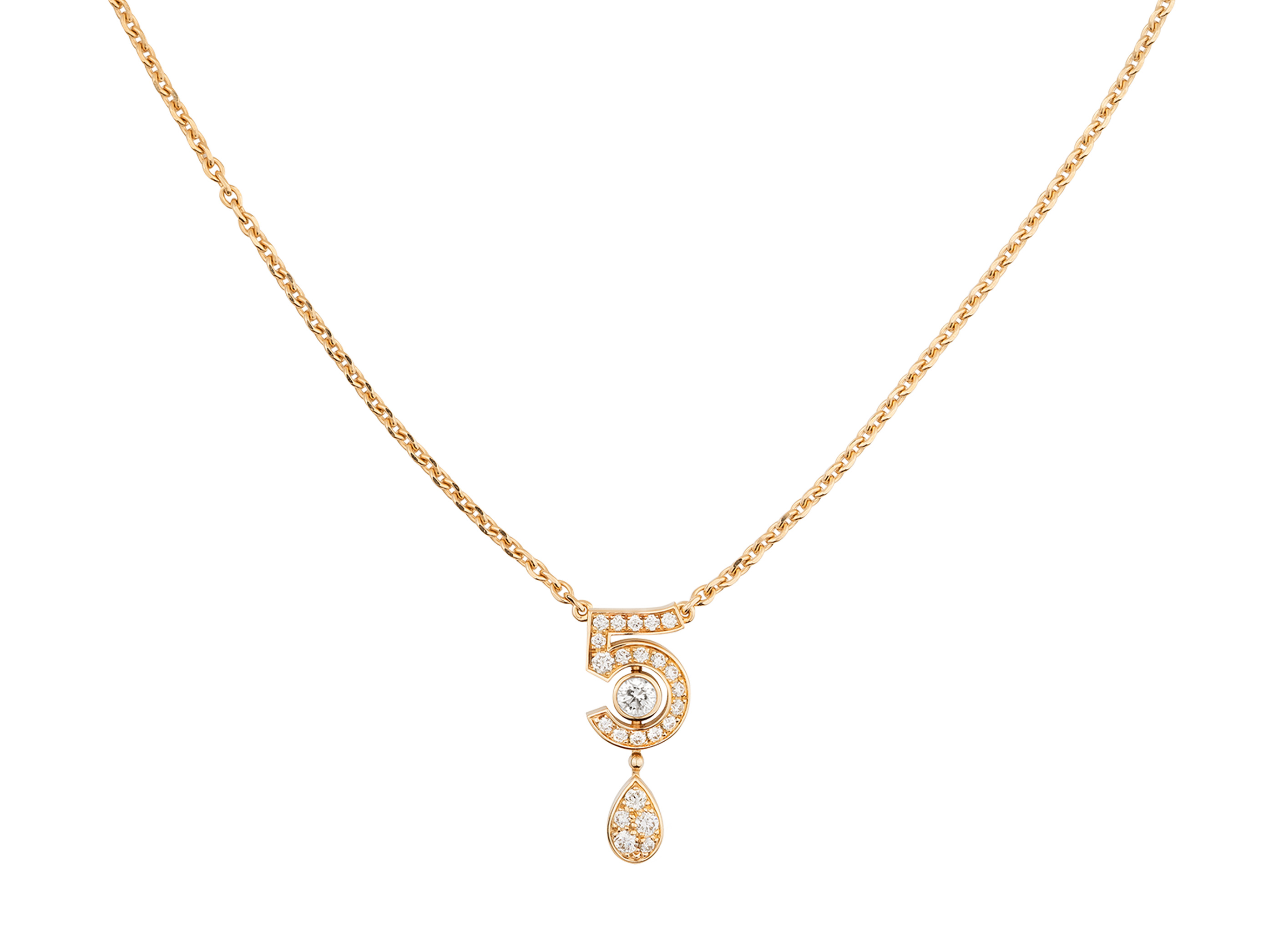
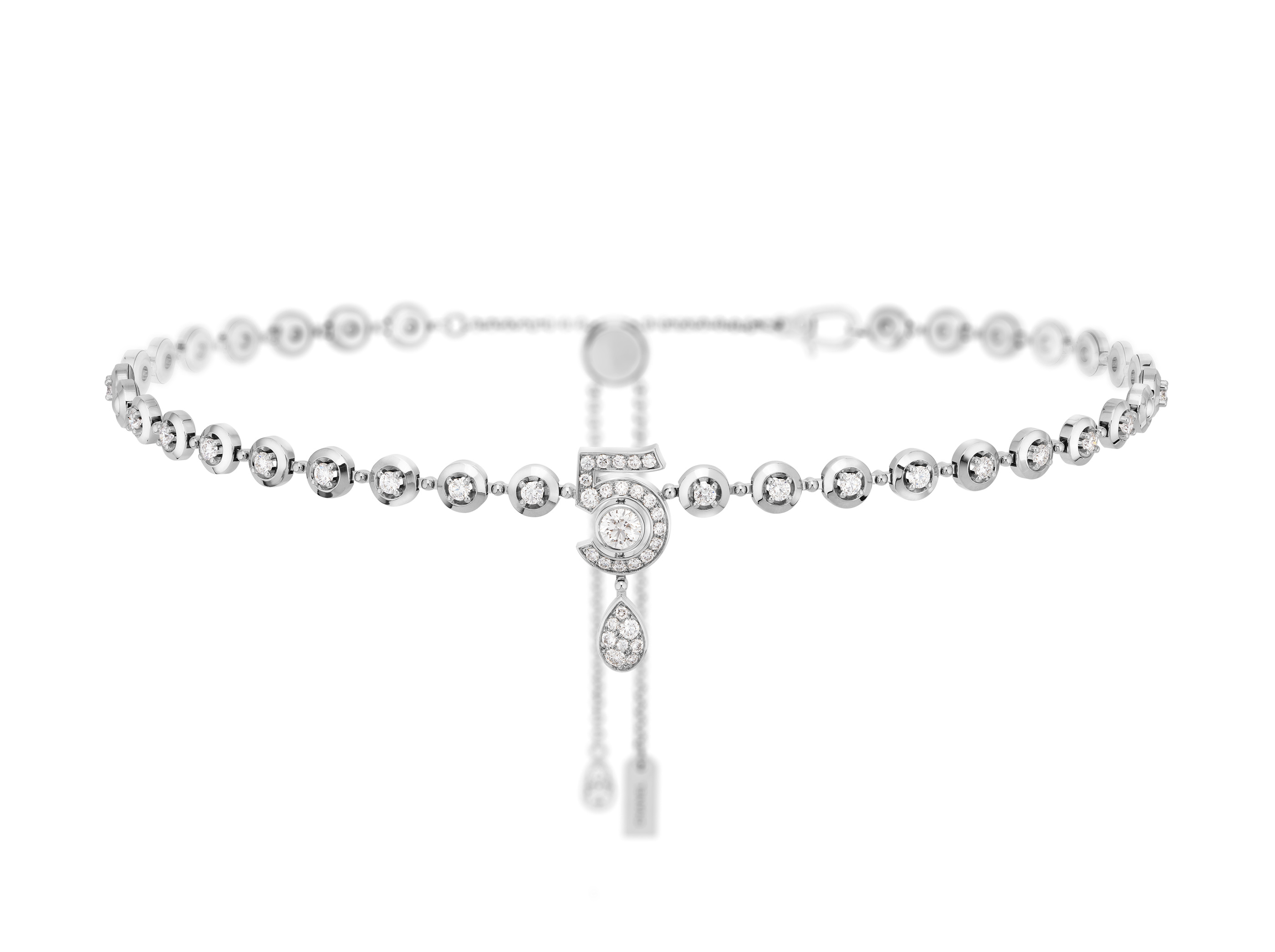
In the complete necklace view, the numeral is not the only thing to follow. The chain or diamond-like line leading towards it establishes a route and a scale. A familiar sign that would be ordinary on paper becomes more deliberate when it interrupts that route. The contrast is especially clear in the white-background photograph, where there is little surrounding colour to distract from the relationship between the enclosing line and its concentrated graphic accent.
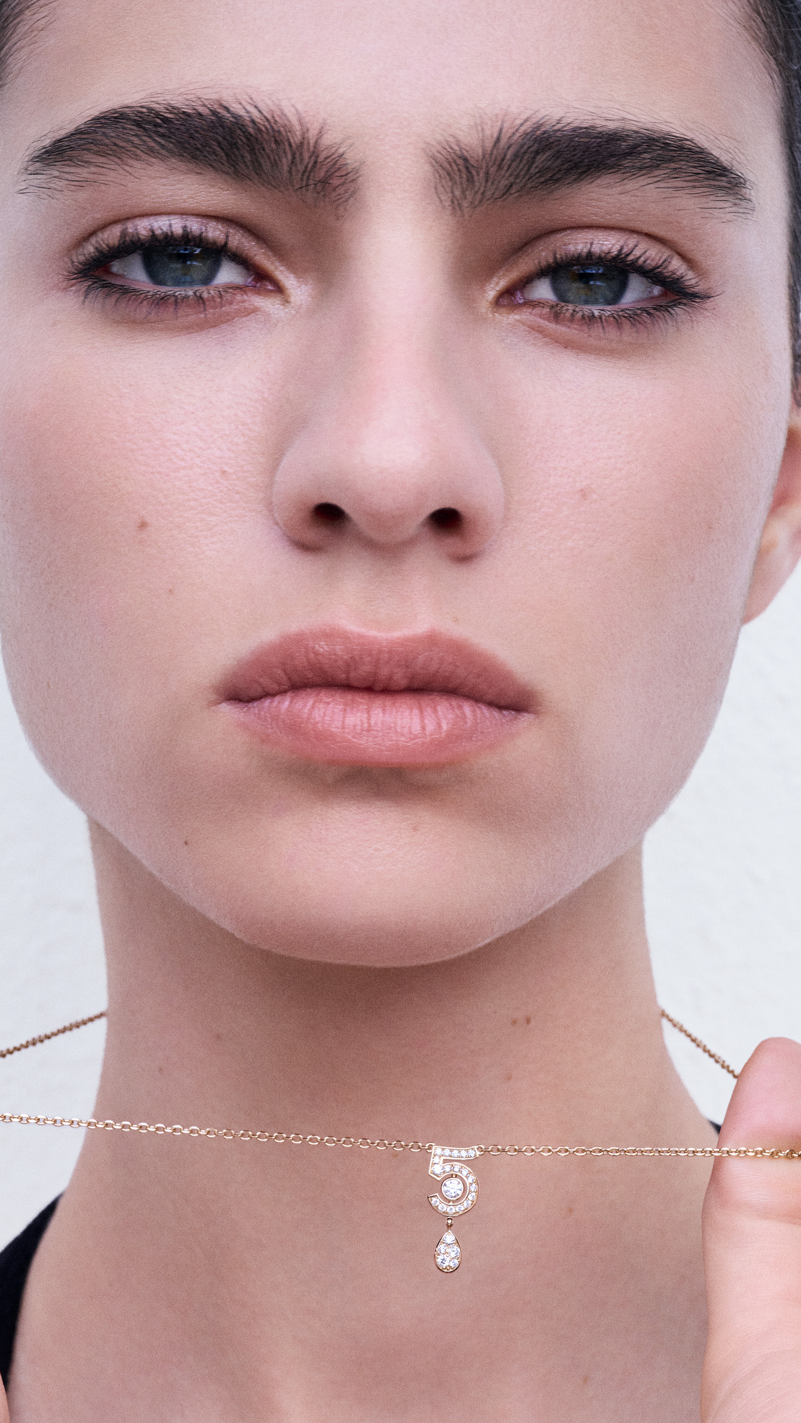
The worn portrait changes the reading. The necklace meets the neck and the upper edge of clothing, so the number becomes part of an arrangement already formed by the body. It is no longer an isolated emblem at the centre of an empty field. Its visual size can be judged beside a shoulder, a collarbone and the fabric around it. The same sign can therefore seem more discreet or more assertive depending on where it sits and how much uninterrupted space the neckline provides.

The gold-coloured Eternal N°5 and the diamond-line interpretation shown here should keep their separate product identities. The shared number is a design link, not proof of matching materials, dimensions or stone counts. The official collection offers the range; the exact reference supplies the specification. That separation is particularly useful when comparing two pieces whose outline appears related but whose line, brightness and overall fall create different visual effects.
The ring turns typography into a small structure
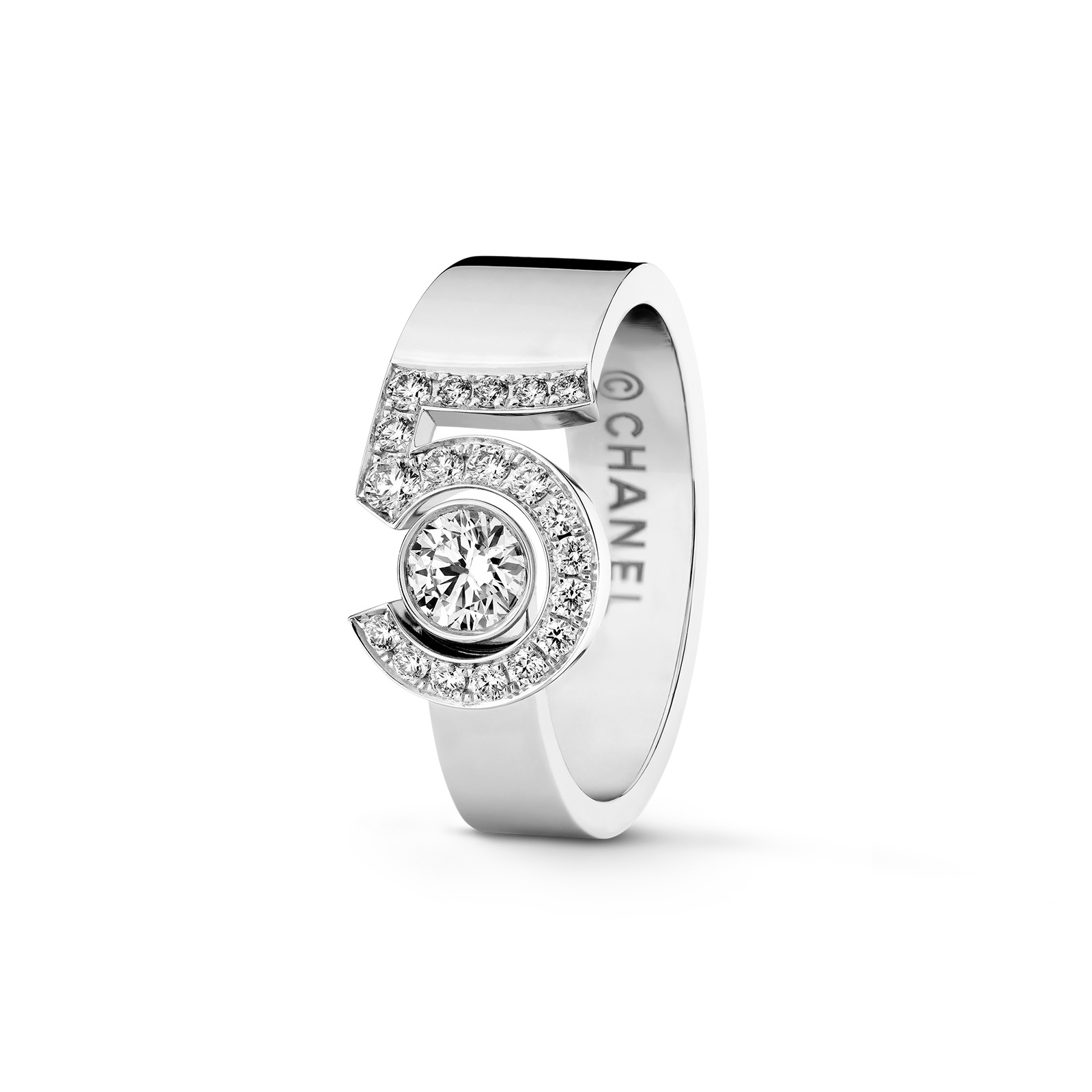
A number on a ring has to negotiate the curve of a finger. In the official product view, N°5 occupies a concentrated area within that curve, and its open spaces remain part of the design. The eye moves between the visible sign and the band that supports it. The result is closer to a small structure than a flat symbol pasted onto a conventional ring: the numeral has an edge, a surface and a relationship to the opening around it.
This is where the distinction between outline and scale becomes useful. A sign can remain recognisable even when it is small, but its character changes as the proportion between the numeral and the supporting band changes. The studio photograph makes that proportion available for inspection. A worn image would then establish how much territory the ring occupies across the finger. Neither should be replaced by a measurement borrowed from another reference in the same family.
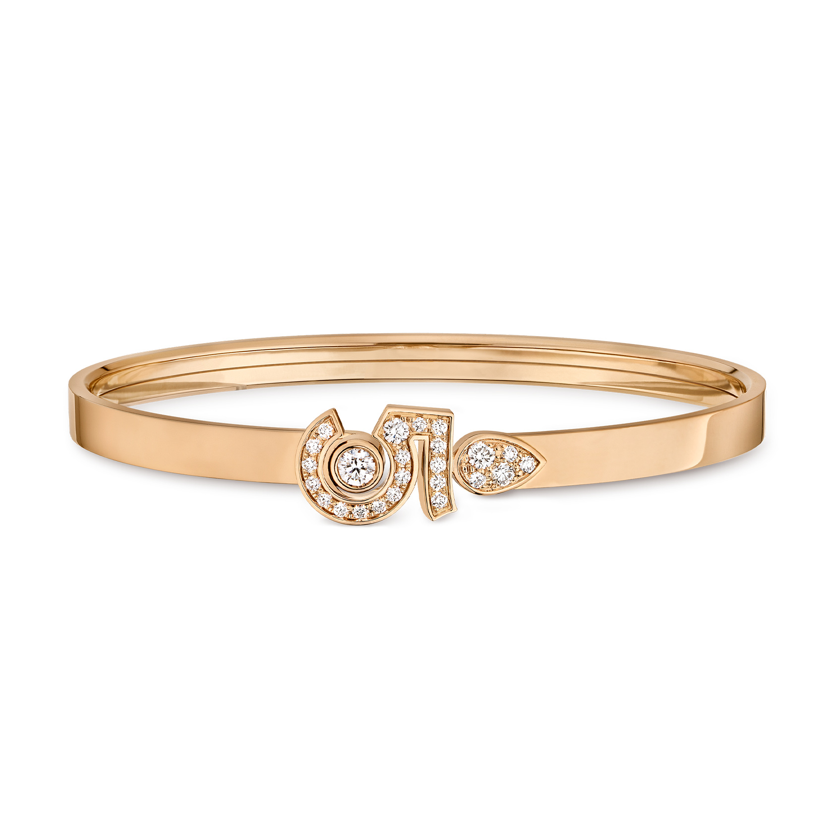
The collection’s craftsmanship presentation provides a separate route into the objects, but the photographs here are not a technical drawing of the setting. Brightness can make individual boundaries disappear in a finished image. Rather than assigning a setting method from appearance alone, it is more precise to describe what is visible: the numeral’s continuous curve, the light-catching surface and the points where it meets the ring’s wider geometry. Those features already explain a great deal about its visual identity.
The wrist and face introduce different intervals
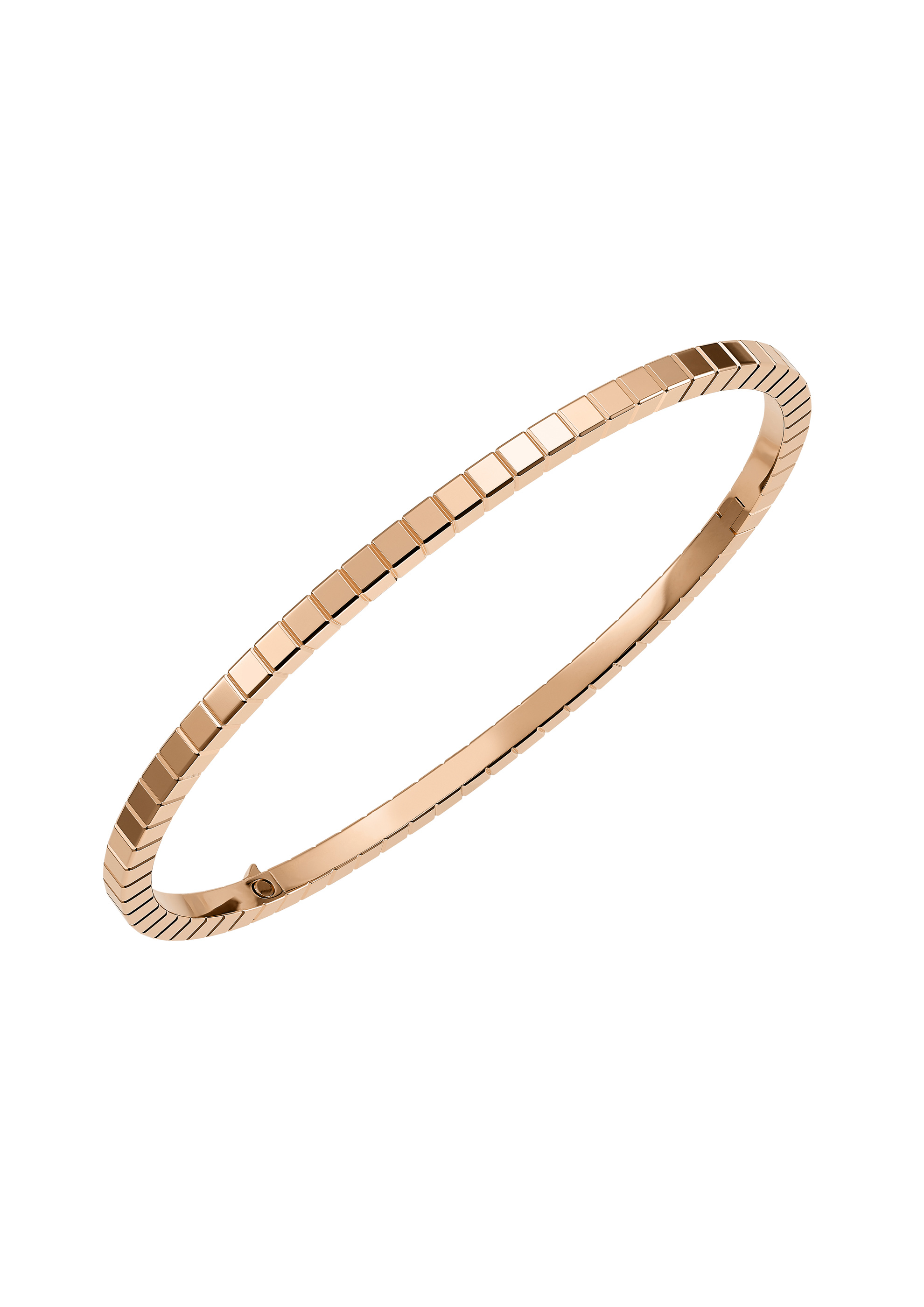
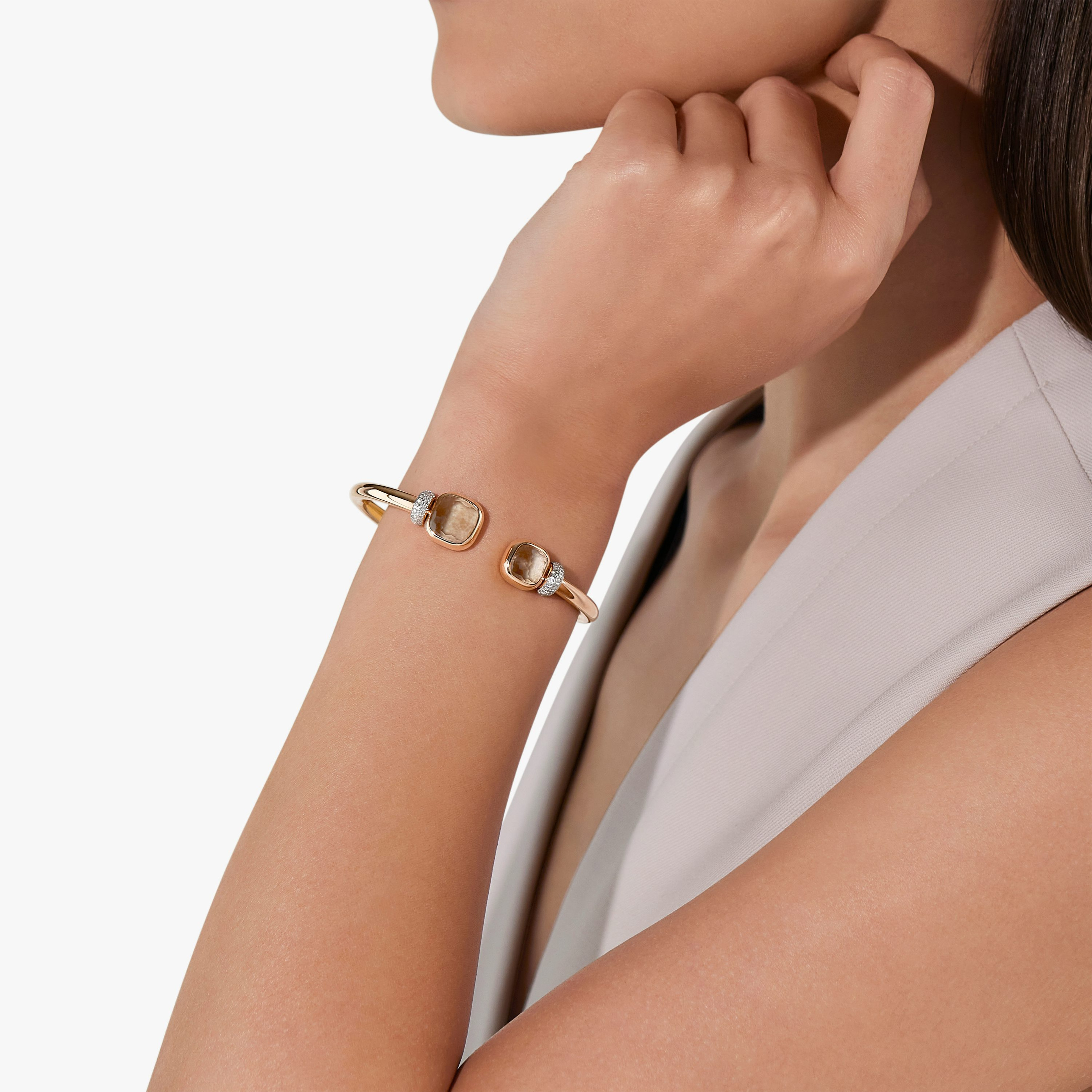
The bracelet has more circumference to work with than a ring, and its graphic accent is seen through the movement of an arm. In the official worn photograph, the space around the wrist matters as much as the object’s isolated outline. A broad cuff of fabric can meet the jewel closely; bare skin can give it a larger field. The numeral then becomes either a compact interruption within an outfit or a focal point on an otherwise quiet wrist.
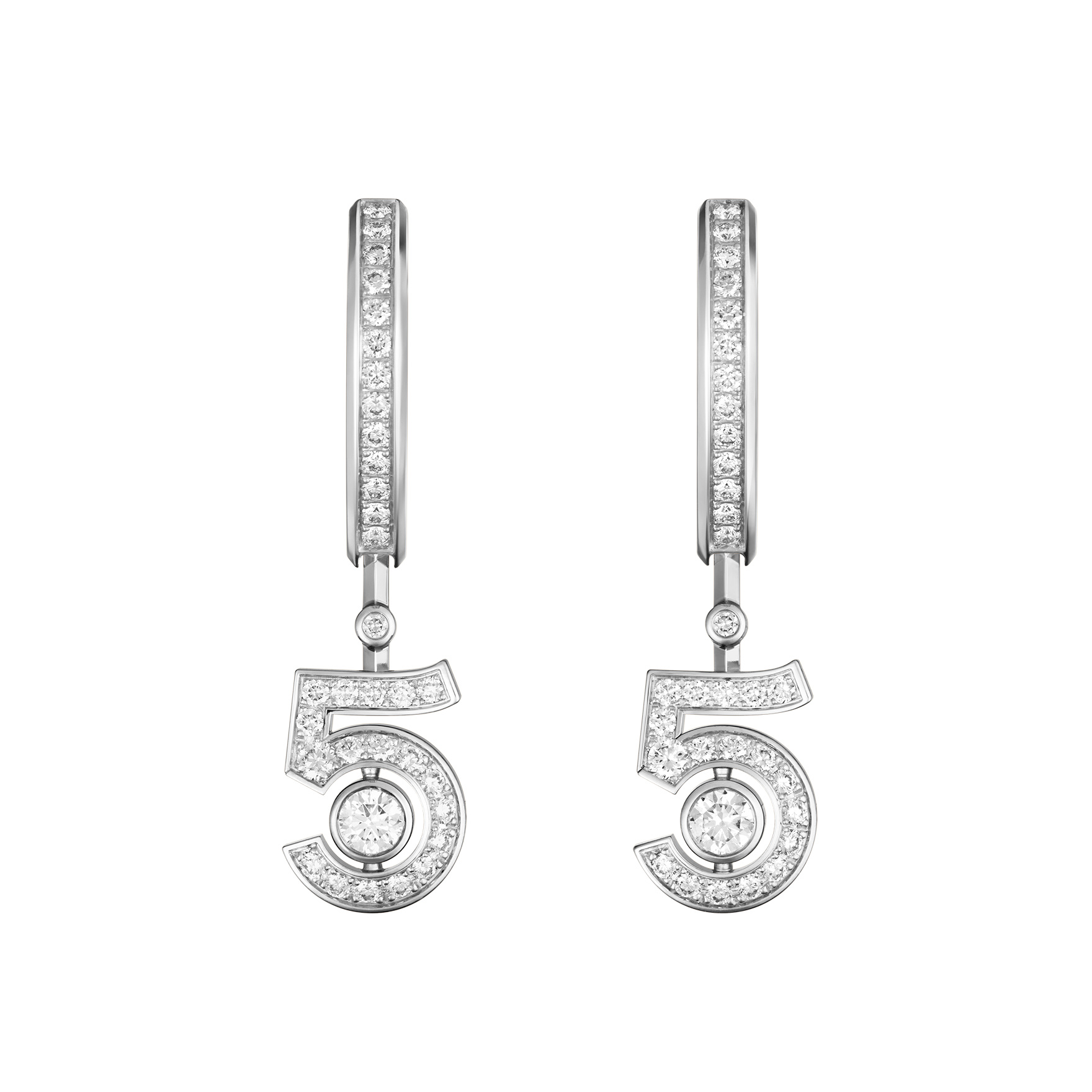
Earrings introduce a different interval: the small distance between jewellery, cheek and hair. The product pair establishes the objects as a matched presentation, while the worn portrait shows how the sign is encountered beside the face. Their visual presence depends on placement and surrounding detail, rather than simply on whether the same motif appears in a necklace. The number carries continuity across the collection, but each category asks it to perform a different compositional job.

For a wearer, that suggests a useful fitting sequence. Consider the exact ring on the intended finger, the bracelet beside the clothes most often worn, and the earrings with the usual hairstyle. Then compare how clearly the sign reads from further away. This is a visual decision rather than a promise of universal suitability. Size, fastening, material and maintenance still belong to the specific product record and the maison’s advice, not to the familiarity of the N°5 name.
A number across four objects
| Object | Where the sign sits | What to check on the reference |
|---|---|---|
| Necklace | Within a longer line around the neckline | Length, position and the complete fall |
| Ring | Across a small curved field on the finger | Width, size and the numeral’s projection |
| Bracelet | At the wrist, beside skin or clothing | Circumference, fastening and exact material |
| Earrings | In the narrow space beside the face | Dimensions, closure and worn position |
The table compares visual roles. It does not combine specifications from different N°5 references. The gold-coloured, BEIGE GOLD and white-metal product views shown in the official presentation retain their own identities, and any diamond description should be confirmed on the exact piece being considered.
The Luxe Digital view
N°5 becomes a convincing jewellery language when the number’s outline and its place on the body are considered together. CHANEL’s collection gives a familiar sign several kinds of presence: punctuation at the neckline, structure on the finger and an accent beside the face. The strongest reading comes from those changes of scale, rather than from recognition alone.
N°5 becomes a convincing jewellery language when the number’s outline and its place on the body are considered together.
Sources & credits
Sources and methodology
Independent visual analysis of current official imagery and named product records, checked on 14 October 2026. Historical introductions, manufacturer specifications and visual observations are kept distinct. No visit, interview, independent handling or appraisal is implied.
- CHANEL — source 1: Current official collection, named designs, dated context and selected image provenance.
- CHANEL — source 2: Current official collection, named designs, dated context and selected image provenance.