The Tank à Guichets makes a watch face feel newly strange. Where a familiar Tank places hands and a dial between its brancards, this design presents a largely uninterrupted metal surface with two small openings. The time is still there, but its visual presence has changed. Cartier’s 2025 return to the idea is worth reading as an exercise in proportion and attention: how much of a watch needs to remain visible for its identity to become stronger?
The face as a field of metal
Cartier dates the original Tank à Guichets to 1928 and identifies its 2025 interpretation with the hand-wound 9755 MC movement. This is a mechanical digital display: the hours and minutes appear as numerals through apertures. Digital describes the way information is presented here, not an electronic movement or a connected function.
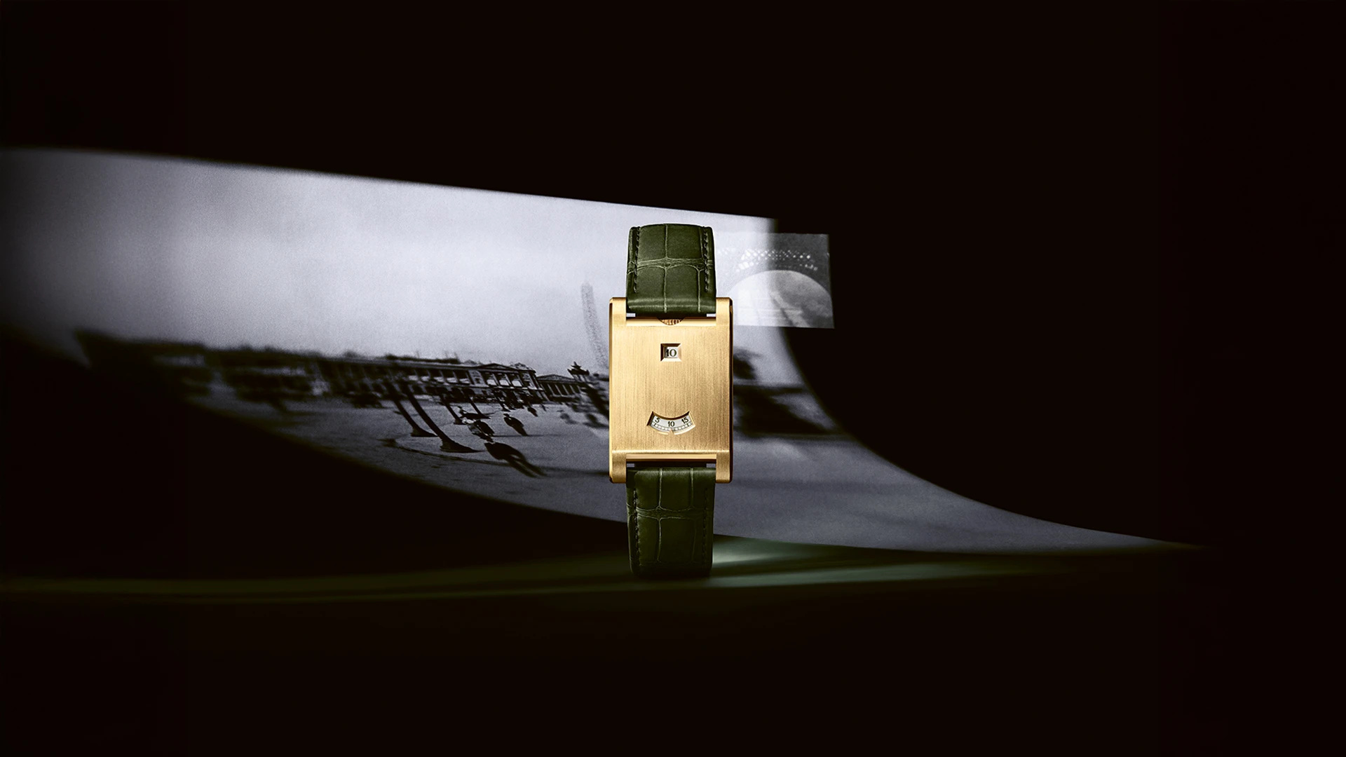
The distinction is particularly clear in the official launch photograph of a yellow-gold example. Its brushed face occupies most of the visible rectangle; the green strap and dark surrounding setting make the small indications feel more concentrated. The photograph illustrates the launch’s styling. It does not establish that the same strap accompanies every regional reference currently offered.
What remains recognisable is the Tank’s relationship between long sides and short ends. The vertical edges still organise the object even when the conventional dial disappears. That makes the metal surface active rather than blank. Brushing supplies direction, the openings interrupt it, and the crown sits at the upper end instead of competing with the rectangle from the side. The interest comes from arranging a few elements very precisely.
Two openings, two arrangements
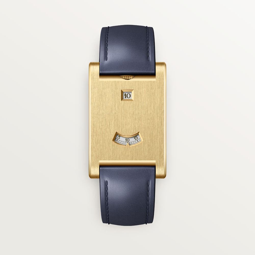
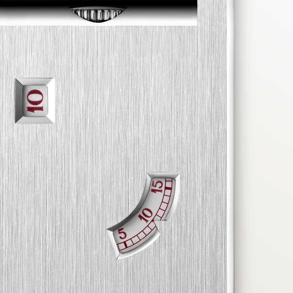
The current Cartier Brazil records provide two clearly identified examples. Yellow-gold reference WGTA0389 places its hour aperture at twelve and its minute aperture at six. Platinum reference WGTA0392 places the openings at ten and four. The latter is described as a numbered edition of 200. These are reference-specific distinctions, not properties to transfer to every Tank à Guichets.
The conventional arrangement preserves a strong vertical reading. The eye passes through the upper hour window and down towards the minute sector, with a broad area of metal between them. Moving the openings onto a diagonal changes the balance without needing a new case outline. The same rectangle begins to feel less formally centred, because the information no longer sits along its main axis.
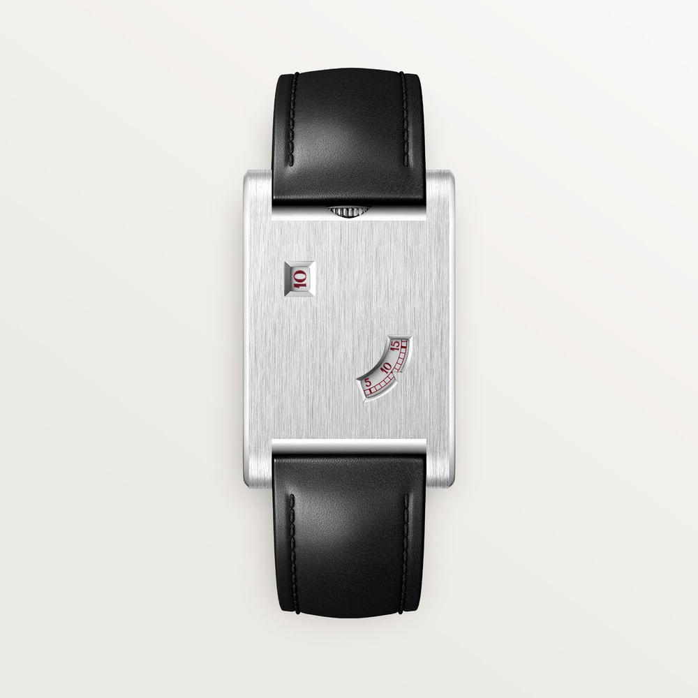
This is a useful example of design variety that does not depend on adding ornament. A minute window occupies very little of the face, yet moving it changes the entire composition. The special platinum version should therefore be considered for the arrangement itself. Its numbered status says nothing about current availability, an allocation prospect or an eventual resale result.
Reading is different from seeing
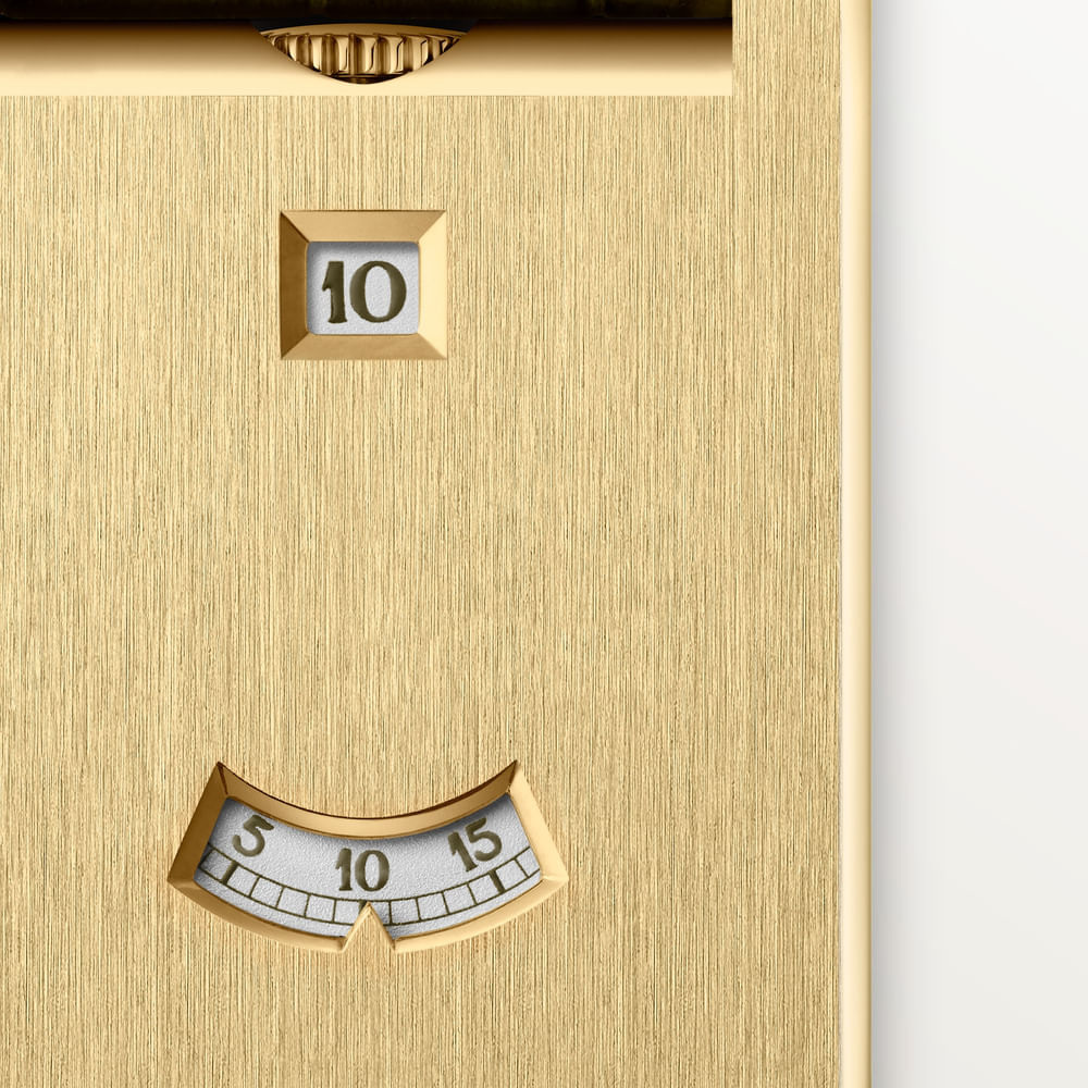
Cartier identifies a jumping hour in the product descriptions. The numeral offers a direct reading of the current hour, while the minute display asks the eye to locate the smaller indication below or across from it. A conventional pair of hands gives an immediate geometric picture; these openings present a more concentrated piece of information. The appeal lies partly in that difference.
Neither a macro photograph nor the mechanism’s description establishes how easy it will be for a particular reader to use. The aperture size, contrast, viewing angle and available light need to be experienced together. Anyone considering the watch should look at it at an ordinary wrist distance, then again without deliberately rotating the arm into a display position. An aesthetic preference and a useful reading habit should be allowed to meet.
The absence of a broad dial also changes what catches the eye when the watch is not being read. On a patterned sleeve, a narrow rectangle can behave almost like a small piece of metalwork. In a close photograph, the same object becomes a study of the edges around the openings. This change of scale gives the design more range than its apparently spare surface first suggests.
A small rectangle needs a precise fitting
Both cited regional records give a case of 37.6 by 24.8 millimetres and a thickness of 6 millimetres. The dimensions describe two specific references, not an effective round-watch diameter. Length, width and the route of the strap around the wrist should be considered separately. A single number cannot explain the presence of a rectangular watch.
Ask to see the actual proposed reference and strap. The current Brazil descriptions list calfskin configurations that differ from the green styling of the launch visual used here. That is a useful reminder to distinguish a dated campaign image from a current regional product record. Materials, supplied second straps and buckle details belong to the exact offer, rather than to a general idea of the model.
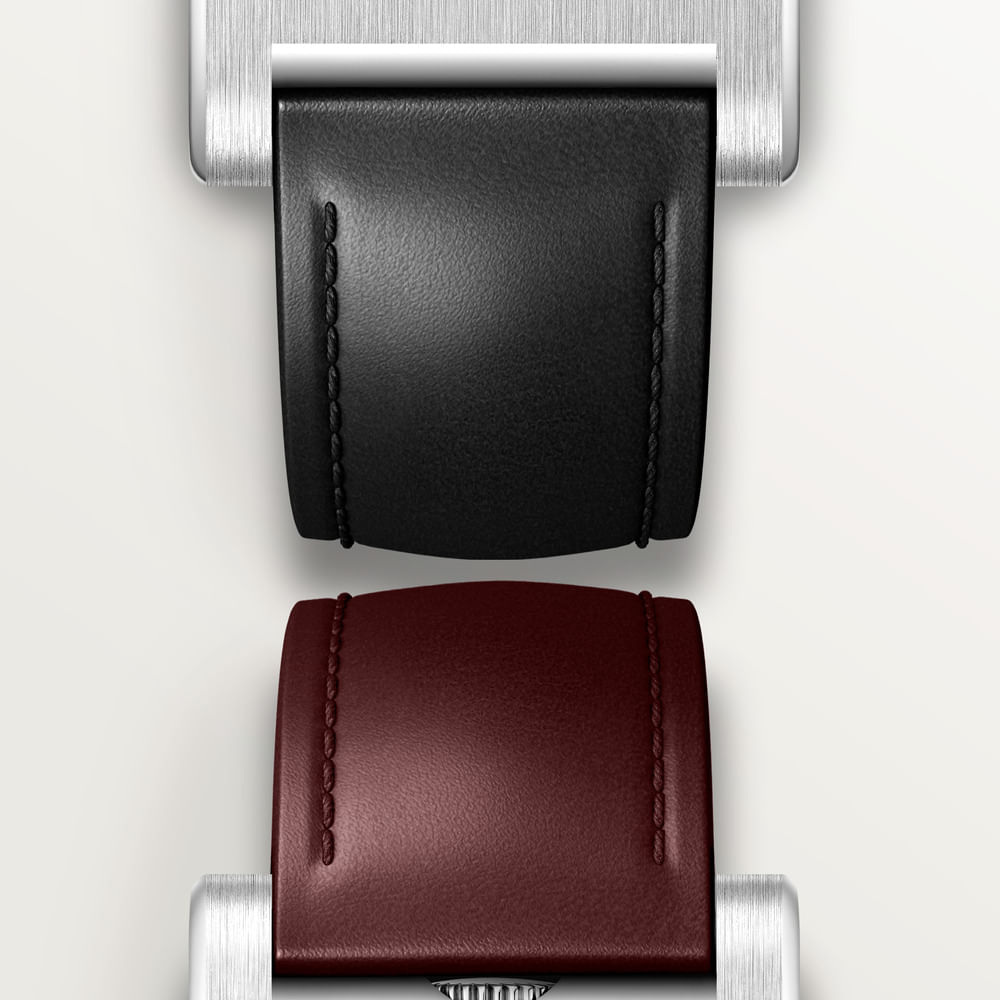
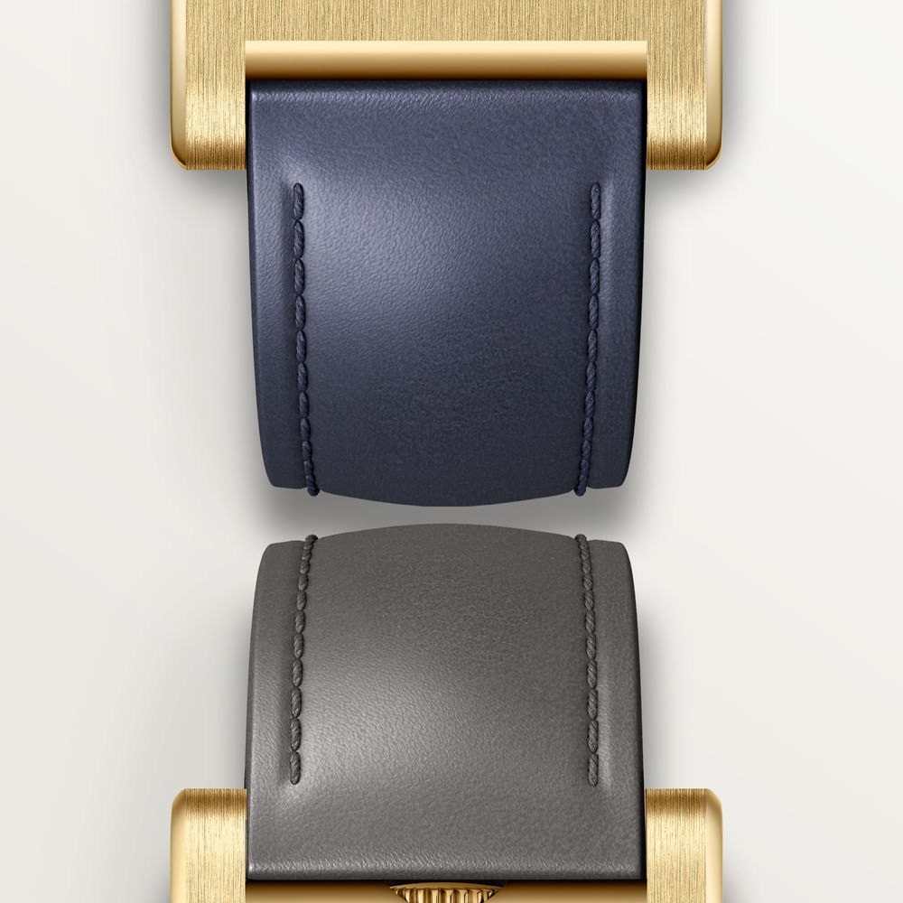
Those same regional records explicitly describe the two references as not water-resistant. That statement should remain attached to these references, without inventing a water-use allowance. Obtain the manufacturer’s current instructions and service guidance for the watch supplied. The point is to understand the object accurately before choosing where it fits in an existing collection and in an ordinary day.
The reference notebook
These details were checked against the cited official records on 15 October 2026. They separate display architecture from configuration and buying questions. No price, stock position, measured accuracy or first-hand wearing result is implied.
| Element | WGTA0389 | WGTA0392 |
|---|---|---|
| Case material | Yellow gold, as listed by Cartier Brazil | Platinum, as listed by Cartier Brazil |
| Hour opening | Twelve o’clock | Ten o’clock |
| Minute opening | Six o’clock | Four o’clock |
| Case dimensions | 37.6 × 24.8 mm; 6 mm thick | 37.6 × 24.8 mm; 6 mm thick |
| Movement | Hand-wound 9755 MC; jumping hour | Hand-wound 9755 MC; jumping hour |
| Edition statement | No numbered limit stated in the cited record | 200 individually numbered pieces |
| Water-use description | Listed as not water-resistant | Listed as not water-resistant |
The first decision is the reading arrangement. After that, consider material and the exact strap configuration. Treating all three as one choice makes it easier to understand why an apparently minor variation can matter. The metal is most of what is visible, but the position of the windows determines how that metal is perceived.
The Luxe Digital view
The Tank à Guichets is persuasive because it reduces the familiar watch face without reducing the design to anonymity. Its small windows give a large area of metal something specific to do. The rectangle becomes a surface for reading, looking and noticing changes of light.
Choose between its arrangements with the same attention Cartier gives to the openings themselves. Look from a normal distance, establish the actual reference and let the watch remain a watch rather than a forecast about rarity. Its lasting interest is already visible in the decision to show very little, and to place that little with unusual care.
The Tank à Guichets is persuasive because it reduces the familiar watch face without reducing the design to anonymity.
Sources & credits
Sources and methodology
Independent watch design and reference analysis of the named official records and imagery, checked on 15 October 2026. Original introduction dates and reference-specific specifications are retained. Images show the identified configurations. Independent visual and reference analysis of official material. No hands-on wearing, accuracy or water-use test, workshop visit, interview or specimen inspection claimed. Launch, current regional records, studio visuals, campaign compositions and assembly photographs are identified separately. Availability, individual condition, fitting and care require exact-reference confirmation.