Grain de Café is a useful reminder that a jewellery motif can begin with something ordinary and acquire its character through scale, placement and surface. Cartier’s coffee-bean forms are recognisable, but their interest is not confined to that resemblance. In the current collection imagery, they become clusters, hanging accents and rounded volumes that alter the outline of a ring, necklace or bracelet.
A rounded seed becomes a sculptural form
The wide worn photograph is the right starting point. It places the jewellery inside a complete arrangement of body and clothing, where individual beans are smaller than they appear in a studio product frame. Their curved shapes still establish a rhythm. The eye notices concentrations of gold-coloured volume and quieter intervals, then moves closer to distinguish how a bean-shaped element meets its neighbours or the line that carries it.
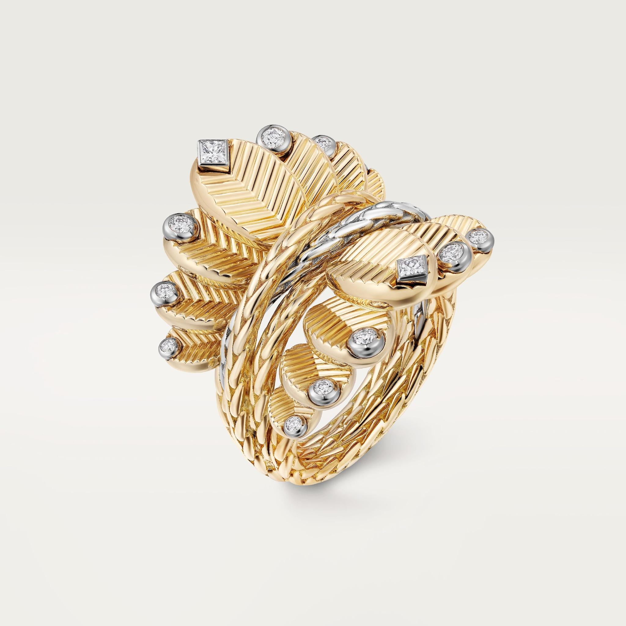
This is a visual study of Cartier’s current Grain de Café presentation and a named diamond-ring reference, N4804800. The product record establishes that specific object’s identity; the collection imagery shows a broader family. Materials, stone weights and dimensions should stay attached to their references. The design can be read across the family without making every photographed piece inherit the same specification.
The bean has a direction as well as a volume
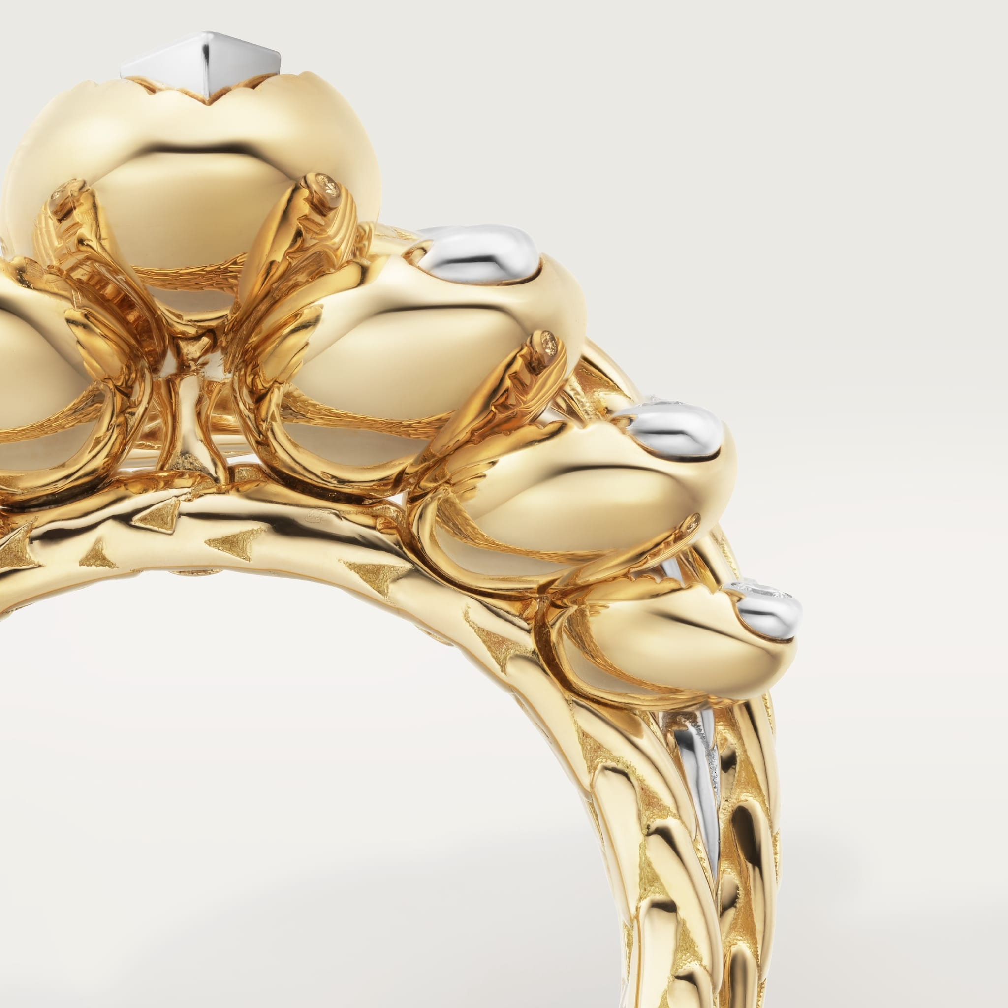
In the complete ring photograph, the motif is not simply a rounded bead. A visible division across its surface gives it a direction, while the fuller outer contour creates a concentrated volume above the band. Those two features work together. Without the division, the form would be more generic; without the rounded profile, it would lose the sculptural presence that makes the motif readable at a distance.
The polished close view introduces another layer. Light gathers along a curved surface and changes at its edges, making a bean’s contour legible through contrast. That is a photographic observation, not a measurement of polish quality or a claim about a particular finishing process. The image allows the viewer to follow the shape. It does not by itself establish how the surface was made, how resistant it is to wear or which component contains which precious material.

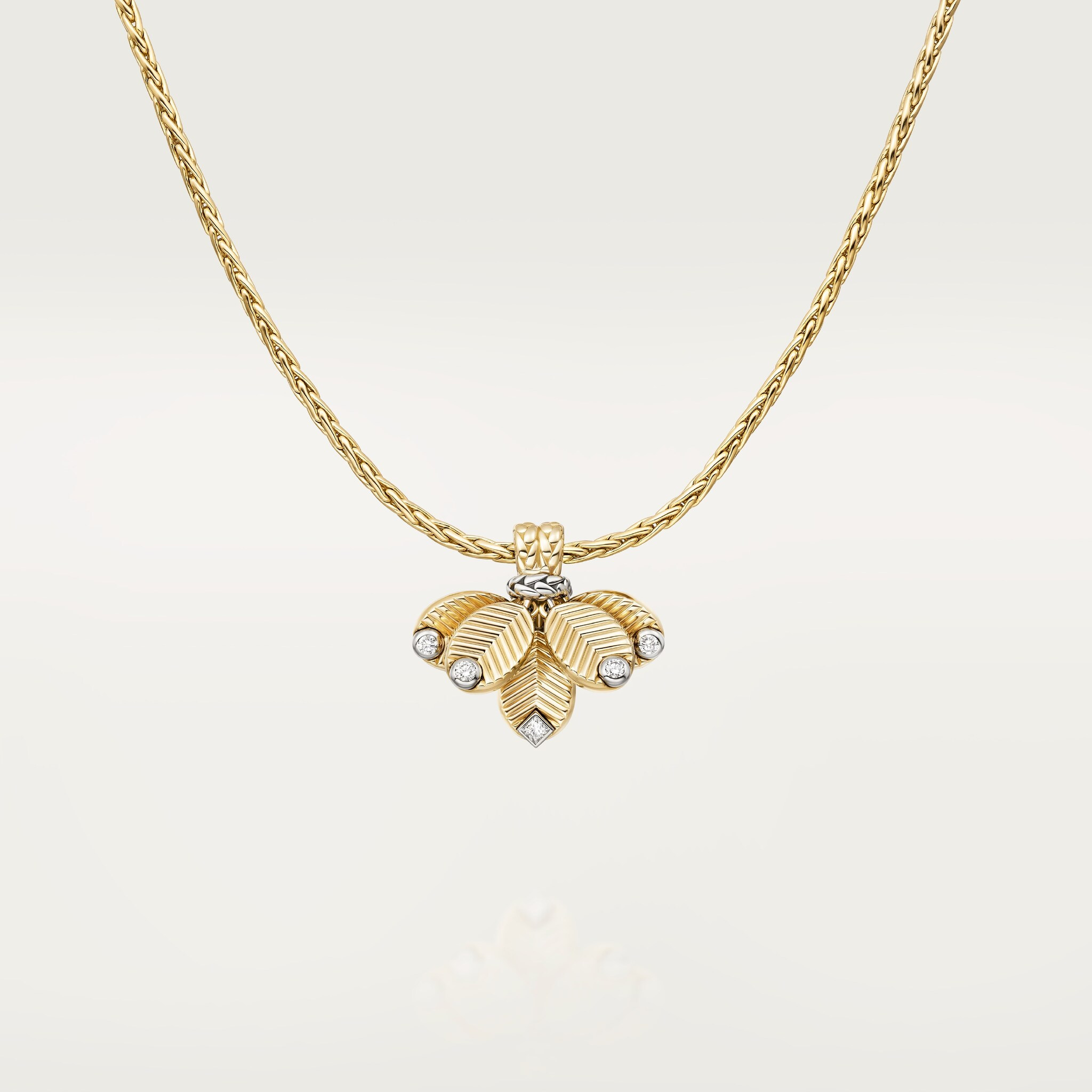
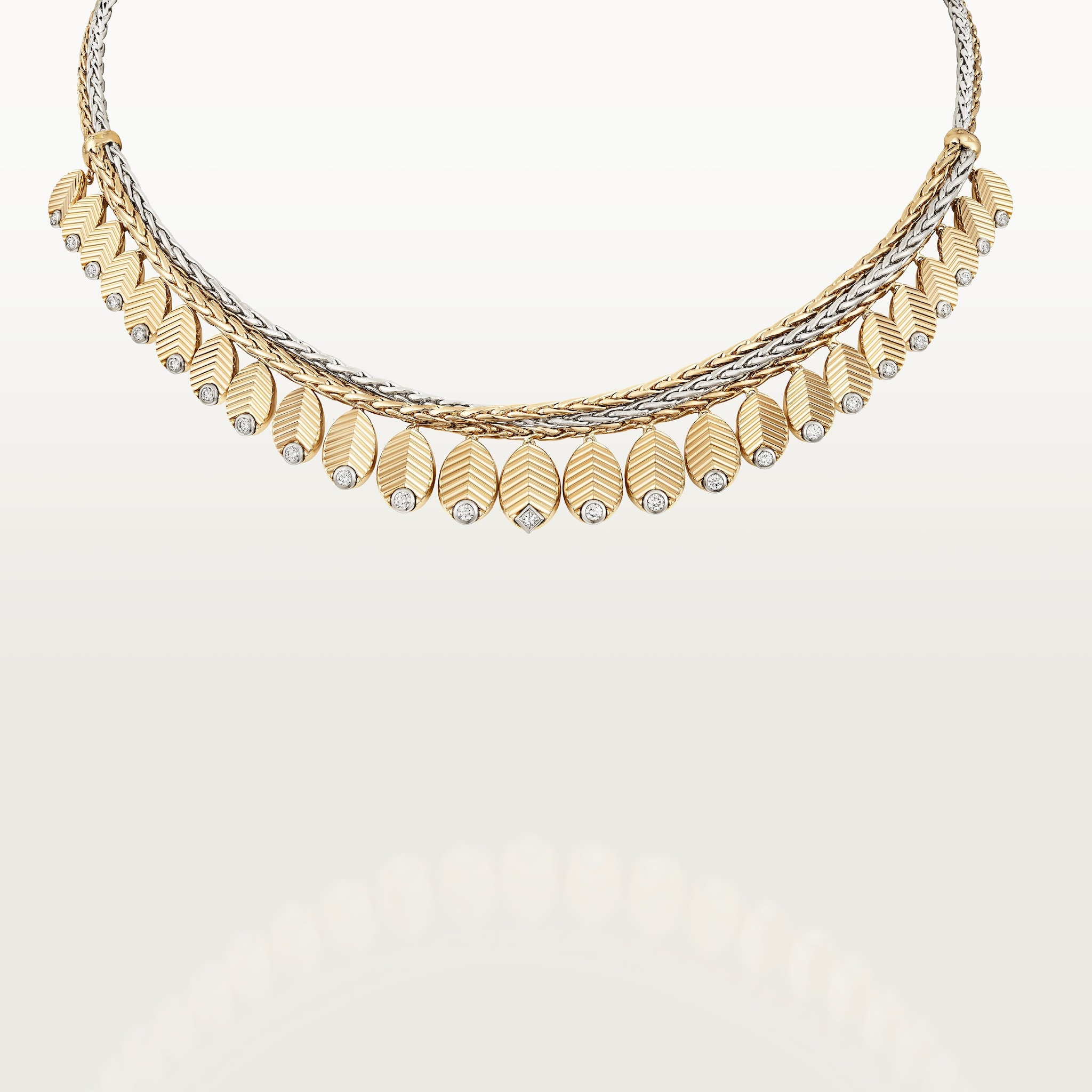
The complete necklace demonstrates how these forms can be organised along a line. The chain gives the object a route around the neck; the clustered or hanging elements interrupt that route with volume. The design therefore has two speeds of looking: the longer line is understood quickly, while the smaller bean-shaped forms reward closer attention. That difference is part of the collection’s visual identity and helps explain why the motif can move beyond a single sculptural ring.
A bracelet turns a cluster into a curve
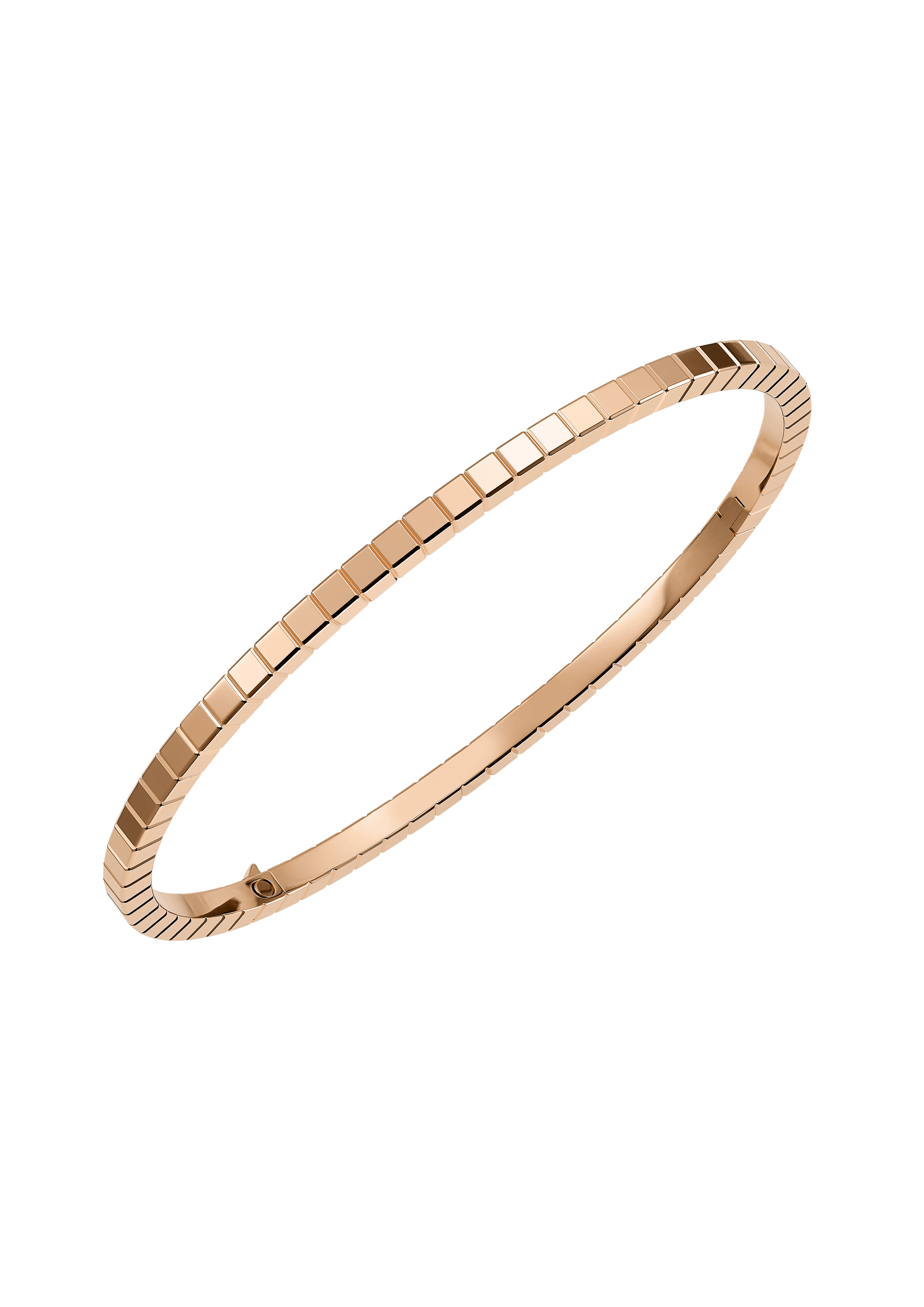
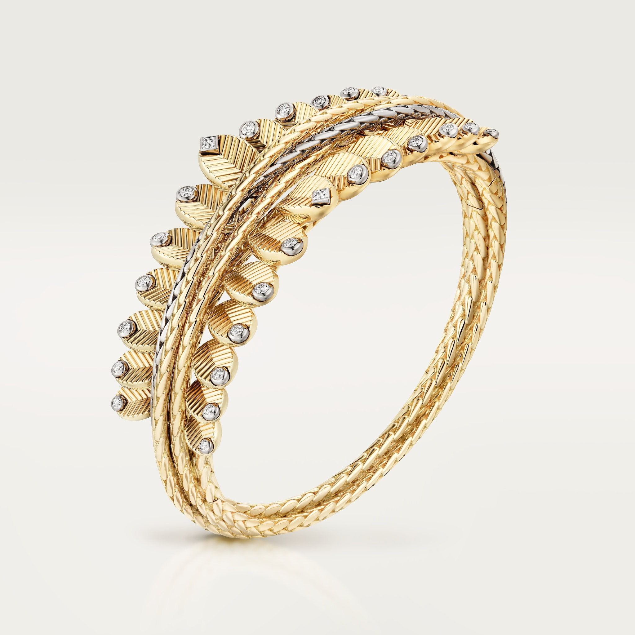
A bracelet has to create its outline around the wrist, and the complete Grain de Café product view makes that larger curve visible. The bean-shaped accents meet a structure that has its own circumference and inner opening. When the front and rear views are considered together, the object becomes easier to understand as something built around the body, rather than as an arrangement of decorative forms seen only from its most flattering angle.
The rear view is valuable for that reason. It restores the internal curve and the relationship between the prominent external forms and the quieter side of the object. This is not an independent inspection of the fastening or a proof of comfort. It is a different piece of visual information, one that a presentation limited to front-facing glamour shots would omit. The object’s inner space belongs to its design, even if the surface facing the viewer carries most of the ornament.
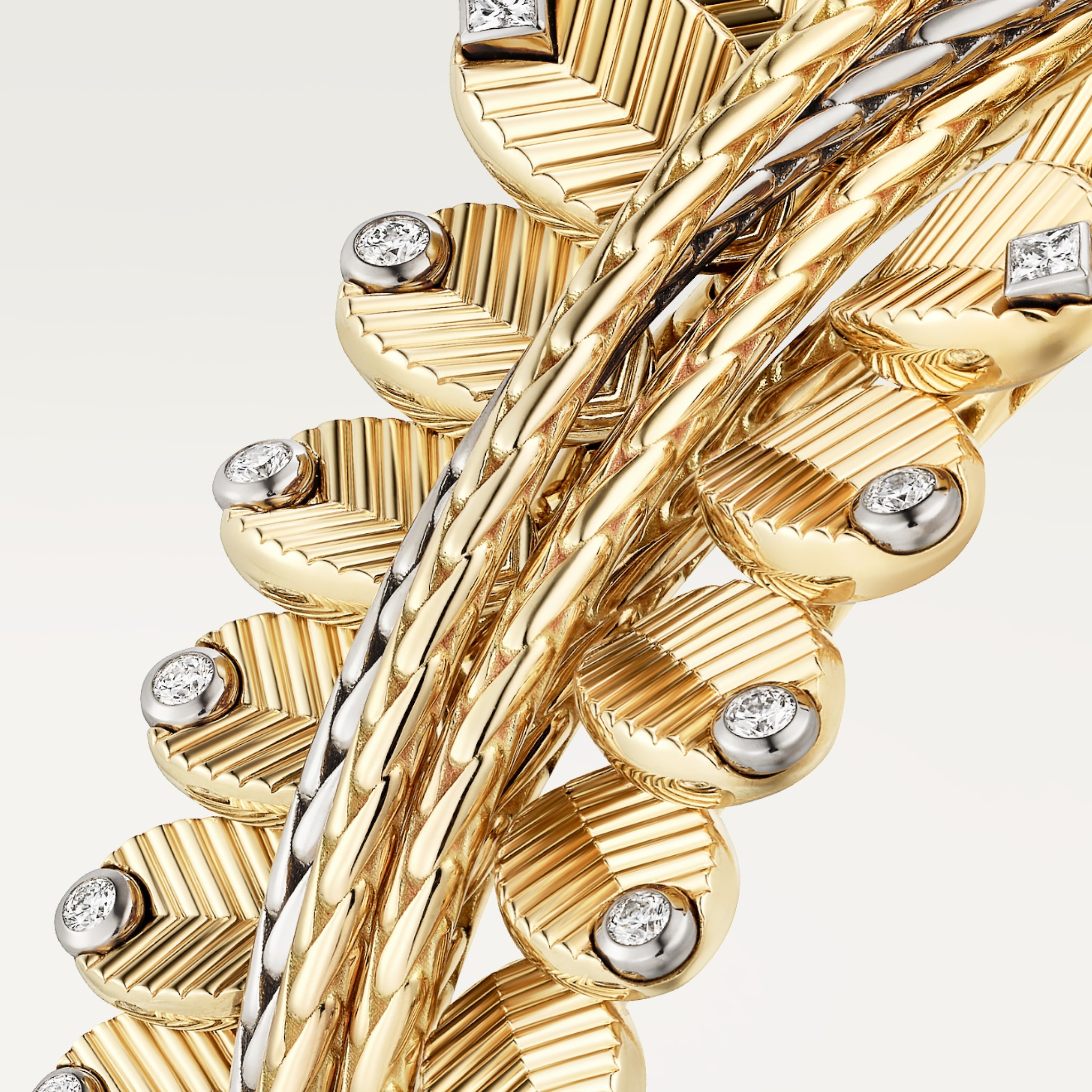
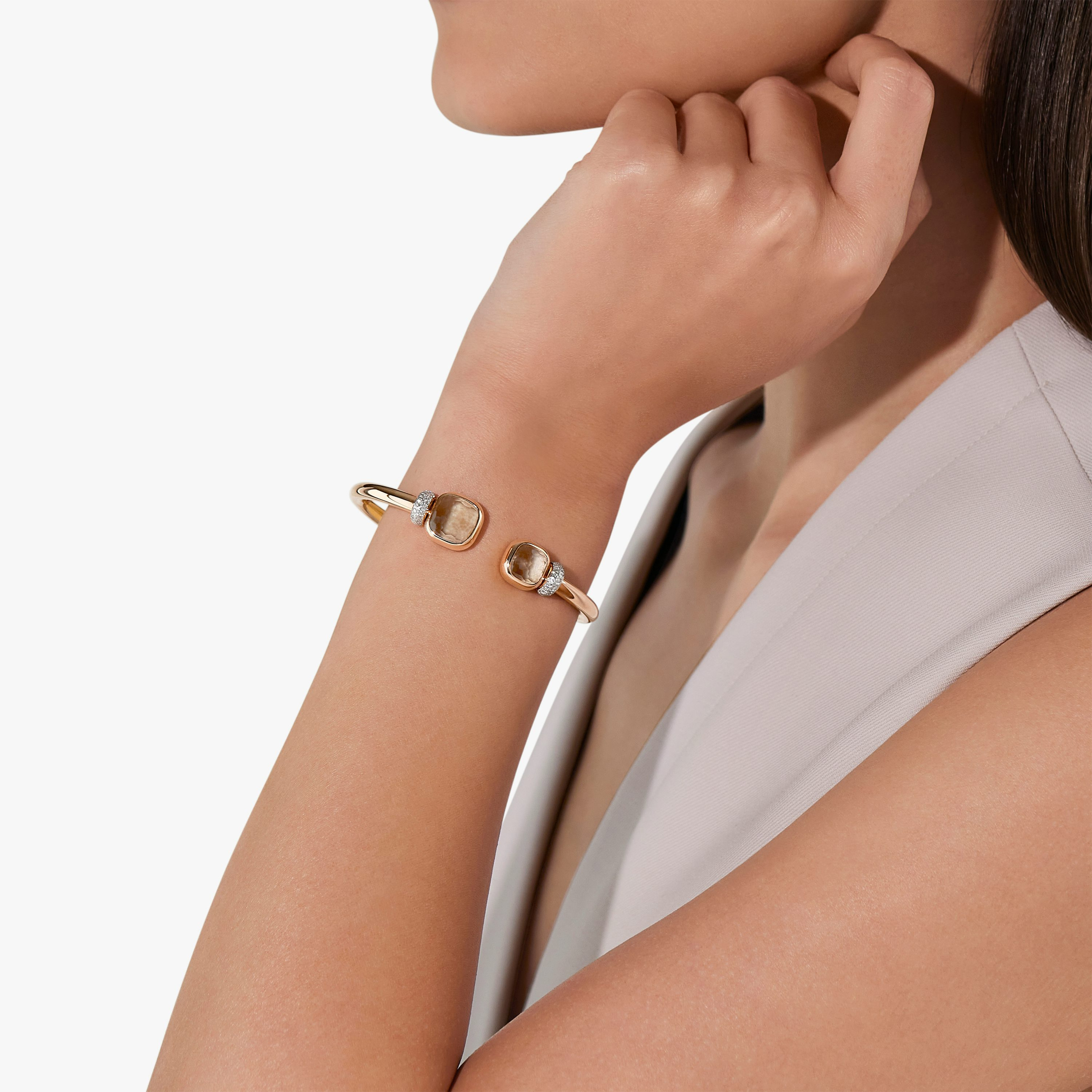
The official worn photograph then gives the curve a physical scale. Against a hand and sleeve, the rounded motifs can be seen as accents within an outfit. A bracelet may appear dense in isolation and more concentrated when the surrounding body is included. That change of scale is useful for choosing what to look at next: the inner dimension, the height of the projecting forms or the point at which the piece meets the wrist’s movement.
A broader necklace changes the rhythm
The larger necklace shown here is distinct from the smaller pendant arrangement. Its visual presence comes from a wider accumulation of forms rather than one isolated hanging centre. Seen complete, it creates a more extended contour around the neckline. The spaces between elements still matter: they let the line remain readable and give each rounded form enough separation to contribute to the rhythm.
The comparison with the pendant is more revealing than placing two almost identical product angles together. One object concentrates attention; the other distributes it. Both can belong to Grain de Café because the same rounded vocabulary is organised differently. The motif’s consistency does not require an identical composition, and the collection becomes clearer when the viewer can see that distinction before considering the smaller surface details.
For a prospective wearer, the next step is to compare the exact piece at the intended location. A necklace should be considered with the relevant neckline, while a projecting ring needs to be seen from the side as well as from above. A bracelet’s internal size and closure should be confirmed on its product record and in a fitting. The official images can guide those questions, but they cannot establish a universal judgement of ease or practicality across every reference.
Reading the motif at three distances
| Distance | What becomes visible | What still needs confirmation |
|---|---|---|
| Complete outfit | The distribution of volume at neck, hand or wrist | Exact dimensions and fit |
| Whole object | Chain, band, inner curve and clustered outline | Reference-specific materials and fastening |
| Surface detail | Rounded contours and the division across a bean | Construction and finish described by the maker |
The named ring record is one reference within a wider collection. Its specifications should not be extended to the broader necklace or bracelet by visual resemblance. The photographs are official product and campaign images; this article does not report an independent fitting, handling session or durability assessment.
The Luxe Digital view
Grain de Café gains its identity from the way a rounded form is directed, clustered and suspended. Cartier’s motif remains recognisable, but the more useful distinction is between concentrated and distributed volume. The current imagery gives both enough space to be understood, with the rear view restoring a part of the object that decorative presentation often leaves out.
Grain de Café gains its identity from the way a rounded form is directed, clustered and suspended.
Sources & credits
Sources and methodology
Independent visual analysis of current official imagery and named product records, checked on 14 October 2026. Historical introductions, manufacturer specifications and visual observations are kept distinct. No visit, interview, independent handling or appraisal is implied.
- Cartier — source 1: Current official collection, named designs, dated context and selected image provenance.
- Cartier — source 2: Current official collection, named designs, dated context and selected image provenance.