Water rarely keeps the shape that makes it interesting. A ripple spreads, a waterfall breaks into separate streams and a wave folds before collapsing. Boucheron’s Or Bleu collection takes those unstable moments as the starting point for objects that must hold their form on a body. Its subject is water; its design problem is movement made tangible.
Presented in 2024 under creative director Claire Choisne, this Carte Blanche collection drew on Iceland’s waters and landscapes. It contains 26 creations, according to the house’s official presentation. This is an archival design feature about that collection, not an announcement of Boucheron’s latest high-jewellery programme in 2026.
Begin with a ripple
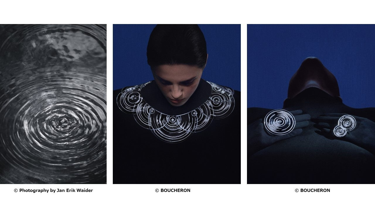
Ondes provides a particularly clear entry into the collection’s thinking. In the official visual sequence, a water surface sits beside the jewel worn on a body. The relation is visible without demanding that the two images be identical. The jewel takes the spreading organisation of a ripple and gives it a defined place, scale and edge.
What matters is the translation. A photograph of water contains light, reflection and movement; a jewel has to use material, construction and the wearer to create its effect. For Ondes, Boucheron used sculpted and polished rock crystal, with diamonds set beneath the transparent material. The house describes using digital modelling to establish the ripple’s volumes before the crystal was worked. The clear surface and the light beneath it perform different jobs: one draws the wave; the other gives it brightness.
The back view is useful for another reason. It asks the reader to follow the object around the body rather than treat the front as the entire design. High jewellery is encountered in movement and from several directions. A considered photographic presentation should acknowledge that, even when the available material is a set of still images.
Cascade turns falling water into a vertical line
Cascade changes the axis. Where Ondes encourages a horizontal reading, the long necklace establishes a descent across the body. Boucheron describes Cascade as a 148-centimetre necklace in white gold and diamonds, with a construction that can transform into shorter arrangements and earrings. Its length turns the necklace into a line across the torso. Its flexibility allows the direction to remain visible without making the jewel a rigid frame around the wearer.
The body is essential to that argument. A long jewel cannot be understood fully as an isolated product cutout: its relation to shoulder, torso and clothing is part of its effect. The worn photograph establishes scale. The other views make it possible to examine the shape without asking the model to carry every detail at once.
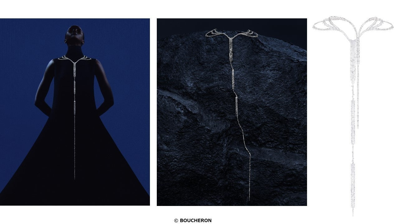
This is why we preserve the house’s complete compositions. They were assembled to connect inspiration, object and wearer. Cropping them into narrow strips could remove the very information that makes them useful, including the landscape photographer’s credit. The presentation should respect their structure while providing its own editorial sequence around them.
Darkness has a material role
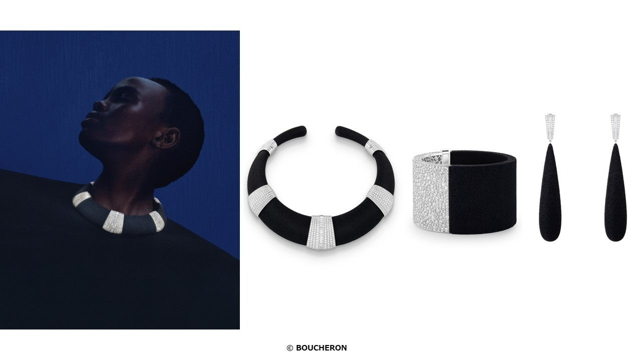
Sable Noir introduces a different relationship between water and ground. The official imagery places dark shores and breaking water beside black-and-white jewellery studies. It is a change from the more obvious language of clear water and bright reflection. Contrast becomes a tool for explaining the landscape rather than an ornamental colour choice.
The product views make that contrast legible at several scales. A close worn image shows the object’s relation to the body; the isolated composition makes the outline and grouping easier to study. For Sable Noir, the house binds real black sand with a polymer through a three-dimensional printing process. The resulting dark forms are placed against diamond-set areas. The contrast therefore belongs to the material construction: granular darkness and bright points are carried into the jewel, rather than applied as a colour story around it.
The wider collection also includes materials and techniques that are less familiar in a conventional account of high jewellery. It would be easy to turn that variety into a catalogue of unusual substances. Here, the more useful question is what each choice does visually. Does it create opacity, a granular surface, a transparent edge or a strong transition between light and dark? The photographs provide a first answer without substituting for a technical examination.
Iceberg and Vague work at different scales
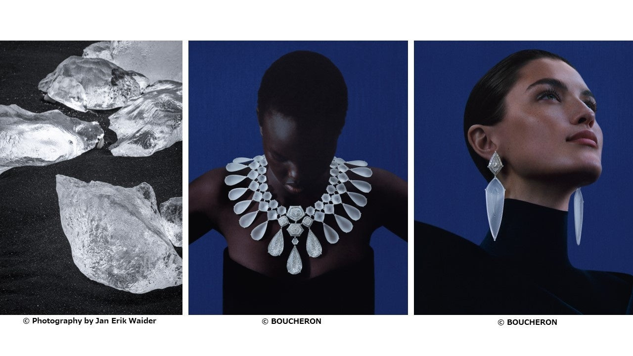
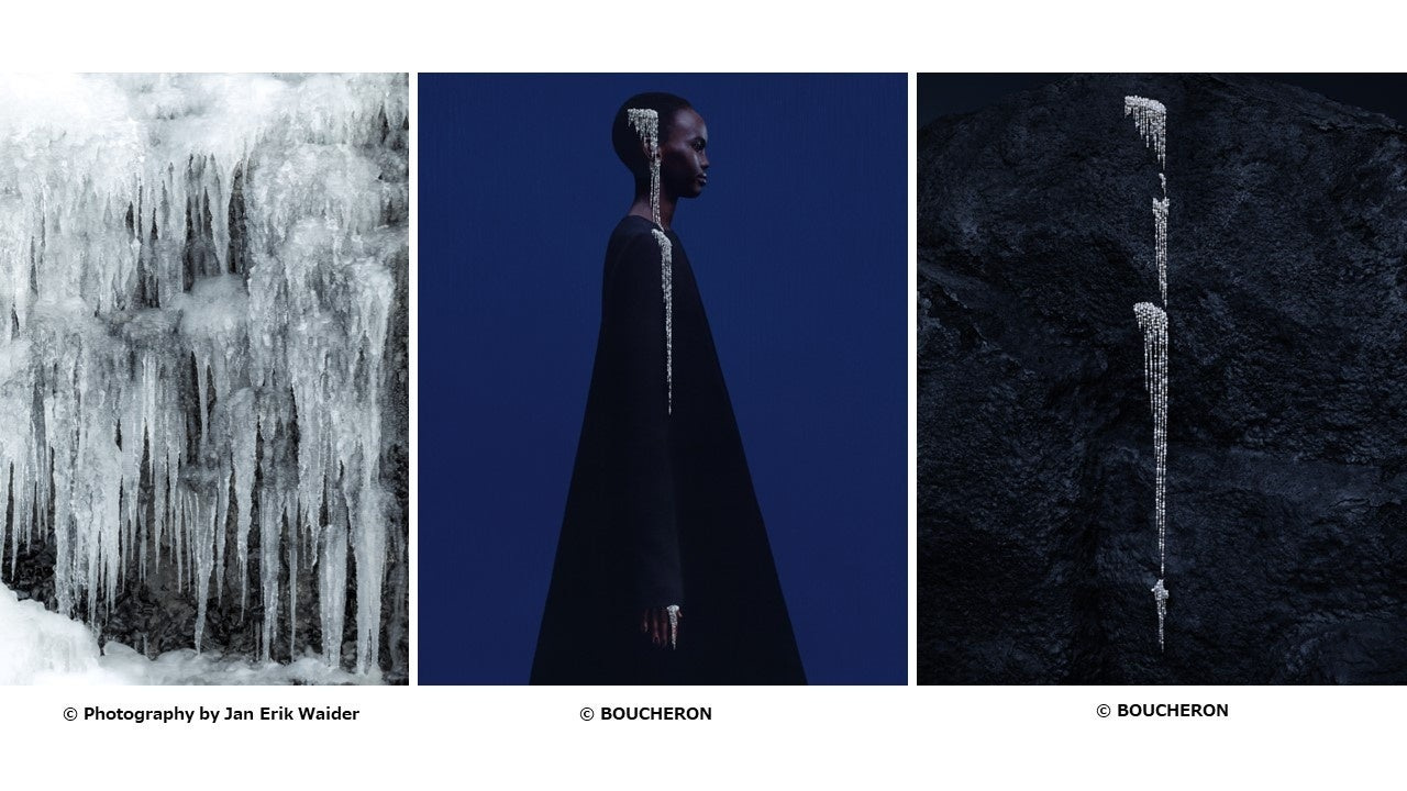
The Iceberg sequence brings a colder, more crystalline reading of the landscape. The source scene and worn jewellery are connected by shape and light rather than a literal copy of a block of ice. Boucheron uses sandblasted rock crystal to give Iceberg a frosted appearance, with diamonds accommodated directly within the crystal. The choice translates ice’s cloudy edges and internal light into a stable, wearable construction. Transparency becomes a material problem as well as a visual effect.
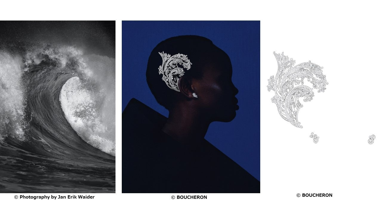
Vague introduces the larger gesture of a wave. In the official presentation, the worn view and isolated jewel show how a sweeping shape can become part of the body’s silhouette. This is not simply jewellery as a small bright detail. The house relates Vague to a 1910 tiara inspired by Hokusai’s wave. Lost-wax casting gives its form to the white-gold structure, bringing an archival idea into a different relationship with the wearer. The sweeping outline has a history as well as a landscape behind it.
These examples also explain why a collection should not be presented as an uninterrupted grid of identical product boxes. A ripple, a long descent and a sweeping wave have different visual needs. One asks for a view across the surface; another needs vertical scale; a third needs room around the wearer. The editorial composition should follow those differences.
A vocabulary of water, read through the body
The following table is a guide to the selected visual studies. It records an editorial reading of the official imagery, not a technical inventory, a price list or a certification of the materials in each piece.
| Study | Visual starting point | What to examine in the worn image |
|---|---|---|
| Ondes | Spreading ripples | The organisation of lines across and around the body. |
| Cascade | A descending flow | Length, direction and the relation between jewel and torso. |
| Sable Noir | Dark shore and breaking water | Contrast, surface and the outline of the object. |
| Iceberg | Ice and reflected light | The translation of a landscape’s edges into a wearable form. |
| Vague | A folding wave | The larger gesture around the wearer’s silhouette. |
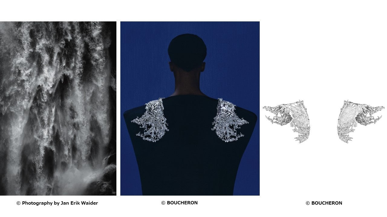
| Eau Vive | The force and direction of moving water | How an unexpected placement changes the body’s outline. |
Eau Vive extends the discussion beyond familiar placements. The official worn and isolated views are particularly valuable together: the first shows the gesture in use, while the second clarifies that a jewel can be conceived around an area of the body that is less conventional than neck, wrist or finger. For Eau Vive, Boucheron specifies sculpted aluminium with a palladium finish and a magnetic attachment system. Material, weight and fastening all serve the placement: the shoulder is the intended setting, and the construction has to make that larger gesture wearable.
The landscape remains a partner in the image
The collection’s visual material includes landscape photography credited to Jan Erik Waider. That work is not a disposable background. It supplies the source conditions against which the jewels can be read: water’s direction, the shore’s texture and the contrast between reflected brightness and dark ground. We retain the embedded credit and identify it in the accompanying captions.
The strongest pieces do not imitate water; they translate a way of seeing it. That is our editorial reading of the collection. Or Bleu is persuasive when the photographs let the reader make those comparisons for themselves, moving between the landscape, the designed object and the wearer. The house’s imagination becomes visible through specific decisions, rather than through a succession of superlatives.
The strongest pieces do not imitate water; they translate a way of seeing it.
Sources & credits
Methodology and sources
This independent archival feature concerns the 2024 Or Bleu collection. It uses Boucheron’s official collection presentation and the house’s Japanese press release, which carries the selected visual compositions. No handling, gemological assessment, interview or current availability claim is implied. Material details not established for an individual illustrated piece are omitted. Landscape credits remain intact; model and product imagery is credited to Boucheron.