


Norman Silverman Los Angeles diamond houses should be read first through the jewellery itself: the line of a pendant on the neckline, the scale of a centre stone, the polish of a ring designed to be seen up close. For LuxeDigital, the stronger article is not a judgement on the brand. It is a visual passage through the product world Norman Silverman publishes on its own official pages.
The feature stays close to the official Norman Silverman homepage, the diamond pendant necklace category, the rings category, and the official house page. The result should feel less like a profile and more like a private viewing: pendants, rings, worn diamond imagery and Los Angeles craft context, all shown with enough clarity that the brand would recognise what it is trying to sell.
The Product World

Norman Silverman opens its site with the language of natural diamond jewellery, private appointment retail and heirloom pieces that move between milestones and everyday presence. The important editorial move is to stay close to that world. The brand is not asking to be decoded through scepticism; it is asking to be seen through diamonds that are meant to live on the body.
That is where the Vogue and Katerina Perez benchmark becomes useful. The article should let the jewellery do visible work. A strong image first, then a product detail, then the category story: that rhythm gives a reader a reason to keep looking, and gives the brand the sense that the publication understands the commercial and emotional role of the pieces.
Pendants, Rings, And Everyday Diamond Visibility
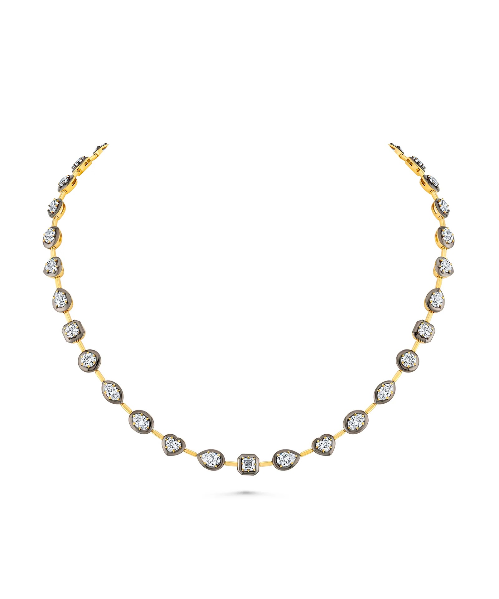
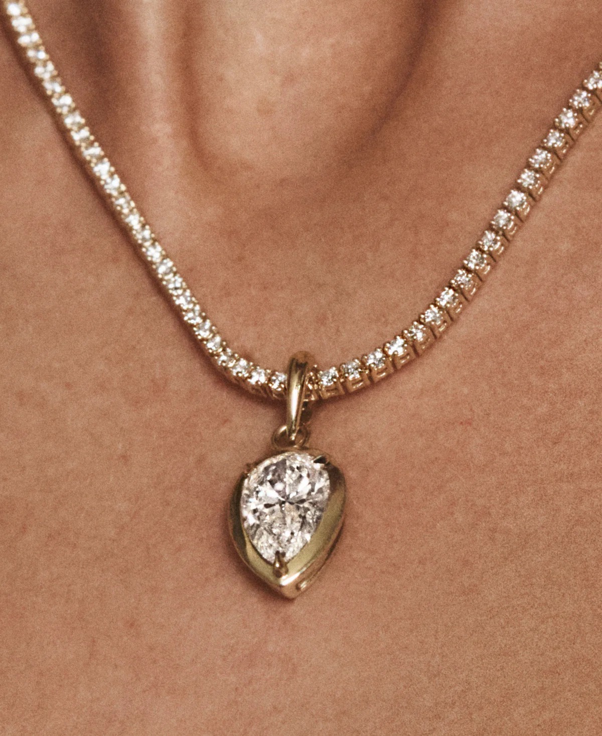
The pendant category is one of the clearest entry points into Norman Silverman’s current product language. The official pendant page describes diamond pendant necklaces with refined proportion, clean lines and a focus on the stone. That matters because it makes the category feel wearable rather than ceremonial: the diamond is still central, but the design is about how it sits along the neckline.
The range also gives the brand more than one mood. The official pendant category includes cross pendants, solitaire pendants, charm necklaces, fancy yellow diamond drops, sapphire accents and Toi et Moi compositions. Some pieces show listed prices while others invite enquiry, which suits a house built around stones whose appeal often depends on scale, setting and client context.
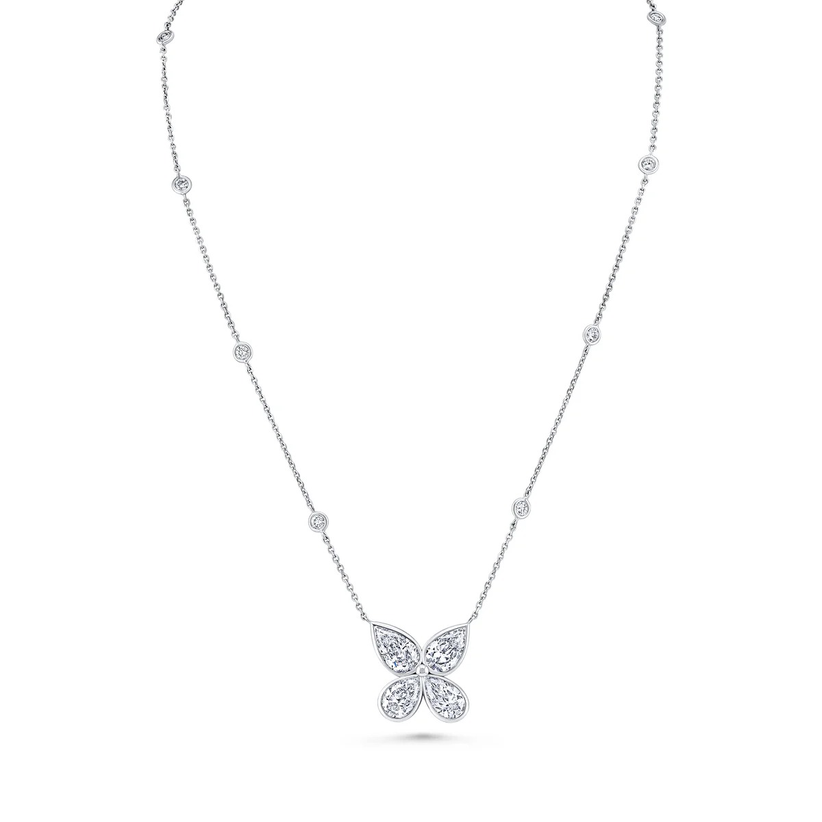
This is the part of the article that should quietly encourage browsing. A reader can move from a simple bezel-set pendant to a butterfly motif or a fancy yellow heart-shaped drop without feeling pushed into a hard sell. The editorial job is to make that movement feel natural: stone, silhouette, line, then occasion.
The pendant page is especially useful because it gives the article product names rather than vague category labels. Diamond Outline Cross Pendant, Emerald Cut Diamond Cross Pendant, Cushion Diamond Pendant, Floating East West Emerald Cut Diamond Pendant and Fancy Yellow Heart Diamond Drop Pendant each point to a different buying mood: symbolic, geometric, solitaire, directional or colour-led. That is the kind of specificity a brand-facing article needs if it is going to feel useful to the house, not merely flattering from the outside.
The Los Angeles Retail Atmosphere
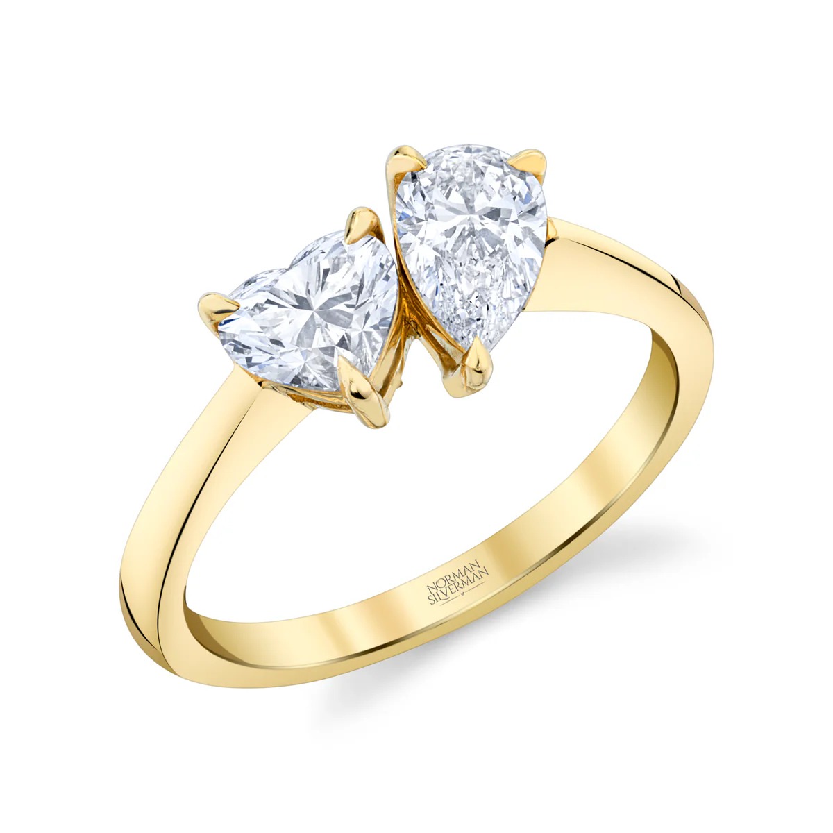
The rings category brings the Los Angeles retail atmosphere into sharper focus. Norman Silverman groups engagement rings, eternity bands, halfway bands and fashion rings inside the broader site navigation, but the official imagery shows a more expressive vocabulary too: Toi et Moi rings, mixed-shape designs, yellow diamonds, emerald cuts, heart shapes, bypass settings and cocktail silhouettes.
That breadth is commercially important. It lets the brand speak to bridal clients, collectors of visible diamonds and shoppers looking for a ring that reads with personality rather than anonymity. The Toi et Moi ring with pear and heart diamonds is useful here because it shows exactly what the article should foreground: recognisable stones, a romantic silhouette, and enough visual distinctiveness to make the piece memorable.
The same logic applies to rings. A category page with emerald cuts, Toi et Moi compositions, fancy yellow diamonds, cocktail shapes and pave-set bands gives a publication enough visual vocabulary to write with confidence. The point is not to claim that every ring carries the same weight; it is to show the house’s range in a way that helps a reader imagine the next step, whether that is a private appointment, a bridal conversation or a more expressive diamond purchase.
Why The Category Creates Desire
Desire in this category comes from immediacy. A pendant can mark a personal moment without waiting for a gala. A diamond ring can be bridal, expressive or daily-visible depending on the shape and setting. Norman Silverman’s site is organised around that practical glamour: necklaces, rings, earrings, bracelets, bridal, New Arrivals, NS Signature, Petites by NS, Fancy Yellow and Precious Color.
For a brand-facing LuxeDigital article, that architecture is more useful than abstract praise. It gives the reader places to look. It gives the brand credit for categories that can turn interest into appointment, enquiry or purchase. And it keeps the editorial tone clean: no forced verdict, no attempt to rank the house against larger maisons, no artificial toughness.
Closing Perspective

The strongest Norman Silverman story is the product world itself: diamond pendants with clear neckline logic, rings that move from bridal structure to expressive shapes, and a Los Angeles house language built around stones that are meant to be worn, viewed and selected in person.
That is the direction LuxeDigital should keep. Make the jewellery visible, make the category desirable, keep every claim source-safe, and let the article feel like a polished editorial introduction a brand could share without feeling it had been reviewed from a distance.